The same plot in 14 other libraries — Python: Altair, Bokeh, lets-plot, Matplotlib, Plotly, plotnine, Pygal, Seaborn; Julia: Makie.jl; JavaScript: Chart.js, D3.js, Apache ECharts, Highcharts, MUI X Charts. Compare all 15 side by side: OHLC Bar Chart in Python, R, Julia and JavaScript.
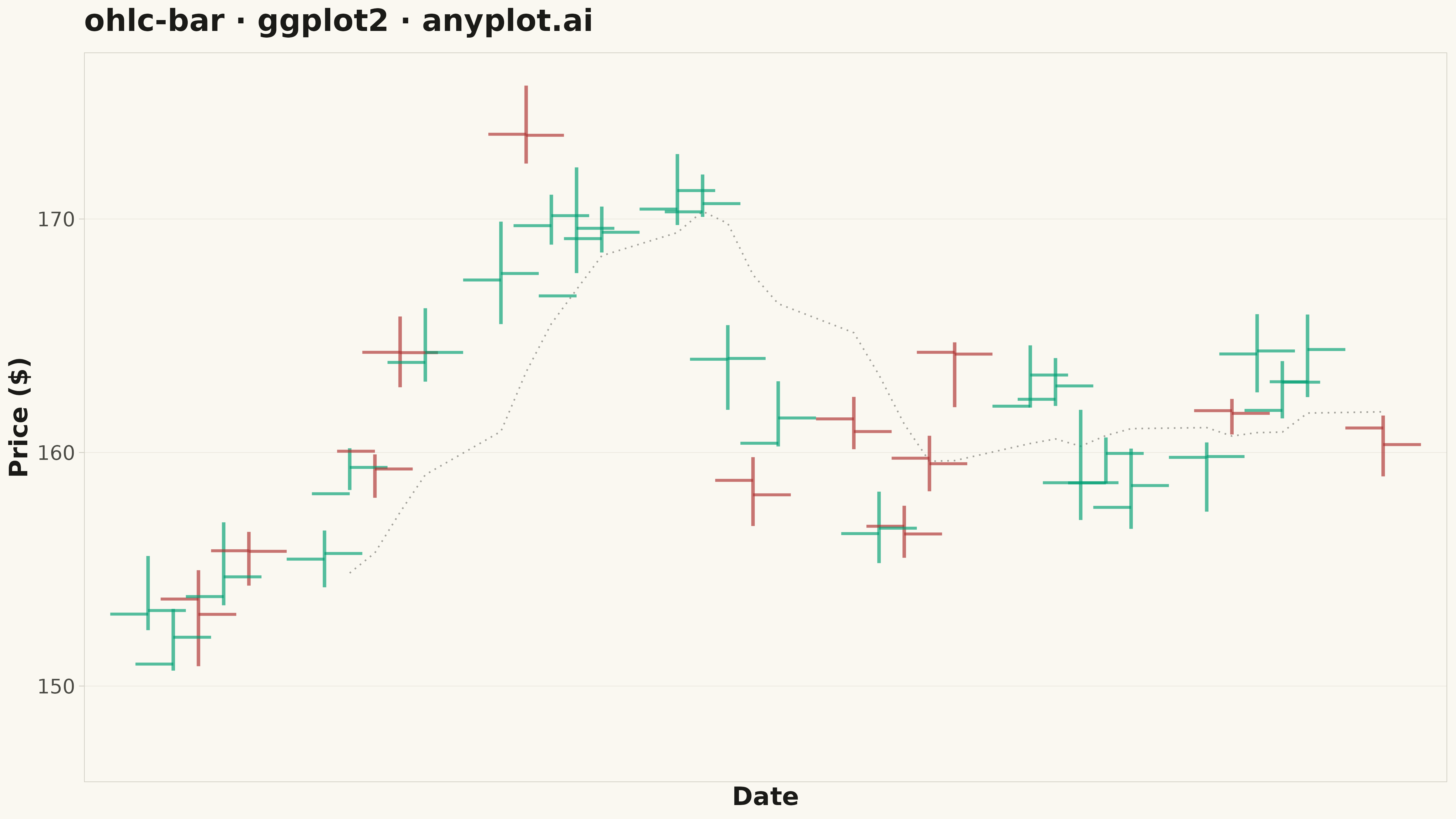
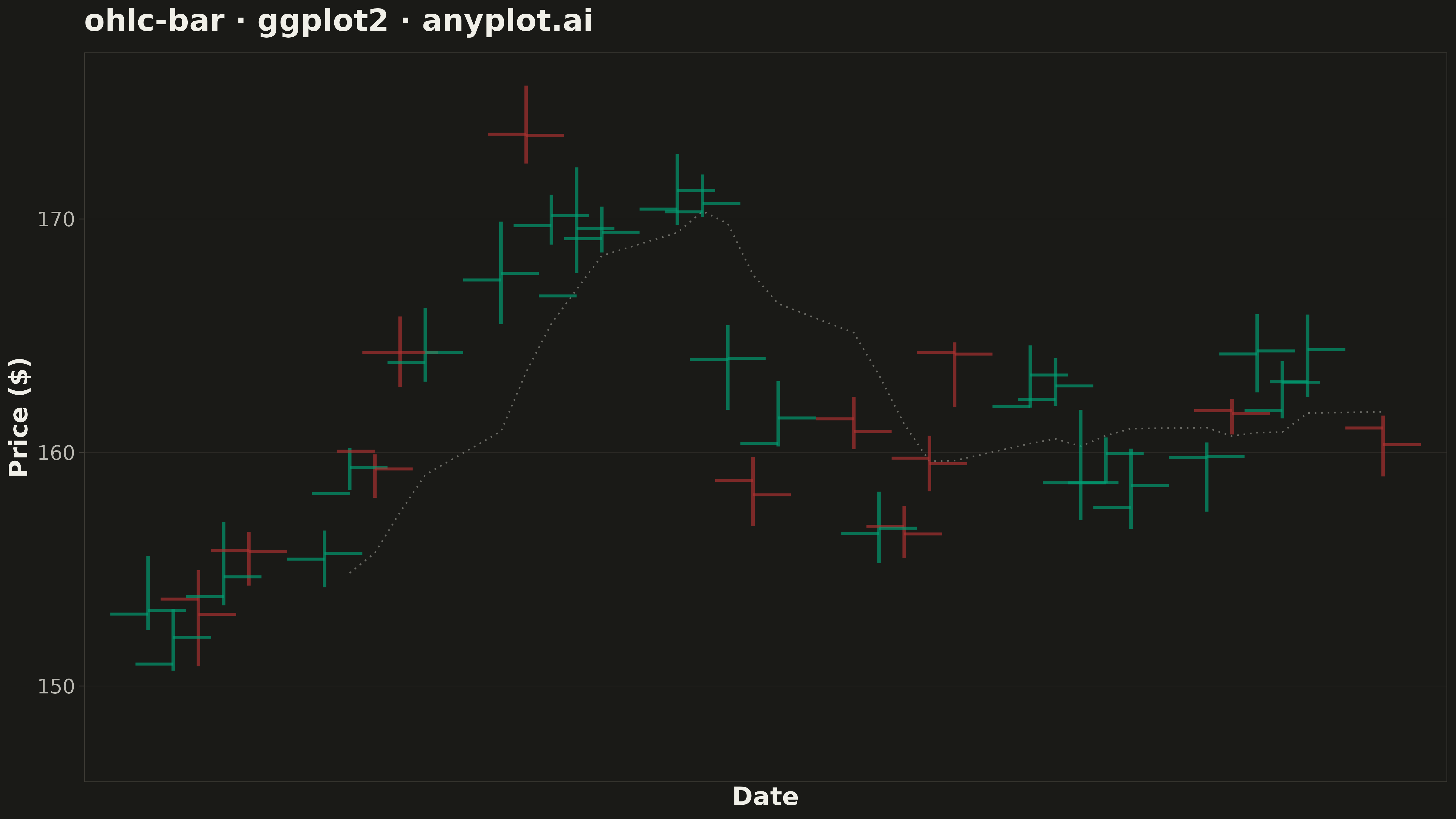
An OHLC (Open-High-Low-Close) bar chart displays financial price data using vertical bars with horizontal tick marks. Each bar shows the price range from high to low as a thin vertical line, with a left tick indicating the opening price and a right tick indicating the closing price. Unlike candlestick charts that use colored bodies, OHLC bars provide a cleaner, less cluttered view favored by technical analysts who prefer to focus on price levels rather than visual patterns.
#' anyplot.ai
#' ohlc-bar: OHLC Bar Chart
#' Library: ggplot2 3.5.1 | R 4.4.1
#' Quality: 87/100 | Created: 2026-05-17

library(ggplot2)
library(dplyr)
library(ragg)

set.seed(42)

# --- Theme tokens -----------------------------------------------------------
THEME       <- Sys.getenv("ANYPLOT_THEME", "light")
PAGE_BG     <- if (THEME == "light") "#FAF8F1" else "#1A1A17"
INK         <- if (THEME == "light") "#1A1A17" else "#F0EFE8"
INK_SOFT    <- if (THEME == "light") "#4A4A44" else "#B8B7B0"
BORDER_COL  <- if (THEME == "light") "#D0CEC4" else "#3F3D37"
GRID_COL    <- if (THEME == "light") "#E8E6DC" else "#2A2824"
IMPRINT   <- c("#009E73", "#C475FD", "#4467A3", "#BD8233",
                 "#AE3030", "#2ABCCD", "#954477")

# --- Data: Realistic stock prices over 50 trading days ----------------------
dates <- seq(as.Date("2024-01-01"), by = "1 day", length.out = 50)
# Filter to trading days (Mon-Fri)
trading_dates <- dates[weekdays(dates) %in% c("Monday", "Tuesday", "Wednesday", "Thursday", "Friday")]
trading_dates <- trading_dates[1:45]

# Generate realistic OHLC data with trend
n <- length(trading_dates)
returns <- rnorm(n, mean = 0.001, sd = 0.015)
close_prices <- 150 * cumprod(1 + returns)

ohlc_data <- data.frame(
  date = trading_dates,
  open = close_prices + rnorm(n, mean = -0.5, sd = 0.8),
  close = close_prices,
  high = pmax(close_prices, close_prices + abs(rnorm(n, mean = 1.5, sd = 0.6))),
  low = pmin(close_prices, close_prices - abs(rnorm(n, mean = 1.5, sd = 0.6)))
) %>%
  mutate(
    direction = ifelse(close > open, "up", "down"),
    color_val = if_else(direction == "up", "#009E73", "#AE3030"),  # imprint green / red
    x_pos = as.numeric(date),
    volatility = (high - low) / low,
    opacity_val = 0.6 + 0.4 * min(volatility / max(volatility), 1.0)
  )

# --- Build plot segments for high-low and open-close ticks ------------------
# Main high-low vertical lines
hl_segments <- ohlc_data %>%
  mutate(
    y_min = low,
    y_max = high
  ) %>%
  select(x_pos, y_min, y_max, direction, color_val, opacity_val)

# Open tick marks (left side, small horizontal)
open_segments <- ohlc_data %>%
  mutate(
    x_start = x_pos - 1.5,
    x_end = x_pos,
    y = open
  ) %>%
  select(x_start, x_end, y, direction, color_val, opacity_val)

# Close tick marks (right side, small horizontal)
close_segments <- ohlc_data %>%
  mutate(
    x_start = x_pos,
    x_end = x_pos + 1.5,
    y = close
  ) %>%
  select(x_start, x_end, y, direction, color_val, opacity_val)

# Compute moving average for trend visualization
ma_period <- 7
ma_close <- rep(NA, nrow(ohlc_data))
for (i in ma_period:nrow(ohlc_data)) {
  ma_close[i] <- mean(ohlc_data$close[(i - ma_period + 1):i])
}
ohlc_data$ma_close <- ma_close

# --- Create the plot --------------------------------------------------------
p <- ggplot() +
  # Subtle trend line (moving average)
  geom_line(
    data = ohlc_data,
    aes(x = x_pos, y = ma_close),
    color = INK_SOFT,
    linewidth = 0.6,
    linetype = "dotted",
    alpha = 0.5
  ) +
  # High-low vertical lines with opacity variation for volatility
  geom_segment(
    data = hl_segments,
    aes(x = x_pos, xend = x_pos, y = y_min, yend = y_max, color = direction, alpha = opacity_val),
    linewidth = 1.3,
    show.legend = FALSE
  ) +
  # Open tick marks (left)
  geom_segment(
    data = open_segments,
    aes(x = x_start, xend = x_end, y = y, yend = y, color = direction, alpha = opacity_val),
    linewidth = 1.1,
    show.legend = FALSE
  ) +
  # Close tick marks (right)
  geom_segment(
    data = close_segments,
    aes(x = x_start, xend = x_end, y = y, yend = y, color = direction, alpha = opacity_val),
    linewidth = 1.1,
    show.legend = FALSE
  ) +
  scale_color_manual(
    values = c("up" = "#009E73", "down" = "#AE3030")  # imprint semantic anchors
  ) +
  scale_alpha_identity() +
  scale_x_continuous(
    breaks = seq(1, nrow(ohlc_data), by = 5),
    labels = format(ohlc_data$date[seq(1, nrow(ohlc_data), by = 5)], "%b %d"),
    expand = c(0.02, 0)
  ) +
  labs(
    title = "ohlc-bar · ggplot2 · anyplot.ai",
    x = "Date",
    y = "Price ($)"
  ) +
  theme_minimal(base_size = 14) +
  theme(
    plot.background     = element_rect(fill = PAGE_BG, color = PAGE_BG),
    panel.background    = element_rect(fill = PAGE_BG, color = NA),
    panel.border        = element_rect(fill = NA, color = BORDER_COL, linewidth = 0.5),
    panel.grid.major.y  = element_line(color = GRID_COL, linewidth = 0.2),
    panel.grid.major.x  = element_blank(),
    panel.grid.minor    = element_blank(),
    axis.ticks          = element_line(color = BORDER_COL, linewidth = 0.3),
    axis.ticks.length   = unit(4, "pt"),
    axis.title          = element_text(color = INK, size = 20, face = "bold"),
    axis.text           = element_text(color = INK_SOFT, size = 16),
    axis.text.x         = element_text(angle = 45, hjust = 1),
    plot.title          = element_text(color = INK, size = 24, face = "bold", margin = margin(b = 12))
  )

# --- Save -------------------------------------------------------------------
ggsave(
  filename = sprintf("plot-%s.png", THEME),
  plot     = p,
  device   = ragg::agg_png,
  width    = 16,
  height   = 9,
  units    = "in",
  dpi      = 300
)
Runnable source as JSON, for any HTTP client: https://api.anyplot.ai/specs/ohlc-bar/ggplot2/code. Any spec id and library id listed in llms-full.txt fit the same URL shape; every URL below is complete and callable.
{
  "spec_id": "ohlc-bar",
  "language": "r",
  "library": "ggplot2",
  "page": "https://anyplot.ai/ohlc-bar/r/ggplot2",
  "hub": "https://anyplot.ai/ohlc-bar",
  "code_json": "https://api.anyplot.ai/specs/ohlc-bar/ggplot2/code",
  "spec_json": "https://api.anyplot.ai/specs/ohlc-bar",
  "render_light_png": "https://storage.googleapis.com/anyplot-images/plots/ohlc-bar/r/ggplot2/plot-light.png",
  "render_dark_png": "https://storage.googleapis.com/anyplot-images/plots/ohlc-bar/r/ggplot2/plot-dark.png",
  "quality_score": 87.0,
  "license": "MIT",
  "guide": "https://anyplot.ai/llms.txt"
}
Part of OHLC Bar Chart on anyplot.ai.