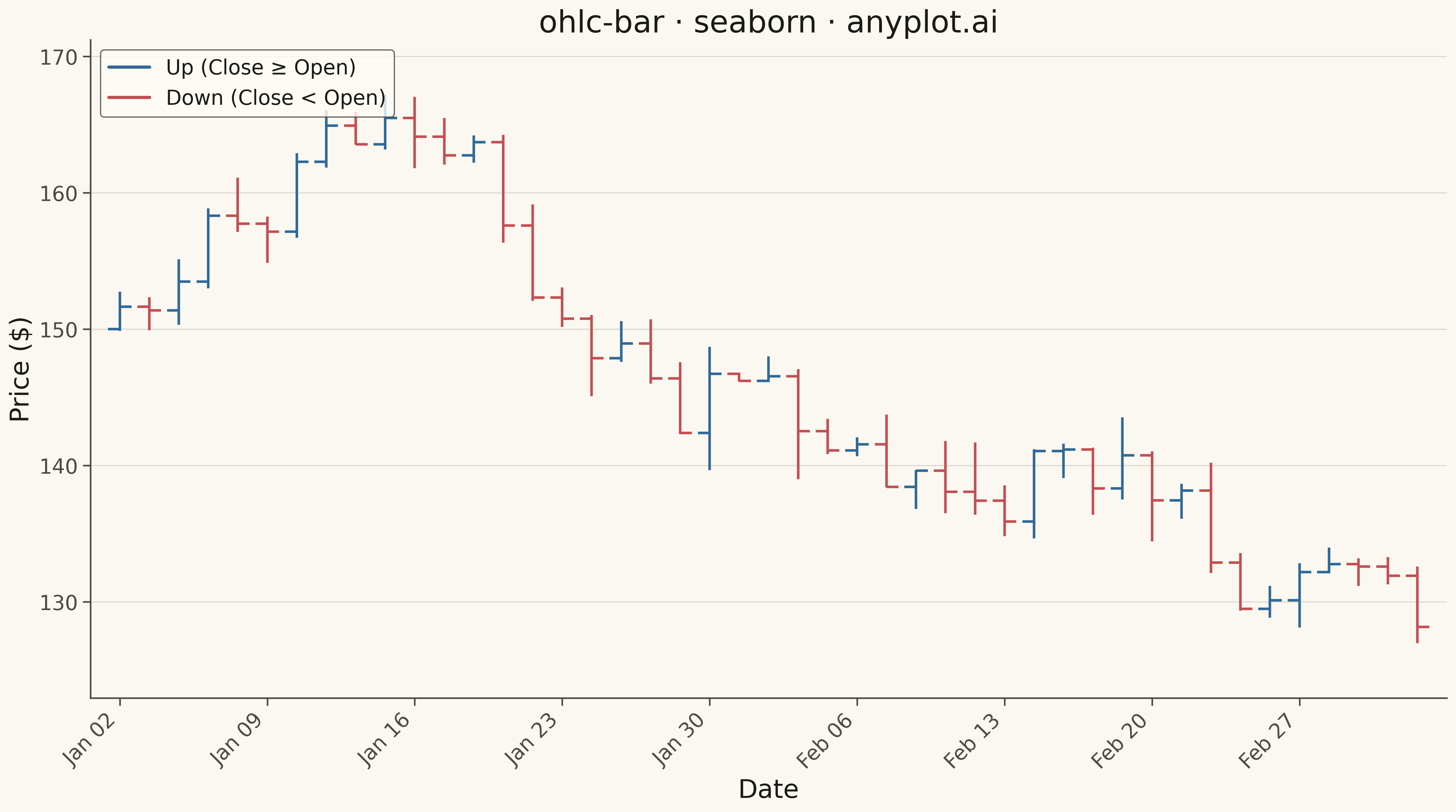
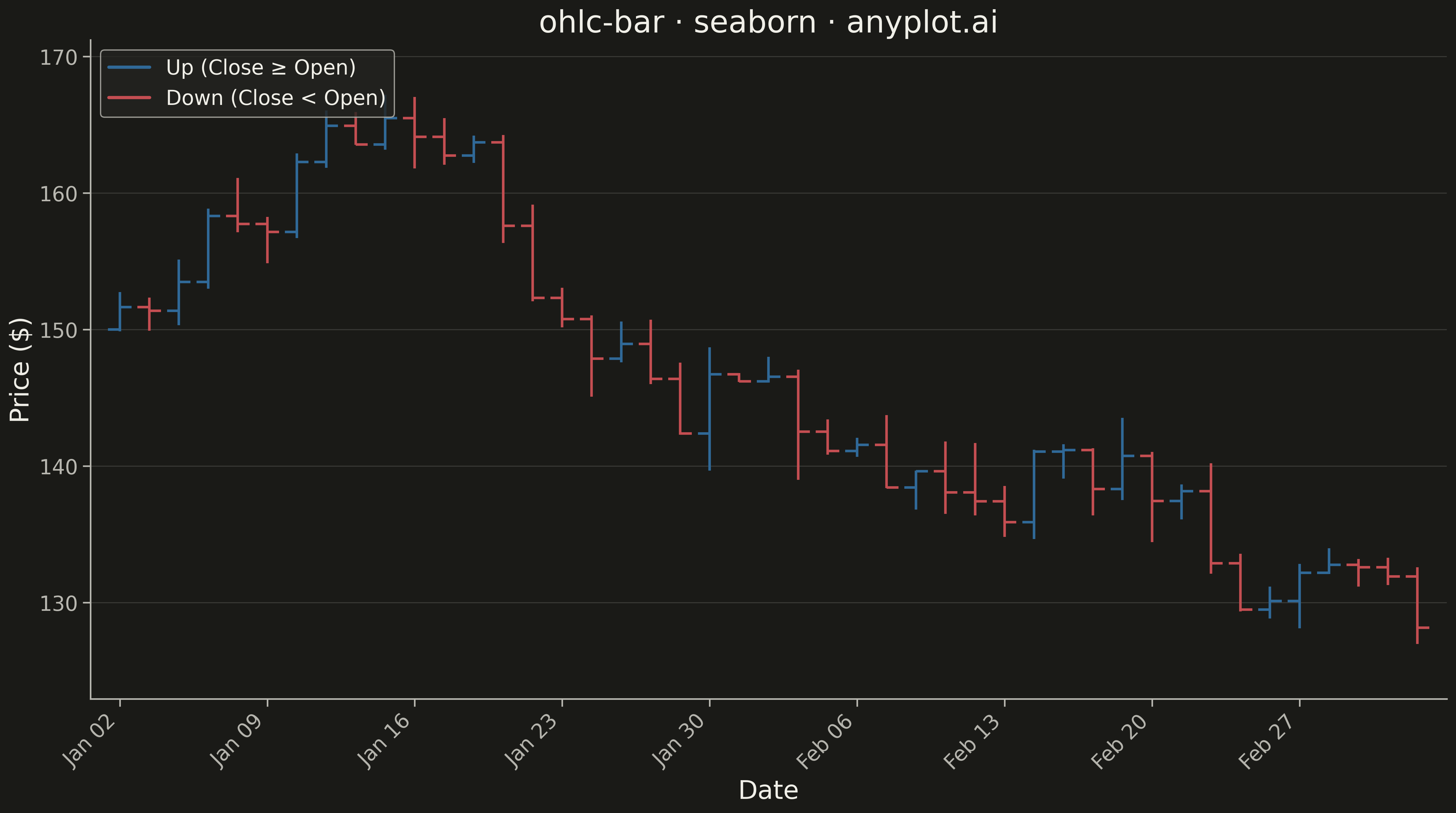
An OHLC (Open-High-Low-Close) bar chart displays financial price data using vertical bars with horizontal tick marks. Each bar shows the price range from high to low as a thin vertical line, with a left tick indicating the opening price and a right tick indicating the closing price. Unlike candlestick charts that use colored bodies, OHLC bars provide a cleaner, less cluttered view favored by technical analysts who prefer to focus on price levels rather than visual patterns.
""" anyplot.ai
ohlc-bar: OHLC Bar Chart
Library: seaborn 0.13.2 | Python 3.13.13
Quality: 90/100 | Updated: 2026-05-17
"""

import os

import matplotlib.pyplot as plt
import numpy as np
import pandas as pd
import seaborn as sns


# Theme tokens
THEME = os.getenv("ANYPLOT_THEME", "light")
PAGE_BG = "#FAF8F1" if THEME == "light" else "#1A1A17"
ELEVATED_BG = "#FFFDF6" if THEME == "light" else "#242420"
INK = "#1A1A17" if THEME == "light" else "#F0EFE8"
INK_SOFT = "#4A4A44" if THEME == "light" else "#B8B7B0"

# OHLC-specific colors: up bars and down bars
COLOR_UP = "#306998"
COLOR_DOWN = "#C44E52"

# Set seaborn theme with theme-adaptive styling
sns.set_theme(
    style="ticks",
    rc={
        "figure.facecolor": PAGE_BG,
        "axes.facecolor": PAGE_BG,
        "axes.edgecolor": INK_SOFT,
        "axes.labelcolor": INK,
        "text.color": INK,
        "xtick.color": INK_SOFT,
        "ytick.color": INK_SOFT,
        "grid.color": INK,
        "grid.alpha": 0.10,
        "legend.facecolor": ELEVATED_BG,
        "legend.edgecolor": INK_SOFT,
    },
)

# Generate synthetic OHLC stock data
np.random.seed(42)
n_days = 45

# Create date range (business days)
dates = pd.date_range(start="2024-01-02", periods=n_days, freq="B")

# Generate realistic price movements
base_price = 150.0
returns = np.random.normal(0.001, 0.02, n_days)
close_prices = base_price * np.cumprod(1 + returns)

# Generate OHLC from close prices
open_prices = np.roll(close_prices, 1)
open_prices[0] = base_price
high_prices = np.maximum(open_prices, close_prices) * (1 + np.abs(np.random.normal(0, 0.01, n_days)))
low_prices = np.minimum(open_prices, close_prices) * (1 - np.abs(np.random.normal(0, 0.01, n_days)))

# Create DataFrame
df = pd.DataFrame({"date": dates, "open": open_prices, "high": high_prices, "low": low_prices, "close": close_prices})

# Add direction column for coloring
df["direction"] = np.where(df["close"] >= df["open"], "up", "down")

# Create figure
fig, ax = plt.subplots(figsize=(16, 9), facecolor=PAGE_BG)

# Draw OHLC bars using matplotlib primitives
tick_width = 0.4

for idx, row in df.iterrows():
    i = df.index.get_loc(idx)
    color = COLOR_UP if row["direction"] == "up" else COLOR_DOWN

    # Vertical line from low to high
    ax.vlines(x=i, ymin=row["low"], ymax=row["high"], color=color, linewidth=2)

    # Left tick for open price
    ax.hlines(y=row["open"], xmin=i - tick_width, xmax=i, color=color, linewidth=2)

    # Right tick for close price
    ax.hlines(y=row["close"], xmin=i, xmax=i + tick_width, color=color, linewidth=2)

# Create custom legend with line representations
up_line = plt.Line2D([0], [0], color=COLOR_UP, linewidth=2.5, label="Up (Close ≥ Open)")
down_line = plt.Line2D([0], [0], color=COLOR_DOWN, linewidth=2.5, label="Down (Close < Open)")
ax.legend(handles=[up_line, down_line], fontsize=16, loc="upper left")

# Configure x-axis with date labels
tick_positions = np.arange(0, len(df), max(1, len(df) // 8))
tick_labels = [df["date"].iloc[i].strftime("%b %d") for i in tick_positions]
ax.set_xticks(tick_positions)
ax.set_xticklabels(tick_labels, rotation=45, ha="right", fontsize=16)

# Style the plot
ax.set_xlabel("Date", fontsize=20, color=INK)
ax.set_ylabel("Price ($)", fontsize=20, color=INK)
ax.set_title("ohlc-bar · seaborn · anyplot.ai", fontsize=24, color=INK)
ax.tick_params(axis="both", labelsize=16, colors=INK_SOFT)

# Remove top and right spines
ax.spines["top"].set_visible(False)
ax.spines["right"].set_visible(False)

# Subtle grid
ax.yaxis.grid(True, alpha=0.15, linewidth=0.8, color=INK)
ax.set_axisbelow(True)

# Set axis limits with padding
ax.set_xlim(-1, len(df))
y_min, y_max = df["low"].min(), df["high"].max()
y_padding = (y_max - y_min) * 0.1
ax.set_ylim(y_min - y_padding, y_max + y_padding)

plt.tight_layout()
plt.savefig(f"plot-{THEME}.png", dpi=300, bbox_inches="tight", facecolor=PAGE_BG)
Runnable source as JSON, for any HTTP client: https://api.anyplot.ai/specs/ohlc-bar/seaborn/code. Any spec id and library id listed in llms-full.txt fit the same URL shape; every URL below is complete and callable.
{
  "spec_id": "ohlc-bar",
  "language": "python",
  "library": "seaborn",
  "page": "https://anyplot.ai/ohlc-bar/python/seaborn",
  "hub": "https://anyplot.ai/ohlc-bar",
  "code_json": "https://api.anyplot.ai/specs/ohlc-bar/seaborn/code",
  "spec_json": "https://api.anyplot.ai/specs/ohlc-bar",
  "render_light_png": "https://storage.googleapis.com/anyplot-images/plots/ohlc-bar/python/seaborn/plot-light.png",
  "render_dark_png": "https://storage.googleapis.com/anyplot-images/plots/ohlc-bar/python/seaborn/plot-dark.png",
  "quality_score": 90.0,
  "license": "MIT",
  "guide": "https://anyplot.ai/llms.txt"
}
Part of OHLC Bar Chart on anyplot.ai.