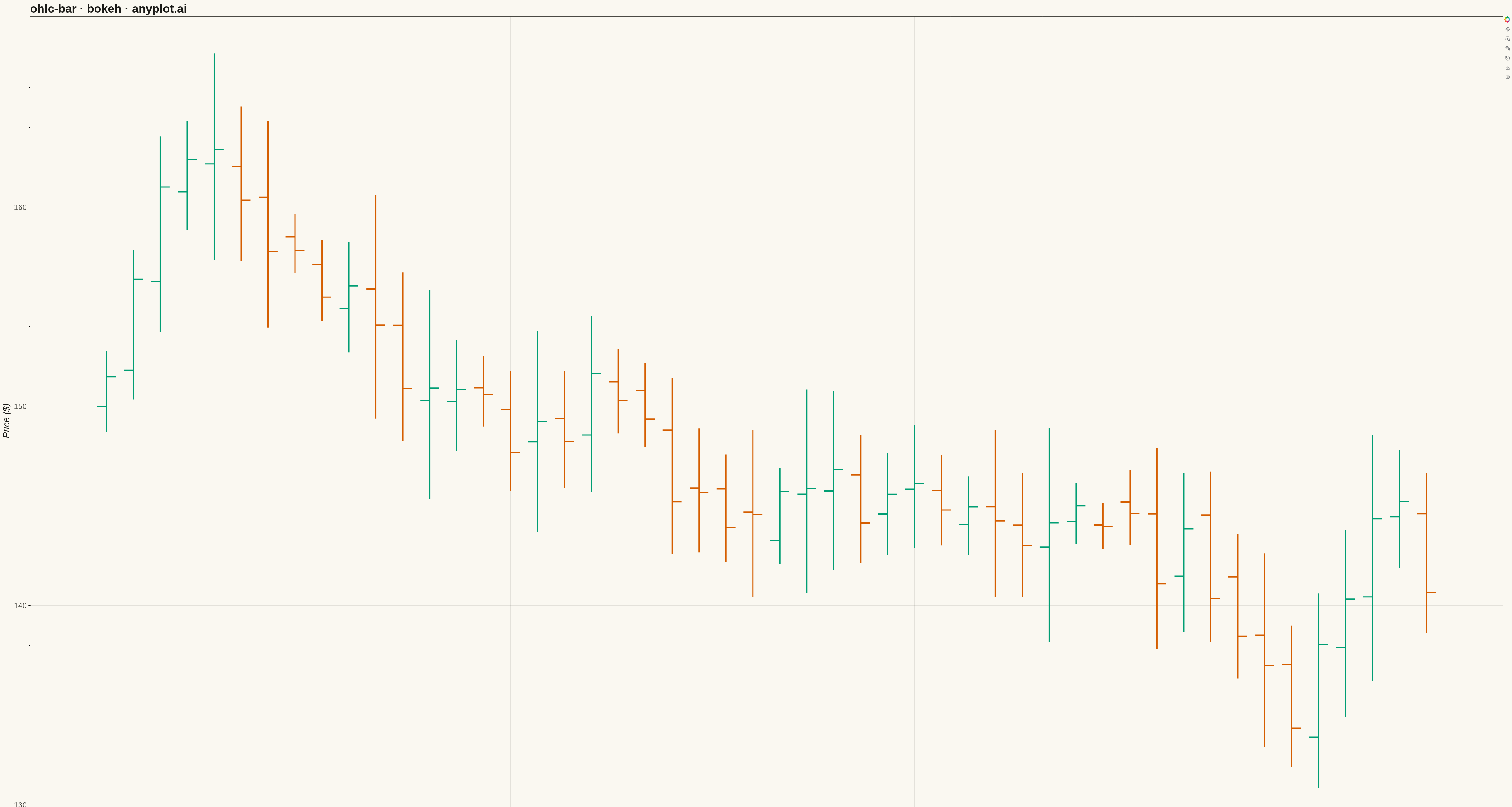
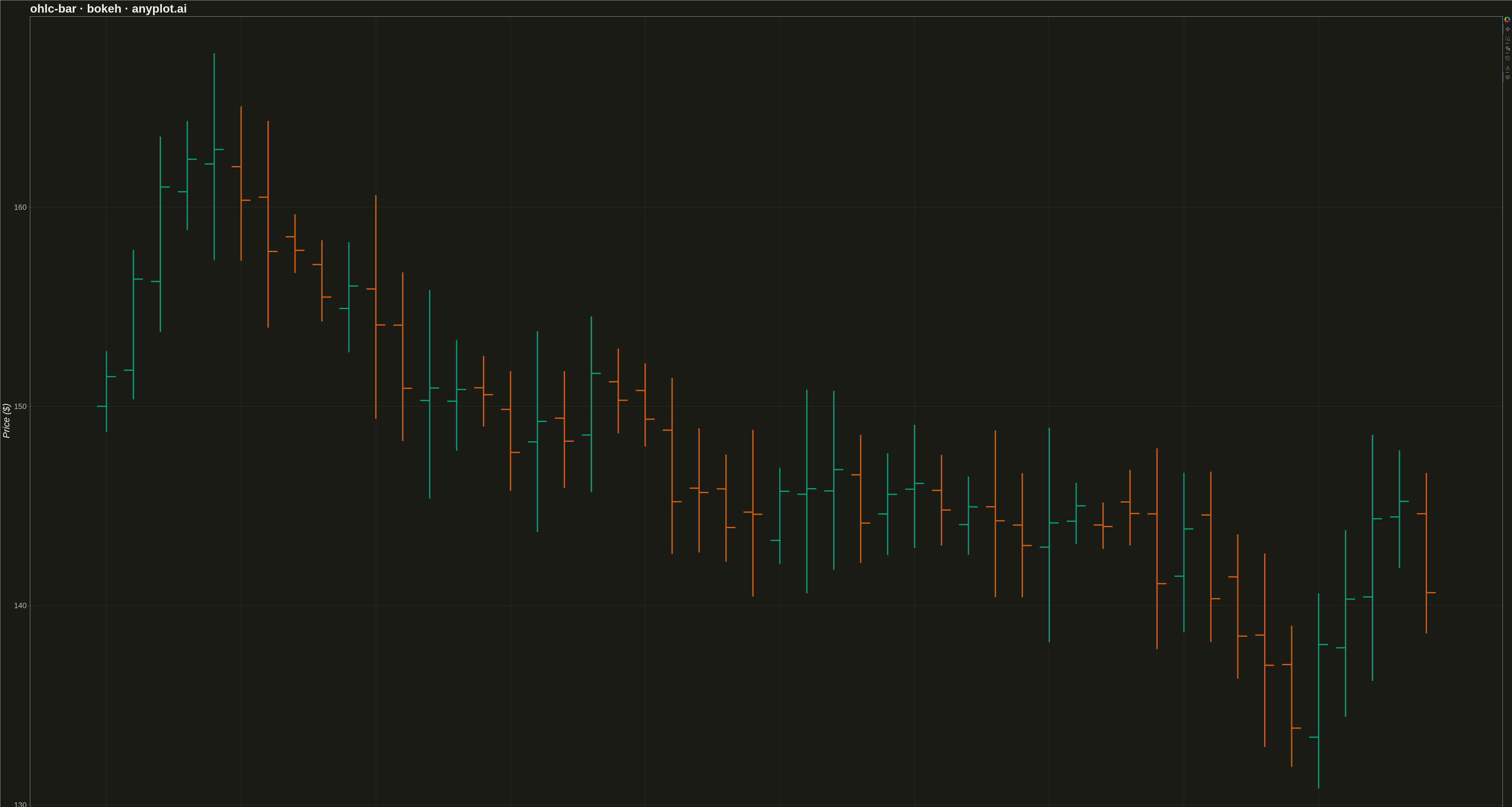
An OHLC (Open-High-Low-Close) bar chart displays financial price data using vertical bars with horizontal tick marks. Each bar shows the price range from high to low as a thin vertical line, with a left tick indicating the opening price and a right tick indicating the closing price. Unlike candlestick charts that use colored bodies, OHLC bars provide a cleaner, less cluttered view favored by technical analysts who prefer to focus on price levels rather than visual patterns.
""" anyplot.ai
ohlc-bar: OHLC Bar Chart
Library: bokeh 3.9.0 | Python 3.13.13
Quality: 82/100 | Updated: 2026-05-17
"""

import numpy as np
import pandas as pd
from bokeh.io import export_png, output_file, save
from bokeh.models import ColumnDataSource, HoverTool
from bokeh.plotting import figure


# Data - Generate 50 trading days of OHLC data
np.random.seed(42)
n_days = 50
dates = pd.date_range("2025-06-01", periods=n_days, freq="B")  # Business days

# Generate realistic price movement starting around $150
price = 150.0
opens, highs, lows, closes = [], [], [], []

for _ in range(n_days):
    open_price = price
    # Random daily movement
    change = np.random.randn() * 3
    close_price = open_price + change
    # High and low based on volatility
    volatility = abs(np.random.randn() * 2) + 1
    high_price = max(open_price, close_price) + volatility
    low_price = min(open_price, close_price) - volatility

    opens.append(open_price)
    highs.append(high_price)
    lows.append(low_price)
    closes.append(close_price)

    # Next day opens near previous close
    price = close_price + np.random.randn() * 0.5

df = pd.DataFrame({"date": dates, "open": opens, "high": highs, "low": lows, "close": closes})

# Determine up/down bars for coloring (blue for up, orange for down - colorblind safe)
df["color"] = np.where(df["close"] >= df["open"], "#306998", "#E07020")
df["date_str"] = df["date"].dt.strftime("%Y-%m-%d")
df["x"] = range(len(df))  # Numeric x for positioning

# Create figure
p = figure(
    width=4800,
    height=2700,
    title="ohlc-bar · bokeh · pyplots.ai",
    x_axis_label="Date",
    y_axis_label="Price ($)",
    tools="pan,wheel_zoom,box_zoom,reset,save",
)

# Create ColumnDataSource
source = ColumnDataSource(df)

# OHLC bar width for tick marks
tick_width = 0.35

# Draw high-low vertical lines (segments)
p.segment(x0="x", y0="low", x1="x", y1="high", source=source, color="color", line_width=4)

# Draw open ticks (horizontal line to the left)
p.segment(x0=df["x"] - tick_width, y0=df["open"], x1=df["x"], y1=df["open"], color=df["color"].tolist(), line_width=4)

# Draw close ticks (horizontal line to the right)
p.segment(x0=df["x"], y0=df["close"], x1=df["x"] + tick_width, y1=df["close"], color=df["color"].tolist(), line_width=4)

# Add hover tool
hover = HoverTool(
    tooltips=[
        ("Date", "@date_str"),
        ("Open", "$@open{0.2f}"),
        ("High", "$@high{0.2f}"),
        ("Low", "$@low{0.2f}"),
        ("Close", "$@close{0.2f}"),
    ],
    mode="vline",
)
p.add_tools(hover)

# Customize x-axis to show dates
tick_positions = list(range(0, len(df), 5))
tick_labels = {i: df.loc[i, "date"].strftime("%b %d") for i in tick_positions}
p.xaxis.ticker = tick_positions
p.xaxis.major_label_overrides = tick_labels

# Text styling for large canvas
p.title.text_font_size = "36pt"
p.xaxis.axis_label_text_font_size = "28pt"
p.yaxis.axis_label_text_font_size = "28pt"
p.xaxis.major_label_text_font_size = "22pt"
p.yaxis.major_label_text_font_size = "22pt"

# Grid styling
p.grid.grid_line_alpha = 0.3
p.grid.grid_line_dash = "dashed"

# Background
p.background_fill_color = "#fafafa"

# Axis styling
p.xaxis.axis_line_width = 2
p.yaxis.axis_line_width = 2
p.xaxis.major_tick_line_width = 2
p.yaxis.major_tick_line_width = 2

# Save PNG
export_png(p, filename="plot.png")

# Save interactive HTML
output_file("plot.html", title="OHLC Bar Chart")
save(p)
Runnable source as JSON, for any HTTP client: https://api.anyplot.ai/specs/ohlc-bar/bokeh/code. Any spec id and library id listed in llms-full.txt fit the same URL shape; every URL below is complete and callable.
{
  "spec_id": "ohlc-bar",
  "language": "python",
  "library": "bokeh",
  "page": "https://anyplot.ai/ohlc-bar/python/bokeh",
  "hub": "https://anyplot.ai/ohlc-bar",
  "code_json": "https://api.anyplot.ai/specs/ohlc-bar/bokeh/code",
  "spec_json": "https://api.anyplot.ai/specs/ohlc-bar",
  "render_light_png": "https://storage.googleapis.com/anyplot-images/plots/ohlc-bar/python/bokeh/plot-light.png",
  "render_dark_png": "https://storage.googleapis.com/anyplot-images/plots/ohlc-bar/python/bokeh/plot-dark.png",
  "interactive_light_html": "https://storage.googleapis.com/anyplot-images/plots/ohlc-bar/python/bokeh/plot-light.html",
  "interactive_dark_html": "https://storage.googleapis.com/anyplot-images/plots/ohlc-bar/python/bokeh/plot-dark.html",
  "quality_score": 82.0,
  "license": "MIT",
  "guide": "https://anyplot.ai/llms.txt"
}
Part of OHLC Bar Chart on anyplot.ai.