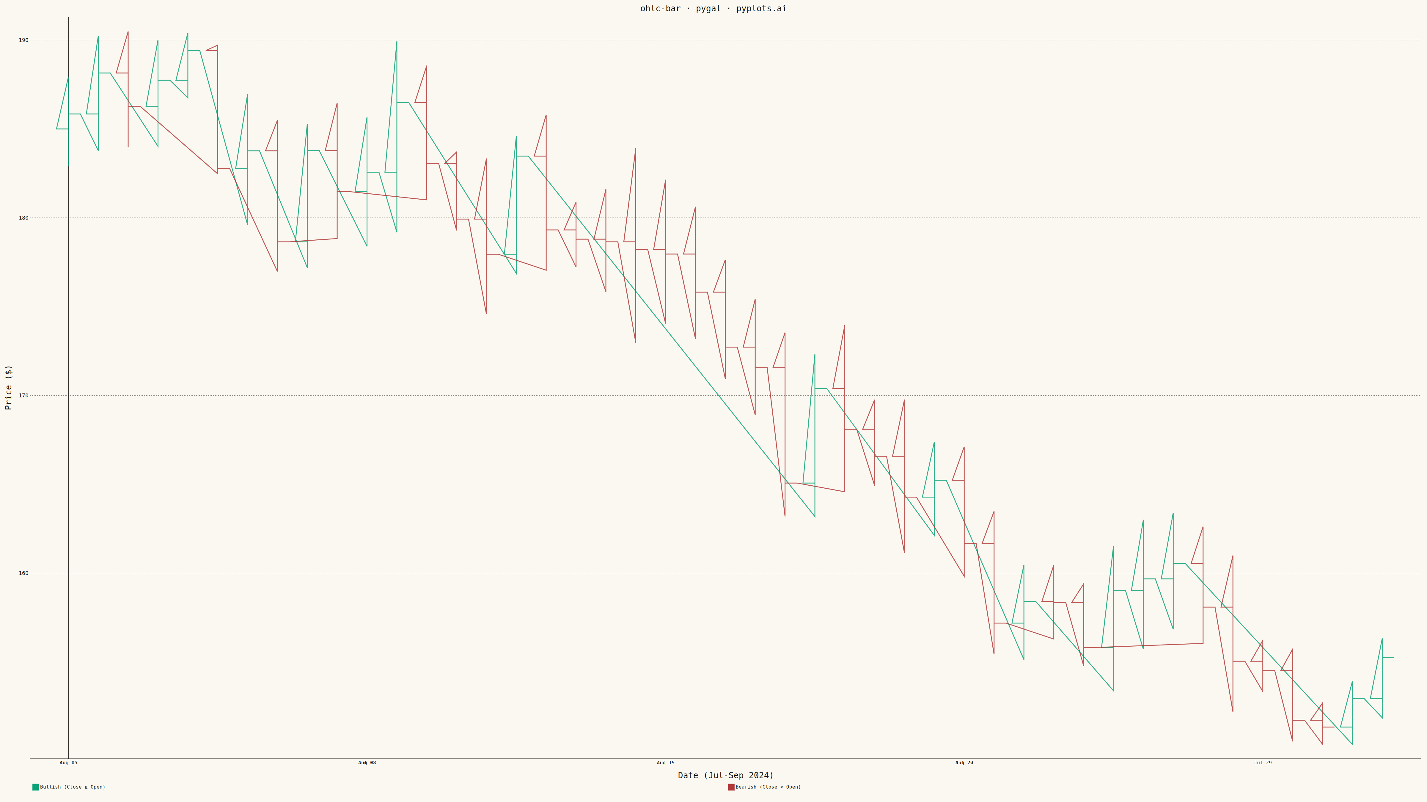
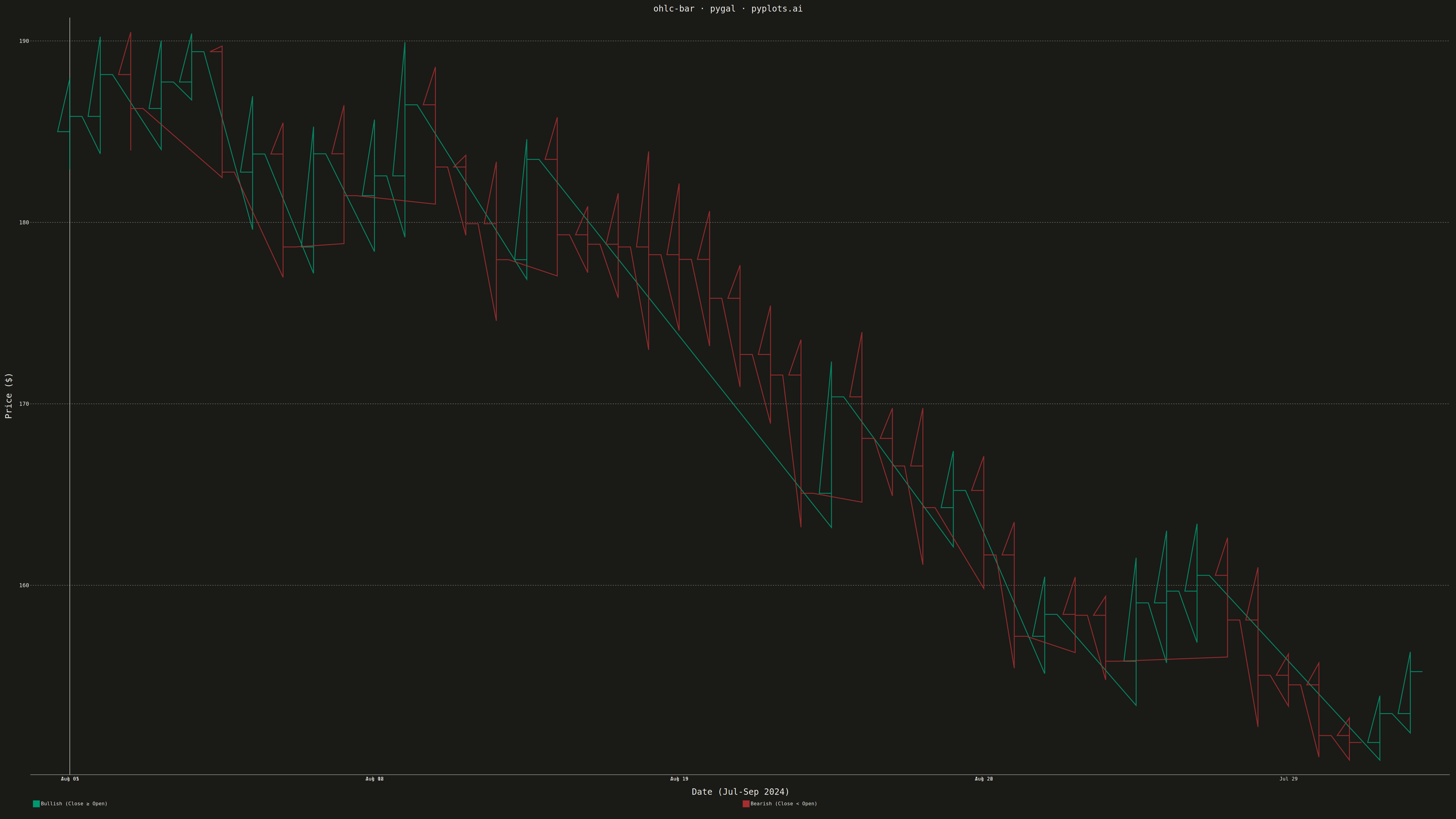
An OHLC (Open-High-Low-Close) bar chart displays financial price data using vertical bars with horizontal tick marks. Each bar shows the price range from high to low as a thin vertical line, with a left tick indicating the opening price and a right tick indicating the closing price. Unlike candlestick charts that use colored bodies, OHLC bars provide a cleaner, less cluttered view favored by technical analysts who prefer to focus on price levels rather than visual patterns.
""" anyplot.ai
ohlc-bar: OHLC Bar Chart
Library: pygal 3.1.0 | Python 3.13.13
Quality: 88/100 | Updated: 2026-05-17
"""

import os
import sys

import numpy as np
import pandas as pd


# Work around file-name shadowing: temporarily remove current dir from path
_cwd = sys.path[0] if sys.path and sys.path[0] == "" or sys.path[0] == "." else None
if sys.path and (sys.path[0] == "" or sys.path[0] == "."):
    sys.path.pop(0)
_script_dir = os.path.dirname(os.path.abspath(__file__))
while _script_dir in sys.path:
    sys.path.remove(_script_dir)

import pygal
from pygal.style import Style


# Theme tokens
THEME = os.getenv("ANYPLOT_THEME", "light")
PAGE_BG = "#FAF8F1" if THEME == "light" else "#1A1A17"
INK = "#1A1A17" if THEME == "light" else "#F0EFE8"
INK_MUTED = "#6B6A63" if THEME == "light" else "#A8A79F"

# Okabe-Ito palette
BRAND = "#009E73"  # Bullish (up bars)
ACCENT = "#AE3030"  # imprint red — bearish (down bars)

# Data - Generate realistic stock price data with different seed/start than plotnine
np.random.seed(77)
n_days = 45

# Different starting price and return distribution
start_price = 185.0
# Use exponential drift (trending upward) instead of simple normal returns
drift = 0.0005
volatility = 0.018
daily_returns = drift + np.random.normal(0, volatility, n_days)

# Generate OHLC data
dates = pd.date_range("2024-07-01", periods=n_days, freq="B")  # Business days
closes = start_price * np.cumprod(1 + daily_returns)
opens = np.roll(closes, 1)
opens[0] = start_price

# Generate highs and lows based on volatility
daily_volatility = np.abs(np.random.normal(0.012, 0.006, n_days))
highs = np.maximum(opens, closes) * (1 + daily_volatility)
lows = np.minimum(opens, closes) * (1 - daily_volatility)

# Custom style with theme-adaptive colors
custom_style = Style(
    background=PAGE_BG,
    plot_background=PAGE_BG,
    foreground=INK,
    foreground_strong=INK,
    foreground_subtle=INK_MUTED,
    guide_stroke_color=INK_MUTED,
    opacity=".95",
    opacity_hover=".85",
    colors=(BRAND, ACCENT),
    title_font_size=28,
    label_font_size=18,
    major_label_font_size=16,
    legend_font_size=16,
    value_font_size=14,
    tooltip_font_size=14,
    stroke_width=3,
)

# Create date labels for x-axis (every 5th date for clarity)
date_labels = {i: dates[i].strftime("%b %d") for i in range(0, n_days, 5)}

# Create XY chart
chart = pygal.XY(
    width=4800,
    height=2700,
    style=custom_style,
    title="ohlc-bar · pygal · pyplots.ai",
    x_title="Date (Jul-Sep 2024)",
    y_title="Price ($)",
    show_legend=True,
    legend_at_bottom=True,
    legend_box_size=20,
    show_x_guides=False,
    show_y_guides=True,
    truncate_label=-1,
    truncate_legend=-1,
    stroke=True,
    show_dots=False,
    x_labels=list(date_labels.values()),
    x_labels_major_every=1,
)

# Tick width for open/close marks
tick_width = 0.4

# Build OHLC bar segments
# Each bar needs: vertical line (low to high), open tick (left), close tick (right)
up_bars = []
down_bars = []

for i in range(n_days):
    x = float(i)
    o, h, lo, c = opens[i], highs[i], lows[i], closes[i]

    # Each OHLC bar: vertical line + open tick + close tick
    bar_points = [
        # Vertical line (low to high)
        (x, lo),
        (x, h),
        # Break
        (None, None),
        # Open tick (left horizontal)
        (x - tick_width, o),
        (x, o),
        # Break
        (None, None),
        # Close tick (right horizontal)
        (x, c),
        (x + tick_width, c),
        # Break for next bar
        (None, None),
    ]

    if c >= o:  # Up bar (bullish)
        up_bars.extend(bar_points)
    else:  # Down bar (bearish)
        down_bars.extend(bar_points)

# Add series with descriptive labels
chart.add("Bullish (Close ≥ Open)", up_bars)
chart.add("Bearish (Close < Open)", down_bars)

# Save outputs
chart.render_to_png(f"plot-{THEME}.png")
with open(f"plot-{THEME}.html", "wb") as f:
    f.write(chart.render())
Runnable source as JSON, for any HTTP client: https://api.anyplot.ai/specs/ohlc-bar/pygal/code. Any spec id and library id listed in llms-full.txt fit the same URL shape; every URL below is complete and callable.
{
  "spec_id": "ohlc-bar",
  "language": "python",
  "library": "pygal",
  "page": "https://anyplot.ai/ohlc-bar/python/pygal",
  "hub": "https://anyplot.ai/ohlc-bar",
  "code_json": "https://api.anyplot.ai/specs/ohlc-bar/pygal/code",
  "spec_json": "https://api.anyplot.ai/specs/ohlc-bar",
  "render_light_png": "https://storage.googleapis.com/anyplot-images/plots/ohlc-bar/python/pygal/plot-light.png",
  "render_dark_png": "https://storage.googleapis.com/anyplot-images/plots/ohlc-bar/python/pygal/plot-dark.png",
  "interactive_light_html": "https://storage.googleapis.com/anyplot-images/plots/ohlc-bar/python/pygal/plot-light.html",
  "interactive_dark_html": "https://storage.googleapis.com/anyplot-images/plots/ohlc-bar/python/pygal/plot-dark.html",
  "quality_score": 88.0,
  "license": "MIT",
  "guide": "https://anyplot.ai/llms.txt"
}
Part of OHLC Bar Chart on anyplot.ai.