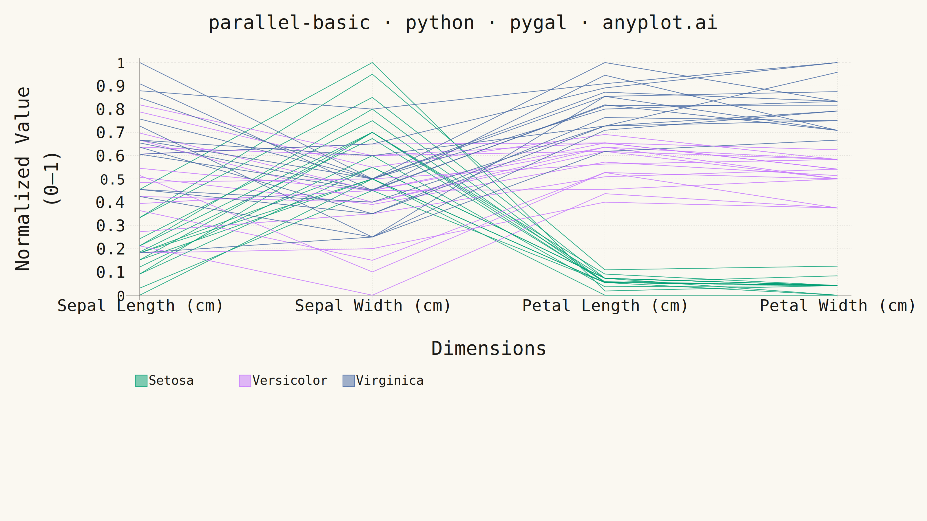
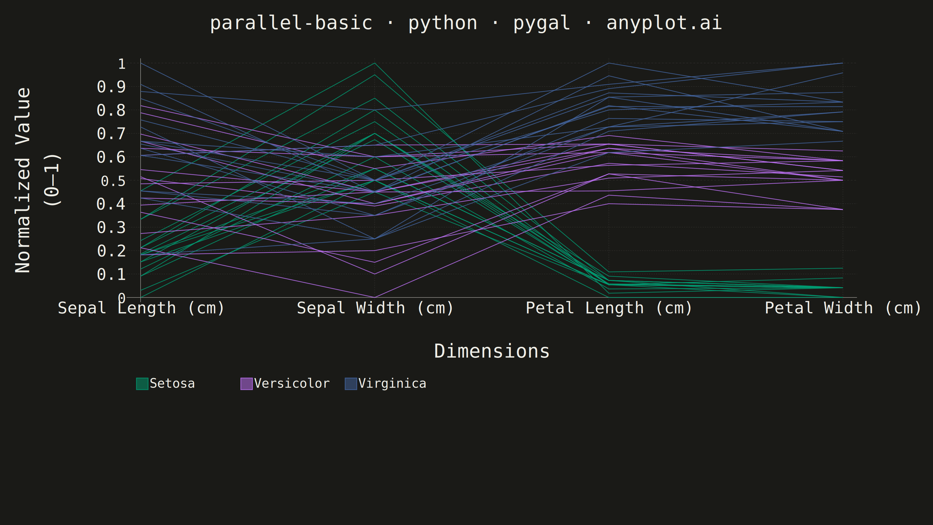
A parallel coordinates plot visualizes multivariate data by representing each variable as a vertical axis and each observation as a line connecting values across all axes. This technique is powerful for identifying patterns, clusters, and outliers in high-dimensional datasets where traditional 2D plots fall short. It enables simultaneous comparison of multiple variables for each data point.
""" anyplot.ai
parallel-basic: Basic Parallel Coordinates Plot
Library: pygal 3.1.3 | Python 3.13.14
Quality: 82/100 | Updated: 2026-07-24
"""

import os
import sys


# Remove script directory from sys.path so local pygal.py doesn't shadow the installed package
sys.path.pop(0)

import pygal
from pygal.style import Style


THEME = os.getenv("ANYPLOT_THEME", "light")
PAGE_BG = "#FAF8F1" if THEME == "light" else "#1A1A17"
INK = "#1A1A17" if THEME == "light" else "#F0EFE8"
INK_MUTED = "#6B6A63" if THEME == "light" else "#A8A79F"
RULE = "rgba(26,26,23,0.15)" if THEME == "light" else "rgba(240,239,232,0.15)"

# Imprint palette (canonical order) — Setosa=brand green, Versicolor=lavender, Virginica=blue
SPECIES_COLORS = {"Setosa": "#009E73", "Versicolor": "#C475FD", "Virginica": "#4467A3"}

# Data - Iris dataset, 15 samples per species across 4 dimensions
iris_data = {
    "Setosa": [
        [5.1, 3.5, 1.4, 0.2],
        [4.9, 3.0, 1.4, 0.2],
        [4.7, 3.2, 1.3, 0.2],
        [4.6, 3.1, 1.5, 0.2],
        [5.0, 3.6, 1.4, 0.2],
        [5.4, 3.9, 1.7, 0.4],
        [4.6, 3.4, 1.4, 0.3],
        [5.0, 3.4, 1.5, 0.2],
        [4.4, 2.9, 1.4, 0.2],
        [4.9, 3.1, 1.5, 0.1],
        [5.4, 3.7, 1.5, 0.2],
        [4.8, 3.4, 1.6, 0.2],
        [4.8, 3.0, 1.4, 0.1],
        [4.3, 3.0, 1.1, 0.1],
        [5.8, 4.0, 1.2, 0.2],
    ],
    "Versicolor": [
        [7.0, 3.2, 4.7, 1.4],
        [6.4, 3.2, 4.5, 1.5],
        [6.9, 3.1, 4.9, 1.5],
        [5.5, 2.3, 4.0, 1.3],
        [6.5, 2.8, 4.6, 1.5],
        [5.7, 2.8, 4.5, 1.3],
        [6.3, 3.3, 4.7, 1.6],
        [4.9, 2.4, 3.3, 1.0],
        [6.6, 2.9, 4.6, 1.3],
        [5.2, 2.7, 3.9, 1.4],
        [5.0, 2.0, 3.5, 1.0],
        [5.9, 3.0, 4.2, 1.5],
        [6.0, 2.2, 4.0, 1.0],
        [6.1, 2.9, 4.7, 1.4],
        [5.6, 2.9, 3.6, 1.3],
    ],
    "Virginica": [
        [6.3, 3.3, 6.0, 2.5],
        [5.8, 2.7, 5.1, 1.9],
        [7.1, 3.0, 5.9, 2.1],
        [6.3, 2.9, 5.6, 1.8],
        [6.5, 3.0, 5.8, 2.2],
        [7.6, 3.0, 6.6, 2.1],
        [4.9, 2.5, 4.5, 1.7],
        [7.3, 2.9, 6.3, 1.8],
        [6.7, 2.5, 5.8, 1.8],
        [7.2, 3.6, 6.1, 2.5],
        [6.5, 3.2, 5.1, 2.0],
        [6.4, 2.7, 5.3, 1.9],
        [6.8, 3.0, 5.5, 2.1],
        [5.7, 2.5, 5.0, 2.0],
        [5.8, 2.8, 5.1, 2.4],
    ],
}

species_list = list(iris_data.keys())
dimension_labels = ["Sepal Length (cm)", "Sepal Width (cm)", "Petal Length (cm)", "Petal Width (cm)"]

# Per-dimension min/max for normalization
all_values = [[row[i] for species in iris_data.values() for row in species] for i in range(4)]
mins = [min(col) for col in all_values]
maxs = [max(col) for col in all_values]

# Pygal cycles through `colors` sequentially per series added.
# Order: 3 mean lines, then 3 combined per-species individual-observation lines
# (one interrupted series per species, not one per observation).
color_list = [SPECIES_COLORS[s] for s in species_list] * 2

custom_style = Style(
    background=PAGE_BG,
    plot_background=PAGE_BG,
    foreground=INK,
    foreground_strong=INK,
    foreground_subtle=INK_MUTED,
    colors=tuple(color_list),
    title_font_size=66,
    label_font_size=56,
    major_label_font_size=48,
    legend_font_size=44,
    value_font_size=36,
    opacity=0.50,
    opacity_hover=1.0,
    stroke_width=2.5,
    guide_stroke_color=RULE,
    major_guide_stroke_color=RULE,
)

# Plot — pygal.XY (not Line) so each species' 15 observations can share one series via
# allow_interruptions: pygal reserves legend-at-bottom margin proportional to the total
# series count (ceil(sqrt(N)) rows), so 45 separate untitled per-observation Line series
# blew up the reservation to ~10 legend rows though only 1 ever renders. Collapsing the
# observations into one interrupted XY series per species drops the series count from 48
# to 6, and legend_at_bottom_columns=3 (matching the 3 titled series) keeps the margin
# formula's row estimate at the true value of 1.
chart = pygal.XY(
    width=3200,
    height=1800,
    style=custom_style,
    title="parallel-basic · python · pygal · anyplot.ai",
    x_title="Dimensions",
    y_title="Normalized Value (0–1)",
    show_dots=False,
    show_y_guides=True,
    show_x_guides=True,  # faint vertical lines at each dimension — the "parallel axes" identity
    x_label_rotation=30,  # start-anchors each label at its tick instead of centering it on top;
    # steeper than before so the leftmost label clears the y-axis "0" tick label sooner
    legend_at_bottom=True,
    legend_at_bottom_columns=3,
    legend_box_size=40,
    truncate_legend=-1,
    range=(0, 1),
    xrange=(0, 3),
    margin=100,
    spacing=34,
    margin_right=260,
    show_legend=True,
)

chart.x_labels = [{"value": i, "label": label} for i, label in enumerate(dimension_labels)]

# Mean lines per species — thicker stroke, appear in legend, tooltip shows the actual mean measurement
for species_name in species_list:
    rows = iris_data[species_name]
    mean_row = [sum(row[i] for row in rows) / len(rows) for i in range(4)]
    normalized_mean = [(mean_row[i] - mins[i]) / (maxs[i] - mins[i]) for i in range(4)]
    mean_points = [
        {"value": (i, normalized_mean[i]), "tooltip": f"{species_name} mean · {dimension_labels[i]}: {mean_row[i]:.2f}"}
        for i in range(4)
    ]
    chart.add(species_name, mean_points, stroke_style={"width": 7})

# Individual observation lines — thinner, no legend entry, tooltip shows the actual measurement.
# All 15 observations per species share one series, separated by None to break the line
# between observations (allow_interruptions), instead of one series per observation.
for species_name in species_list:
    combined_points = []
    rows = iris_data[species_name]
    for row_index, row in enumerate(rows):
        normalized = [(row[i] - mins[i]) / (maxs[i] - mins[i]) for i in range(4)]
        combined_points.extend(
            {"value": (i, normalized[i]), "tooltip": f"{species_name} · {dimension_labels[i]}: {row[i]:.1f}"}
            for i in range(4)
        )
        if row_index != len(rows) - 1:
            combined_points.append(None)
    chart.add(None, combined_points, stroke_style={"width": 3}, allow_interruptions=True)

# Save
chart.render_to_png(f"plot-{THEME}.png")
with open(f"plot-{THEME}.html", "wb") as f:
    f.write(chart.render())
Runnable source as JSON, for any HTTP client: https://api.anyplot.ai/specs/parallel-basic/pygal/code. Any spec id and library id listed in llms-full.txt fit the same URL shape; every URL below is complete and callable.
{
  "spec_id": "parallel-basic",
  "language": "python",
  "library": "pygal",
  "page": "https://anyplot.ai/parallel-basic/python/pygal",
  "hub": "https://anyplot.ai/parallel-basic",
  "code_json": "https://api.anyplot.ai/specs/parallel-basic/pygal/code",
  "spec_json": "https://api.anyplot.ai/specs/parallel-basic",
  "render_light_png": "https://storage.googleapis.com/anyplot-images/plots/parallel-basic/python/pygal/plot-light.png",
  "render_dark_png": "https://storage.googleapis.com/anyplot-images/plots/parallel-basic/python/pygal/plot-dark.png",
  "interactive_light_html": "https://storage.googleapis.com/anyplot-images/plots/parallel-basic/python/pygal/plot-light.html",
  "interactive_dark_html": "https://storage.googleapis.com/anyplot-images/plots/parallel-basic/python/pygal/plot-dark.html",
  "quality_score": 82.0,
  "license": "MIT",
  "guide": "https://anyplot.ai/llms.txt"
}
Part of Basic Parallel Coordinates Plot on anyplot.ai.