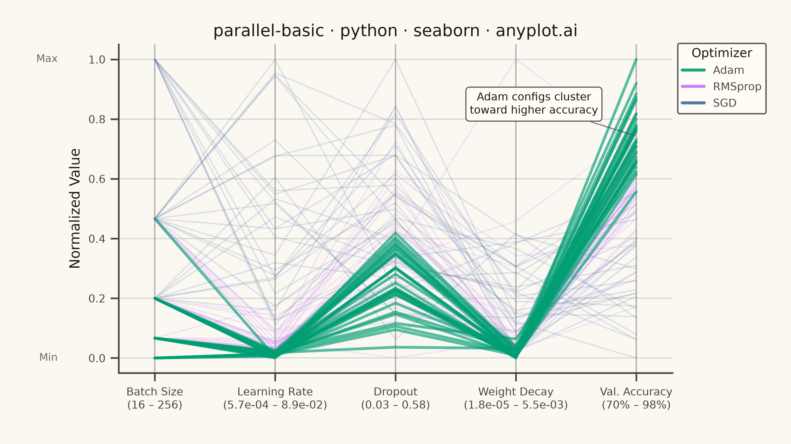
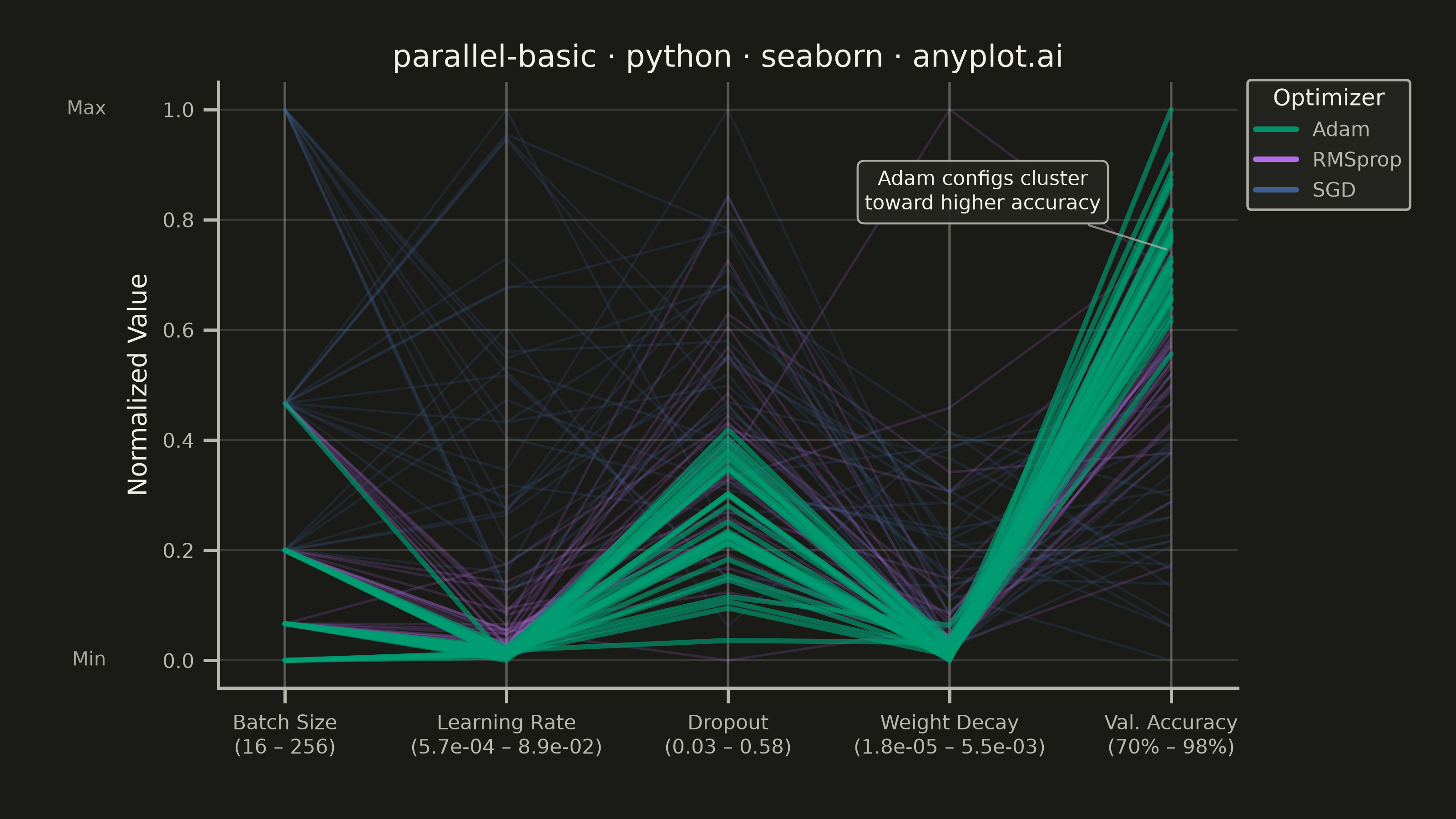
A parallel coordinates plot visualizes multivariate data by representing each variable as a vertical axis and each observation as a line connecting values across all axes. This technique is powerful for identifying patterns, clusters, and outliers in high-dimensional datasets where traditional 2D plots fall short. It enables simultaneous comparison of multiple variables for each data point.
""" anyplot.ai
parallel-basic: Basic Parallel Coordinates Plot
Library: seaborn 0.13.2 | Python 3.13.14
Quality: 90/100 | Updated: 2026-07-24
"""

import os
import sys


# Prevent local matplotlib.py from shadowing the installed matplotlib package
sys.path = [p for p in sys.path if os.path.abspath(p or ".") != os.path.dirname(os.path.abspath(__file__))]

import matplotlib.pyplot as plt
import numpy as np
import pandas as pd
import seaborn as sns
from matplotlib.lines import Line2D


# Theme tokens
THEME = os.getenv("ANYPLOT_THEME", "light")
PAGE_BG = "#FAF8F1" if THEME == "light" else "#1A1A17"
ELEVATED_BG = "#FFFDF6" if THEME == "light" else "#242420"
INK = "#1A1A17" if THEME == "light" else "#F0EFE8"
INK_SOFT = "#4A4A44" if THEME == "light" else "#B8B7B0"
INK_MUTED = "#6B6A63" if THEME == "light" else "#A8A79F"

IMPRINT = ["#009E73", "#C475FD", "#4467A3", "#BD8233", "#AE3030", "#2ABCCD", "#954477"]

sns.set_theme(
    style="ticks",
    rc={
        "figure.facecolor": PAGE_BG,
        "axes.facecolor": PAGE_BG,
        "axes.edgecolor": INK_SOFT,
        "axes.labelcolor": INK,
        "text.color": INK,
        "xtick.color": INK_SOFT,
        "ytick.color": INK_SOFT,
        "grid.color": INK,
        "grid.alpha": 0.15,
        "legend.facecolor": ELEVATED_BG,
        "legend.edgecolor": INK_SOFT,
    },
)

# Data: synthetic hyperparameter search runs across three optimizers,
# each producing a final validation accuracy — a common ML tuning workflow.
rng = np.random.default_rng(42)
n_per_optimizer = 30

configs = {
    "Adam": {
        "lr_mean": np.log(0.0015),
        "lr_sigma": 0.5,
        "batch_choices": [16, 32, 64, 128],
        "batch_p": [0.15, 0.35, 0.35, 0.15],
        "dropout_mean": 0.18,
        "dropout_sd": 0.08,
        "wd_mean": np.log(1.0e-4),
        "wd_sigma": 1.0,
        "acc_mean": 0.91,
        "acc_sd": 0.025,
    },
    "RMSprop": {
        "lr_mean": np.log(0.005),
        "lr_sigma": 0.55,
        "batch_choices": [32, 64, 128],
        "batch_p": [0.25, 0.5, 0.25],
        "dropout_mean": 0.24,
        "dropout_sd": 0.10,
        "wd_mean": np.log(3.0e-4),
        "wd_sigma": 1.0,
        "acc_mean": 0.85,
        "acc_sd": 0.04,
    },
    "SGD": {
        "lr_mean": np.log(0.03),
        "lr_sigma": 0.6,
        "batch_choices": [64, 128, 256],
        "batch_p": [0.3, 0.4, 0.3],
        "dropout_mean": 0.30,
        "dropout_sd": 0.12,
        "wd_mean": np.log(1.0e-3),
        "wd_sigma": 1.0,
        "acc_mean": 0.79,
        "acc_sd": 0.05,
    },
}

rows = []
for optimizer, cfg in configs.items():
    lr = np.clip(rng.lognormal(cfg["lr_mean"], cfg["lr_sigma"], n_per_optimizer), 1.0e-4, 3.0e-1)
    batch = rng.choice(cfg["batch_choices"], size=n_per_optimizer, p=cfg["batch_p"])
    dropout = np.clip(rng.normal(cfg["dropout_mean"], cfg["dropout_sd"], n_per_optimizer), 0.0, 0.6)
    weight_decay = np.clip(rng.lognormal(cfg["wd_mean"], cfg["wd_sigma"], n_per_optimizer), 1.0e-6, 1.0e-2)
    val_accuracy = np.clip(rng.normal(cfg["acc_mean"], cfg["acc_sd"], n_per_optimizer), 0.5, 0.99)
    for i in range(n_per_optimizer):
        rows.append(
            {
                "optimizer": optimizer,
                "learning_rate": lr[i],
                "batch_size": batch[i],
                "dropout": dropout[i],
                "weight_decay": weight_decay[i],
                "val_accuracy": val_accuracy[i],
            }
        )

df = pd.DataFrame(rows)
df["run"] = range(len(df))

# Order predictor axes by correlation strength with the outcome (Val. Accuracy)
# so adjacent axes are more likely to reveal a relationship, per the spec's
# "consider axis ordering to reveal correlations between adjacent variables".
predictor_cols = ["learning_rate", "batch_size", "dropout", "weight_decay"]
corr_to_accuracy = df[predictor_cols + ["val_accuracy"]].corr()["val_accuracy"].drop("val_accuracy")
predictor_cols = corr_to_accuracy.abs().sort_values(ascending=False).index.tolist()
numeric_cols = predictor_cols + ["val_accuracy"]

df_norm = df.copy()
for col in numeric_cols:
    col_min = df[col].min()
    col_max = df[col].max()
    df_norm[col] = (df[col] - col_min) / (col_max - col_min)

df_long = df_norm.melt(
    id_vars=["optimizer", "run"], value_vars=numeric_cols, var_name="dimension", value_name="normalized_value"
)

# Plot
optimizer_order = ["Adam", "RMSprop", "SGD"]
palette = {opt: IMPRINT[i] for i, opt in enumerate(optimizer_order)}

# Adam reaches the highest validation accuracy on average — foreground it with
# higher opacity/linewidth while the other optimizers recede into context.
emphasis = "Adam"
alpha_map = {"Adam": 0.65, "RMSprop": 0.16, "SGD": 0.16}
linewidth_map = {"Adam": 2.0, "RMSprop": 1.0, "SGD": 1.0}
draw_order = [opt for opt in optimizer_order if opt != emphasis] + [emphasis]

fig, ax = plt.subplots(figsize=(8, 4.5), dpi=400, facecolor=PAGE_BG)
ax.set_facecolor(PAGE_BG)

for optimizer in draw_order:
    subset = df_long[df_long["optimizer"] == optimizer]
    sns.lineplot(
        data=subset,
        x="dimension",
        y="normalized_value",
        units="run",
        estimator=None,
        color=palette[optimizer],
        alpha=alpha_map[optimizer],
        linewidth=linewidth_map[optimizer],
        ax=ax,
        legend=False,
    )

# Vertical axis lines at each dimension
for i in range(len(numeric_cols)):
    ax.axvline(x=i, color=INK_SOFT, linewidth=1.0, alpha=0.4, zorder=0)

# Style
label_by_col = {
    "learning_rate": f"Learning Rate\n({df['learning_rate'].min():.1e} – {df['learning_rate'].max():.1e})",
    "batch_size": f"Batch Size\n({df['batch_size'].min():.0f} – {df['batch_size'].max():.0f})",
    "dropout": f"Dropout\n({df['dropout'].min():.2f} – {df['dropout'].max():.2f})",
    "weight_decay": f"Weight Decay\n({df['weight_decay'].min():.1e} – {df['weight_decay'].max():.1e})",
    "val_accuracy": f"Val. Accuracy\n({df['val_accuracy'].min() * 100:.0f}% – {df['val_accuracy'].max() * 100:.0f}%)",
}
labels = [label_by_col[col] for col in numeric_cols]
ax.set_xticks(range(len(numeric_cols)))
ax.set_xticklabels(labels, fontsize=8, color=INK_SOFT)
ax.tick_params(axis="y", labelsize=8, colors=INK_SOFT)

ax.set_xlabel("")
ax.set_ylabel("Normalized Value", fontsize=10, color=INK)
ax.set_title("parallel-basic · python · seaborn · anyplot.ai", fontsize=12, fontweight="medium", color=INK)
ax.set_xlim(-0.3, len(numeric_cols) - 1 + 0.3)
ax.set_ylim(-0.05, 1.05)

ax.spines["top"].set_visible(False)
ax.spines["right"].set_visible(False)
for s in ("left", "bottom"):
    ax.spines[s].set_color(INK_SOFT)

ax.yaxis.grid(True, alpha=0.15, linewidth=0.8, color=INK)

legend_handles = [Line2D([0], [0], color=palette[opt], linewidth=2.2, alpha=0.9, label=opt) for opt in optimizer_order]
legend = ax.legend(
    handles=legend_handles,
    title="Optimizer",
    title_fontsize=9,
    fontsize=8,
    loc="upper left",
    bbox_to_anchor=(1.0, 1.02),
    framealpha=0.92,
    facecolor=ELEVATED_BG,
    edgecolor=INK_SOFT,
)
legend.get_title().set_color(INK)
for text in legend.get_texts():
    text.set_color(INK_SOFT)

# Add min/max tick annotations on left axis
for val, label in [(0.0, "Min"), (1.0, "Max")]:
    ax.text(
        -0.11, val, label, transform=ax.get_yaxis_transform(), fontsize=7.5, color=INK_MUTED, ha="right", va="center"
    )

# Callout: highlight the key insight (Adam clusters toward higher accuracy)
adam_acc = df.loc[df["optimizer"] == "Adam", "val_accuracy"]
ax.annotate(
    "Adam configs cluster\ntoward higher accuracy",
    xy=(
        len(numeric_cols) - 1,
        (adam_acc.mean() - df["val_accuracy"].min()) / (df["val_accuracy"].max() - df["val_accuracy"].min()),
    ),
    xytext=(len(numeric_cols) - 1.85, 0.85),
    fontsize=8,
    color=INK,
    ha="center",
    va="center",
    arrowprops={"arrowstyle": "-", "color": INK_SOFT, "linewidth": 0.8, "alpha": 0.7},
    bbox={
        "boxstyle": "round,pad=0.35",
        "facecolor": ELEVATED_BG,
        "edgecolor": INK_SOFT,
        "alpha": 0.92,
        "linewidth": 0.8,
    },
)

fig.subplots_adjust(left=0.15, right=0.85, top=0.90, bottom=0.16)

# Save
plt.savefig(f"plot-{THEME}.png", dpi=400, facecolor=PAGE_BG)
Runnable source as JSON, for any HTTP client: https://api.anyplot.ai/specs/parallel-basic/seaborn/code. Any spec id and library id listed in llms-full.txt fit the same URL shape; every URL below is complete and callable.
{
  "spec_id": "parallel-basic",
  "language": "python",
  "library": "seaborn",
  "page": "https://anyplot.ai/parallel-basic/python/seaborn",
  "hub": "https://anyplot.ai/parallel-basic",
  "code_json": "https://api.anyplot.ai/specs/parallel-basic/seaborn/code",
  "spec_json": "https://api.anyplot.ai/specs/parallel-basic",
  "render_light_png": "https://storage.googleapis.com/anyplot-images/plots/parallel-basic/python/seaborn/plot-light.png",
  "render_dark_png": "https://storage.googleapis.com/anyplot-images/plots/parallel-basic/python/seaborn/plot-dark.png",
  "quality_score": 90.0,
  "license": "MIT",
  "guide": "https://anyplot.ai/llms.txt"
}
Part of Basic Parallel Coordinates Plot on anyplot.ai.