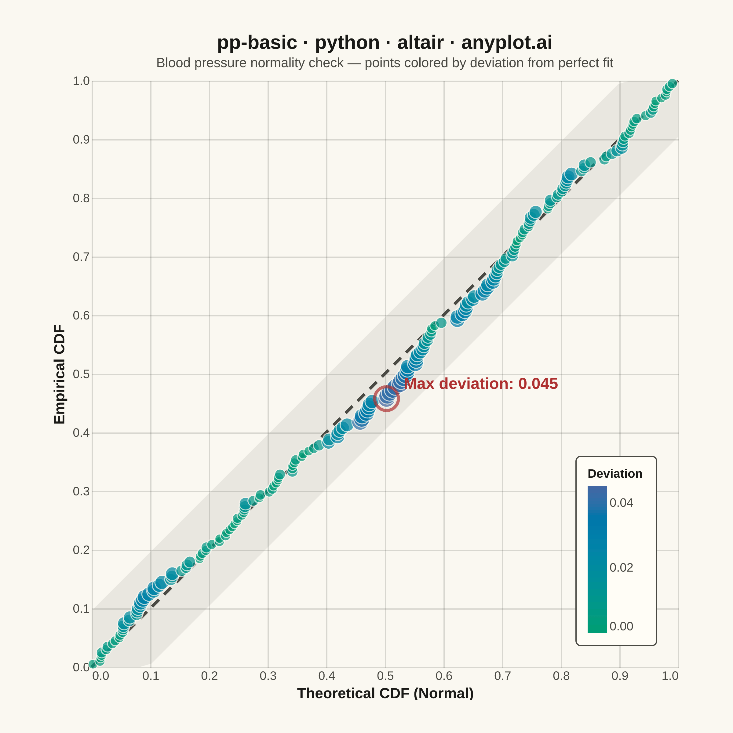
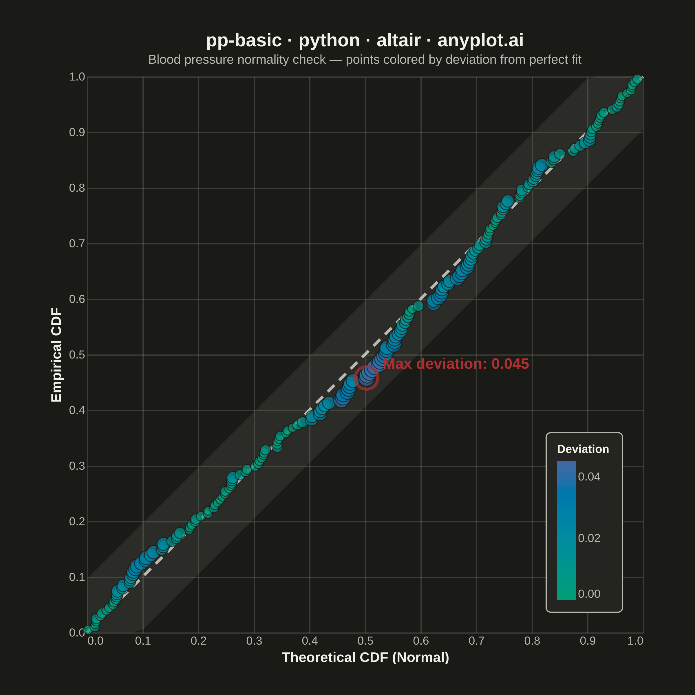
A diagnostic plot comparing the cumulative distribution function (CDF) of observed data against a theoretical distribution by plotting empirical CDF values against theoretical CDF values. Unlike Q-Q plots which compare quantiles, P-P plots compare cumulative probabilities on both axes (0 to 1), making them more sensitive to deviations in the center of the distribution. Points falling along the 45-degree diagonal indicate a good fit.
""" anyplot.ai
pp-basic: Probability-Probability (P-P) Plot
Library: altair 6.2.1 | Python 3.13.13
Quality: 93/100 | Updated: 2026-06-16
"""

import os
from statistics import NormalDist

import altair as alt
import numpy as np
import pandas as pd
from PIL import Image


# Theme tokens (see prompts/default-style-guide.md "Theme-adaptive Chrome")
THEME = os.getenv("ANYPLOT_THEME", "light")
PAGE_BG = "#FAF8F1" if THEME == "light" else "#1A1A17"
ELEVATED_BG = "#FFFDF6" if THEME == "light" else "#242420"
INK = "#1A1A17" if THEME == "light" else "#F0EFE8"
INK_SOFT = "#4A4A44" if THEME == "light" else "#B8B7B0"
INK_MUTED = "#6B6A63" if THEME == "light" else "#A8A79F"

# Imprint sequential cmap for continuous deviation (brand green -> blue)
IMPRINT_SEQ = ["#009E73", "#4467A3"]
ALERT = "#AE3030"  # matte red — semantic anchor for worst fit / max deviation

# Data — clinical trial: blood pressure measurements vs normal reference
np.random.seed(42)
observed = np.concatenate([np.random.normal(50, 10, 160), np.random.exponential(5, 40) + 55])
observed_sorted = np.sort(observed)
n = len(observed_sorted)

mu = float(observed_sorted.mean())
sigma = float(observed_sorted.std())
dist = NormalDist(mu, sigma)
empirical_cdf = np.arange(1, n + 1) / (n + 1)
theoretical_cdf = np.array([dist.cdf(x) for x in observed_sorted])
deviation = np.abs(empirical_cdf - theoretical_cdf)

# Mark the point of maximum deviation for annotation
max_dev_idx = int(np.argmax(deviation))

df = pd.DataFrame({"Theoretical CDF (Normal)": theoretical_cdf, "Empirical CDF": empirical_cdf, "Deviation": deviation})

ref_df = pd.DataFrame({"x": [0, 1], "y": [0, 1]})

# Confidence band around diagonal (± ~1.36/√n Kolmogorov-Smirnov bound)
ks_bound = 1.36 / np.sqrt(n)
band_x = np.linspace(0, 1, 50)
band_df = pd.DataFrame(
    {"x": band_x, "y_lo": np.clip(band_x - ks_bound, 0, 1), "y_hi": np.clip(band_x + ks_bound, 0, 1)}
)

# Max deviation annotation label
max_dev_df = pd.DataFrame(
    {
        "x": [theoretical_cdf[max_dev_idx]],
        "y": [empirical_cdf[max_dev_idx]],
        "label": [f"Max deviation: {deviation[max_dev_idx]:.3f}"],
    }
)

# Interactive selection — hovering highlights nearby points (Altair-distinctive)
hover = alt.selection_point(on="pointerover", nearest=True, empty=False)

# Plot layers
band = (
    alt.Chart(band_df).mark_area(opacity=0.12, color=INK_MUTED).encode(x=alt.X("x:Q"), y=alt.Y("y_lo:Q"), y2="y_hi:Q")
)

reference_line = (
    alt.Chart(ref_df).mark_line(strokeDash=[8, 6], strokeWidth=2.5, color=INK_SOFT).encode(x="x:Q", y="y:Q")
)

points = (
    alt.Chart(df)
    .mark_circle(stroke=PAGE_BG, strokeWidth=0.8)
    .encode(
        x=alt.X("Theoretical CDF (Normal):Q", scale=alt.Scale(domain=[0, 1]), title="Theoretical CDF (Normal)"),
        y=alt.Y("Empirical CDF:Q", scale=alt.Scale(domain=[0, 1]), title="Empirical CDF"),
        color=alt.Color(
            "Deviation:Q",
            scale=alt.Scale(range=IMPRINT_SEQ, domain=[0, float(deviation.max())]),
            legend=alt.Legend(title="Deviation", orient="bottom-right", direction="vertical", gradientLength=120),
        ),
        size=alt.condition(
            hover, alt.value(260), alt.Size("Deviation:Q", scale=alt.Scale(range=[55, 200]), legend=None)
        ),
        opacity=alt.condition(hover, alt.value(1.0), alt.value(0.7)),
        strokeWidth=alt.condition(hover, alt.value(1.8), alt.value(0.8)),
        tooltip=[
            alt.Tooltip("Theoretical CDF (Normal):Q", format=".3f"),
            alt.Tooltip("Empirical CDF:Q", format=".3f"),
            alt.Tooltip("Deviation:Q", format=".4f", title="Abs. Deviation"),
        ],
    )
    .add_params(hover)
)

# Highlight max-deviation point with contrasting ring
max_point = (
    alt.Chart(max_dev_df).mark_point(size=380, stroke=ALERT, strokeWidth=2.5, filled=False).encode(x="x:Q", y="y:Q")
)

max_label = (
    alt.Chart(max_dev_df)
    .mark_text(align="left", dx=14, dy=-12, fontSize=13, fontWeight="bold", color=ALERT)
    .encode(x="x:Q", y="y:Q", text="label:N")
)

chart = (
    (band + reference_line + points + max_point + max_label)
    .properties(
        width=480,
        height=480,
        background=PAGE_BG,
        padding={"left": 0, "right": 0, "top": 0, "bottom": 0},
        title=alt.Title(
            "pp-basic · python · altair · anyplot.ai",
            fontSize=16,
            fontWeight="bold",
            color=INK,
            subtitle="Blood pressure normality check — points colored by deviation from perfect fit",
            subtitleFontSize=11,
            subtitleColor=INK_SOFT,
        ),
    )
    .configure_view(fill=PAGE_BG, strokeWidth=0)
    .configure_axis(
        labelFontSize=10,
        titleFontSize=12,
        titleColor=INK,
        labelColor=INK_SOFT,
        grid=True,
        gridOpacity=0.15,
        gridColor=INK,
        domain=False,
        ticks=False,
    )
    .configure_legend(
        titleFontSize=10,
        labelFontSize=10,
        titleColor=INK,
        labelColor=INK_SOFT,
        fillColor=ELEVATED_BG,
        strokeColor=INK_SOFT,
        padding=10,
        cornerRadius=4,
    )
)

# Save — square target 2400×2400 (P-P plot keeps a square data region for the 45° diagonal)
chart.save(f"plot-{THEME}.png", scale_factor=4.0)
chart.save(f"plot-{THEME}.html")

# Pad the saved PNG up to the exact 2400×2400 target (vl-convert pads outside width/height).
TW, TH = 2400, 2400
_img = Image.open(f"plot-{THEME}.png").convert("RGB")
_w, _h = _img.size
if _w > TW or _h > TH:
    raise SystemExit(
        f"altair vl-convert produced {_w}×{_h}, exceeds target {TW}×{TH}. "
        f"Shrink chart .properties(width=, height=) values and re-render."
    )
if _w < TW or _h < TH:
    _canvas = Image.new("RGB", (TW, TH), PAGE_BG)
    _canvas.paste(_img, ((TW - _w) // 2, (TH - _h) // 2))
    _canvas.save(f"plot-{THEME}.png")
Runnable source as JSON, for any HTTP client: https://api.anyplot.ai/specs/pp-basic/altair/code. Any spec id and library id listed in llms-full.txt fit the same URL shape; every URL below is complete and callable.
{
  "spec_id": "pp-basic",
  "language": "python",
  "library": "altair",
  "page": "https://anyplot.ai/pp-basic/python/altair",
  "hub": "https://anyplot.ai/pp-basic",
  "code_json": "https://api.anyplot.ai/specs/pp-basic/altair/code",
  "spec_json": "https://api.anyplot.ai/specs/pp-basic",
  "render_light_png": "https://storage.googleapis.com/anyplot-images/plots/pp-basic/python/altair/plot-light.png",
  "render_dark_png": "https://storage.googleapis.com/anyplot-images/plots/pp-basic/python/altair/plot-dark.png",
  "interactive_light_html": "https://storage.googleapis.com/anyplot-images/plots/pp-basic/python/altair/plot-light.html",
  "interactive_dark_html": "https://storage.googleapis.com/anyplot-images/plots/pp-basic/python/altair/plot-dark.html",
  "quality_score": 93.0,
  "license": "MIT",
  "guide": "https://anyplot.ai/llms.txt"
}
Part of Probability-Probability (P-P) Plot on anyplot.ai.