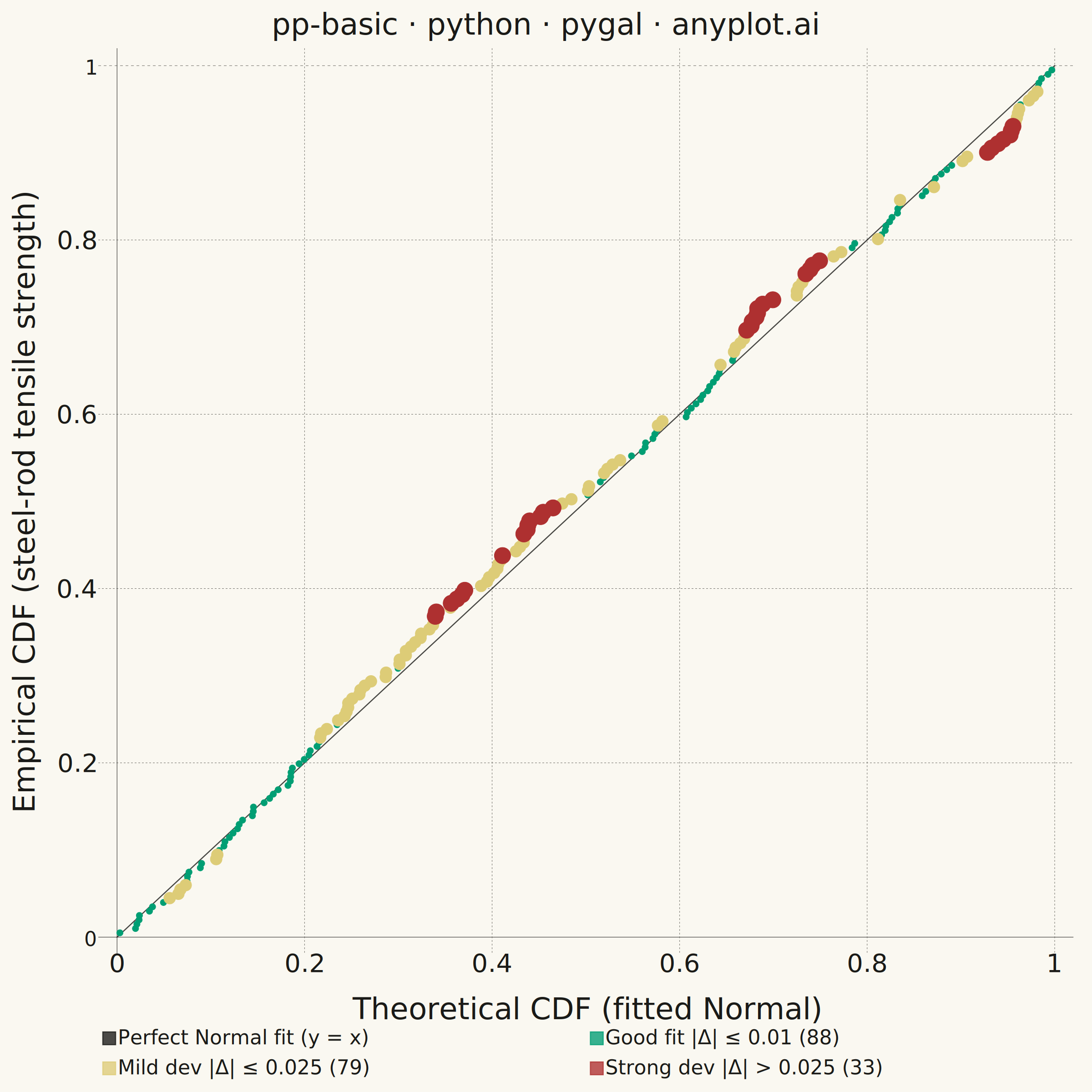
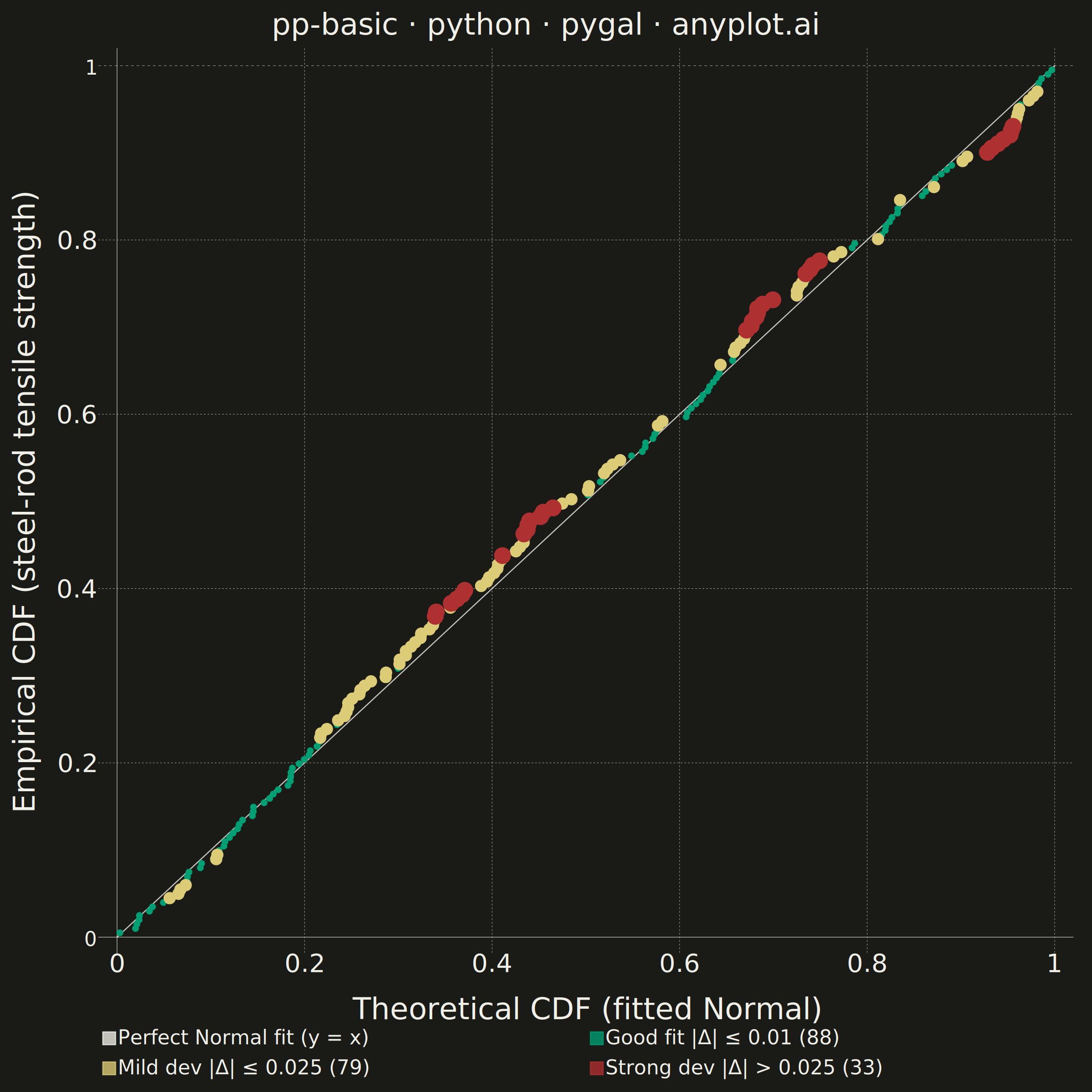
A diagnostic plot comparing the cumulative distribution function (CDF) of observed data against a theoretical distribution by plotting empirical CDF values against theoretical CDF values. Unlike Q-Q plots which compare quantiles, P-P plots compare cumulative probabilities on both axes (0 to 1), making them more sensitive to deviations in the center of the distribution. Points falling along the 45-degree diagonal indicate a good fit.
""" anyplot.ai
pp-basic: Probability-Probability (P-P) Plot
Library: pygal 3.1.0 | Python 3.13.13
Quality: 92/100 | Updated: 2026-06-16
"""

import math
import os
import sys


# This file is named pygal.py, which shadows the installed `pygal` package when
# run as `python pygal.py`; dropping the script directory from sys.path lets the
# real package resolve.
sys.path.pop(0)

import numpy as np
import pygal
from pygal.style import Style


# Theme tokens (see prompts/default-style-guide.md "Theme-adaptive Chrome")
THEME = os.getenv("ANYPLOT_THEME", "light")
PAGE_BG = "#FAF8F1" if THEME == "light" else "#1A1A17"
INK = "#1A1A17" if THEME == "light" else "#F0EFE8"
INK_SOFT = "#4A4A44" if THEME == "light" else "#B8B7B0"
INK_MUTED = "#6B6A63" if THEME == "light" else "#A8A79F"

# Imprint palette anchors used here — severity tiers map to semantic colors:
# good/pass -> brand green (also the mandatory first categorical series),
# warning -> amber, bad/error -> matte red. CVD-safe and clearly separable.
BRAND_GREEN = "#009E73"  # Imprint position 1 — first categorical series
IMPRINT_AMBER = "#DDCC77"  # warning / caution anchor
IMPRINT_RED = "#AE3030"  # bad / error anchor (Imprint position 5)
NEUTRAL = INK  # reference line — structural "neutral" anchor (theme-adaptive)

# Data — quality-control scenario: 200 tensile-strength measurements (MPa) from
# steel rods. A compliant production run (normal) mixed with a heat-treatment
# drift batch (skewed) so the data departs from pure normality.
np.random.seed(42)
compliant = np.random.normal(520, 35, 160)
anomalous = np.random.exponential(30, 40) + 480
observed = np.sort(np.concatenate([compliant, anomalous]))
n = len(observed)

# Fit normal parameters from the full sample
mu = np.mean(observed)
sigma = np.std(observed, ddof=1)

# Empirical CDF using plotting position i/(n+1)
empirical_cdf = np.arange(1, n + 1) / (n + 1)

# Theoretical CDF: Phi((x - mu) / sigma)
sqrt2 = math.sqrt(2)
theoretical_cdf = np.array([0.5 * (1.0 + math.erf((x - mu) / (sigma * sqrt2))) for x in observed])

# Deviation from perfect fit — drives the three-tier visual hierarchy
deviation = empirical_cdf - theoretical_cdf

good_fit = []  # |Δ| ≤ 0.01 — tightly along the diagonal
mild_dev = []  # 0.01 < |Δ| ≤ 0.025 — moderate departure
strong_dev = []  # |Δ| > 0.025 — clear distributional mismatch

for i in range(n):
    t = float(theoretical_cdf[i])
    e = float(empirical_cdf[i])
    d = float(deviation[i])
    label = "#{} · {:.0f} MPa · Δ = {:+.3f}".format(i + 1, observed[i], d)
    point = {"value": (t, e), "label": label}
    if abs(d) <= 0.01:
        good_fit.append(point)
    elif abs(d) <= 0.025:
        mild_dev.append(point)
    else:
        strong_dev.append(point)

# Style — pygal Style carries every theme token. Font sizes are unitless source
# pixels (see default-style-guide.md "Why the Native-pixel numbers look bigger").
custom_style = Style(
    background=PAGE_BG,
    plot_background=PAGE_BG,
    foreground=INK,  # primary text
    foreground_strong=INK,  # title
    foreground_subtle=INK_MUTED,  # tick labels / grid tone
    opacity=".78",
    opacity_hover="1",
    transition="120ms ease-in",
    # Color cycle follows add() order: reference line, good, mild, strong.
    colors=(NEUTRAL, BRAND_GREEN, IMPRINT_AMBER, IMPRINT_RED),
    value_colors=(),
    title_font_size=66,
    label_font_size=56,
    major_label_font_size=44,
    legend_font_size=44,
    value_font_size=36,
    tooltip_font_size=34,
    stroke_width=2.5,
    guide_stroke_color=INK_MUTED,
    major_guide_stroke_color=INK_MUTED,
    font_family="Helvetica Neue, Helvetica, Arial, sans-serif",
    tooltip_border_radius=8,
)

# Square canvas (2400×2400) preserves the meaning of the 45° diagonal
chart = pygal.XY(
    width=2400,
    height=2400,
    style=custom_style,
    title="pp-basic · python · pygal · anyplot.ai",
    x_title="Theoretical CDF  (fitted Normal)",
    y_title="Empirical CDF  (steel-rod tensile strength)",
    show_legend=True,
    legend_at_bottom=True,
    legend_box_size=28,
    stroke=False,
    show_x_guides=True,
    show_y_guides=True,
    xrange=(0, 1),
    range=(0, 1),
    x_labels=[0, 0.2, 0.4, 0.6, 0.8, 1.0],
    y_labels=[0, 0.2, 0.4, 0.6, 0.8, 1.0],
    print_values=False,
    tooltip_fancy_mode=True,
    explicit_size=True,
    margin_bottom=40,
    margin_top=30,
    margin_left=30,
    margin_right=40,
    truncate_legend=-1,
)

# 45° reference line — perfect distributional fit (neutral anchor), drawn first
# and dashed so the data points sit on top of it.
chart.add(
    "Perfect Normal fit  (y = x)",
    [(0, 0), (0.5, 0.5), (1, 1)],
    stroke=True,
    show_dots=False,
    dots_size=0,
    stroke_dasharray="16, 10",
    stroke_style={"width": 5, "linecap": "round"},
    formatter=lambda x, y: "Reference: y = x",
)

# Three severity tiers — graduated dot sizes amplify the color hierarchy. The
# dense good-fit band uses the smallest dots to de-clutter the diagonal while
# the sparse strong-deviation points stay large and focal.
chart.add("Good fit  |Δ| ≤ 0.01  ({})".format(len(good_fit)), good_fit, dots_size=7)
chart.add("Mild dev  |Δ| ≤ 0.025  ({})".format(len(mild_dev)), mild_dev, dots_size=13)
chart.add("Strong dev  |Δ| > 0.025  ({})".format(len(strong_dev)), strong_dev, dots_size=18)

# Save — theme-suffixed PNG (gallery) + interactive HTML (pygal is interactive)
chart.render_to_png(f"plot-{THEME}.png")
with open(f"plot-{THEME}.html", "wb") as f:
    f.write(chart.render())
Runnable source as JSON, for any HTTP client: https://api.anyplot.ai/specs/pp-basic/pygal/code. Any spec id and library id listed in llms-full.txt fit the same URL shape; every URL below is complete and callable.
{
  "spec_id": "pp-basic",
  "language": "python",
  "library": "pygal",
  "page": "https://anyplot.ai/pp-basic/python/pygal",
  "hub": "https://anyplot.ai/pp-basic",
  "code_json": "https://api.anyplot.ai/specs/pp-basic/pygal/code",
  "spec_json": "https://api.anyplot.ai/specs/pp-basic",
  "render_light_png": "https://storage.googleapis.com/anyplot-images/plots/pp-basic/python/pygal/plot-light.png",
  "render_dark_png": "https://storage.googleapis.com/anyplot-images/plots/pp-basic/python/pygal/plot-dark.png",
  "interactive_light_html": "https://storage.googleapis.com/anyplot-images/plots/pp-basic/python/pygal/plot-light.html",
  "interactive_dark_html": "https://storage.googleapis.com/anyplot-images/plots/pp-basic/python/pygal/plot-dark.html",
  "quality_score": 92.0,
  "license": "MIT",
  "guide": "https://anyplot.ai/llms.txt"
}
Part of Probability-Probability (P-P) Plot on anyplot.ai.