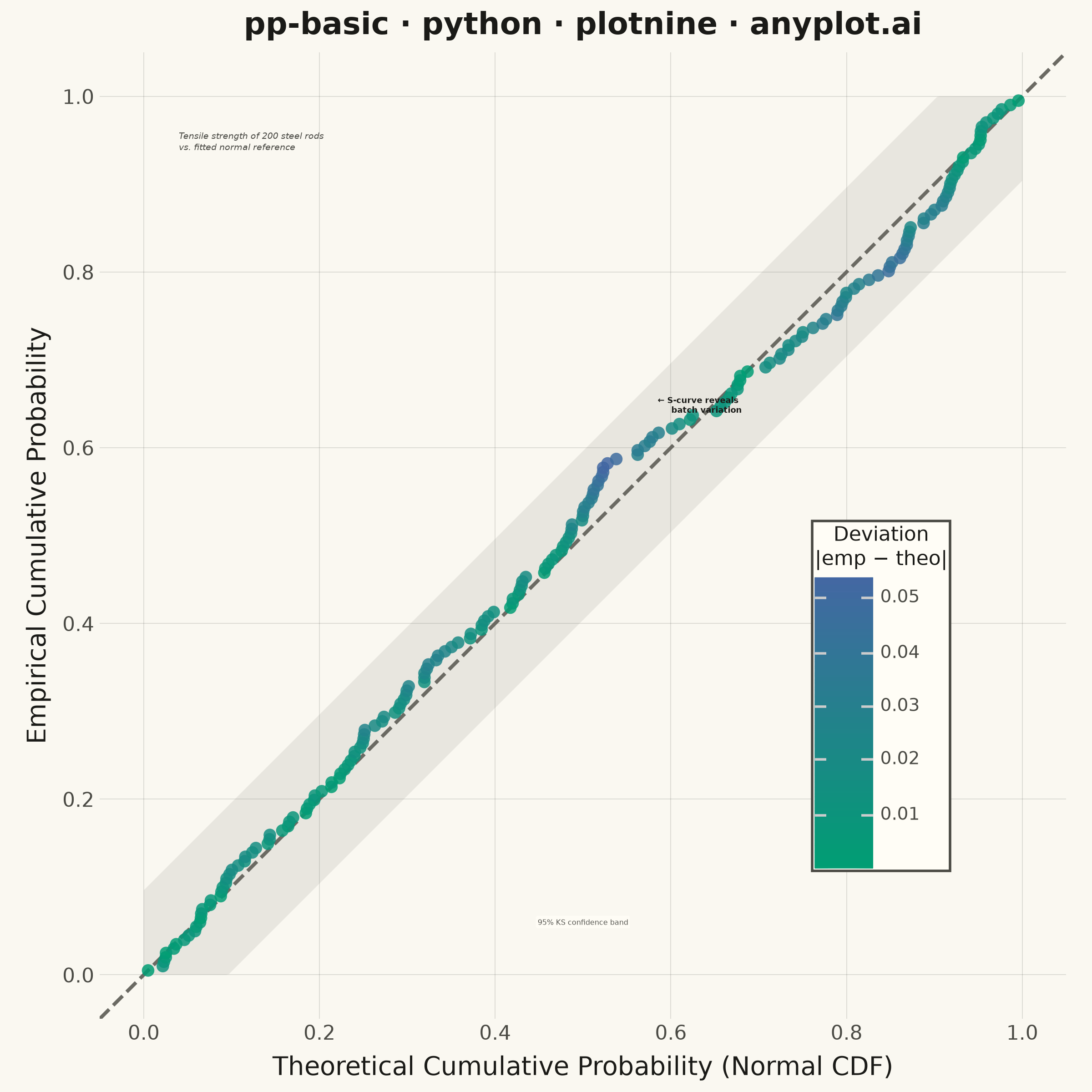
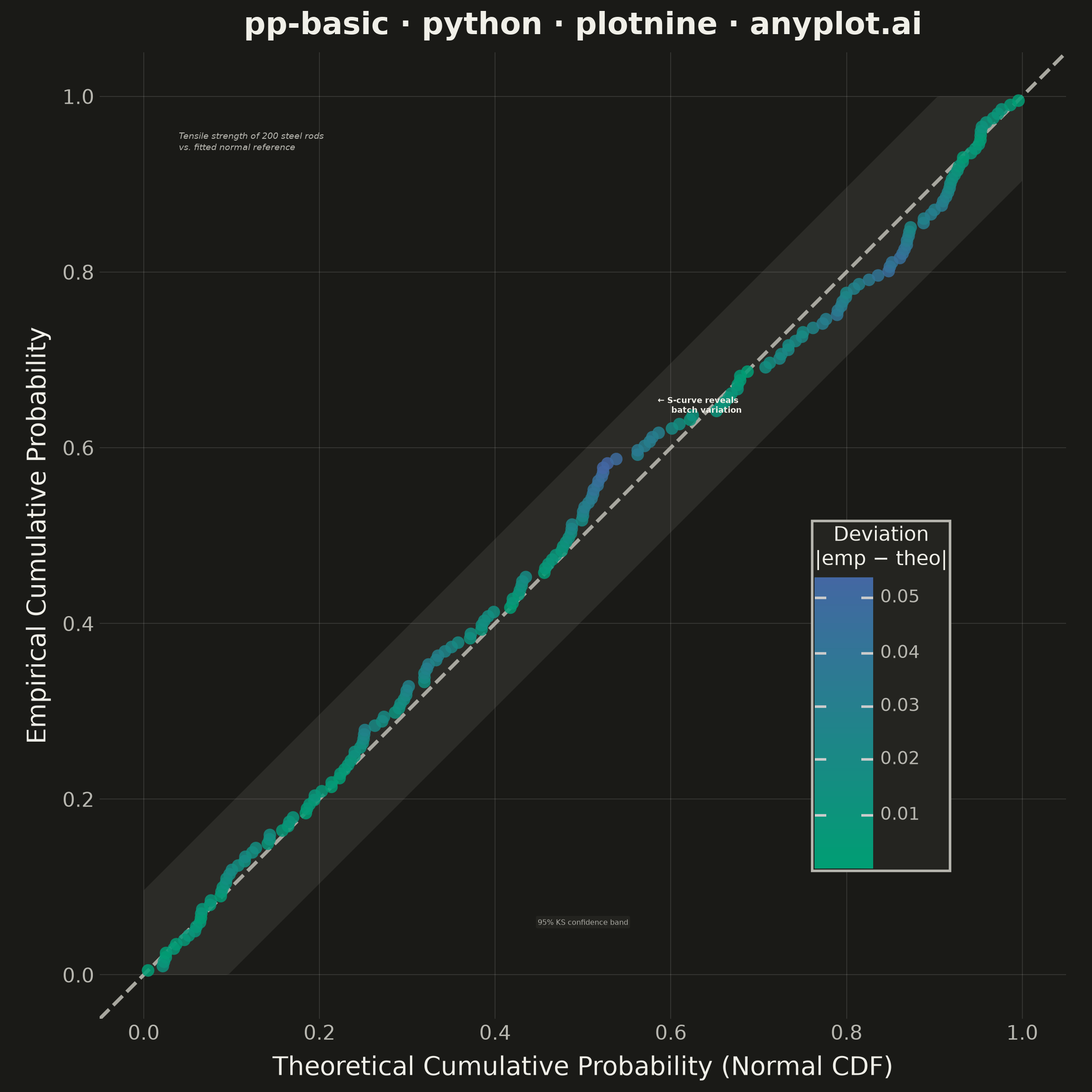
A diagnostic plot comparing the cumulative distribution function (CDF) of observed data against a theoretical distribution by plotting empirical CDF values against theoretical CDF values. Unlike Q-Q plots which compare quantiles, P-P plots compare cumulative probabilities on both axes (0 to 1), making them more sensitive to deviations in the center of the distribution. Points falling along the 45-degree diagonal indicate a good fit.
""" anyplot.ai
pp-basic: Probability-Probability (P-P) Plot
Library: plotnine 0.15.7 | Python 3.13.13
Quality: 93/100 | Updated: 2026-06-16
"""

import os

import numpy as np
import pandas as pd
from plotnine import (
    aes,
    annotate,
    coord_fixed,
    element_blank,
    element_line,
    element_rect,
    element_text,
    geom_abline,
    geom_point,
    geom_ribbon,
    ggplot,
    labs,
    scale_color_gradient,
    scale_x_continuous,
    scale_y_continuous,
    theme,
    theme_minimal,
)
from scipy import stats


# Theme-adaptive chrome (Imprint palette + tokens)
THEME = os.getenv("ANYPLOT_THEME", "light")
PAGE_BG = "#FAF8F1" if THEME == "light" else "#1A1A17"
ELEVATED_BG = "#FFFDF6" if THEME == "light" else "#242420"
INK = "#1A1A17" if THEME == "light" else "#F0EFE8"
INK_SOFT = "#4A4A44" if THEME == "light" else "#B8B7B0"
INK_MUTED = "#6B6A63" if THEME == "light" else "#A8A79F"

# Imprint sequential cmap (single-polarity): brand green -> blue.
# Deviation magnitude is single-polarity, so imprint_seq is the correct ramp:
# near-zero (good fit) reads brand green, large departures read blue. Every
# point stays saturated and visible (the previous diverging midpoint sat too
# close to the low end — fixed by using magnitude on a sequential ramp).
SEQ_LOW = "#009E73"  # brand green — points on the diagonal (good fit)
SEQ_HIGH = "#4467A3"  # blue — points departing from the diagonal

# Data: Quality control — tensile strength of steel rods (MPa).
# A mixture reflects a manufacturing process with occasional batch variation,
# which produces a clear S-shaped departure from the normal reference.
np.random.seed(42)
n = 200
main_batch = np.random.normal(loc=520, scale=35, size=160)
variant_batch = np.random.normal(loc=580, scale=20, size=40)
tensile_strength = np.concatenate([main_batch, variant_batch])

sorted_data = np.sort(tensile_strength)
mu, sigma = np.mean(sorted_data), np.std(sorted_data)
empirical_cdf = np.arange(1, n + 1) / (n + 1)
theoretical_cdf = stats.norm.cdf(sorted_data, loc=mu, scale=sigma)

# Deviation from the diagonal drives the storytelling color ramp
deviation = empirical_cdf - theoretical_cdf
df = pd.DataFrame({"theoretical": theoretical_cdf, "empirical": empirical_cdf, "abs_deviation": np.abs(deviation)})

# Confidence envelope: approximate 95% band under null (Kolmogorov-Smirnov)
ks_band = 1.36 / np.sqrt(n)
envelope_t = np.linspace(0, 1, 300)
envelope_df = pd.DataFrame(
    {
        "theoretical": envelope_t,
        "upper": np.minimum(envelope_t + ks_band, 1.0),
        "lower": np.maximum(envelope_t - ks_band, 0.0),
    }
)

# Plot — plotnine grammar of graphics with layered composition
plot = (
    ggplot()
    # Layer 1: KS confidence envelope (muted band fill, sits behind the data)
    + geom_ribbon(aes(x="theoretical", ymin="lower", ymax="upper"), data=envelope_df, fill=INK_MUTED, alpha=0.12)
    # Layer 2: 45-degree reference line for perfect distributional fit
    + geom_abline(intercept=0, slope=1, color=INK_MUTED, size=0.8, linetype="dashed")
    # Layer 3: Points colored by deviation magnitude — visual storytelling
    + geom_point(aes(x="theoretical", y="empirical", color="abs_deviation"), data=df, size=2.8, alpha=0.85, stroke=0)
    # Imprint sequential ramp (single-polarity magnitude)
    + scale_color_gradient(low=SEQ_LOW, high=SEQ_HIGH, name="Deviation\n|emp − theo|")
    # Annotation: scenario context
    + annotate(
        "text",
        x=0.04,
        y=0.96,
        label="Tensile strength of 200 steel rods\nvs. fitted normal reference",
        ha="left",
        va="top",
        size=3.4,
        color=INK_SOFT,
        fontstyle="italic",
    )
    # Annotation: highlight the S-curve departure
    + annotate(
        "text",
        x=0.585,
        y=0.66,
        label="← S-curve reveals\n     batch variation",
        ha="left",
        va="top",
        size=3.2,
        color=INK,
        fontweight="bold",
    )
    # Annotation: label the confidence band
    + annotate(
        "label",
        x=0.5,
        y=0.06,
        label="95% KS confidence band",
        ha="center",
        size=2.9,
        color=INK_SOFT,
        fill=ELEVATED_BG,
        alpha=0.92,
        label_size=0,
    )
    + labs(
        x="Theoretical Cumulative Probability (Normal CDF)",
        y="Empirical Cumulative Probability",
        title="pp-basic · python · plotnine · anyplot.ai",
    )
    + scale_x_continuous(limits=(0, 1), breaks=np.arange(0, 1.1, 0.2))
    + scale_y_continuous(limits=(0, 1), breaks=np.arange(0, 1.1, 0.2))
    + coord_fixed(ratio=1)
    + theme_minimal()
    + theme(
        figure_size=(6, 6),
        text=element_text(size=7),
        plot_title=element_text(size=12, weight="bold", color=INK),
        axis_title=element_text(size=10, color=INK),
        axis_text=element_text(size=8, color=INK_SOFT),
        panel_grid_major=element_line(color=INK, size=0.3, alpha=0.15),
        panel_grid_minor=element_blank(),
        legend_title=element_text(size=8, color=INK),
        legend_text=element_text(size=7, color=INK_SOFT),
        legend_position=(0.86, 0.24),
        legend_background=element_rect(fill=ELEVATED_BG, color=INK_SOFT),
        plot_background=element_rect(fill=PAGE_BG, color=PAGE_BG),
        panel_background=element_rect(fill=PAGE_BG),
    )
)

# Save (square 2400x2400 — preserves the diagonal's visual meaning)
plot.save(f"plot-{THEME}.png", dpi=400, width=6, height=6, units="in", verbose=False)
Runnable source as JSON, for any HTTP client: https://api.anyplot.ai/specs/pp-basic/plotnine/code. Any spec id and library id listed in llms-full.txt fit the same URL shape; every URL below is complete and callable.
{
  "spec_id": "pp-basic",
  "language": "python",
  "library": "plotnine",
  "page": "https://anyplot.ai/pp-basic/python/plotnine",
  "hub": "https://anyplot.ai/pp-basic",
  "code_json": "https://api.anyplot.ai/specs/pp-basic/plotnine/code",
  "spec_json": "https://api.anyplot.ai/specs/pp-basic",
  "render_light_png": "https://storage.googleapis.com/anyplot-images/plots/pp-basic/python/plotnine/plot-light.png",
  "render_dark_png": "https://storage.googleapis.com/anyplot-images/plots/pp-basic/python/plotnine/plot-dark.png",
  "quality_score": 93.0,
  "license": "MIT",
  "guide": "https://anyplot.ai/llms.txt"
}
Part of Probability-Probability (P-P) Plot on anyplot.ai.