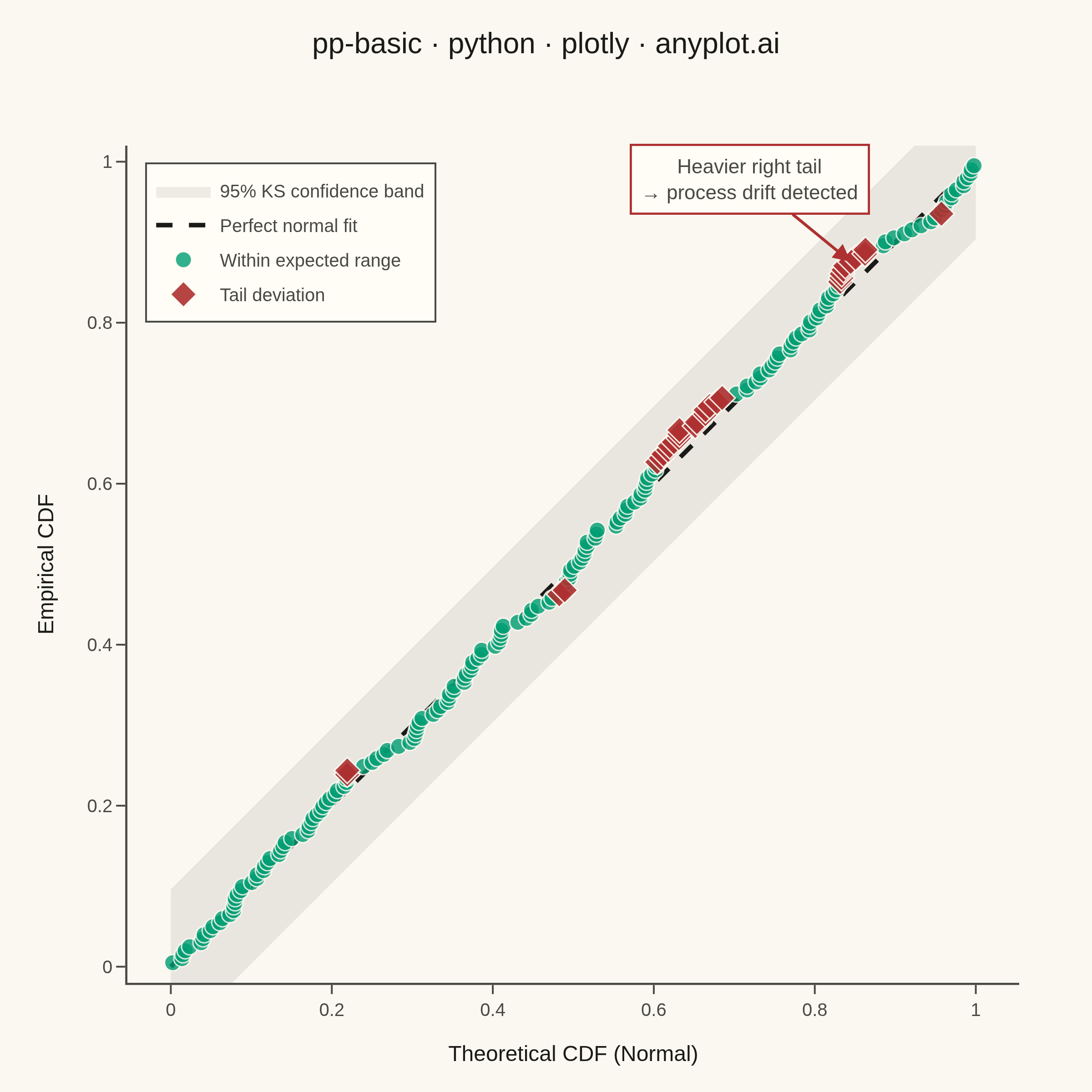
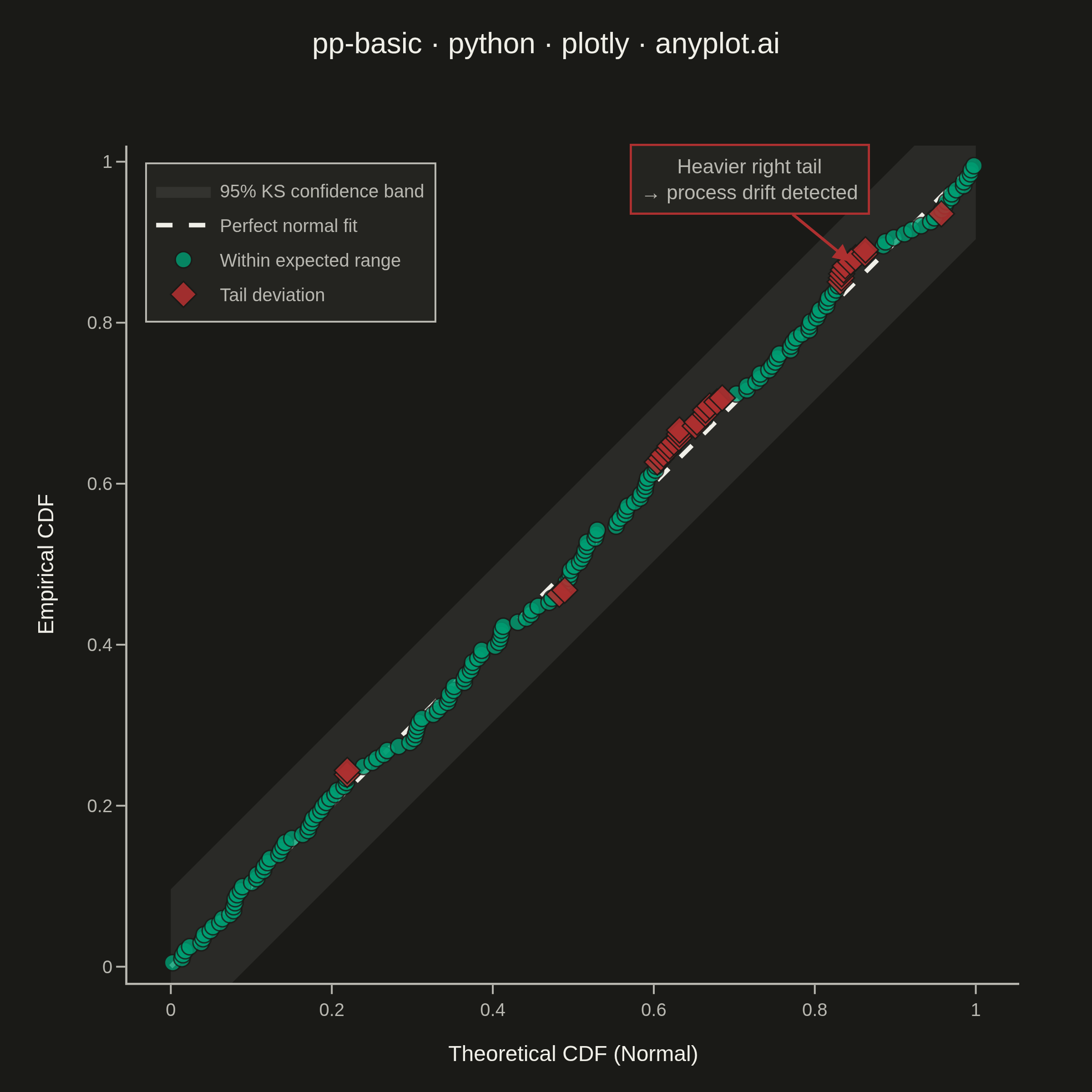
A diagnostic plot comparing the cumulative distribution function (CDF) of observed data against a theoretical distribution by plotting empirical CDF values against theoretical CDF values. Unlike Q-Q plots which compare quantiles, P-P plots compare cumulative probabilities on both axes (0 to 1), making them more sensitive to deviations in the center of the distribution. Points falling along the 45-degree diagonal indicate a good fit.
""" anyplot.ai
pp-basic: Probability-Probability (P-P) Plot
Library: plotly 6.8.0 | Python 3.13.13
Quality: 87/100 | Updated: 2026-06-16
"""

import os

import numpy as np
import plotly.graph_objects as go
from scipy import stats


THEME = os.getenv("ANYPLOT_THEME", "light")

# Theme-adaptive chrome
PAGE_BG = "#FAF8F1" if THEME == "light" else "#1A1A17"
ELEVATED_BG = "#FFFDF6" if THEME == "light" else "#242420"
INK = "#1A1A17" if THEME == "light" else "#F0EFE8"
INK_SOFT = "#4A4A44" if THEME == "light" else "#B8B7B0"
INK_MUTED = "#6B6A63" if THEME == "light" else "#A8A79F"
GRID = "rgba(26,26,23,0.15)" if THEME == "light" else "rgba(240,239,232,0.15)"

# Imprint palette
BRAND = "#009E73"  # brand green — within-range points (first categorical series)
DEVIATION = "#AE3030"  # matte red — semantic anchor for deviation / poor fit
NEUTRAL = INK  # totals / baseline / reference line (theme-adaptive)
MUTED = INK_MUTED  # confidence-band fill (theme-adaptive)

# Data: mixture of normal + exponential simulating process drift
np.random.seed(42)
observed = np.random.normal(loc=50, scale=10, size=200) + np.random.exponential(scale=2, size=200)

observed_sorted = np.sort(observed)
n = len(observed_sorted)

# Fit normal distribution to observed data
mu, sigma = stats.norm.fit(observed_sorted)

# Empirical CDF using plotting position formula i/(n+1)
empirical_cdf = np.arange(1, n + 1) / (n + 1)

# Theoretical CDF from fitted normal
theoretical_cdf = stats.norm.cdf(observed_sorted, loc=mu, scale=sigma)

# Deviation threshold for storytelling — confine flagged points to the genuine
# right tail (theoretical CDF > 0.8), where the added exponential mass makes the
# data depart from the fitted normal. This keeps the red diamonds in the tail
# region the annotation describes, rather than the distribution body.
deviation = np.abs(empirical_cdf - theoretical_cdf)
in_right_tail = theoretical_cdf > 0.8
threshold = np.percentile(deviation, 75)
is_deviant = in_right_tail & (deviation > threshold)

# 95% confidence band (Kolmogorov-Smirnov)
ks_band = 1.36 / np.sqrt(n)
diag = np.linspace(0, 1, 200)

# Plot
fig = go.Figure()

# Confidence band
fig.add_trace(
    go.Scatter(
        x=np.concatenate([diag, diag[::-1]]),
        y=np.concatenate([diag + ks_band, (diag - ks_band)[::-1]]),
        fill="toself",
        fillcolor="rgba(107,106,99,0.12)" if THEME == "light" else "rgba(168,167,159,0.12)",
        line={"width": 0},
        name="95% KS confidence band",
        hoverinfo="skip",
    )
)

# Reference line (perfect fit = structural baseline → neutral)
fig.add_trace(
    go.Scatter(
        x=[0, 1],
        y=[0, 1],
        mode="lines",
        line={"color": NEUTRAL, "width": 2.5, "dash": "dash"},
        name="Perfect normal fit",
        hoverinfo="skip",
    )
)

# Data points: within expected range
fig.add_trace(
    go.Scatter(
        x=theoretical_cdf[~is_deviant],
        y=empirical_cdf[~is_deviant],
        mode="markers",
        marker={"size": 6.5, "color": BRAND, "opacity": 0.6, "line": {"width": 0.6, "color": PAGE_BG}},
        name="Within expected range",
        customdata=np.column_stack([observed_sorted[~is_deviant], deviation[~is_deviant]]),
        hovertemplate=(
            "Theoretical: %{x:.3f}<br>"
            "Empirical: %{y:.3f}<br>"
            "Value: %{customdata[0]:.1f}<br>"
            "Deviation: %{customdata[1]:.3f}"
            "<extra></extra>"
        ),
    )
)

# Data points: tail deviations
fig.add_trace(
    go.Scatter(
        x=theoretical_cdf[is_deviant],
        y=empirical_cdf[is_deviant],
        mode="markers",
        marker={
            "size": 11,
            "color": DEVIATION,
            "symbol": "diamond",
            "opacity": 0.9,
            "line": {"width": 0.8, "color": PAGE_BG},
        },
        name="Tail deviation",
        customdata=np.column_stack([observed_sorted[is_deviant], deviation[is_deviant]]),
        hovertemplate=(
            "Theoretical: %{x:.3f}<br>"
            "Empirical: %{y:.3f}<br>"
            "Value: %{customdata[0]:.1f}<br>"
            "Deviation: %{customdata[1]:.3f}"
            "<extra></extra>"
        ),
    )
)

# Annotation pointing to right-tail deviation
tail_idx = np.where(is_deviant & (theoretical_cdf > 0.8))[0]
if len(tail_idx) > 0:
    ax_pt = theoretical_cdf[tail_idx[len(tail_idx) // 2]]
    ay_pt = empirical_cdf[tail_idx[len(tail_idx) // 2]]
    fig.add_annotation(
        x=ax_pt,
        y=ay_pt,
        ax=-55,
        ay=-45,
        text="Heavier right tail<br>→ process drift detected",
        showarrow=True,
        arrowhead=2,
        arrowsize=1.2,
        arrowwidth=1.6,
        arrowcolor=DEVIATION,
        font={"size": 11, "color": INK_SOFT},
        bgcolor=ELEVATED_BG,
        bordercolor=DEVIATION,
        borderwidth=1.2,
        borderpad=5,
    )

# Layout
fig.update_layout(
    autosize=False,
    width=600,
    height=600,
    margin={"l": 70, "r": 40, "t": 80, "b": 60},
    title={
        "text": "pp-basic · python · plotly · anyplot.ai",
        "font": {"size": 16, "color": INK},
        "x": 0.5,
        "xanchor": "center",
        "y": 0.97,
    },
    xaxis={
        "title": {"text": "Theoretical CDF (Normal)", "font": {"size": 12, "color": INK}},
        "tickfont": {"size": 10, "color": INK_SOFT},
        "range": [-0.02, 1.02],
        "showgrid": False,
        "showline": True,
        "linecolor": INK_SOFT,
        "linewidth": 1.2,
        "zeroline": False,
        "ticks": "outside",
        "tickcolor": INK_SOFT,
        "dtick": 0.2,
    },
    yaxis={
        "title": {"text": "Empirical CDF", "font": {"size": 12, "color": INK}},
        "tickfont": {"size": 10, "color": INK_SOFT},
        "range": [-0.02, 1.02],
        "showgrid": False,
        "showline": True,
        "linecolor": INK_SOFT,
        "linewidth": 1.2,
        "zeroline": False,
        "ticks": "outside",
        "tickcolor": INK_SOFT,
        "dtick": 0.2,
        "scaleanchor": "x",
        "scaleratio": 1,
    },
    legend={
        "x": 0.02,
        "y": 0.98,
        "xanchor": "left",
        "yanchor": "top",
        "font": {"size": 10, "color": INK_SOFT},
        "bgcolor": ELEVATED_BG,
        "bordercolor": INK_SOFT,
        "borderwidth": 1,
    },
    paper_bgcolor=PAGE_BG,
    plot_bgcolor=PAGE_BG,
    font={"color": INK},
)

# Save — square canvas: 600 × 600 × scale 4 = 2400 × 2400
fig.write_image(f"plot-{THEME}.png", width=600, height=600, scale=4)
fig.write_html(f"plot-{THEME}.html", include_plotlyjs="cdn")
Runnable source as JSON, for any HTTP client: https://api.anyplot.ai/specs/pp-basic/plotly/code. Any spec id and library id listed in llms-full.txt fit the same URL shape; every URL below is complete and callable.
{
  "spec_id": "pp-basic",
  "language": "python",
  "library": "plotly",
  "page": "https://anyplot.ai/pp-basic/python/plotly",
  "hub": "https://anyplot.ai/pp-basic",
  "code_json": "https://api.anyplot.ai/specs/pp-basic/plotly/code",
  "spec_json": "https://api.anyplot.ai/specs/pp-basic",
  "render_light_png": "https://storage.googleapis.com/anyplot-images/plots/pp-basic/python/plotly/plot-light.png",
  "render_dark_png": "https://storage.googleapis.com/anyplot-images/plots/pp-basic/python/plotly/plot-dark.png",
  "interactive_light_html": "https://storage.googleapis.com/anyplot-images/plots/pp-basic/python/plotly/plot-light.html",
  "interactive_dark_html": "https://storage.googleapis.com/anyplot-images/plots/pp-basic/python/plotly/plot-dark.html",
  "quality_score": 87.0,
  "license": "MIT",
  "guide": "https://anyplot.ai/llms.txt"
}
Part of Probability-Probability (P-P) Plot on anyplot.ai.