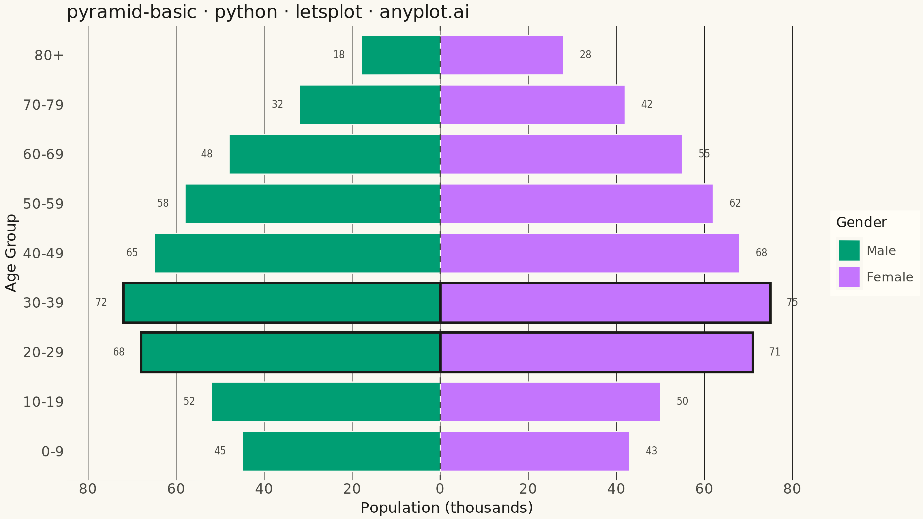
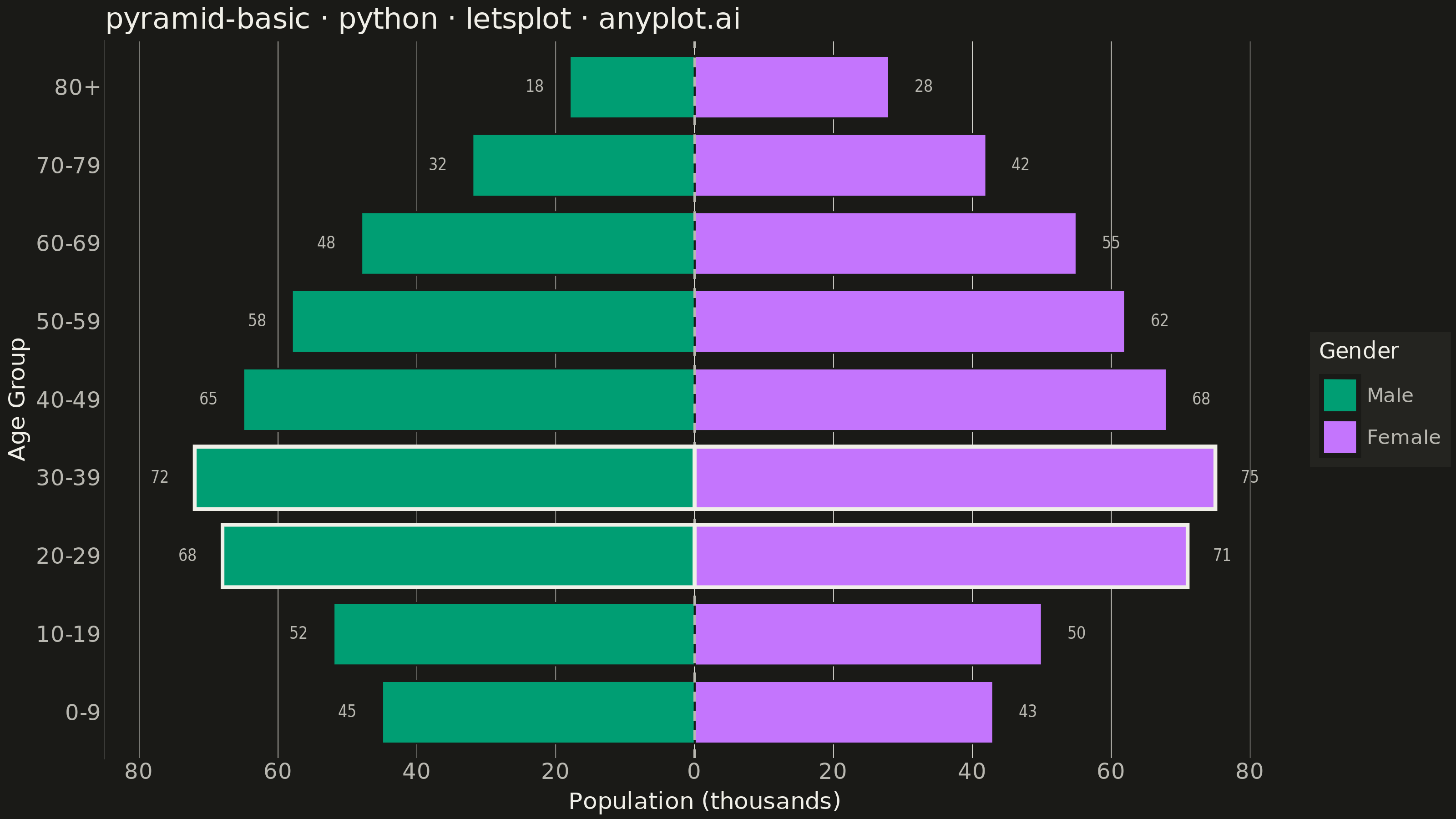
A pyramid chart displays two opposing horizontal bar charts that share a central axis, creating a pyramid or butterfly shape. This visualization is ideal for comparing two related metrics across the same categories, revealing asymmetries and patterns in bidirectional data. Most commonly used for population pyramids showing age-gender distributions.
""" anyplot.ai
pyramid-basic: Basic Pyramid Chart
Library: letsplot 4.10.1 | Python 3.13.13
Quality: 91/100 | Updated: 2026-06-16
"""

import os

import pandas as pd
from lets_plot import *


LetsPlot.setup_html()

# Theme-adaptive chrome (see prompts/default-style-guide.md "Theme-adaptive Chrome")
THEME = os.getenv("ANYPLOT_THEME", "light")
PAGE_BG = "#FAF8F1" if THEME == "light" else "#1A1A17"
ELEVATED_BG = "#FFFDF6" if THEME == "light" else "#242420"
INK = "#1A1A17" if THEME == "light" else "#F0EFE8"
INK_SOFT = "#4A4A44" if THEME == "light" else "#B8B7B0"
GRID = "#1A1A17" if THEME == "light" else "#F0EFE8"

# Imprint palette — Male is the first categorical series (brand green), Female lavender
MALE_COLOR = "#009E73"
FEMALE_COLOR = "#C475FD"

# Data - Population pyramid showing age distribution by gender (in thousands)
age_groups = ["0-9", "10-19", "20-29", "30-39", "40-49", "50-59", "60-69", "70-79", "80+"]
male_population = [45, 52, 68, 72, 65, 58, 48, 32, 18]
female_population = [43, 50, 71, 75, 68, 62, 55, 42, 28]

# Negative values place male bars on the left, female on the right of the shared axis
signed = [-x for x in male_population] + female_population
df = pd.DataFrame(
    {
        "age": age_groups * 2,
        "population": signed,
        "gender": ["Male"] * len(age_groups) + ["Female"] * len(age_groups),
        # Absolute-value tip labels; nudge outward so text clears each bar end
        "label": male_population + female_population,
        "label_pos": [v - 5 for v in signed[: len(age_groups)]] + [v + 5 for v in signed[len(age_groups) :]],
    }
)
df["age"] = pd.Categorical(df["age"], categories=age_groups, ordered=True)

# Storytelling: spotlight the dominant working-age cohorts (20-29, 30-39)
peak = df[df["age"].isin(["20-29", "30-39"])]

# Plot
plot = (
    ggplot(df, aes(x="age", y="population", fill="gender"))
    + geom_bar(stat="identity", width=0.8, color=PAGE_BG, size=0.4)
    # Faint central reference line anchoring the two opposing sides
    + geom_hline(yintercept=0, color=INK_SOFT, size=0.6, linetype="dashed")
    # Emphasis outline on the peak working-age cohorts to create a focal point
    + geom_bar(data=peak, stat="identity", width=0.8, fill="rgba(0,0,0,0)", color=INK, size=0.9)
    # Population value at each bar tip for direct read-off
    + geom_text(aes(x="age", y="label_pos", label="label"), inherit_aes=False, size=4, color=INK_SOFT)
    + coord_flip()
    + scale_fill_manual(values={"Male": MALE_COLOR, "Female": FEMALE_COLOR})
    + scale_y_continuous(
        breaks=[-80, -60, -40, -20, 0, 20, 40, 60, 80], labels=["80", "60", "40", "20", "0", "20", "40", "60", "80"]
    )
    + labs(
        x="Age Group", y="Population (thousands)", title="pyramid-basic · python · letsplot · anyplot.ai", fill="Gender"
    )
    + theme_minimal()
    + theme(
        plot_background=element_rect(fill=PAGE_BG, color=PAGE_BG),
        panel_background=element_rect(fill=PAGE_BG, color=PAGE_BG),
        panel_grid_major_x=element_blank(),
        panel_grid_minor=element_blank(),
        panel_grid_major_y=element_line(color=GRID, size=0.3),
        axis_title=element_text(size=13, color=INK),
        axis_text=element_text(size=12, color=INK_SOFT),
        axis_line=element_line(color=INK_SOFT),
        plot_title=element_text(size=16, color=INK),
        legend_title=element_text(size=12, color=INK),
        legend_text=element_text(size=11, color=INK_SOFT),
        legend_background=element_rect(fill=ELEVATED_BG, color=INK_SOFT),
        legend_position="right",
    )
    + ggsize(800, 450)
)

# Save PNG (scale 4x -> 3200 x 1800 px) and interactive HTML
ggsave(plot, f"plot-{THEME}.png", path=".", scale=4)
ggsave(plot, f"plot-{THEME}.html", path=".")
Runnable source as JSON, for any HTTP client: https://api.anyplot.ai/specs/pyramid-basic/letsplot/code. Any spec id and library id listed in llms-full.txt fit the same URL shape; every URL below is complete and callable.
{
  "spec_id": "pyramid-basic",
  "language": "python",
  "library": "letsplot",
  "page": "https://anyplot.ai/pyramid-basic/python/letsplot",
  "hub": "https://anyplot.ai/pyramid-basic",
  "code_json": "https://api.anyplot.ai/specs/pyramid-basic/letsplot/code",
  "spec_json": "https://api.anyplot.ai/specs/pyramid-basic",
  "render_light_png": "https://storage.googleapis.com/anyplot-images/plots/pyramid-basic/python/letsplot/plot-light.png",
  "render_dark_png": "https://storage.googleapis.com/anyplot-images/plots/pyramid-basic/python/letsplot/plot-dark.png",
  "interactive_light_html": "https://storage.googleapis.com/anyplot-images/plots/pyramid-basic/python/letsplot/plot-light.html",
  "interactive_dark_html": "https://storage.googleapis.com/anyplot-images/plots/pyramid-basic/python/letsplot/plot-dark.html",
  "quality_score": 91.0,
  "license": "MIT",
  "guide": "https://anyplot.ai/llms.txt"
}
Part of Basic Pyramid Chart on anyplot.ai.