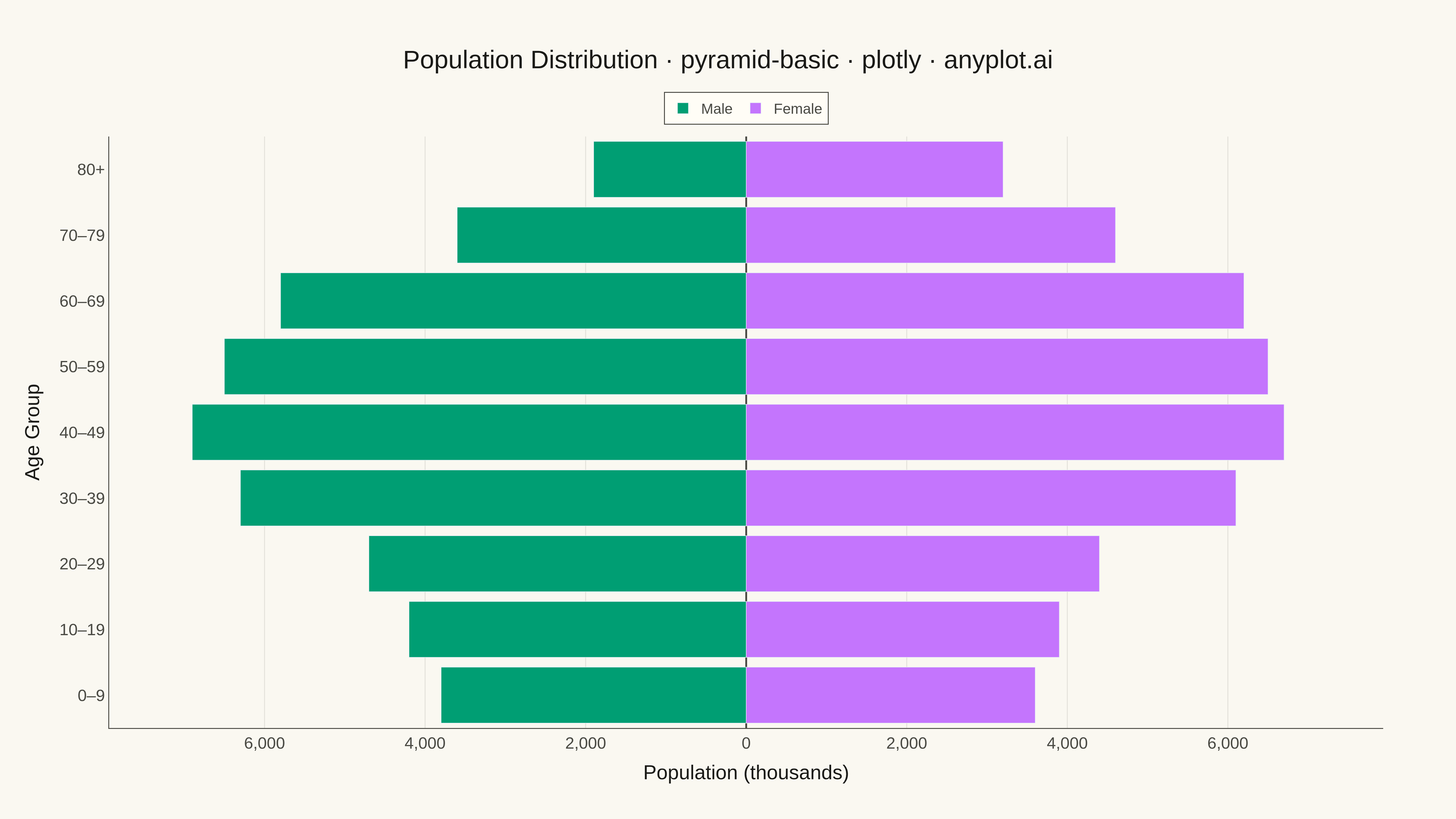
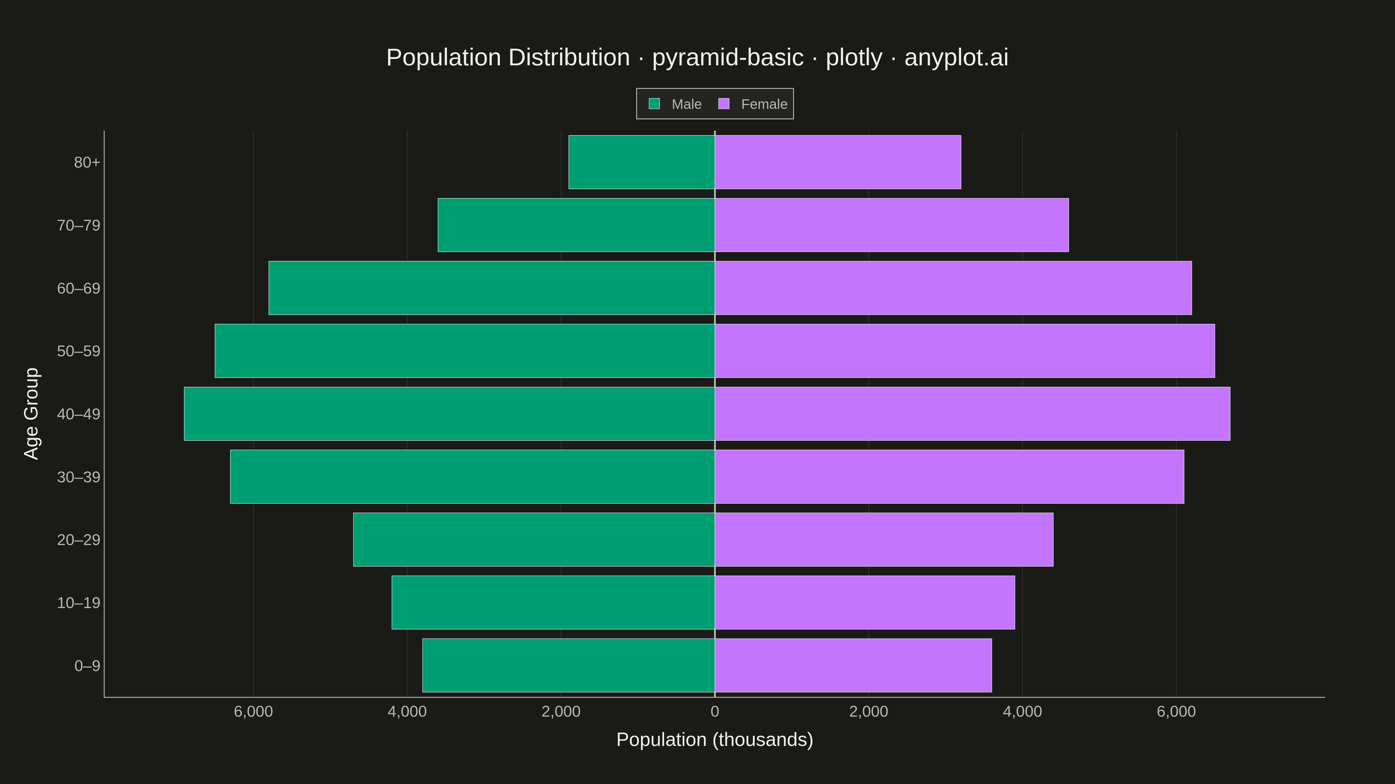
A pyramid chart displays two opposing horizontal bar charts that share a central axis, creating a pyramid or butterfly shape. This visualization is ideal for comparing two related metrics across the same categories, revealing asymmetries and patterns in bidirectional data. Most commonly used for population pyramids showing age-gender distributions.
""" anyplot.ai
pyramid-basic: Basic Pyramid Chart
Library: plotly 6.7.0 | Python 3.13.13
Quality: 91/100 | Updated: 2026-04-29
"""

import os

import plotly.graph_objects as go


# Theme tokens
THEME = os.getenv("ANYPLOT_THEME", "light")
PAGE_BG = "#FAF8F1" if THEME == "light" else "#1A1A17"
ELEVATED_BG = "#FFFDF6" if THEME == "light" else "#242420"
INK = "#1A1A17" if THEME == "light" else "#F0EFE8"
INK_SOFT = "#4A4A44" if THEME == "light" else "#B8B7B0"
GRID = "rgba(26,26,23,0.10)" if THEME == "light" else "rgba(240,239,232,0.10)"

# Data — Germany-scale population pyramid (~83M total), values in thousands
age_groups = ["0–9", "10–19", "20–29", "30–39", "40–49", "50–59", "60–69", "70–79", "80+"]
male_population = [3800, 4200, 4700, 6300, 6900, 6500, 5800, 3600, 1900]
female_population = [3600, 3900, 4400, 6100, 6700, 6500, 6200, 4600, 3200]

# Plot
fig = go.Figure()

fig.add_trace(
    go.Bar(
        y=age_groups,
        x=[-v for v in male_population],
        orientation="h",
        name="Male",
        marker_color="#009E73",  # Okabe-Ito position 1
        hovertemplate="Male<br>Age: %{y}<br>Population: %{customdata:,}k<extra></extra>",
        customdata=male_population,
    )
)

fig.add_trace(
    go.Bar(
        y=age_groups,
        x=female_population,
        orientation="h",
        name="Female",
        marker_color="#C475FD",  # Okabe-Ito position 2
        hovertemplate="Female<br>Age: %{y}<br>Population: %{customdata:,}k<extra></extra>",
        customdata=female_population,
    )
)

max_val = max(max(male_population), max(female_population))
tick_vals = list(range(-8000, 8001, 2000))
tick_text = [f"{abs(v):,}" for v in tick_vals]

fig.update_layout(
    title={
        "text": "Population Distribution · pyramid-basic · plotly · anyplot.ai",
        "font": {"size": 28, "color": INK},
        "x": 0.5,
        "xanchor": "center",
    },
    xaxis={
        "title": {"text": "Population (thousands)", "font": {"size": 22, "color": INK}},
        "tickfont": {"size": 18, "color": INK_SOFT},
        "tickvals": tick_vals,
        "ticktext": tick_text,
        "range": [-max_val * 1.15, max_val * 1.15],
        "gridcolor": GRID,
        "gridwidth": 1,
        "zeroline": True,
        "zerolinecolor": INK_SOFT,
        "zerolinewidth": 2,
        "linecolor": INK_SOFT,
    },
    yaxis={
        "title": {"text": "Age Group", "font": {"size": 22, "color": INK}},
        "tickfont": {"size": 18, "color": INK_SOFT},
        "categoryorder": "array",
        "categoryarray": age_groups,
        "linecolor": INK_SOFT,
    },
    barmode="overlay",
    bargap=0.15,
    paper_bgcolor=PAGE_BG,
    plot_bgcolor=PAGE_BG,
    font={"color": INK},
    legend={
        "font": {"size": 16, "color": INK_SOFT},
        "bgcolor": ELEVATED_BG,
        "bordercolor": INK_SOFT,
        "borderwidth": 1,
        "orientation": "h",
        "yanchor": "bottom",
        "y": 1.02,
        "xanchor": "center",
        "x": 0.5,
    },
    margin={"l": 120, "r": 80, "t": 150, "b": 100},
)

# Save
fig.write_image(f"plot-{THEME}.png", width=1600, height=900, scale=3)
fig.write_html(f"plot-{THEME}.html", include_plotlyjs="cdn")
Runnable source as JSON, for any HTTP client: https://api.anyplot.ai/specs/pyramid-basic/plotly/code. Any spec id and library id listed in llms-full.txt fit the same URL shape; every URL below is complete and callable.
{
  "spec_id": "pyramid-basic",
  "language": "python",
  "library": "plotly",
  "page": "https://anyplot.ai/pyramid-basic/python/plotly",
  "hub": "https://anyplot.ai/pyramid-basic",
  "code_json": "https://api.anyplot.ai/specs/pyramid-basic/plotly/code",
  "spec_json": "https://api.anyplot.ai/specs/pyramid-basic",
  "render_light_png": "https://storage.googleapis.com/anyplot-images/plots/pyramid-basic/python/plotly/plot-light.png",
  "render_dark_png": "https://storage.googleapis.com/anyplot-images/plots/pyramid-basic/python/plotly/plot-dark.png",
  "interactive_light_html": "https://storage.googleapis.com/anyplot-images/plots/pyramid-basic/python/plotly/plot-light.html",
  "interactive_dark_html": "https://storage.googleapis.com/anyplot-images/plots/pyramid-basic/python/plotly/plot-dark.html",
  "quality_score": 91.0,
  "license": "MIT",
  "guide": "https://anyplot.ai/llms.txt"
}
Part of Basic Pyramid Chart on anyplot.ai.