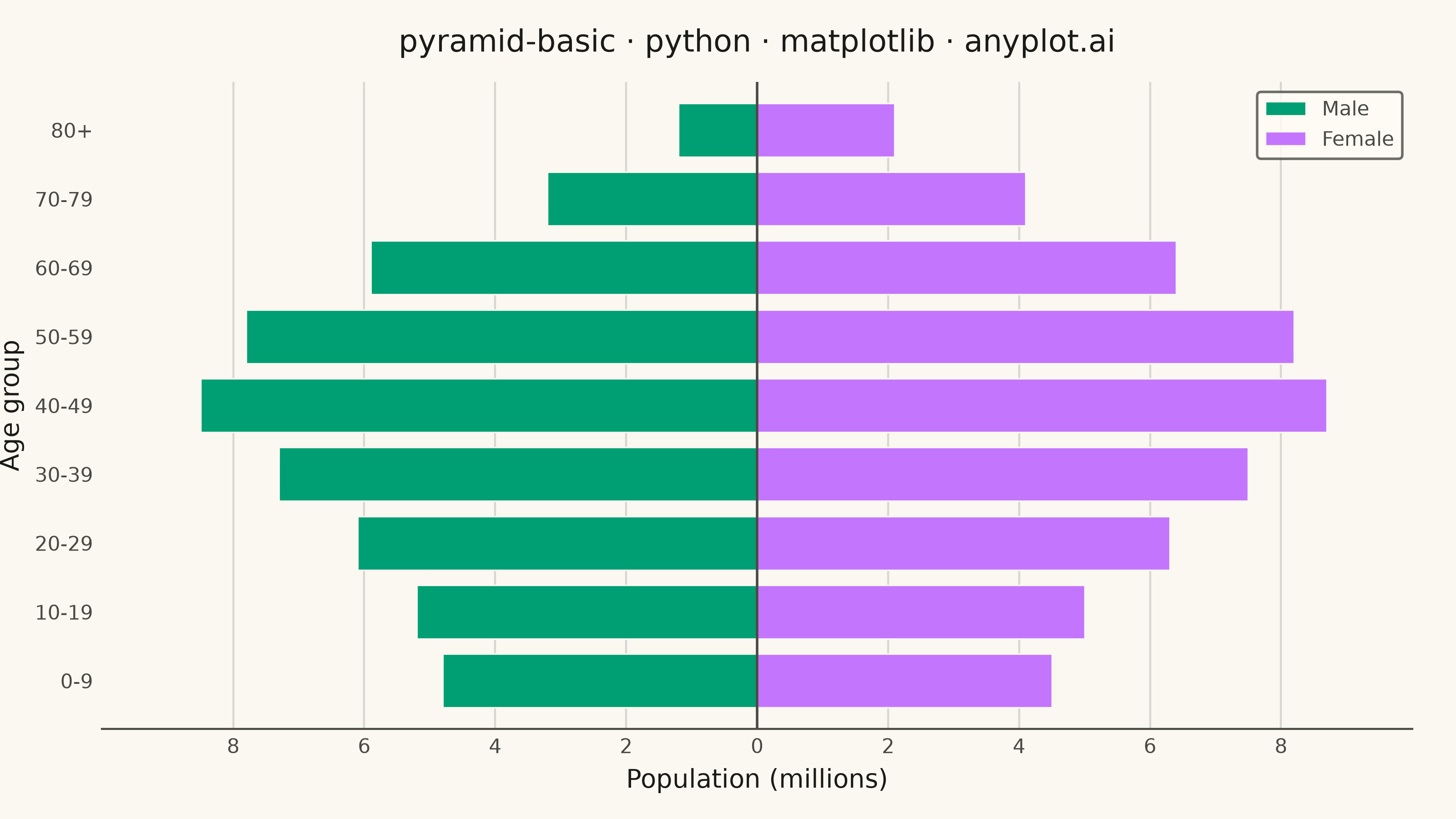
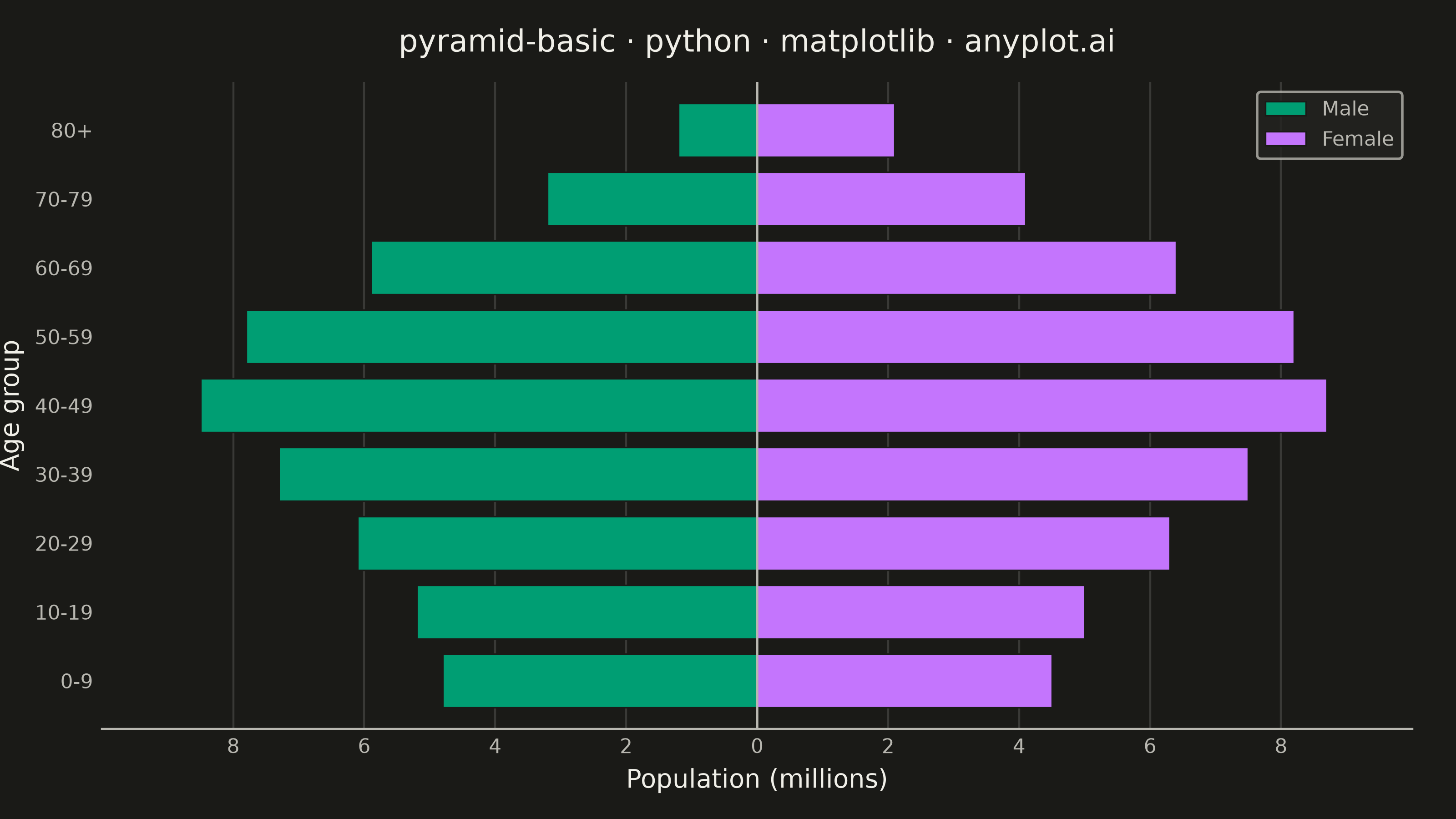
A pyramid chart displays two opposing horizontal bar charts that share a central axis, creating a pyramid or butterfly shape. This visualization is ideal for comparing two related metrics across the same categories, revealing asymmetries and patterns in bidirectional data. Most commonly used for population pyramids showing age-gender distributions.
""" anyplot.ai
pyramid-basic: Basic Pyramid Chart
Library: matplotlib 3.11.0 | Python 3.13.13
Quality: 92/100 | Updated: 2026-06-16
"""

import os

import matplotlib.pyplot as plt
import numpy as np


# Theme-adaptive chrome tokens
THEME = os.getenv("ANYPLOT_THEME", "light")
PAGE_BG = "#FAF8F1" if THEME == "light" else "#1A1A17"
ELEVATED_BG = "#FFFDF6" if THEME == "light" else "#242420"
INK = "#1A1A17" if THEME == "light" else "#F0EFE8"
INK_SOFT = "#4A4A44" if THEME == "light" else "#B8B7B0"

# Imprint palette — first two categorical positions (gender is abstract here,
# so canonical order 1→2 applies: brand green, lavender)
MALE = "#009E73"  # Imprint position 1 (brand green) — always first series
FEMALE = "#C475FD"  # Imprint position 2 (lavender)

# Data — population pyramid showing age distribution by gender (millions).
# Deterministic, no randomness; females outlive males at the oldest groups.
age_groups = ["0-9", "10-19", "20-29", "30-39", "40-49", "50-59", "60-69", "70-79", "80+"]
male = np.array([4.8, 5.2, 6.1, 7.3, 8.5, 7.8, 5.9, 3.2, 1.2])
female = np.array([4.5, 5.0, 6.3, 7.5, 8.7, 8.2, 6.4, 4.1, 2.1])

# Figure — landscape 3200×1800 px (8 × 4.5 in @ 400 dpi)
fig, ax = plt.subplots(figsize=(8, 4.5), dpi=400, facecolor=PAGE_BG)
ax.set_facecolor(PAGE_BG)

y_pos = np.arange(len(age_groups))
bar_height = 0.78

# Focal zone — shade the oldest age bands where the female surplus appears,
# drawing the eye to the chart's real insight (women outlive men).
focus = {7, 8}  # 70-79 and 80+
ax.axhspan(min(focus) - 0.5, max(focus) + 0.5, color=INK, alpha=0.06, zorder=0)

# Male extends left (negative), female extends right (positive)
male_bars = ax.barh(y_pos, -male, height=bar_height, color=MALE, label="Male", edgecolor=PAGE_BG, linewidth=0.6)
female_bars = ax.barh(y_pos, female, height=bar_height, color=FEMALE, label="Female", edgecolor=PAGE_BG, linewidth=0.6)

# Symmetric axis for fair comparison — tightened so the data fills the canvas
max_val = max(male.max(), female.max())
ax.set_xlim(-max_val * 1.08, max_val * 1.08)
ax.set_ylim(-0.7, len(age_groups) - 0.3)

# Tick labels — absolute values on x so both sides read positive
ax.set_yticks(y_pos)
ax.set_yticklabels(age_groups)
ax.set_xticks([-8, -6, -4, -2, 0, 2, 4, 6, 8])
ax.set_xticklabels(["8", "6", "4", "2", "0", "2", "4", "6", "8"])

title = "pyramid-basic · python · matplotlib · anyplot.ai"
ax.set_title(title, fontsize=12, fontweight="medium", color=INK, pad=12)
ax.set_xlabel("Population (millions)", fontsize=10, color=INK)
ax.set_ylabel("Age group", fontsize=10, color=INK)
ax.tick_params(axis="both", colors=INK_SOFT, labelsize=9, length=0)

# Value tags on the focal bands only — bar_label makes the asymmetry concrete
# without cluttering the symmetric core.
male_tags = [f"{v:.1f}" if i in focus else "" for i, v in enumerate(male)]
female_tags = [f"{v:.1f}" if i in focus else "" for i, v in enumerate(female)]
ax.bar_label(male_bars, labels=male_tags, padding=3, fontsize=8, color=INK, fontweight="medium")
ax.bar_label(female_bars, labels=female_tags, padding=3, fontsize=8, color=INK, fontweight="medium")

# Caption — name the story the shaded focal zone tells
ax.text(
    -max_val * 1.04, 7.5, "Women outlive men", fontsize=9, fontstyle="italic", color=INK_SOFT, ha="left", va="center"
)

# Central divider — structural reference line in neutral ink
ax.axvline(x=0, color=INK_SOFT, linewidth=1.0)

# Subtle x-grid only, behind the bars
ax.set_axisbelow(True)
ax.xaxis.grid(True, alpha=0.15, color=INK, linewidth=0.8)

# Spines — keep only the bottom (L-shaped frame; left replaced by center line)
for s in ("top", "right", "left"):
    ax.spines[s].set_visible(False)
ax.spines["bottom"].set_color(INK_SOFT)

# Legend — theme-adaptive elevated frame
leg = ax.legend(fontsize=8, loc="upper right", frameon=True)
leg.get_frame().set_facecolor(ELEVATED_BG)
leg.get_frame().set_edgecolor(INK_SOFT)
plt.setp(leg.get_texts(), color=INK_SOFT)

fig.subplots_adjust(left=0.07, right=0.97, top=0.9, bottom=0.11)
plt.savefig(f"plot-{THEME}.png", dpi=400, facecolor=PAGE_BG)
Runnable source as JSON, for any HTTP client: https://api.anyplot.ai/specs/pyramid-basic/matplotlib/code. Any spec id and library id listed in llms-full.txt fit the same URL shape; every URL below is complete and callable.
{
  "spec_id": "pyramid-basic",
  "language": "python",
  "library": "matplotlib",
  "page": "https://anyplot.ai/pyramid-basic/python/matplotlib",
  "hub": "https://anyplot.ai/pyramid-basic",
  "code_json": "https://api.anyplot.ai/specs/pyramid-basic/matplotlib/code",
  "spec_json": "https://api.anyplot.ai/specs/pyramid-basic",
  "render_light_png": "https://storage.googleapis.com/anyplot-images/plots/pyramid-basic/python/matplotlib/plot-light.png",
  "render_dark_png": "https://storage.googleapis.com/anyplot-images/plots/pyramid-basic/python/matplotlib/plot-dark.png",
  "quality_score": 92.0,
  "license": "MIT",
  "guide": "https://anyplot.ai/llms.txt"
}
Part of Basic Pyramid Chart on anyplot.ai.