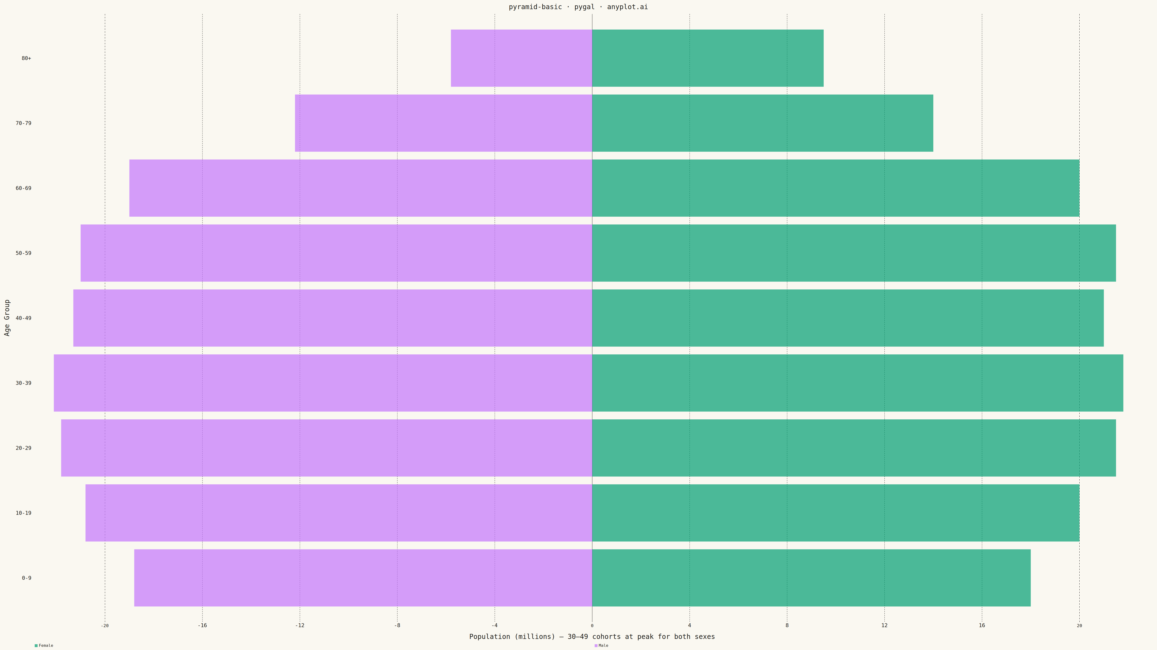
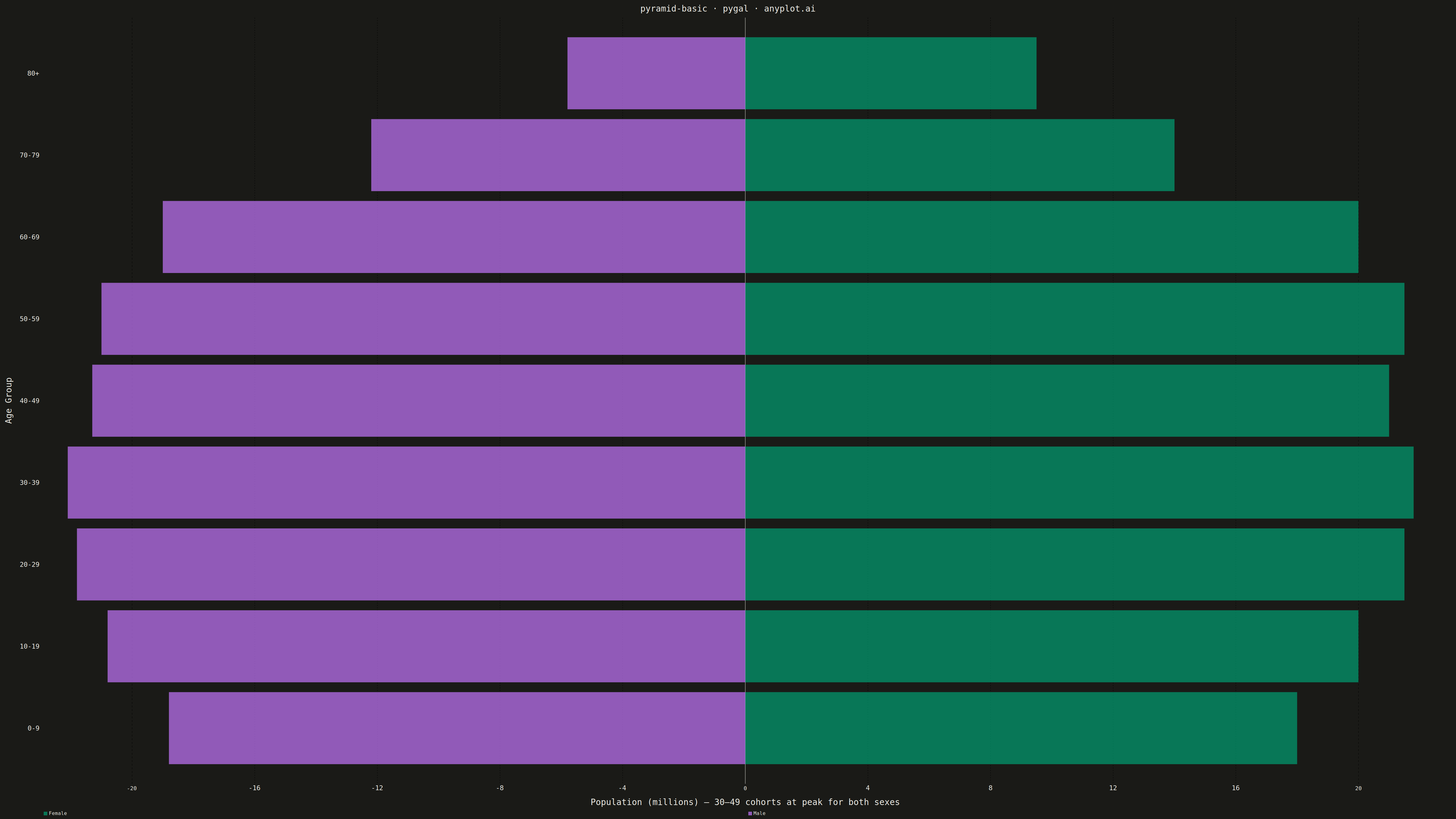
A pyramid chart displays two opposing horizontal bar charts that share a central axis, creating a pyramid or butterfly shape. This visualization is ideal for comparing two related metrics across the same categories, revealing asymmetries and patterns in bidirectional data. Most commonly used for population pyramids showing age-gender distributions.
""" anyplot.ai
pyramid-basic: Basic Pyramid Chart
Library: pygal 3.1.0 | Python 3.13.13
Quality: 85/100 | Updated: 2026-04-29
"""

import os
import sys


# Pop script directory so local pygal.py doesn't shadow the installed package
_script_dir = sys.path.pop(0)

import pygal
from pygal.style import Style


sys.path.insert(0, _script_dir)

# Theme tokens
THEME = os.getenv("ANYPLOT_THEME", "light")
PAGE_BG = "#FAF8F1" if THEME == "light" else "#1A1A17"
INK = "#1A1A17" if THEME == "light" else "#F0EFE8"
INK_SOFT = "#4A4A44" if THEME == "light" else "#B8B7B0"
INK_MUTED = "#6B6A63" if THEME == "light" else "#A8A79F"

IMPRINT = ("#009E73", "#C475FD", "#4467A3", "#BD8233", "#AE3030", "#2ABCCD", "#954477")

# US 2023 population by age group (millions); prime working-age cohorts 30-49 lead both sexes
age_groups = ["0-9", "10-19", "20-29", "30-39", "40-49", "50-59", "60-69", "70-79", "80+"]
female = [18.0, 20.0, 21.5, 21.8, 21.0, 21.5, 20.0, 14.0, 9.5]
male = [18.8, 20.8, 21.8, 22.1, 21.3, 21.0, 19.0, 12.2, 5.8]

# Style — stroke_width=0 removes heavy bar outlines that bleed in dark theme
custom_style = Style(
    background=PAGE_BG,
    plot_background=PAGE_BG,
    foreground=INK,
    foreground_strong=INK,
    foreground_subtle=INK_SOFT,
    colors=IMPRINT,
    title_font_size=28,
    label_font_size=22,
    major_label_font_size=18,
    legend_font_size=16,
    value_font_size=14,
    stroke_width=0,
)

# Plot — guides off for a clean look; legend at bottom for better layout
chart = pygal.Pyramid(
    width=4800,
    height=2700,
    style=custom_style,
    title="pyramid-basic · pygal · anyplot.ai",
    x_title="Population (millions) — 30–49 cohorts at peak for both sexes",
    y_title="Age Group",
    show_y_guides=False,
    show_x_guides=False,
    print_values=False,
    show_legend=True,
    human_readable=True,
    legend_at_bottom=True,
    legend_at_bottom_columns=2,
)

chart.x_labels = age_groups

# First series goes RIGHT (female), second goes LEFT (male)
chart.add("Female", female)
chart.add("Male", male)

# Save
chart.render_to_png(f"plot-{THEME}.png")
chart.render_to_file(f"plot-{THEME}.html")
Runnable source as JSON, for any HTTP client: https://api.anyplot.ai/specs/pyramid-basic/pygal/code. Any spec id and library id listed in llms-full.txt fit the same URL shape; every URL below is complete and callable.
{
  "spec_id": "pyramid-basic",
  "language": "python",
  "library": "pygal",
  "page": "https://anyplot.ai/pyramid-basic/python/pygal",
  "hub": "https://anyplot.ai/pyramid-basic",
  "code_json": "https://api.anyplot.ai/specs/pyramid-basic/pygal/code",
  "spec_json": "https://api.anyplot.ai/specs/pyramid-basic",
  "render_light_png": "https://storage.googleapis.com/anyplot-images/plots/pyramid-basic/python/pygal/plot-light.png",
  "render_dark_png": "https://storage.googleapis.com/anyplot-images/plots/pyramid-basic/python/pygal/plot-dark.png",
  "interactive_light_html": "https://storage.googleapis.com/anyplot-images/plots/pyramid-basic/python/pygal/plot-light.html",
  "interactive_dark_html": "https://storage.googleapis.com/anyplot-images/plots/pyramid-basic/python/pygal/plot-dark.html",
  "quality_score": 85.0,
  "license": "MIT",
  "guide": "https://anyplot.ai/llms.txt"
}
Part of Basic Pyramid Chart on anyplot.ai.