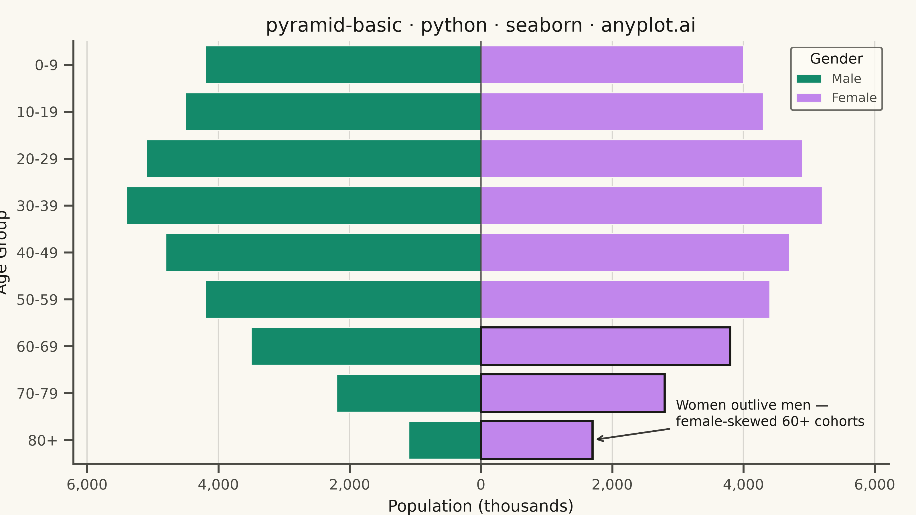
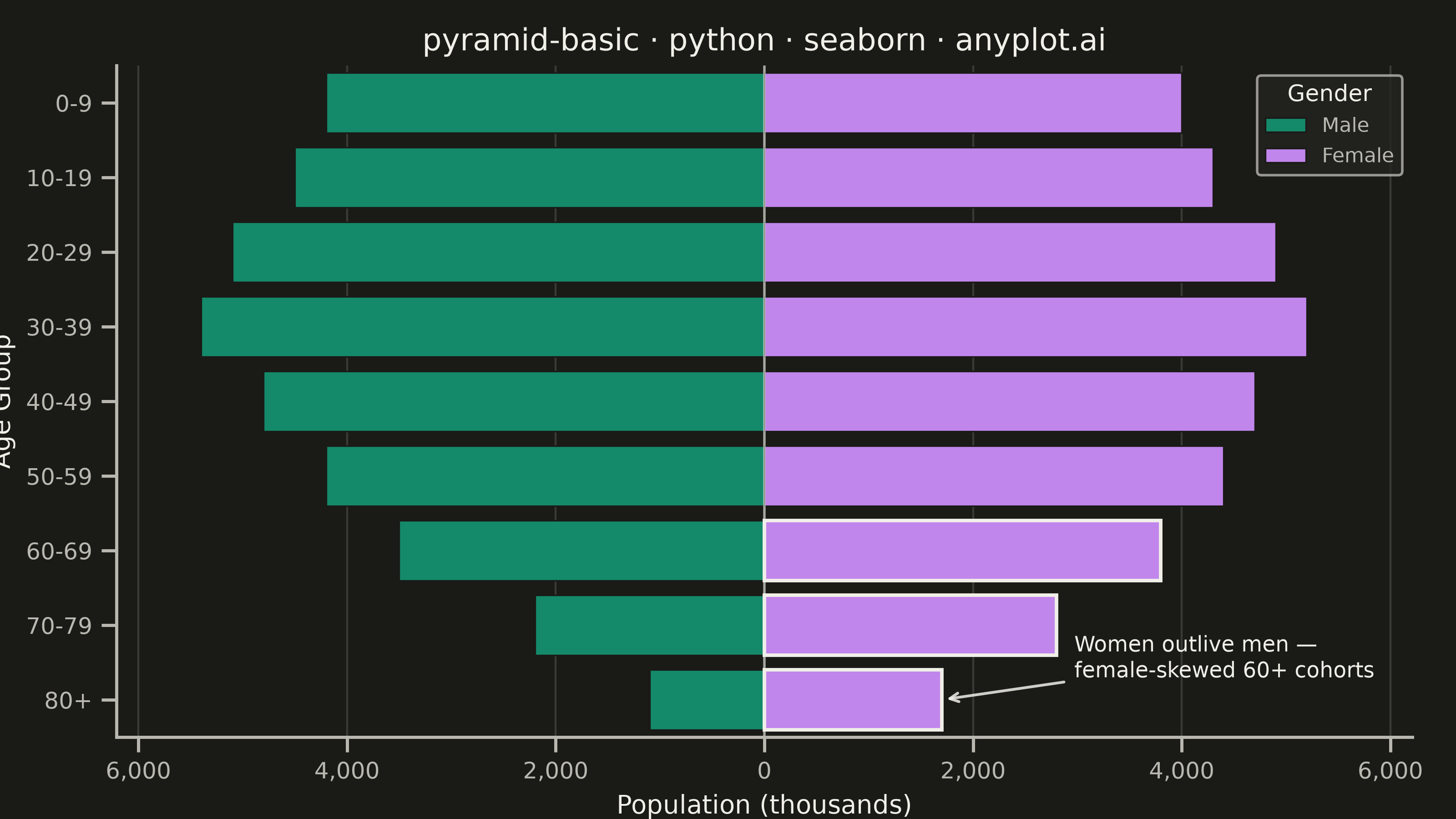
A pyramid chart displays two opposing horizontal bar charts that share a central axis, creating a pyramid or butterfly shape. This visualization is ideal for comparing two related metrics across the same categories, revealing asymmetries and patterns in bidirectional data. Most commonly used for population pyramids showing age-gender distributions.
""" anyplot.ai
pyramid-basic: Basic Pyramid Chart
Library: seaborn 0.13.2 | Python 3.13.13
Quality: 89/100 | Updated: 2026-06-16
"""

import os

import matplotlib.pyplot as plt
import pandas as pd
import seaborn as sns


# Theme-adaptive chrome
THEME = os.getenv("ANYPLOT_THEME", "light")
PAGE_BG = "#FAF8F1" if THEME == "light" else "#1A1A17"
ELEVATED_BG = "#FFFDF6" if THEME == "light" else "#242420"
INK = "#1A1A17" if THEME == "light" else "#F0EFE8"
INK_SOFT = "#4A4A44" if THEME == "light" else "#B8B7B0"

# Imprint palette — canonical order, first series always #009E73.
# Gender categories carry no widely-shared color expectation, so default to
# canonical order: Male → brand green, Female → lavender.
BRAND = "#009E73"
SECOND = "#C475FD"

# Data - Population pyramid showing age distribution by gender
age_groups = ["0-9", "10-19", "20-29", "30-39", "40-49", "50-59", "60-69", "70-79", "80+"]
male_population = [4200, 4500, 5100, 5400, 4800, 4200, 3500, 2200, 1100]
female_population = [4000, 4300, 4900, 5200, 4700, 4400, 3800, 2800, 1700]

# Create DataFrame with male values as negative for left-side display
df = pd.DataFrame(
    {
        "Age Group": age_groups * 2,
        "Population": [-m for m in male_population] + female_population,
        "Gender": ["Male"] * len(age_groups) + ["Female"] * len(age_groups),
    }
)

sns.set_theme(
    style="ticks",
    rc={
        "figure.facecolor": PAGE_BG,
        "axes.facecolor": PAGE_BG,
        "axes.edgecolor": INK_SOFT,
        "axes.labelcolor": INK,
        "text.color": INK,
        "xtick.color": INK_SOFT,
        "ytick.color": INK_SOFT,
        "grid.color": INK,
        "grid.alpha": 0.15,
        "legend.facecolor": ELEVATED_BG,
        "legend.edgecolor": INK_SOFT,
    },
)

# Plot — landscape canvas: 8 x 4.5 in @ 400 dpi → 3200 x 1800 px
fig, ax = plt.subplots(figsize=(8, 4.5), dpi=400)

sns.barplot(
    data=df,
    y="Age Group",
    x="Population",
    hue="Gender",
    hue_order=["Male", "Female"],
    palette={"Male": BRAND, "Female": SECOND},
    ax=ax,
    dodge=False,
    orient="h",
    width=0.8,
    edgecolor=PAGE_BG,
    linewidth=0.6,
)

# Styling
ax.set_xlabel("Population (thousands)", fontsize=10)
ax.set_ylabel("Age Group", fontsize=10)
ax.set_title("pyramid-basic · python · seaborn · anyplot.ai", fontsize=12, fontweight="medium")
ax.tick_params(axis="both", labelsize=9)

# Make x-axis symmetric
max_val = max(max(male_population), max(female_population))
ax.set_xlim(-max_val * 1.15, max_val * 1.15)

# Custom x-tick labels to show absolute values
ticks = [-6000, -4000, -2000, 0, 2000, 4000, 6000]
ax.set_xticks(ticks)
ax.set_xticklabels([f"{abs(t):,}" for t in ticks])

# Subtle reference line at the central axis (theme-adaptive ink)
ax.axvline(x=0, color=INK, linewidth=1.0, alpha=0.6)

# Grid (x-axis only, subtle solid)
ax.grid(True, axis="x", alpha=0.15, linewidth=0.8)
ax.set_axisbelow(True)

# Clean L-frame — idiomatic seaborn despine
sns.despine(ax=ax, top=True, right=True)

# Data storytelling: emphasize the female-skewed older cohorts (women
# outlive men). Female bars extend right (positive width); accent the three
# oldest with a crisp ink edge, then annotate the crossover.
focal_groups = ["60-69", "70-79", "80+"]
focal_values = {female_population[age_groups.index(g)] for g in focal_groups}
for patch in ax.patches:
    if patch.get_width() > 0 and round(patch.get_width()) in focal_values:
        patch.set_edgecolor(INK)
        patch.set_linewidth(1.4)

focal_idx = age_groups.index("80+")
ax.annotate(
    "Women outlive men —\nfemale-skewed 60+ cohorts",
    xy=(female_population[focal_idx], focal_idx),
    xytext=(max_val * 0.55, focal_idx - 0.55),
    fontsize=8.5,
    color=INK,
    ha="left",
    va="center",
    arrowprops={"arrowstyle": "->", "color": INK, "lw": 1.1, "alpha": 0.85},
)

# Legend
legend = ax.legend(title="Gender", fontsize=8, title_fontsize=9, loc="upper right")
legend.get_frame().set_facecolor(ELEVATED_BG)
legend.get_frame().set_edgecolor(INK_SOFT)
legend.get_title().set_color(INK)
for text in legend.get_texts():
    text.set_color(INK_SOFT)

fig.subplots_adjust(left=0.08, right=0.97, top=0.92, bottom=0.1)
plt.savefig(f"plot-{THEME}.png", dpi=400, facecolor=PAGE_BG)
Runnable source as JSON, for any HTTP client: https://api.anyplot.ai/specs/pyramid-basic/seaborn/code. Any spec id and library id listed in llms-full.txt fit the same URL shape; every URL below is complete and callable.
{
  "spec_id": "pyramid-basic",
  "language": "python",
  "library": "seaborn",
  "page": "https://anyplot.ai/pyramid-basic/python/seaborn",
  "hub": "https://anyplot.ai/pyramid-basic",
  "code_json": "https://api.anyplot.ai/specs/pyramid-basic/seaborn/code",
  "spec_json": "https://api.anyplot.ai/specs/pyramid-basic",
  "render_light_png": "https://storage.googleapis.com/anyplot-images/plots/pyramid-basic/python/seaborn/plot-light.png",
  "render_dark_png": "https://storage.googleapis.com/anyplot-images/plots/pyramid-basic/python/seaborn/plot-dark.png",
  "quality_score": 89.0,
  "license": "MIT",
  "guide": "https://anyplot.ai/llms.txt"
}
Part of Basic Pyramid Chart on anyplot.ai.