The same plot in 14 other libraries — JavaScript: Chart.js, D3.js, Apache ECharts, MUI X Charts; Python: Altair, Bokeh, lets-plot, Matplotlib, Plotly, plotnine, Pygal, Seaborn; R: ggplot2; Julia: Makie.jl. Compare all 15 side by side: Annotated Scatter Plot with Text Labels in Python, R, Julia and JavaScript.
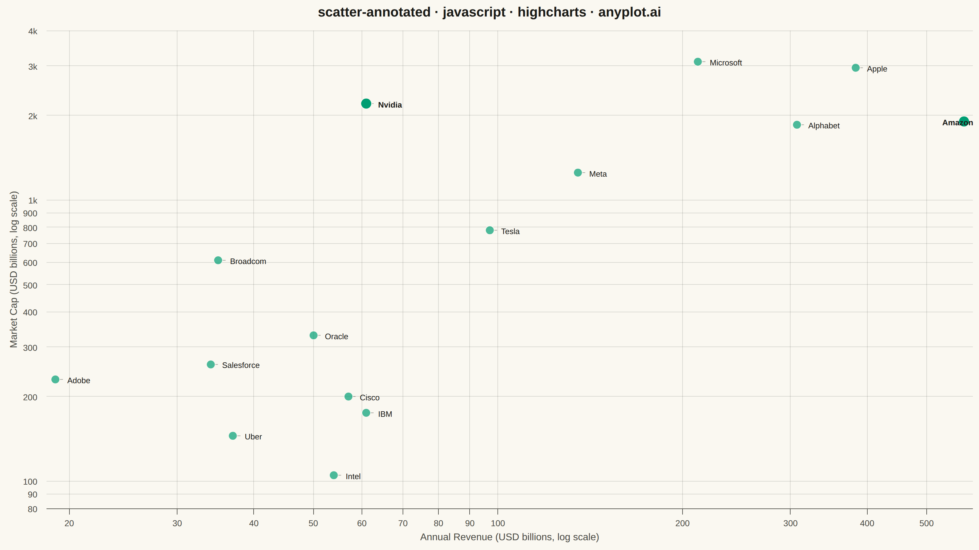
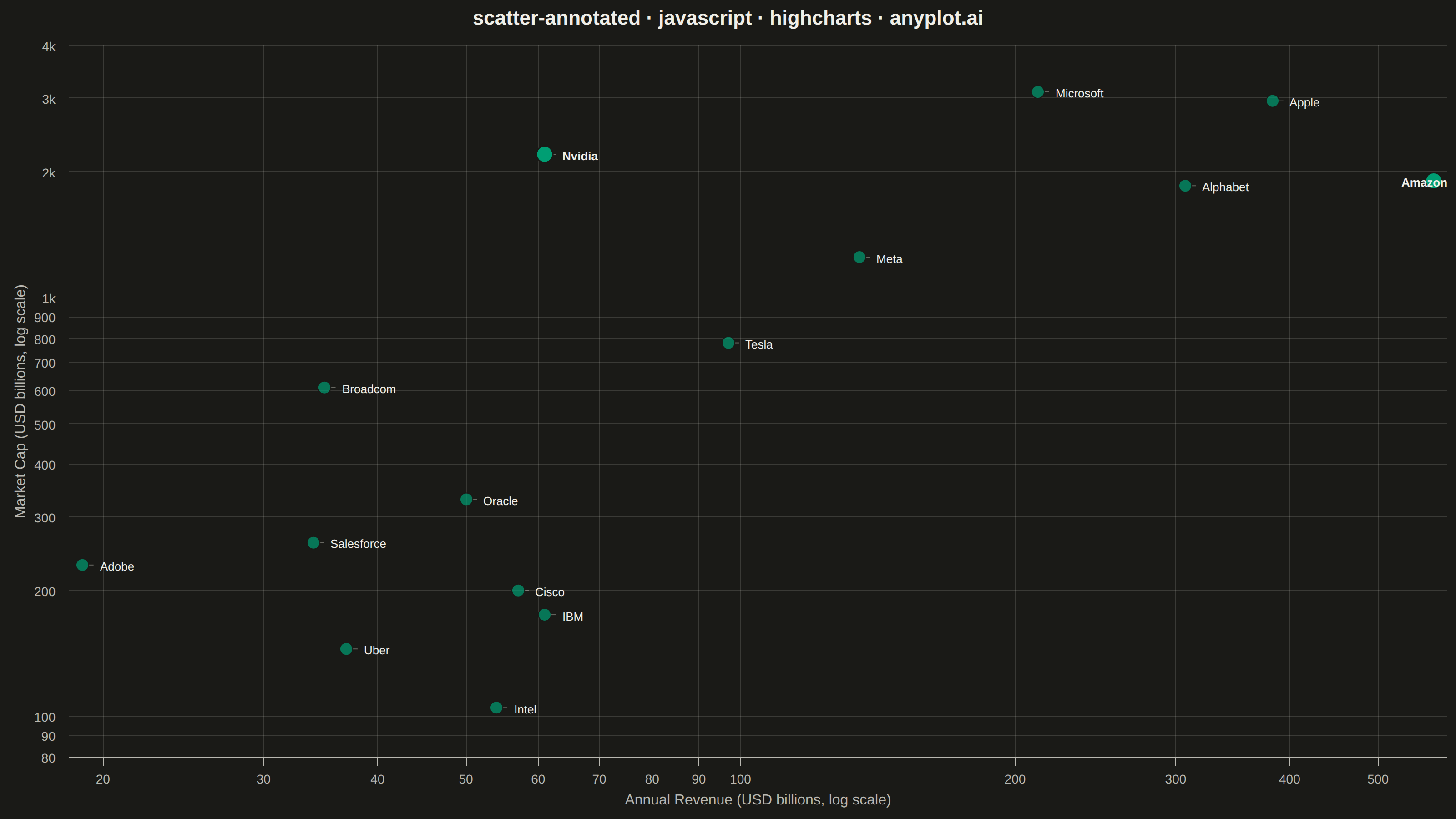
A scatter plot where each data point can have a text label annotation, useful for identifying specific points of interest. This visualization enhances basic scatter plots by adding contextual information directly on the chart, making it easy to highlight outliers, named entities, or key data points that deserve special attention.
// anyplot.ai
// scatter-annotated: Annotated Scatter Plot with Text Labels
// Library: highcharts 12.6.0 | JavaScript 22.23.2
// Quality: 88/100 | Created: 2026-09-05

const t = window.ANYPLOT_TOKENS;

// --- Data (in-memory, deterministic) ----------------------------------------
// Revenue vs. market cap for a set of well-known tech companies (illustrative
// figures, not live market data). Labels annotate every point since n is small.
// Two points are called out as focal outliers: Nvidia carries by far the
// richest market-cap-to-revenue multiple (~36x vs. a ~3-17x range for peers),
// and Amazon is the clear revenue leader — a distinct kind of standout.
const companies = [
  { name: "Apple", revenue: 383, marketCap: 2950 },
  { name: "Microsoft", revenue: 212, marketCap: 3100 },
  { name: "Alphabet", revenue: 307, marketCap: 1850 },
  { name: "Amazon", revenue: 575, marketCap: 1900, highlight: true },
  { name: "Nvidia", revenue: 61, marketCap: 2200, highlight: true },
  { name: "Meta", revenue: 135, marketCap: 1250 },
  { name: "Tesla", revenue: 97, marketCap: 780 },
  { name: "Broadcom", revenue: 35, marketCap: 610 },
  { name: "Oracle", revenue: 50, marketCap: 330 },
  { name: "Adobe", revenue: 19, marketCap: 230 },
  { name: "Salesforce", revenue: 34, marketCap: 260 },
  { name: "IBM", revenue: 61, marketCap: 175 },
  { name: "Intel", revenue: 54, marketCap: 105 },
  { name: "Cisco", revenue: 57, marketCap: 200 },
  { name: "Uber", revenue: 37, marketCap: 145 },
];

// Data-label offset from each point (CSS px) — shared between the dataLabels
// config below and the connector-line renderer so the two stay in sync.
const LABEL_DX = 14;
const LABEL_DY = 0;

const points = companies.map((c) => ({
  x: c.revenue,
  y: c.marketCap,
  name: c.name,
  marker: c.highlight
    ? { radius: 9, fillColor: t.palette[0], lineWidth: 1.5 }
    : undefined,
  dataLabels: c.highlight
    ? { style: { fontWeight: "700" } }
    : undefined,
}));

// --- Chart -------------------------------------------------------------------
Highcharts.chart("container", {
  chart: {
    type: "scatter",
    backgroundColor: "transparent",
    animation: false,
    style: { fontFamily: "inherit" },
    events: {
      // Draw a subtle connector from each marker's edge to its offset label
      // via the SVG renderer directly (Highcharts has no built-in scatter
      // dataLabel connector — that's a pie-only feature).
      render: function () {
        const chart = this;
        if (chart.connectorGroup) {
          chart.connectorGroup.destroy();
        }
        const group = chart.renderer.g("data-connectors").add();
        chart.series[0].points.forEach((point) => {
          if (!point.graphic || !point.dataLabel) return;
          const r = point.graphic.attr("r") || 7;
          const x1 = chart.plotLeft + point.plotX + r;
          const y1 = chart.plotTop + point.plotY;
          const x2 = chart.plotLeft + point.plotX + LABEL_DX - 2;
          const y2 = chart.plotTop + point.plotY + LABEL_DY;
          chart.renderer
            .path(["M", x1, y1, "L", x2, y2])
            .attr({ "stroke-width": 1, stroke: t.inkSoft, opacity: 0.5, zIndex: 3 })
            .add(group);
        });
        chart.connectorGroup = group;
      },
    },
  },
  credits: { enabled: false },
  colors: t.palette,
  title: {
    text: "scatter-annotated · javascript · highcharts · anyplot.ai",
    style: { color: t.ink, fontSize: "22px", fontWeight: "600" },
  },
  xAxis: {
    type: "logarithmic",
    title: {
      text: "Annual Revenue (USD billions, log scale)",
      style: { color: t.inkSoft, fontSize: "16px" },
    },
    lineColor: t.inkSoft,
    tickColor: t.inkSoft,
    gridLineColor: t.grid,
    gridLineWidth: 1,
    labels: { style: { color: t.inkSoft, fontSize: "14px" } },
  },
  yAxis: {
    type: "logarithmic",
    title: {
      text: "Market Cap (USD billions, log scale)",
      style: { color: t.inkSoft, fontSize: "16px" },
    },
    lineColor: t.inkSoft,
    tickColor: t.inkSoft,
    gridLineColor: t.grid,
    gridLineWidth: 1,
    labels: { style: { color: t.inkSoft, fontSize: "14px" } },
  },
  legend: { enabled: false },
  tooltip: {
    pointFormat: "Revenue: {point.x}B · Market Cap: {point.y}B",
  },
  plotOptions: {
    series: { animation: false },
    scatter: {
      marker: {
        radius: 7,
        fillColor: Highcharts.color(t.palette[0]).setOpacity(0.7).get(),
        lineWidth: 1,
        lineColor: t.pageBg,
      },
      dataLabels: {
        enabled: true,
        format: "{point.name}",
        align: "left",
        verticalAlign: "middle",
        x: LABEL_DX,
        y: LABEL_DY,
        allowOverlap: false,
        style: {
          color: t.ink,
          fontSize: "13px",
          fontWeight: "normal",
          textOutline: "none",
        },
      },
    },
  },
  series: [
    {
      name: "Companies",
      data: points,
      color: t.palette[0],
    },
  ],
});
Runnable source as JSON, for any HTTP client: https://api.anyplot.ai/specs/scatter-annotated/highcharts/code. Any spec id and library id listed in llms-full.txt fit the same URL shape; every URL below is complete and callable.
{
  "spec_id": "scatter-annotated",
  "language": "javascript",
  "library": "highcharts",
  "page": "https://anyplot.ai/scatter-annotated/javascript/highcharts",
  "hub": "https://anyplot.ai/scatter-annotated",
  "code_json": "https://api.anyplot.ai/specs/scatter-annotated/highcharts/code",
  "spec_json": "https://api.anyplot.ai/specs/scatter-annotated",
  "render_light_png": "https://storage.googleapis.com/anyplot-images/plots/scatter-annotated/javascript/highcharts/plot-light.png",
  "render_dark_png": "https://storage.googleapis.com/anyplot-images/plots/scatter-annotated/javascript/highcharts/plot-dark.png",
  "interactive_light_html": "https://storage.googleapis.com/anyplot-images/plots/scatter-annotated/javascript/highcharts/plot-light.html",
  "interactive_dark_html": "https://storage.googleapis.com/anyplot-images/plots/scatter-annotated/javascript/highcharts/plot-dark.html",
  "quality_score": 88.0,
  "license": "MIT",
  "guide": "https://anyplot.ai/llms.txt"
}
Part of Annotated Scatter Plot with Text Labels on anyplot.ai.