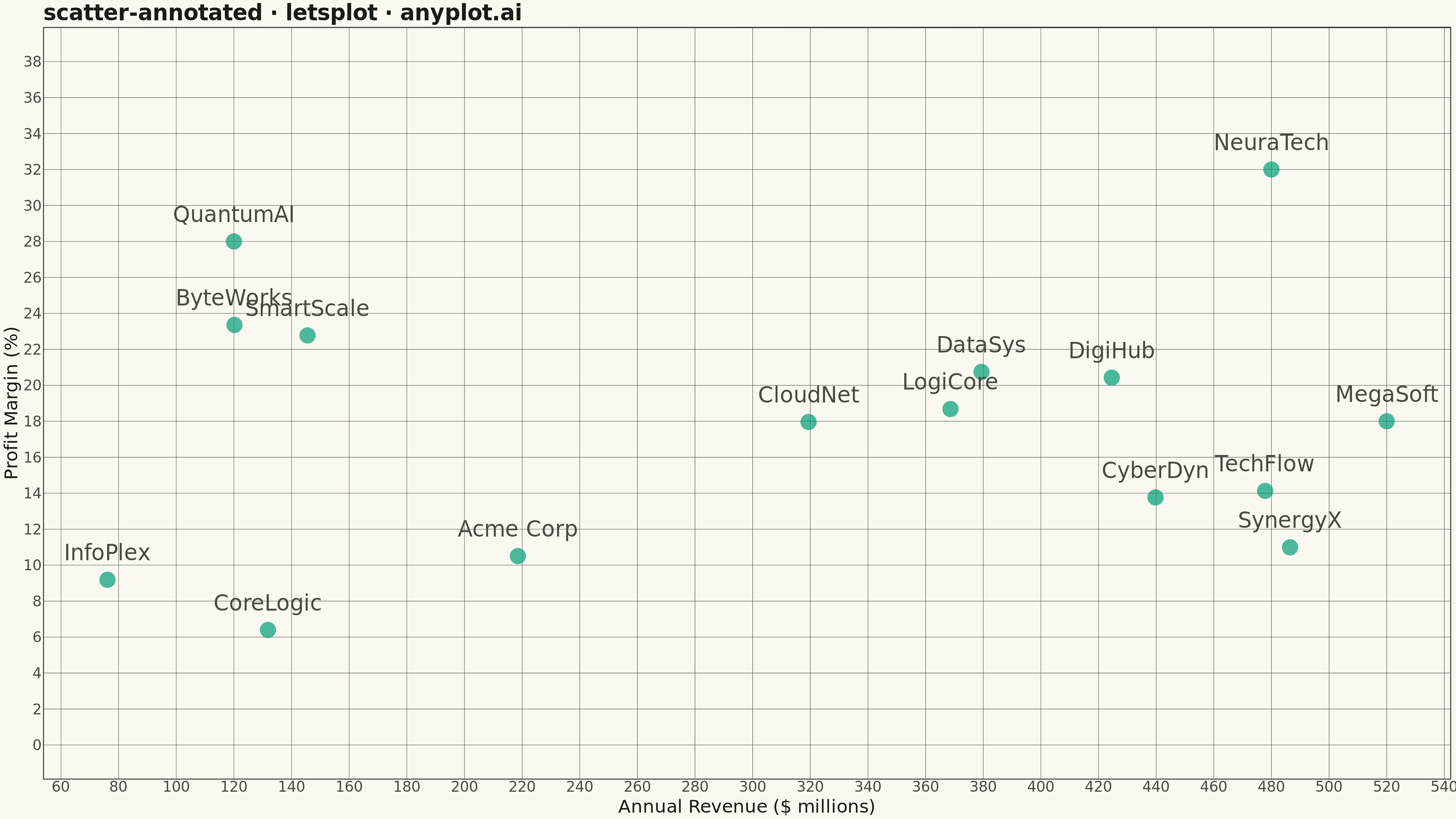
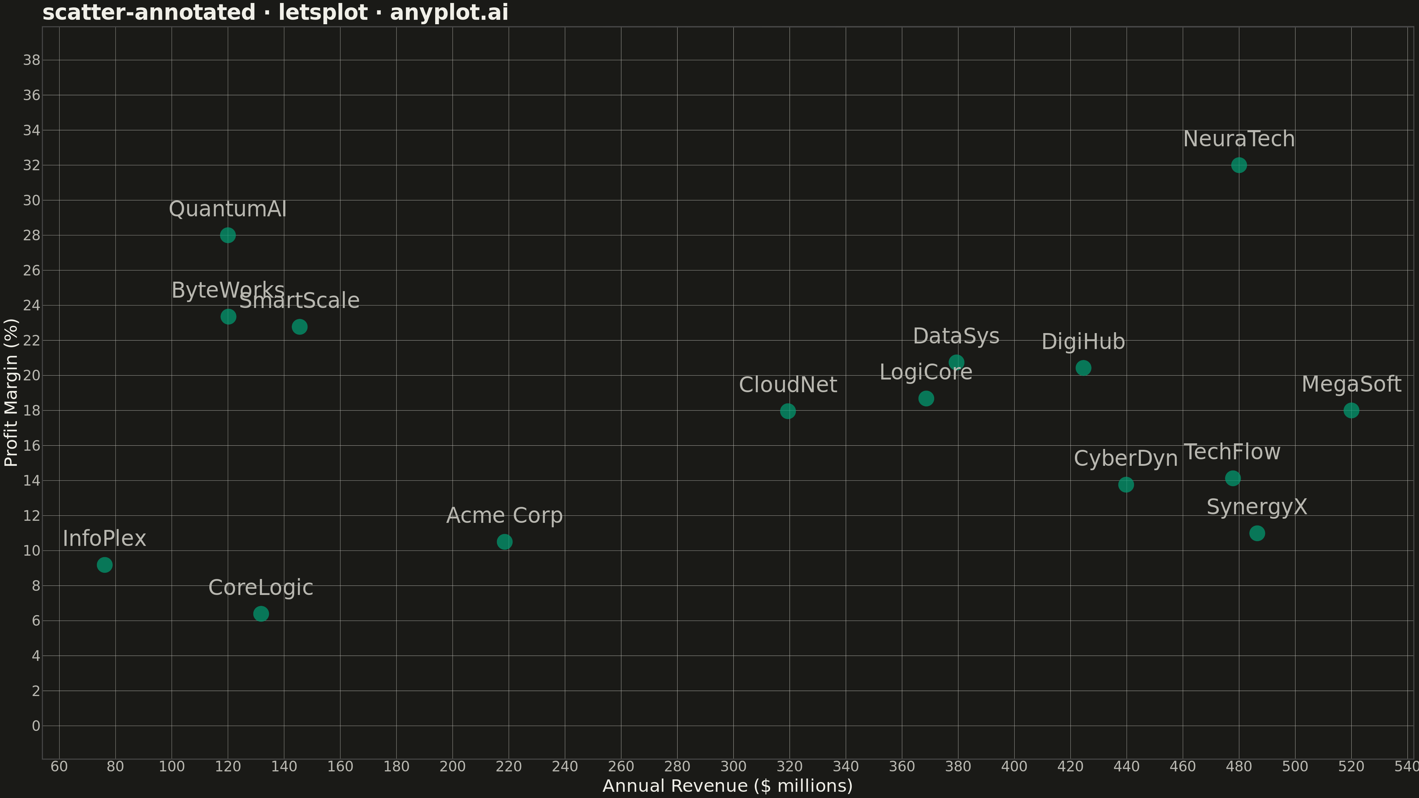
A scatter plot where each data point can have a text label annotation, useful for identifying specific points of interest. This visualization enhances basic scatter plots by adding contextual information directly on the chart, making it easy to highlight outliers, named entities, or key data points that deserve special attention.
""" anyplot.ai
scatter-annotated: Annotated Scatter Plot with Text Labels
Library: letsplot 4.9.0 | Python 3.13.13
Quality: 87/100 | Updated: 2026-05-13
"""

import os
from pathlib import Path

import numpy as np
import pandas as pd
from lets_plot import *

LetsPlot.setup_html()

# Theme tokens
THEME = os.getenv("ANYPLOT_THEME", "light")
PAGE_BG = "#FAF8F1" if THEME == "light" else "#1A1A17"
ELEVATED_BG = "#FFFDF6" if THEME == "light" else "#242420"
INK = "#1A1A17" if THEME == "light" else "#F0EFE8"
INK_SOFT = "#4A4A44" if THEME == "light" else "#B8B7B0"
BRAND = "#009E73"  # Okabe-Ito position 1

# Data - Company performance metrics (neutral business context)
np.random.seed(42)

companies = [
    "Acme Corp",
    "TechFlow",
    "DataSys",
    "CloudNet",
    "NeuraTech",
    "ByteWorks",
    "InfoPlex",
    "CyberDyn",
    "QuantumAI",
    "LogiCore",
    "MegaSoft",
    "SynergyX",
    "DigiHub",
    "SmartScale",
    "CoreLogic",
]

# Revenue (millions) and profit margin (percentage)
revenue = np.random.uniform(50, 500, len(companies))
profit_margin = np.random.uniform(5, 35, len(companies))

# Add some outliers for visual interest
revenue[4] = 480  # NeuraTech - high revenue
profit_margin[4] = 32  # NeuraTech - strong margins
revenue[8] = 120  # QuantumAI - low revenue
profit_margin[8] = 28  # QuantumAI - good margins (efficient startup)
revenue[10] = 520  # MegaSoft - highest revenue
profit_margin[10] = 18  # MegaSoft - lower margins (competitive market)

df = pd.DataFrame({"company": companies, "revenue": revenue, "profit_margin": profit_margin})

# Theme-adaptive styling
anyplot_theme = theme(
    plot_background=element_rect(fill=PAGE_BG, color=PAGE_BG),
    panel_background=element_rect(fill=PAGE_BG),
    panel_grid_major=element_line(color=INK if THEME == "light" else INK_SOFT, size=0.3),
    panel_grid_minor=element_blank(),
    axis_title=element_text(color=INK, size=20),
    axis_text=element_text(color=INK_SOFT, size=16),
    axis_line=element_line(color=INK_SOFT, size=0.5),
    plot_title=element_text(color=INK, size=24, face="bold"),
    legend_background=element_rect(fill=ELEVATED_BG, color=INK_SOFT),
    legend_text=element_text(color=INK_SOFT, size=16),
    legend_title=element_text(color=INK, size=16),
)

# Create annotated scatter plot
plot = (
    ggplot(df, aes(x="revenue", y="profit_margin"))
    + geom_point(size=8, color=BRAND, alpha=0.7)
    + geom_text(aes(label="company"), size=12, nudge_y=1.5, color=INK_SOFT)
    + scale_y_continuous(limits=[0, 38])
    + labs(x="Annual Revenue ($ millions)", y="Profit Margin (%)", title="scatter-annotated · letsplot · anyplot.ai")
    + theme_minimal()
    + anyplot_theme
    + ggsize(1600, 900)
)

# Save as PNG (scale 3x for 4800x2700 px) and HTML
_script_dir = Path(__file__).parent
ggsave(plot, f"plot-{THEME}.png", path=str(_script_dir), scale=3)
ggsave(plot, f"plot-{THEME}.html", path=str(_script_dir))
Runnable source as JSON, for any HTTP client: https://api.anyplot.ai/specs/scatter-annotated/letsplot/code. Any spec id and library id listed in llms-full.txt fit the same URL shape; every URL below is complete and callable.
{
  "spec_id": "scatter-annotated",
  "language": "python",
  "library": "letsplot",
  "page": "https://anyplot.ai/scatter-annotated/python/letsplot",
  "hub": "https://anyplot.ai/scatter-annotated",
  "code_json": "https://api.anyplot.ai/specs/scatter-annotated/letsplot/code",
  "spec_json": "https://api.anyplot.ai/specs/scatter-annotated",
  "render_light_png": "https://storage.googleapis.com/anyplot-images/plots/scatter-annotated/python/letsplot/plot-light.png",
  "render_dark_png": "https://storage.googleapis.com/anyplot-images/plots/scatter-annotated/python/letsplot/plot-dark.png",
  "interactive_light_html": "https://storage.googleapis.com/anyplot-images/plots/scatter-annotated/python/letsplot/plot-light.html",
  "interactive_dark_html": "https://storage.googleapis.com/anyplot-images/plots/scatter-annotated/python/letsplot/plot-dark.html",
  "quality_score": 87.0,
  "license": "MIT",
  "guide": "https://anyplot.ai/llms.txt"
}
Part of Annotated Scatter Plot with Text Labels on anyplot.ai.