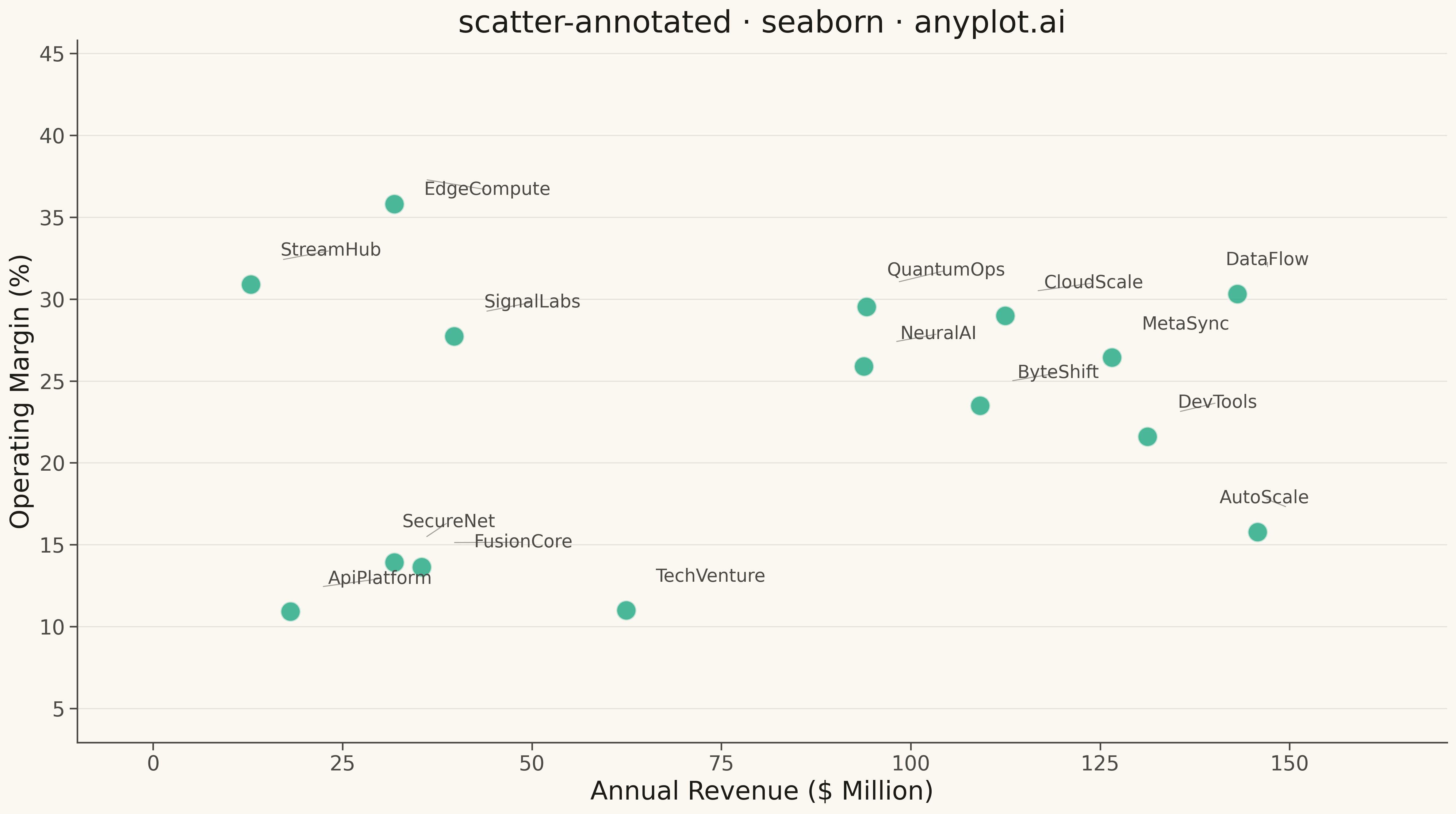
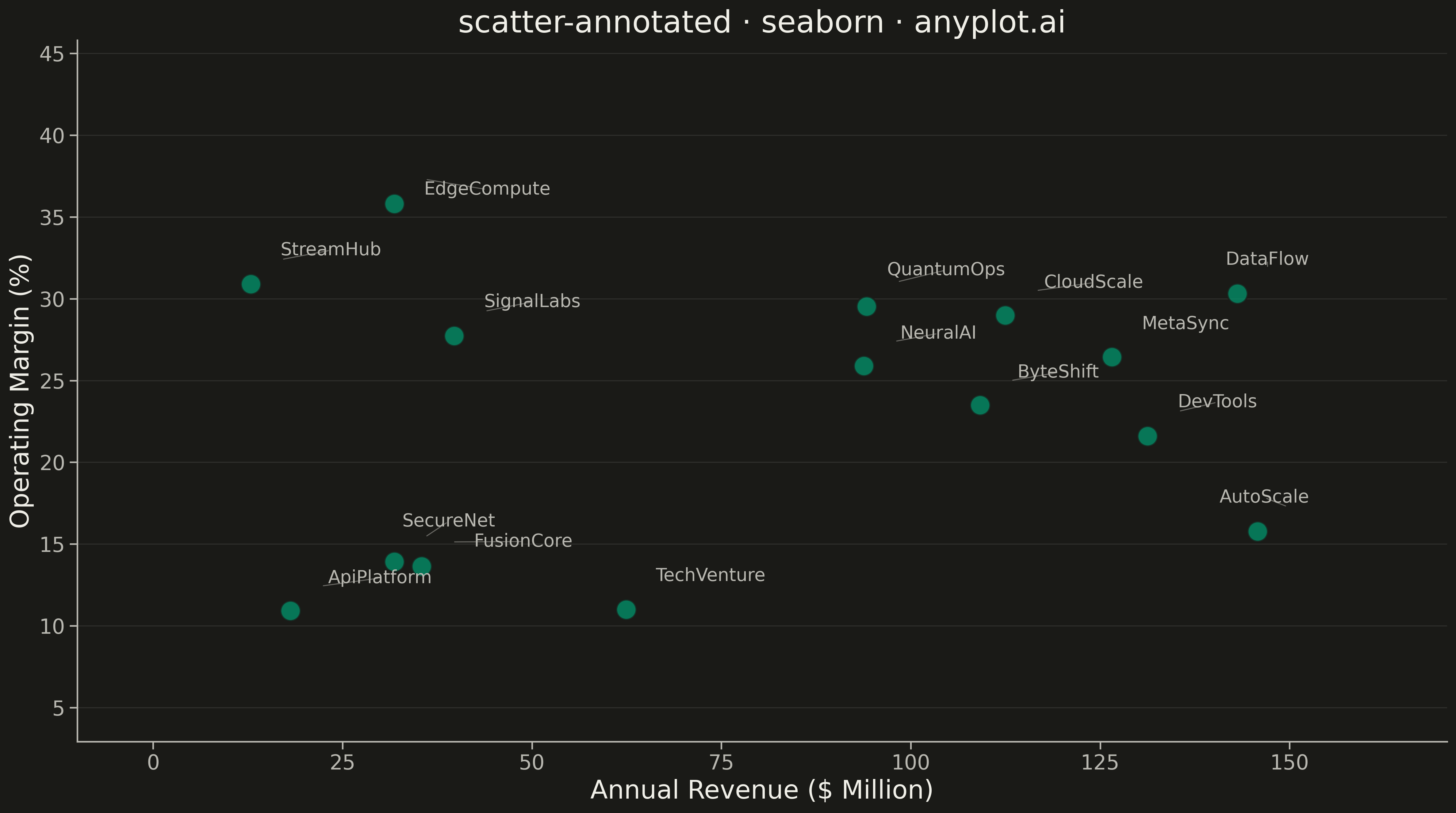
A scatter plot where each data point can have a text label annotation, useful for identifying specific points of interest. This visualization enhances basic scatter plots by adding contextual information directly on the chart, making it easy to highlight outliers, named entities, or key data points that deserve special attention.
""" anyplot.ai
scatter-annotated: Annotated Scatter Plot with Text Labels
Library: seaborn 0.13.2 | Python 3.13.13
Quality: 90/100 | Updated: 2026-05-13
"""

import os

import matplotlib.pyplot as plt
import numpy as np
import pandas as pd
import seaborn as sns
from adjustText import adjust_text


# Theme tokens
THEME = os.getenv("ANYPLOT_THEME", "light")
PAGE_BG = "#FAF8F1" if THEME == "light" else "#1A1A17"
ELEVATED_BG = "#FFFDF6" if THEME == "light" else "#242420"
INK = "#1A1A17" if THEME == "light" else "#F0EFE8"
INK_SOFT = "#4A4A44" if THEME == "light" else "#B8B7B0"
BRAND = "#009E73"  # Okabe-Ito position 1 — ALWAYS first series

# Set seaborn theme with adaptive colors
sns.set_theme(
    style="ticks",
    rc={
        "figure.facecolor": PAGE_BG,
        "axes.facecolor": PAGE_BG,
        "axes.edgecolor": INK_SOFT,
        "axes.labelcolor": INK,
        "text.color": INK,
        "xtick.color": INK_SOFT,
        "ytick.color": INK_SOFT,
        "grid.color": INK,
        "grid.alpha": 0.10,
        "legend.facecolor": ELEVATED_BG,
        "legend.edgecolor": INK_SOFT,
    },
)

# Data: Startup companies with revenue vs operating margin
np.random.seed(42)
startups = [
    "TechVenture",
    "DataFlow",
    "CloudScale",
    "NeuralAI",
    "SecureNet",
    "EdgeCompute",
    "ApiPlatform",
    "DevTools",
    "QuantumOps",
    "ByteShift",
    "StreamHub",
    "AutoScale",
    "MetaSync",
    "SignalLabs",
    "FusionCore",
]
n_points = len(startups)

# Revenue (millions) and Operating Margin (%)
revenue = np.random.uniform(10, 150, n_points)
operating_margin = np.random.uniform(5, 35, n_points) + 0.1 * revenue + np.random.randn(n_points) * 5
operating_margin = np.clip(operating_margin, -20, 45)

# Create DataFrame
df = pd.DataFrame({"company": startups, "revenue": revenue, "operating_margin": operating_margin})

# Create figure and plot
fig, ax = plt.subplots(figsize=(16, 9), facecolor=PAGE_BG)

# Scatter plot with Okabe-Ito brand color
sns.scatterplot(
    data=df, x="revenue", y="operating_margin", s=250, alpha=0.7, color=BRAND, edgecolor=PAGE_BG, linewidth=1.5, ax=ax
)

# Create text annotations with initial offset (collect for adjustText)
texts = []
for _, row in df.iterrows():
    offset_x = 4.0
    offset_y = 1.5
    text = ax.text(
        row["revenue"] + offset_x,
        row["operating_margin"] + offset_y,
        row["company"],
        fontsize=14,
        color=INK_SOFT,
        ha="left",
        va="bottom",
    )
    texts.append(text)

# Use adjustText to prevent label overlaps with connecting lines
adjust_text(
    texts,
    x=df["revenue"].values,
    y=df["operating_margin"].values,
    arrowprops={"arrowstyle": "-", "color": INK_SOFT, "alpha": 0.5, "lw": 0.8},
    expand=(1.3, 1.3),
    force_text=(0.3, 0.3),
    force_points=(0.3, 0.3),
    ax=ax,
)

# Labels and styling
ax.set_xlabel("Annual Revenue ($ Million)", fontsize=20, color=INK)
ax.set_ylabel("Operating Margin (%)", fontsize=20, color=INK)
ax.set_title("scatter-annotated · seaborn · anyplot.ai", fontsize=24, color=INK)
ax.tick_params(axis="both", labelsize=16, colors=INK_SOFT)

# Remove top and right spines
ax.spines["top"].set_visible(False)
ax.spines["right"].set_visible(False)
ax.spines["left"].set_color(INK_SOFT)
ax.spines["bottom"].set_color(INK_SOFT)

# Grid on y-axis only
ax.yaxis.grid(True, alpha=0.1, linewidth=0.8, linestyle="-")
ax.xaxis.grid(False)

# Adjust axis limits to accommodate labels
ax.set_xlim(-10, max(revenue) + 25)
ax.set_ylim(min(operating_margin) - 8, max(operating_margin) + 10)

plt.tight_layout()
plt.savefig(f"plot-{THEME}.png", dpi=300, bbox_inches="tight", facecolor=PAGE_BG)
Runnable source as JSON, for any HTTP client: https://api.anyplot.ai/specs/scatter-annotated/seaborn/code. Any spec id and library id listed in llms-full.txt fit the same URL shape; every URL below is complete and callable.
{
  "spec_id": "scatter-annotated",
  "language": "python",
  "library": "seaborn",
  "page": "https://anyplot.ai/scatter-annotated/python/seaborn",
  "hub": "https://anyplot.ai/scatter-annotated",
  "code_json": "https://api.anyplot.ai/specs/scatter-annotated/seaborn/code",
  "spec_json": "https://api.anyplot.ai/specs/scatter-annotated",
  "render_light_png": "https://storage.googleapis.com/anyplot-images/plots/scatter-annotated/python/seaborn/plot-light.png",
  "render_dark_png": "https://storage.googleapis.com/anyplot-images/plots/scatter-annotated/python/seaborn/plot-dark.png",
  "quality_score": 90.0,
  "license": "MIT",
  "guide": "https://anyplot.ai/llms.txt"
}
Part of Annotated Scatter Plot with Text Labels on anyplot.ai.