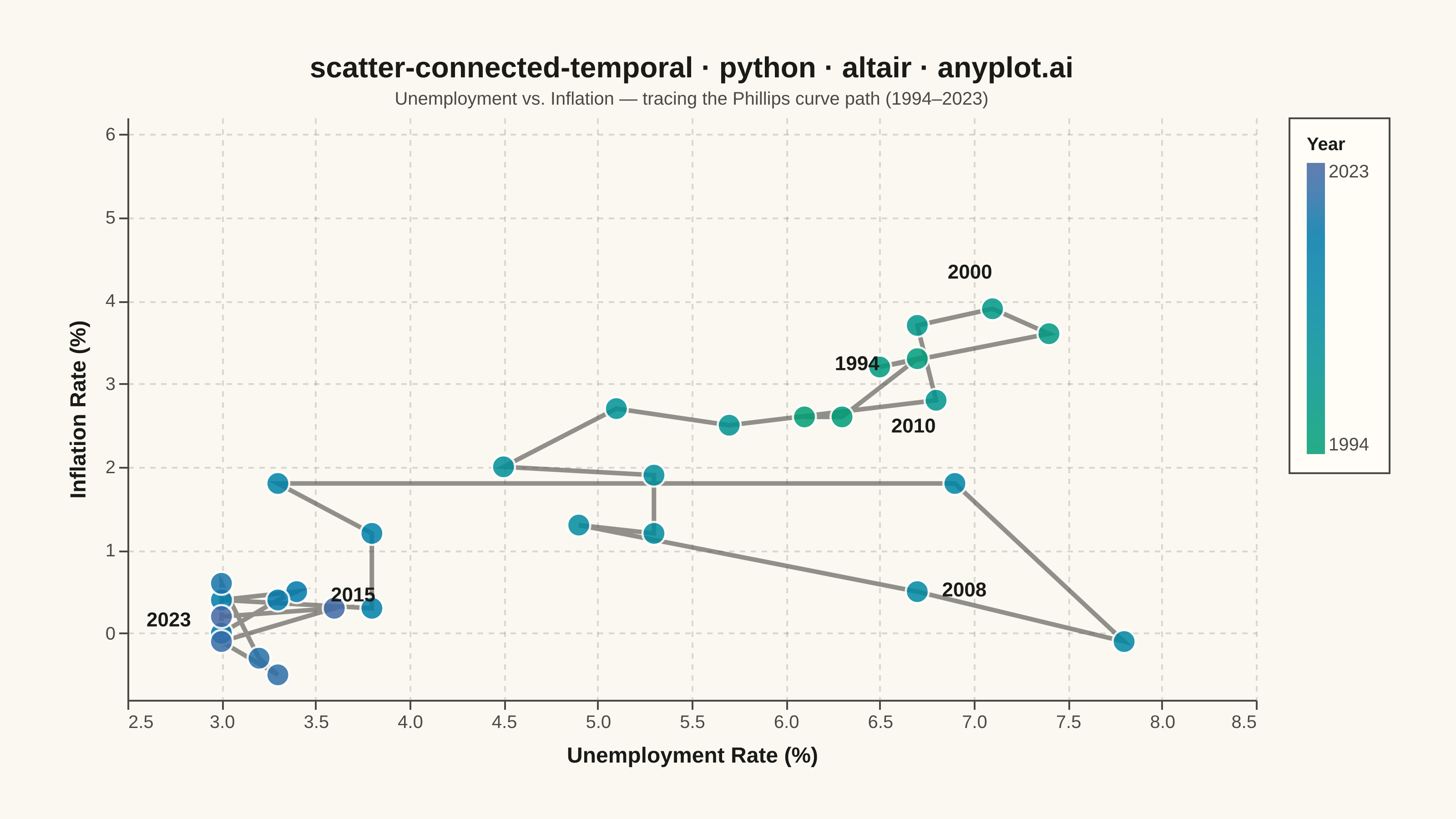
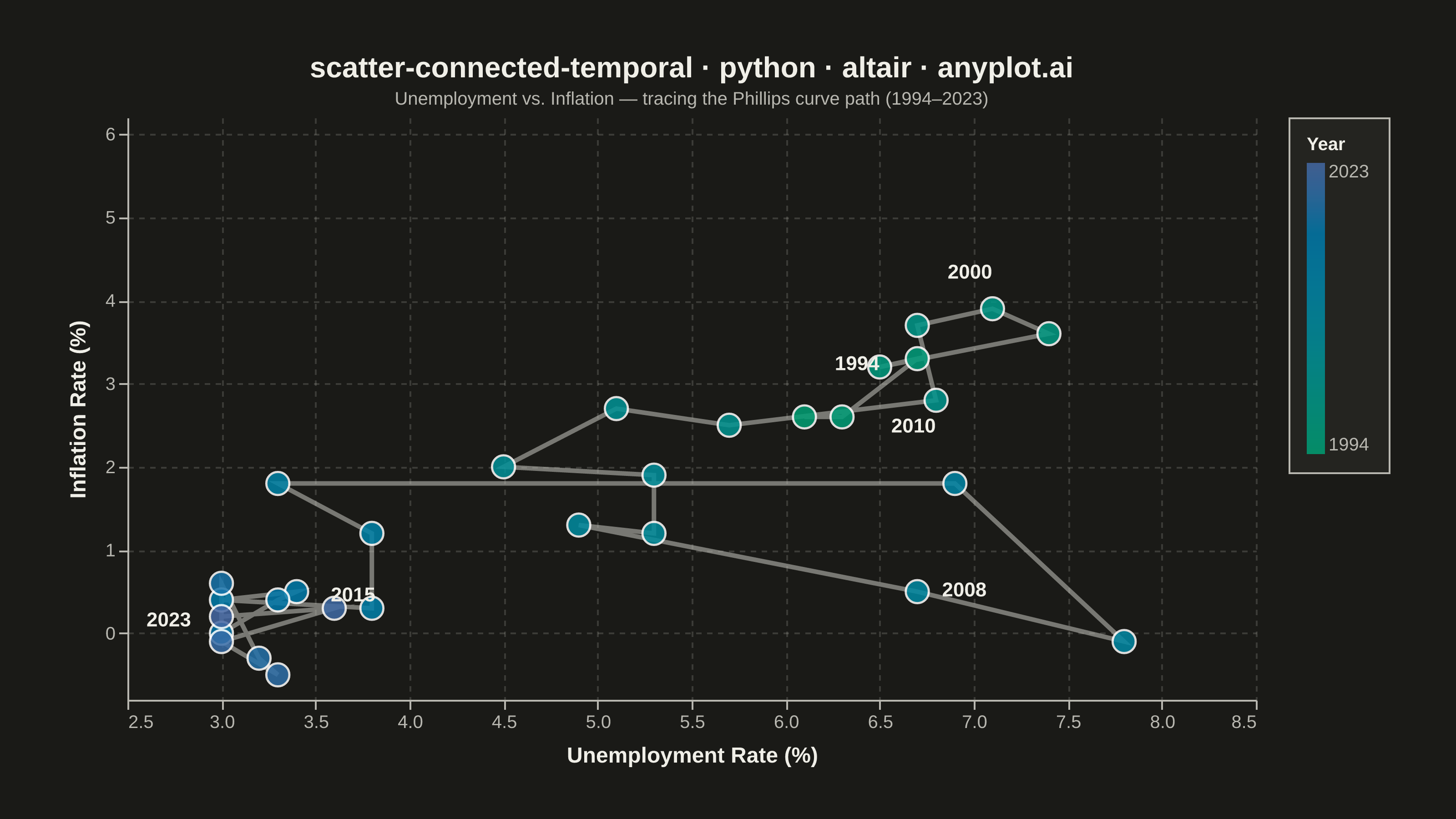
A scatter plot where data points are connected by lines in temporal order, revealing how two variables co-evolve over time. Unlike standard time series plots that show one variable against time, this plot encodes time as movement through 2D space, making cyclical patterns, regime changes, and directional trends visible. Popularized by the New York Times, it is a powerful tool for narrative data visualization.
""" anyplot.ai
scatter-connected-temporal: Connected Scatter Plot with Temporal Path
Library: altair 6.2.1 | Python 3.13.13
Quality: 89/100 | Updated: 2026-06-09
"""

import importlib
import os
import sys


# This file is named altair.py — remove the script directory from sys.path so
# importlib.import_module('altair') resolves the installed package, not this file.
_path0 = sys.path.pop(0)
alt = importlib.import_module("altair")
sys.path.insert(0, _path0)
import numpy as np
import pandas as pd
from PIL import Image


# --- Theme tokens — Imprint palette ---
THEME = os.getenv("ANYPLOT_THEME", "light")
PAGE_BG = "#FAF8F1" if THEME == "light" else "#1A1A17"
ELEVATED_BG = "#FFFDF6" if THEME == "light" else "#242420"
INK = "#1A1A17" if THEME == "light" else "#F0EFE8"
INK_SOFT = "#4A4A44" if THEME == "light" else "#B8B7B0"

# --- Data — US-style unemployment vs inflation (Phillips curve, 1994–2023) ---
np.random.seed(42)
years = np.arange(1994, 2024)
n = len(years)

unemployment = np.zeros(n)
inflation = np.zeros(n)
unemployment[0] = 6.1
inflation[0] = 2.6

for i in range(1, n):
    unemployment[i] = unemployment[i - 1] + np.random.normal(-0.05, 0.6)
    inflation[i] = inflation[i - 1] + np.random.normal(0.02, 0.5)
    unemployment[i] = np.clip(unemployment[i], 3.0, 10.5)
    inflation[i] = np.clip(inflation[i], -0.5, 6.0)

# Recession spike around 2008–2010
unemployment[14:17] += np.array([2.5, 4.0, 3.5])
inflation[14:17] -= np.array([1.0, 1.5, 0.5])
unemployment = np.clip(unemployment, 3.0, 10.5)
inflation = np.clip(inflation, -0.5, 6.0)

df = pd.DataFrame(
    {"year": years, "unemployment": np.round(unemployment, 1), "inflation": np.round(inflation, 1), "order": range(n)}
)

# Key year annotations with nudged positions to avoid crowding
label_years = [1994, 2000, 2008, 2010, 2015, 2023]
df_labels = df[df["year"].isin(label_years)].copy()
nudge = {
    1994: (0.28, 0.30),
    2000: (0.28, 0.30),
    2008: (0.25, -0.32),
    2010: (-0.22, 0.35),
    2015: (0.30, -0.38),
    2023: (-0.28, -0.38),
}
df_labels["label_x"] = df_labels.apply(lambda r: r["unemployment"] + nudge.get(r["year"], (0, 0))[0], axis=1)
df_labels["label_y"] = df_labels.apply(lambda r: r["inflation"] + nudge.get(r["year"], (0, 0))[1], axis=1)

# --- Encodings ---
x_scale = alt.Scale(domain=[2.5, 8.5], nice=False)
# Tightened lower bound — previous [-1.5, 5.8] wasted space below data
y_scale = alt.Scale(domain=[-0.8, 6.2], nice=False)

x_enc = alt.X("unemployment:Q", title="Unemployment Rate (%)", scale=x_scale)
y_enc = alt.Y("inflation:Q", title="Inflation Rate (%)", scale=y_scale)

# Imprint sequential colormap for temporal progression: brand-green (1994) → blue (2023)
imprint_seq_scale = alt.Scale(range=["#009E73", "#4467A3"], domain=[1994, 2023])
year_legend = alt.Legend(
    title="Year", titleFontSize=10, labelFontSize=10, format="d", gradientLength=160, gradientThickness=10
)

# --- Chart layers ---
# Connecting path in temporal order — increased opacity (0.60) for legible trajectory
path = alt.Chart(df).mark_line(strokeWidth=2.5, opacity=0.60, color=INK_SOFT).encode(x=x_enc, y=y_enc, order="order:Q")

# Points colored by temporal progression using Imprint sequential cmap
points = (
    alt.Chart(df)
    .mark_point(filled=True, size=160, opacity=0.85, stroke="white", strokeWidth=1.2)
    .encode(
        x=x_enc,
        y=y_enc,
        color=alt.Color("year:Q", scale=imprint_seq_scale, legend=year_legend),
        tooltip=[
            alt.Tooltip("year:Q", title="Year", format="d"),
            alt.Tooltip("unemployment:Q", title="Unemployment (%)", format=".1f"),
            alt.Tooltip("inflation:Q", title="Inflation (%)", format=".1f"),
        ],
    )
)

# Year annotations for key time points
annotations = (
    alt.Chart(df_labels)
    .mark_text(fontSize=11, fontWeight="bold", color=INK, dy=-15)
    .encode(x=alt.X("label_x:Q"), y=alt.Y("label_y:Q"), text=alt.Text("year:Q", format="d"))
)

# --- Compose + configure ---
# Canvas: 620×320 inner view (landscape) → target PNG 3200×1800 after scale_factor=4
chart = (
    (path + points + annotations)
    .properties(
        width=620,
        height=320,
        background=PAGE_BG,
        title=alt.Title(
            "scatter-connected-temporal · python · altair · anyplot.ai",
            fontSize=16,
            color=INK,
            subtitle="Unemployment vs. Inflation — tracing the Phillips curve path (1994–2023)",
            subtitleFontSize=10,
            subtitleColor=INK_SOFT,
            subtitlePadding=4,
        ),
    )
    .configure_view(fill=PAGE_BG, strokeWidth=0, continuousWidth=620, continuousHeight=320)
    .configure_axis(
        labelFontSize=10,
        labelColor=INK_SOFT,
        titleFontSize=12,
        titleColor=INK,
        titlePadding=8,
        domainColor=INK_SOFT,
        tickColor=INK_SOFT,
        grid=True,
        gridOpacity=0.15,
        gridColor=INK,
        gridDash=[3, 3],
    )
    .configure_title(color=INK)
    .configure_legend(
        orient="right",
        padding=10,
        fillColor=ELEVATED_BG,
        strokeColor=INK_SOFT,
        labelColor=INK_SOFT,
        titleColor=INK,
        labelFontSize=10,
        titleFontSize=10,
    )
    .interactive()
)

# --- Save ---
TW, TH = 3200, 1800
chart.save(f"plot-{THEME}.png", scale_factor=4.0)

# PAD-only to exact 3200×1800 — do NOT crop (cropping clips labels, triggers AR-09)
_img = Image.open(f"plot-{THEME}.png").convert("RGB")
_w, _h = _img.size
if _w > TW or _h > TH:
    raise SystemExit(
        f"altair vl-convert produced {_w}×{_h}, exceeds target {TW}×{TH}. "
        f"Shrink chart .properties(width=, height=) values and re-render."
    )
if _w < TW or _h < TH:
    _canvas = Image.new("RGB", (TW, TH), PAGE_BG)
    _canvas.paste(_img, ((TW - _w) // 2, (TH - _h) // 2))
    _canvas.save(f"plot-{THEME}.png")

# Interactive HTML — untouched by padding
chart.save(f"plot-{THEME}.html")
Runnable source as JSON, for any HTTP client: https://api.anyplot.ai/specs/scatter-connected-temporal/altair/code. Any spec id and library id listed in llms-full.txt fit the same URL shape; every URL below is complete and callable.
{
  "spec_id": "scatter-connected-temporal",
  "language": "python",
  "library": "altair",
  "page": "https://anyplot.ai/scatter-connected-temporal/python/altair",
  "hub": "https://anyplot.ai/scatter-connected-temporal",
  "code_json": "https://api.anyplot.ai/specs/scatter-connected-temporal/altair/code",
  "spec_json": "https://api.anyplot.ai/specs/scatter-connected-temporal",
  "render_light_png": "https://storage.googleapis.com/anyplot-images/plots/scatter-connected-temporal/python/altair/plot-light.png",
  "render_dark_png": "https://storage.googleapis.com/anyplot-images/plots/scatter-connected-temporal/python/altair/plot-dark.png",
  "interactive_light_html": "https://storage.googleapis.com/anyplot-images/plots/scatter-connected-temporal/python/altair/plot-light.html",
  "interactive_dark_html": "https://storage.googleapis.com/anyplot-images/plots/scatter-connected-temporal/python/altair/plot-dark.html",
  "quality_score": 89.0,
  "license": "MIT",
  "guide": "https://anyplot.ai/llms.txt"
}
Part of Connected Scatter Plot with Temporal Path on anyplot.ai.