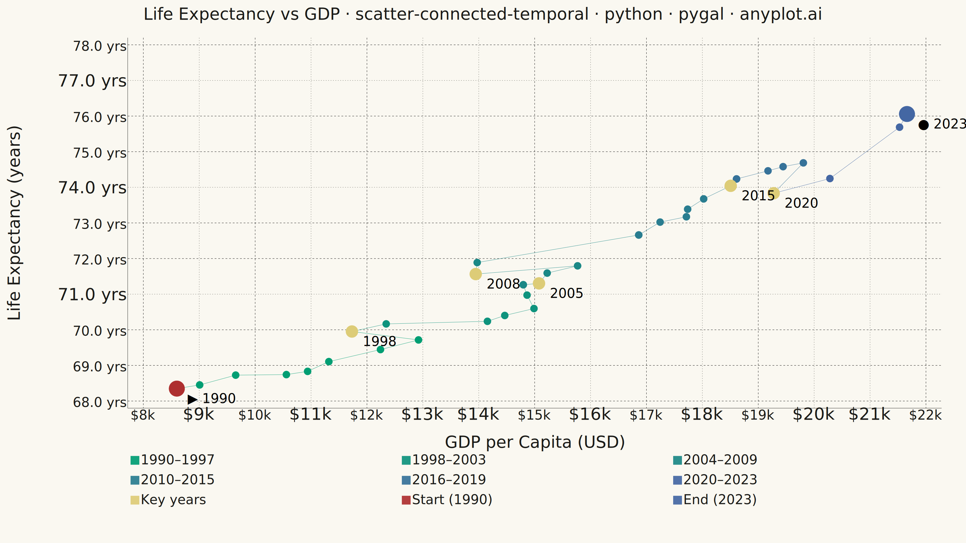
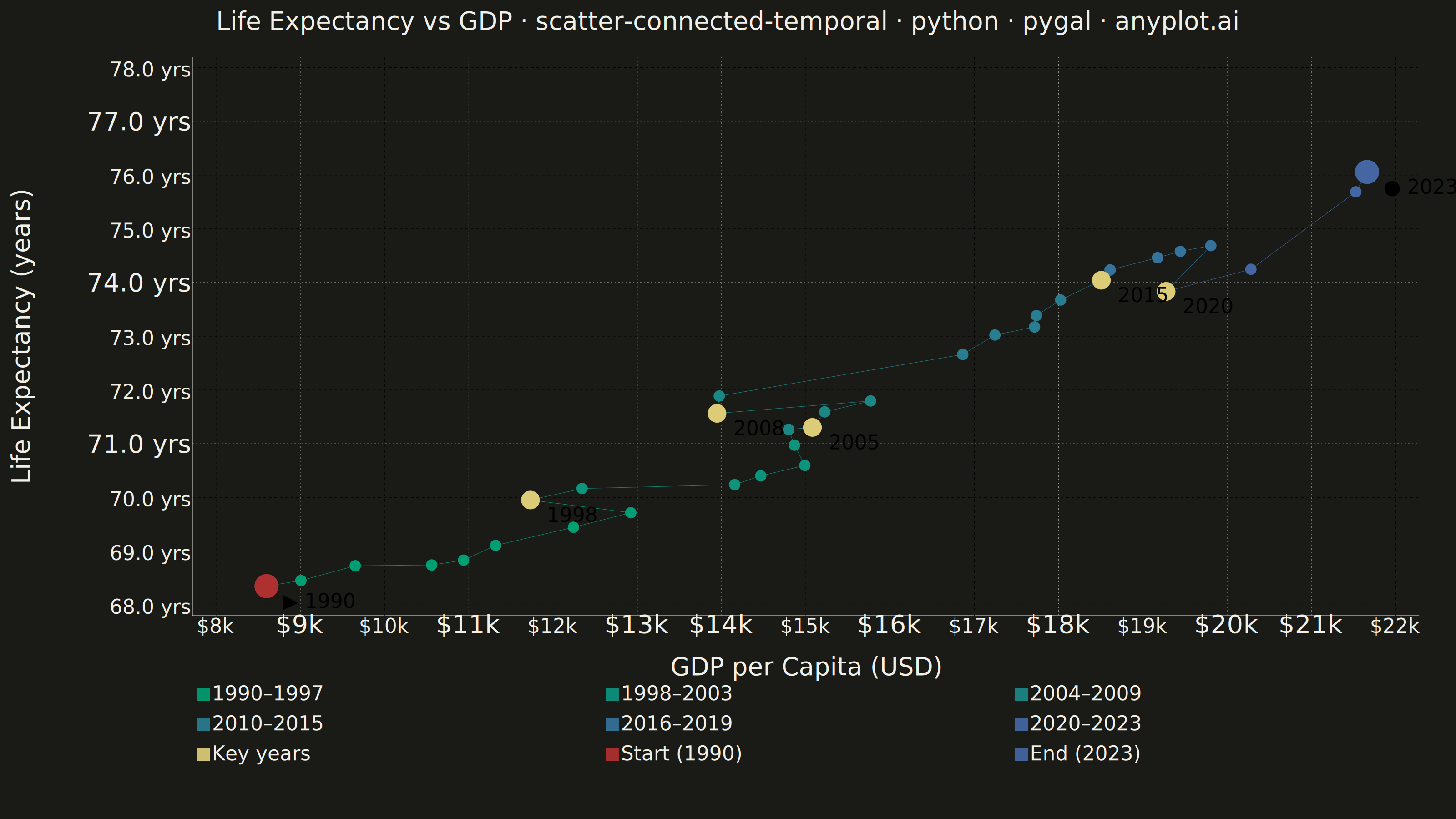
A scatter plot where data points are connected by lines in temporal order, revealing how two variables co-evolve over time. Unlike standard time series plots that show one variable against time, this plot encodes time as movement through 2D space, making cyclical patterns, regime changes, and directional trends visible. Popularized by the New York Times, it is a powerful tool for narrative data visualization.
""" anyplot.ai
scatter-connected-temporal: Connected Scatter Plot with Temporal Path
Library: pygal 3.1.0 | Python 3.13.13
Quality: 84/100 | Updated: 2026-06-09
"""

import os
import re
import sys


# Remove script's own directory from sys.path so the real pygal package is found first
_here = os.path.dirname(os.path.abspath(__file__))
if _here in sys.path:
    sys.path.remove(_here)

import cairosvg
import numpy as np
import pygal
from pygal.style import Style


# Theme tokens
THEME = os.getenv("ANYPLOT_THEME", "light")
PAGE_BG = "#FAF8F1" if THEME == "light" else "#1A1A17"
INK = "#1A1A17" if THEME == "light" else "#F0EFE8"
INK_MUTED = "#6B6A63" if THEME == "light" else "#A8A79F"

# Imprint palette — amber semantic anchor for key events
ANYPLOT_AMBER = "#DDCC77"

# Data — Life expectancy vs GDP per capita for a developing country (1990–2023)
np.random.seed(42)
years = list(range(1990, 2024))
n_years = len(years)

gdp_base = 8000
gdp_growth = np.cumsum(np.random.normal(450, 300, n_years))
gdp_growth[8:10] -= 1500  # 1998–1999 recession
gdp_growth[18:20] -= 2000  # 2008–2009 financial crisis
gdp_growth[30:32] -= 800  # 2020–2021 pandemic
gdp_per_capita = gdp_base + gdp_growth
gdp_per_capita = np.maximum(gdp_per_capita, 5000)

le_base = 68.0
le_growth = np.cumsum(np.random.normal(0.25, 0.12, n_years))
le_growth[18:20] -= 0.4
le_growth[30:32] -= 1.2
life_expectancy = le_base + le_growth
life_expectancy = np.clip(life_expectancy, 64, 82)

# Imprint imprint_seq gradient (#009E73 → #4467A3) for temporal progression
eras = [
    ("1990–1997", 0, 8, "#009E73"),
    ("1998–2003", 8, 14, "#0E937D"),
    ("2004–2009", 14, 20, "#1B8886"),
    ("2010–2015", 20, 26, "#297D90"),
    ("2016–2019", 26, 30, "#367299"),
    ("2020–2023", 30, 34, "#4467A3"),
]

annotate_years = {1998, 2005, 2008, 2015, 2020}

# Title scaled for 81-char length: round(66 × 67/81) = 55
title = "Life Expectancy vs GDP · scatter-connected-temporal · python · pygal · anyplot.ai"
title_font_size = max(44, round(66 * 67 / len(title)))

font = "DejaVu Sans, Helvetica, Arial, sans-serif"
custom_style = Style(
    background=PAGE_BG,
    plot_background=PAGE_BG,
    foreground=INK,
    foreground_strong=INK,
    foreground_subtle=INK_MUTED,
    guide_stroke_color=INK_MUTED,
    guide_stroke_dasharray="3,5",
    colors=("#009E73", "#0E937D", "#1B8886", "#297D90", "#367299", "#4467A3", ANYPLOT_AMBER, "#AE3030", "#4467A3"),
    font_family=font,
    title_font_family=font,
    title_font_size=title_font_size,
    label_font_size=56,
    major_label_font_size=44,
    legend_font_size=44,
    value_font_size=36,
    value_label_font_size=44,
    tooltip_font_size=36,
    tooltip_font_family=font,
    opacity=0.92,
    opacity_hover=1.0,
    stroke_opacity=0.9,
    stroke_opacity_hover=1.0,
)

x_min = float(np.floor(gdp_per_capita.min() / 1000) * 1000)
x_max = float(np.ceil(gdp_per_capita.max() / 1000) * 1000)
y_min = float(np.floor(life_expectancy.min()))
y_max = float(np.ceil(life_expectancy.max()) + 1)

chart = pygal.XY(
    width=3200,
    height=1800,
    style=custom_style,
    title=title,
    x_title="GDP per Capita (USD)",
    y_title="Life Expectancy (years)",
    show_legend=True,
    legend_at_bottom=True,
    legend_at_bottom_columns=3,
    legend_box_size=28,
    stroke=True,
    dots_size=12,
    show_x_guides=True,
    show_y_guides=True,
    x_value_formatter=lambda x: f"${x / 1000:.0f}k",
    value_formatter=lambda y: f"{y:.1f} yrs",
    print_labels=True,
    print_values=False,
    margin_bottom=130,
    margin_left=80,
    margin_right=80,
    margin_top=60,
    range=(y_min, y_max),
    xrange=(x_min, x_max),
    x_labels_major_count=7,
    y_labels_major_count=8,
    js=[],
    show_x_labels=True,
    show_y_labels=True,
)

# Temporal path as Imprint imprint_seq gradient era segments
for era_name, start, end, color in eras:
    end_idx = min(end + 1, n_years)
    segment_points = [
        {"value": (float(gdp_per_capita[i]), float(life_expectancy[i])), "color": color} for i in range(start, end_idx)
    ]
    chart.add(
        era_name,
        segment_points,
        stroke=True,
        show_dots=True,
        dots_size=12,
        stroke_style={"width": 5, "linecap": "round", "linejoin": "round"},
    )

# Key years highlighted with amber dots and year labels
annotated_points = []
for yr in sorted(annotate_years):
    i = yr - 1990
    annotated_points.append(
        {"value": (float(gdp_per_capita[i]), float(life_expectancy[i])), "label": str(yr), "color": ANYPLOT_AMBER}
    )
chart.add("Key years", annotated_points, stroke=False, dots_size=20)

# Start and end markers
chart.add(
    f"Start ({years[0]})",
    [{"value": (float(gdp_per_capita[0]), float(life_expectancy[0])), "label": "▶ 1990", "color": "#AE3030"}],
    stroke=False,
    dots_size=26,
)
chart.add(
    f"End ({years[-1]})",
    [{"value": (float(gdp_per_capita[-1]), float(life_expectancy[-1])), "label": "● 2023", "color": "#4467A3"}],
    stroke=False,
    dots_size=26,
)

# Patch label text colors for dark-theme legibility before PNG conversion
# pygal's print_labels text color does not adapt to the dark background via the foreground Style token
_label_texts = {str(yr) for yr in sorted(annotate_years)} | {"▶ 1990", "● 2023"}


def _patch_label_colors(svg_str, labels, fill_color):
    def _fix(m):
        tag_attrs, content = m.group(1), m.group(2)
        if not any(lbl in content for lbl in labels):
            return m.group(0)
        if "fill=" in tag_attrs:
            tag_attrs = re.sub(r'\bfill="[^"]*"', f'fill="{fill_color}"', tag_attrs)
        else:
            tag_attrs += f' fill="{fill_color}"'
        return f"<text{tag_attrs}>{content}</text>"

    return re.sub(r"<text([^>]*)>(.*?)</text>", _fix, svg_str, flags=re.DOTALL)


svg_data = chart.render()
svg_str = _patch_label_colors(svg_data.decode("utf-8"), _label_texts, INK)
cairosvg.svg2png(bytestring=svg_str.encode("utf-8"), write_to=f"plot-{THEME}.png")
chart.render_to_file(f"plot-{THEME}.html")
Runnable source as JSON, for any HTTP client: https://api.anyplot.ai/specs/scatter-connected-temporal/pygal/code. Any spec id and library id listed in llms-full.txt fit the same URL shape; every URL below is complete and callable.
{
  "spec_id": "scatter-connected-temporal",
  "language": "python",
  "library": "pygal",
  "page": "https://anyplot.ai/scatter-connected-temporal/python/pygal",
  "hub": "https://anyplot.ai/scatter-connected-temporal",
  "code_json": "https://api.anyplot.ai/specs/scatter-connected-temporal/pygal/code",
  "spec_json": "https://api.anyplot.ai/specs/scatter-connected-temporal",
  "render_light_png": "https://storage.googleapis.com/anyplot-images/plots/scatter-connected-temporal/python/pygal/plot-light.png",
  "render_dark_png": "https://storage.googleapis.com/anyplot-images/plots/scatter-connected-temporal/python/pygal/plot-dark.png",
  "interactive_light_html": "https://storage.googleapis.com/anyplot-images/plots/scatter-connected-temporal/python/pygal/plot-light.html",
  "interactive_dark_html": "https://storage.googleapis.com/anyplot-images/plots/scatter-connected-temporal/python/pygal/plot-dark.html",
  "quality_score": 84.0,
  "license": "MIT",
  "guide": "https://anyplot.ai/llms.txt"
}
Part of Connected Scatter Plot with Temporal Path on anyplot.ai.