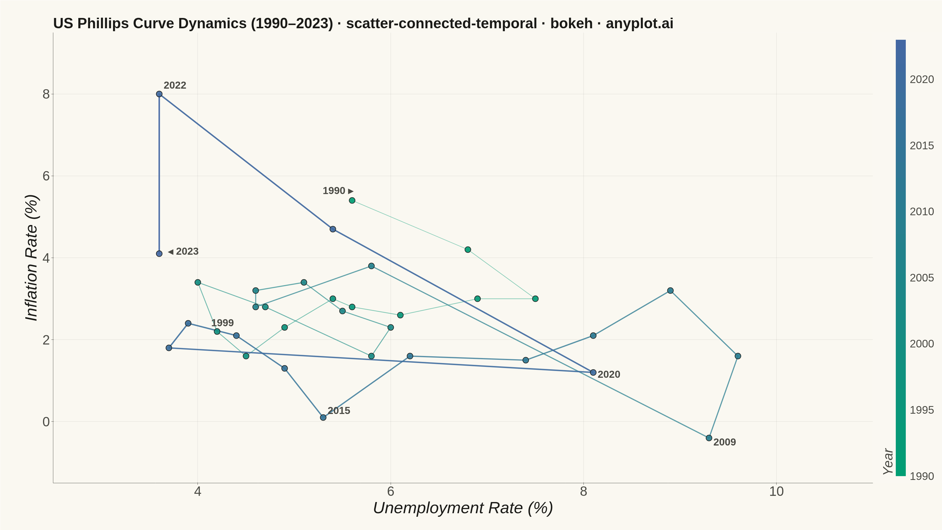
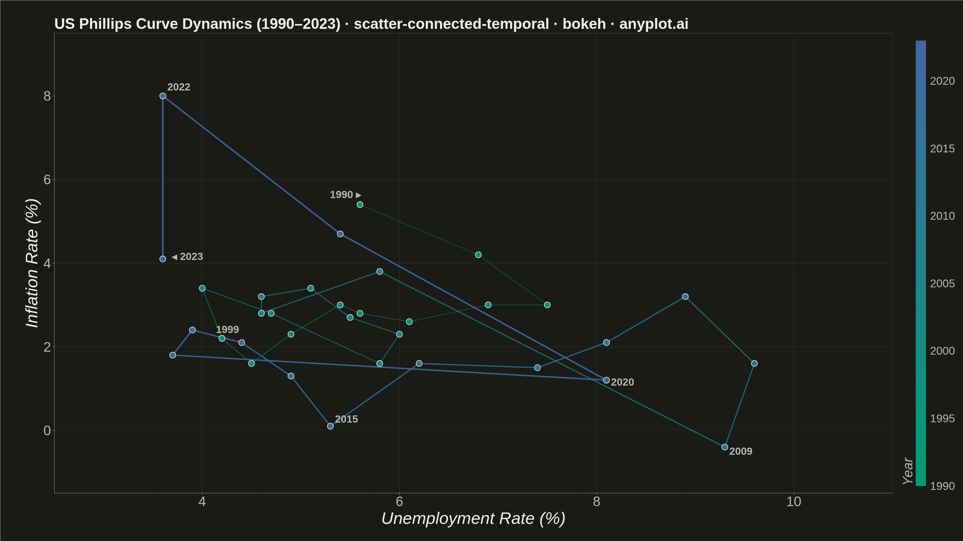
A scatter plot where data points are connected by lines in temporal order, revealing how two variables co-evolve over time. Unlike standard time series plots that show one variable against time, this plot encodes time as movement through 2D space, making cyclical patterns, regime changes, and directional trends visible. Popularized by the New York Times, it is a powerful tool for narrative data visualization.
""" anyplot.ai
scatter-connected-temporal: Connected Scatter Plot with Temporal Path
Library: bokeh 3.9.1 | Python 3.13.13
Quality: 91/100 | Updated: 2026-06-09
"""

import os
import time
from pathlib import Path

import numpy as np
from bokeh.io import output_file, save
from bokeh.models import BasicTicker, ColorBar, ColumnDataSource, Label, LinearColorMapper, NumeralTickFormatter
from bokeh.plotting import figure
from bokeh.transform import transform
from selenium import webdriver
from selenium.webdriver.chrome.options import Options


THEME = os.getenv("ANYPLOT_THEME", "light")
PAGE_BG = "#FAF8F1" if THEME == "light" else "#1A1A17"
ELEVATED_BG = "#FFFDF6" if THEME == "light" else "#242420"
INK = "#1A1A17" if THEME == "light" else "#F0EFE8"
INK_SOFT = "#4A4A44" if THEME == "light" else "#B8B7B0"
INK_MUTED = "#6B6A63" if THEME == "light" else "#A8A79F"


def _lerp_hex(c0, c1, t):
    r0, g0, b0 = (int(c0[i : i + 2], 16) for i in (1, 3, 5))
    r1, g1, b1 = (int(c1[i : i + 2], 16) for i in (1, 3, 5))
    r, g, b = (int(round(a + (b - a) * t)) for a, b in ((r0, r1), (g0, g1), (b0, b1)))
    return f"#{r:02X}{g:02X}{b:02X}"


# Imprint sequential palette: brand green (#009E73) → blue (#4467A3)
ANYPLOT_SEQ256 = [_lerp_hex("#009E73", "#4467A3", t / 255.0) for t in range(256)]

# Data — US unemployment rate vs inflation rate (1990–2023)
years = np.arange(1990, 2024)
n = len(years)

unemployment = np.array(
    [
        5.6,
        6.8,
        7.5,
        6.9,
        6.1,
        5.6,
        5.4,
        4.9,
        4.5,
        4.2,  # 1990s recovery
        4.0,
        4.7,
        5.8,
        6.0,
        5.5,
        5.1,
        4.6,
        4.6,
        5.8,
        9.3,  # 2000s + GFC
        9.6,
        8.9,
        8.1,
        7.4,
        6.2,
        5.3,
        4.9,
        4.4,
        3.9,
        3.7,  # 2010s recovery
        8.1,
        5.4,
        3.6,
        3.6,  # COVID + recovery
    ]
)

inflation = np.array(
    [
        5.4,
        4.2,
        3.0,
        3.0,
        2.6,
        2.8,
        3.0,
        2.3,
        1.6,
        2.2,  # 1990s
        3.4,
        2.8,
        1.6,
        2.3,
        2.7,
        3.4,
        3.2,
        2.8,
        3.8,
        -0.4,  # 2000s
        1.6,
        3.2,
        2.1,
        1.5,
        1.6,
        0.1,
        1.3,
        2.1,
        2.4,
        1.8,  # 2010s
        1.2,
        4.7,
        8.0,
        4.1,  # 2020s
    ]
)

source = ColumnDataSource(data={"unemployment": unemployment, "inflation": inflation, "year_val": years.astype(float)})

# Color mapper from Imprint seq palette so ColorBar shows year → color
color_mapper = LinearColorMapper(palette=ANYPLOT_SEQ256, low=1990, high=2023)

# Title is ~90 chars; scale from default 50pt: round(50 * 67 / 90) = 37pt
p = figure(
    width=3200,
    height=1800,
    title="US Phillips Curve Dynamics (1990–2023) · scatter-connected-temporal · bokeh · anyplot.ai",
    x_axis_label="Unemployment Rate (%)",
    y_axis_label="Inflation Rate (%)",
    toolbar_location=None,
    x_range=(2.5, 11.0),
    y_range=(-1.5, 9.5),
    min_border_bottom=160,
    min_border_left=180,
    min_border_top=110,
    min_border_right=80,
)

# Connecting lines — per-segment color from Imprint seq, increasing opacity over time
xs = [[unemployment[i], unemployment[i + 1]] for i in range(n - 1)]
ys = [[inflation[i], inflation[i + 1]] for i in range(n - 1)]
line_colors = [ANYPLOT_SEQ256[int((i / (n - 2)) * 255)] for i in range(n - 1)]
# Older segments thinner + more transparent to reduce congestion in the central cluster
line_widths = [2.0 + 3.0 * (i / (n - 2)) for i in range(n - 1)]
line_alphas = [0.45 + 0.5 * (i / (n - 2)) for i in range(n - 1)]

line_source = ColumnDataSource(
    data={"xs": xs, "ys": ys, "colors": line_colors, "widths": line_widths, "alphas": line_alphas}
)
p.multi_line(xs="xs", ys="ys", source=line_source, line_width="widths", line_color="colors", line_alpha="alphas")

# Scatter points with Imprint temporal color gradient
p.scatter(
    x="unemployment",
    y="inflation",
    source=source,
    size=20,
    color=transform("year_val", color_mapper),
    alpha=0.92,
    line_color=INK,
    line_width=2,
)

# ColorBar for year → Imprint color mapping
color_bar = ColorBar(
    color_mapper=color_mapper,
    location=(0, 0),
    title="Year",
    title_text_font_size="34pt",
    title_text_color=INK_SOFT,
    major_label_text_font_size="28pt",
    major_label_text_color=INK_SOFT,
    label_standoff=14,
    width=34,
    padding=24,
    formatter=NumeralTickFormatter(format="0"),
    major_tick_line_color=None,
    bar_line_color=None,
    ticker=BasicTicker(desired_num_ticks=5),
    background_fill_color=PAGE_BG,
)
p.add_layout(color_bar, "right")

# Annotate key economic events
annotations = {
    0: ("1990 ▸", -100, 15),
    9: ("1999", -20, 18),
    19: ("2009", 15, -25),
    25: ("2015", 15, 12),
    30: ("2020", 15, -18),
    32: ("2022", 15, 18),
    33: ("◂ 2023", 30, -10),
}

for idx, (label_text, x_offset, y_offset) in annotations.items():
    label = Label(
        x=unemployment[idx],
        y=inflation[idx],
        text=label_text,
        text_font_size="26pt",
        text_color=INK_SOFT,
        text_font_style="bold",
        x_offset=x_offset,
        y_offset=y_offset,
    )
    p.add_layout(label)

# Title styling — scaled down for ~90-char title
p.title.text_font_size = "37pt"
p.title.text_color = INK

# Axis styling
p.xaxis.axis_label_text_font_size = "42pt"
p.yaxis.axis_label_text_font_size = "42pt"
p.xaxis.major_label_text_font_size = "34pt"
p.yaxis.major_label_text_font_size = "34pt"
p.xaxis.axis_label_text_color = INK
p.yaxis.axis_label_text_color = INK
p.xaxis.major_label_text_color = INK_SOFT
p.yaxis.major_label_text_color = INK_SOFT

# Axis lines and ticks — use INK_SOFT for subtle structural chrome
p.xaxis.axis_line_color = INK_SOFT
p.yaxis.axis_line_color = INK_SOFT
p.xaxis.major_tick_line_color = INK_SOFT
p.yaxis.major_tick_line_color = INK_SOFT
p.xaxis.minor_tick_line_color = None
p.yaxis.minor_tick_line_color = None

# Grid — subtle, both axes suit a scatter plot
p.xgrid.grid_line_color = INK
p.ygrid.grid_line_color = INK
p.xgrid.grid_line_alpha = 0.12
p.ygrid.grid_line_alpha = 0.12

# Background
p.background_fill_color = PAGE_BG
p.border_fill_color = PAGE_BG
p.outline_line_color = None

# Save interactive HTML (catalog artifact)
output_file(f"plot-{THEME}.html")
save(p)

# Screenshot with headless Chrome — use CDP to force exact viewport dimensions
# set_window_size alone leaves a ~139px gap between outer and inner height
W, H = 3200, 1800
opts = Options()
for arg in (
    "--headless=new",
    "--no-sandbox",
    "--disable-dev-shm-usage",
    "--disable-gpu",
    "--hide-scrollbars",
    "--force-device-scale-factor=1",
):
    opts.add_argument(arg)
driver = webdriver.Chrome(options=opts)
driver.execute_cdp_cmd(
    "Emulation.setDeviceMetricsOverride", {"width": W, "height": H, "deviceScaleFactor": 1, "mobile": False}
)
driver.get(f"file://{Path(f'plot-{THEME}.html').resolve()}")
time.sleep(3)
driver.save_screenshot(f"plot-{THEME}.png")
driver.quit()
Runnable source as JSON, for any HTTP client: https://api.anyplot.ai/specs/scatter-connected-temporal/bokeh/code. Any spec id and library id listed in llms-full.txt fit the same URL shape; every URL below is complete and callable.
{
  "spec_id": "scatter-connected-temporal",
  "language": "python",
  "library": "bokeh",
  "page": "https://anyplot.ai/scatter-connected-temporal/python/bokeh",
  "hub": "https://anyplot.ai/scatter-connected-temporal",
  "code_json": "https://api.anyplot.ai/specs/scatter-connected-temporal/bokeh/code",
  "spec_json": "https://api.anyplot.ai/specs/scatter-connected-temporal",
  "render_light_png": "https://storage.googleapis.com/anyplot-images/plots/scatter-connected-temporal/python/bokeh/plot-light.png",
  "render_dark_png": "https://storage.googleapis.com/anyplot-images/plots/scatter-connected-temporal/python/bokeh/plot-dark.png",
  "interactive_light_html": "https://storage.googleapis.com/anyplot-images/plots/scatter-connected-temporal/python/bokeh/plot-light.html",
  "interactive_dark_html": "https://storage.googleapis.com/anyplot-images/plots/scatter-connected-temporal/python/bokeh/plot-dark.html",
  "quality_score": 91.0,
  "license": "MIT",
  "guide": "https://anyplot.ai/llms.txt"
}
Part of Connected Scatter Plot with Temporal Path on anyplot.ai.