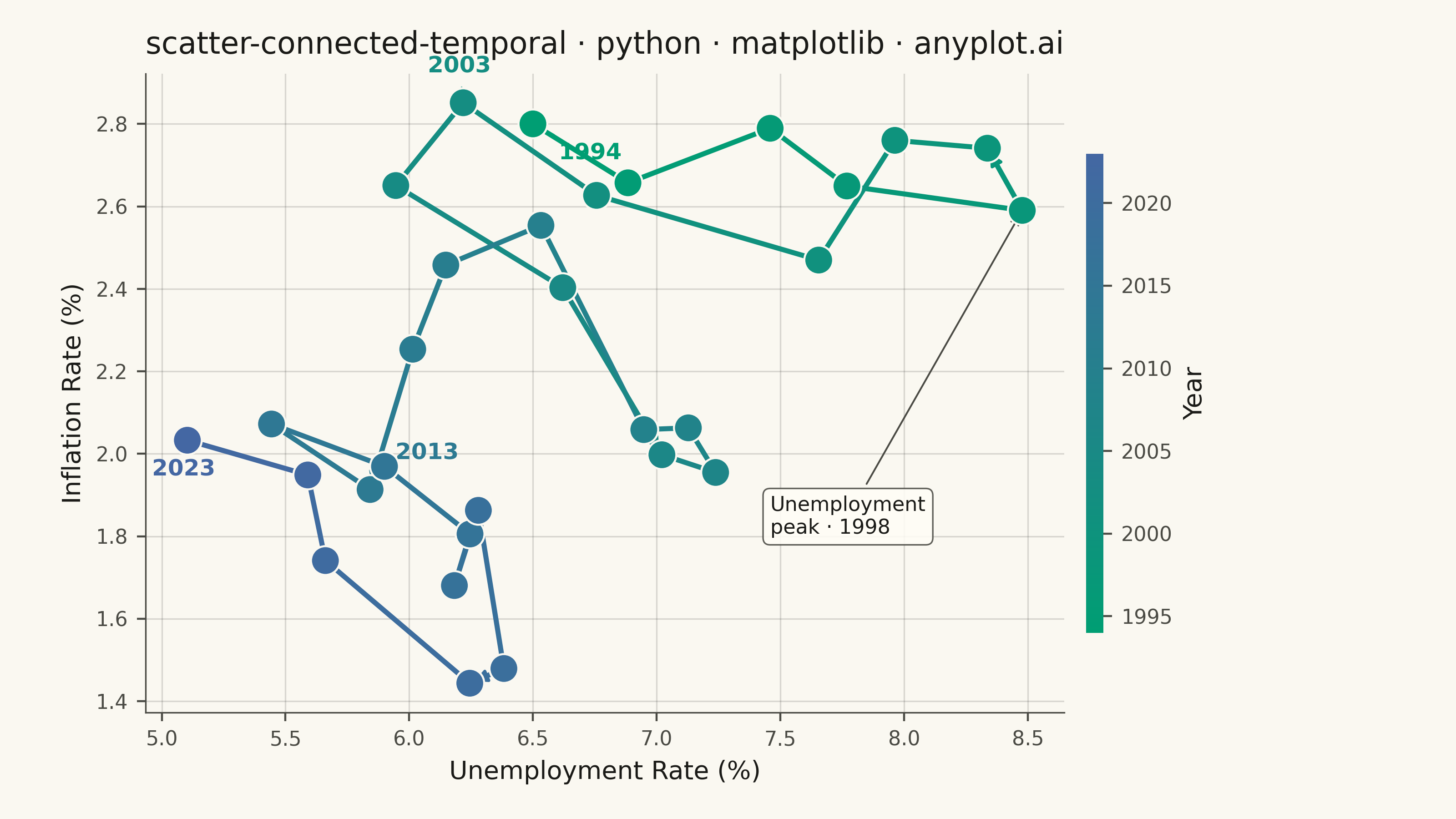
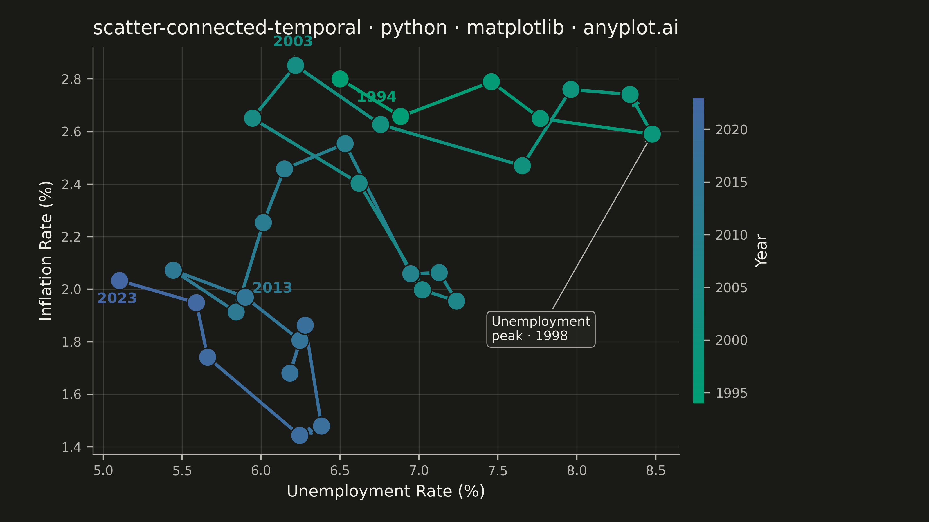
A scatter plot where data points are connected by lines in temporal order, revealing how two variables co-evolve over time. Unlike standard time series plots that show one variable against time, this plot encodes time as movement through 2D space, making cyclical patterns, regime changes, and directional trends visible. Popularized by the New York Times, it is a powerful tool for narrative data visualization.
""" anyplot.ai
scatter-connected-temporal: Connected Scatter Plot with Temporal Path
Library: matplotlib 3.10.9 | Python 3.13.13
Quality: 88/100 | Updated: 2026-06-09
"""

import os

import matplotlib.colors as mcolors
import matplotlib.pyplot as plt
import numpy as np
from matplotlib.patches import FancyArrowPatch


THEME = os.getenv("ANYPLOT_THEME", "light")

# Theme-adaptive chrome tokens
PAGE_BG = "#FAF8F1" if THEME == "light" else "#1A1A17"
ELEVATED_BG = "#FFFDF6" if THEME == "light" else "#242420"
INK = "#1A1A17" if THEME == "light" else "#F0EFE8"
INK_SOFT = "#4A4A44" if THEME == "light" else "#B8B7B0"
INK_MUTED = "#6B6A63" if THEME == "light" else "#A8A79F"

# Data — Phillips curve: unemployment vs inflation over 30 years
np.random.seed(42)
years = np.arange(1994, 2024)
n = len(years)

unemployment = np.zeros(n)
inflation = np.zeros(n)
unemployment[0] = 6.5
inflation[0] = 2.8

for i in range(1, n):
    cycle = np.sin(2 * np.pi * i / 10)
    unemployment[i] = unemployment[i - 1] + cycle * 0.4 + np.random.normal(0, 0.3)
    inflation[i] = inflation[i - 1] - 0.3 * (unemployment[i] - unemployment[i - 1]) + np.random.normal(0, 0.2)

unemployment = np.clip(unemployment, 3.0, 10.0)
inflation = np.clip(inflation, 0.5, 6.0)

# Imprint sequential colormap (brand green → blue) for temporal progression
imprint_seq = mcolors.LinearSegmentedColormap.from_list("imprint_seq", ["#009E73", "#4467A3"])
norm = mcolors.Normalize(vmin=0, vmax=n - 1)

# Canvas: 3200×1800 px (landscape 16:9) — figsize=(8,4.5) × dpi=400
fig, ax = plt.subplots(figsize=(8, 4.5), dpi=400, facecolor=PAGE_BG)
ax.set_facecolor(PAGE_BG)

# Draw path segments with Imprint sequential color gradient
for i in range(n - 1):
    ax.plot(
        unemployment[i : i + 2],
        inflation[i : i + 2],
        color=imprint_seq(norm(i)),
        linewidth=2.0,
        solid_capstyle="round",
        zorder=2,
    )

# Directional arrows at key intervals along the path
arrow_indices = [4, 11, 18, 25]
for idx in arrow_indices:
    arrow = FancyArrowPatch(
        (unemployment[idx], inflation[idx]),
        (unemployment[idx + 1], inflation[idx + 1]),
        arrowstyle="-|>",
        mutation_scale=10,
        color=imprint_seq(norm(idx)),
        linewidth=1.2,
        zorder=3,
    )
    ax.add_patch(arrow)

# Scatter points — edge uses PAGE_BG so markers separate cleanly on both themes
ax.scatter(
    unemployment,
    inflation,
    c=np.arange(n),
    cmap=imprint_seq,
    norm=norm,
    s=130,
    edgecolors=PAGE_BG,
    linewidth=0.8,
    zorder=5,
)

# Annotate key time points
label_indices = [0, 9, 19, n - 1]
offsets = [(10, -14), (-14, 12), (10, 12), (-14, -14)]
for idx, (dx, dy) in zip(label_indices, offsets, strict=True):
    ax.annotate(
        str(years[idx]),
        (unemployment[idx], inflation[idx]),
        textcoords="offset points",
        xytext=(dx, dy),
        fontsize=9,
        fontweight="bold",
        color=imprint_seq(norm(idx)),
        arrowprops={"arrowstyle": "-", "color": imprint_seq(norm(idx)), "alpha": 0.5, "linewidth": 0.6},
    )

# Highlight the unemployment peak — most economically significant inflection point
peak_idx = int(np.argmax(unemployment))
ax.annotate(
    f"Unemployment\npeak · {years[peak_idx]}",
    (unemployment[peak_idx], inflation[peak_idx]),
    xytext=(0.68, 0.28),
    textcoords="axes fraction",
    fontsize=8,
    color=INK,
    bbox={
        "facecolor": ELEVATED_BG,
        "edgecolor": INK_SOFT,
        "alpha": 0.88,
        "boxstyle": "round,pad=0.35",
        "linewidth": 0.6,
    },
    arrowprops={"arrowstyle": "->", "color": INK_SOFT, "linewidth": 0.7},
)

# Colorbar for temporal progression
sm = plt.cm.ScalarMappable(cmap=imprint_seq, norm=mcolors.Normalize(vmin=years[0], vmax=years[-1]))
sm.set_array([])
cbar = fig.colorbar(sm, ax=ax, pad=0.02, aspect=28, shrink=0.75)
cbar.set_label("Year", fontsize=10, color=INK)
cbar.ax.tick_params(labelsize=8, colors=INK_SOFT)
cbar.outline.set_visible(False)

# Title — length 59 chars < 67, so fontsize stays at 12
title = "scatter-connected-temporal · python · matplotlib · anyplot.ai"
ax.set_title(title, fontsize=12, fontweight="medium", pad=8, color=INK)
ax.set_xlabel("Unemployment Rate (%)", fontsize=10, color=INK)
ax.set_ylabel("Inflation Rate (%)", fontsize=10, color=INK)
ax.tick_params(axis="both", labelsize=8, colors=INK_SOFT, labelcolor=INK_SOFT)

# Spines
ax.spines["top"].set_visible(False)
ax.spines["right"].set_visible(False)
ax.spines["left"].set_linewidth(0.6)
ax.spines["bottom"].set_linewidth(0.6)
ax.spines["left"].set_color(INK_SOFT)
ax.spines["bottom"].set_color(INK_SOFT)

# Grid — both axes for scatter context
ax.yaxis.grid(True, alpha=0.15, linewidth=0.6, color=INK)
ax.xaxis.grid(True, alpha=0.15, linewidth=0.6, color=INK)
ax.set_axisbelow(True)

fig.subplots_adjust(left=0.10, right=0.86, top=0.91, bottom=0.13)
# bbox_inches MUST stay default (None) — "tight" silently trims canvas
plt.savefig(f"plot-{THEME}.png", dpi=400, facecolor=PAGE_BG)
plt.close()
Runnable source as JSON, for any HTTP client: https://api.anyplot.ai/specs/scatter-connected-temporal/matplotlib/code. Any spec id and library id listed in llms-full.txt fit the same URL shape; every URL below is complete and callable.
{
  "spec_id": "scatter-connected-temporal",
  "language": "python",
  "library": "matplotlib",
  "page": "https://anyplot.ai/scatter-connected-temporal/python/matplotlib",
  "hub": "https://anyplot.ai/scatter-connected-temporal",
  "code_json": "https://api.anyplot.ai/specs/scatter-connected-temporal/matplotlib/code",
  "spec_json": "https://api.anyplot.ai/specs/scatter-connected-temporal",
  "render_light_png": "https://storage.googleapis.com/anyplot-images/plots/scatter-connected-temporal/python/matplotlib/plot-light.png",
  "render_dark_png": "https://storage.googleapis.com/anyplot-images/plots/scatter-connected-temporal/python/matplotlib/plot-dark.png",
  "quality_score": 88.0,
  "license": "MIT",
  "guide": "https://anyplot.ai/llms.txt"
}
Part of Connected Scatter Plot with Temporal Path on anyplot.ai.