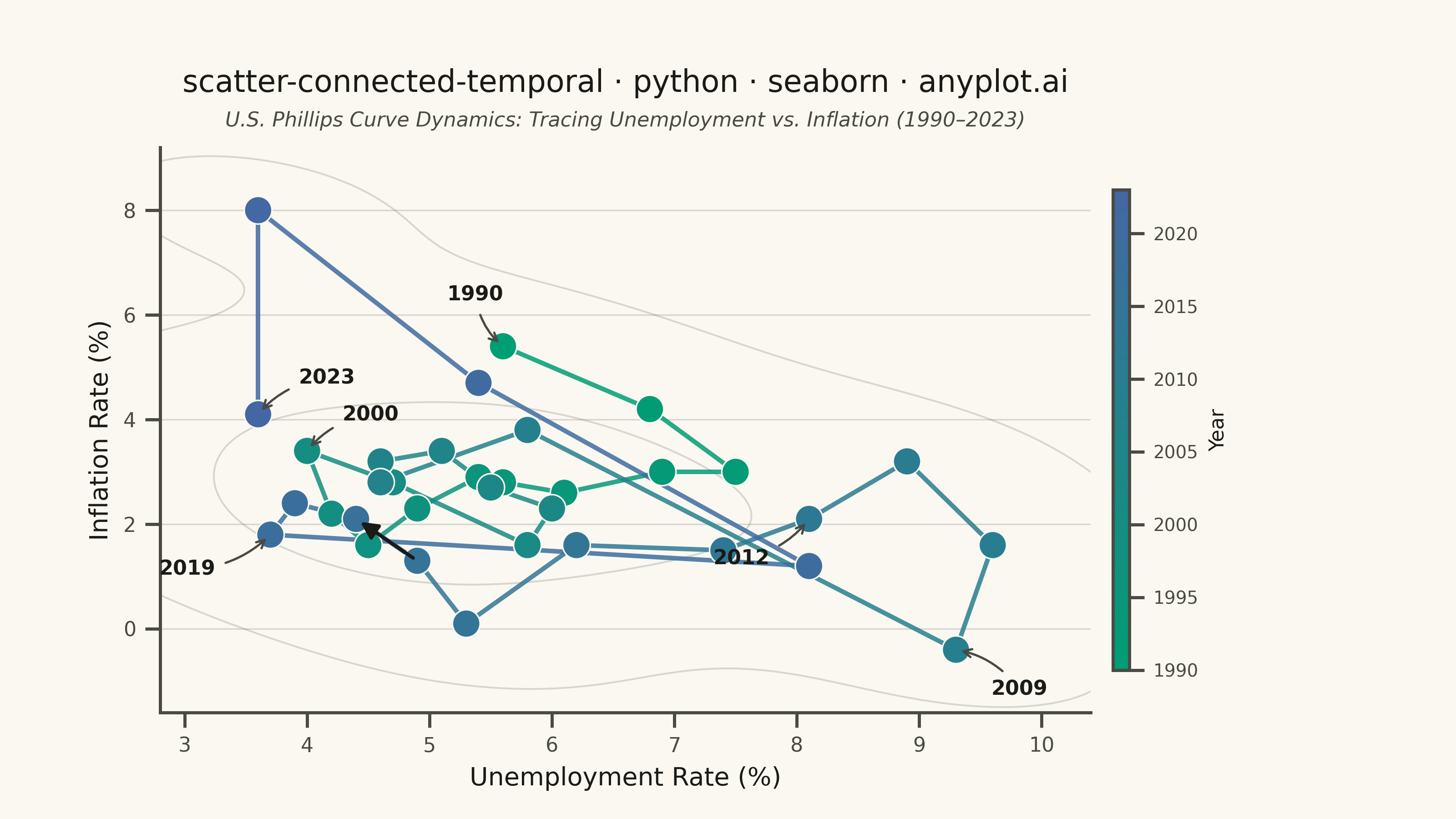
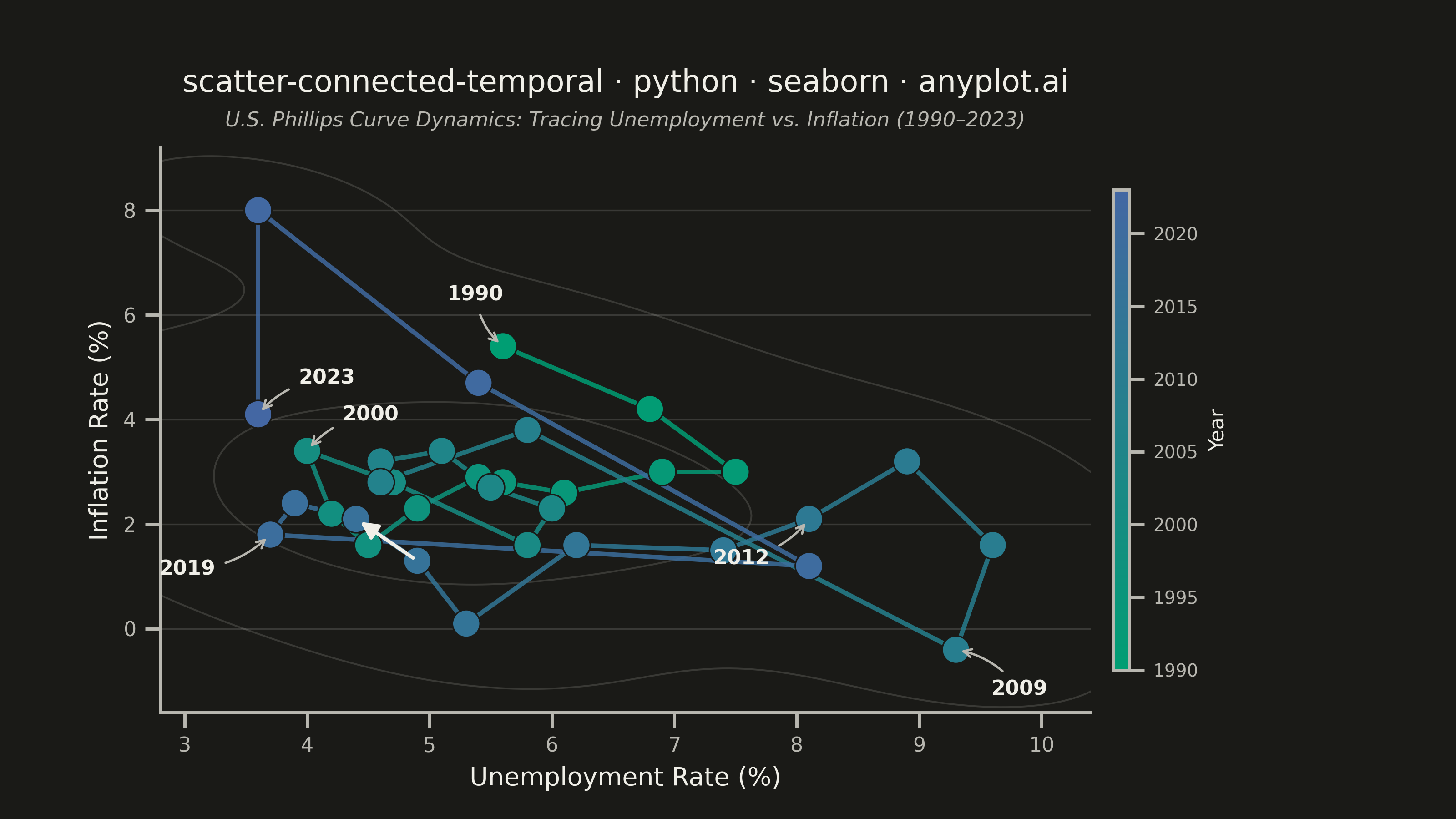
A scatter plot where data points are connected by lines in temporal order, revealing how two variables co-evolve over time. Unlike standard time series plots that show one variable against time, this plot encodes time as movement through 2D space, making cyclical patterns, regime changes, and directional trends visible. Popularized by the New York Times, it is a powerful tool for narrative data visualization.
""" anyplot.ai
scatter-connected-temporal: Connected Scatter Plot with Temporal Path
Library: seaborn 0.13.2 | Python 3.13.13
Quality: 89/100 | Updated: 2026-06-09
"""

import os

import matplotlib.pyplot as plt
import numpy as np
import pandas as pd
import seaborn as sns
from matplotlib.collections import LineCollection
from matplotlib.colors import LinearSegmentedColormap


# Theme-adaptive chrome tokens (Imprint palette)
THEME = os.getenv("ANYPLOT_THEME", "light")
PAGE_BG = "#FAF8F1" if THEME == "light" else "#1A1A17"
ELEVATED_BG = "#FFFDF6" if THEME == "light" else "#242420"
INK = "#1A1A17" if THEME == "light" else "#F0EFE8"
INK_SOFT = "#4A4A44" if THEME == "light" else "#B8B7B0"

# Imprint sequential colormap: brand green (early) → blue (recent)
imprint_seq = LinearSegmentedColormap.from_list("imprint_seq", ["#009E73", "#4467A3"])

sns.set_theme(
    style="ticks",
    rc={
        "figure.facecolor": PAGE_BG,
        "axes.facecolor": PAGE_BG,
        "axes.edgecolor": INK_SOFT,
        "axes.labelcolor": INK,
        "text.color": INK,
        "xtick.color": INK_SOFT,
        "ytick.color": INK_SOFT,
        "grid.color": INK,
        "grid.alpha": 0.15,
        "legend.facecolor": ELEVATED_BG,
        "legend.edgecolor": INK_SOFT,
    },
)

# U.S. unemployment vs. inflation 1990–2023 (Phillips curve dynamics)
years = np.arange(1990, 2024)
n = len(years)

unemployment = np.array(
    [
        5.6,
        6.8,
        7.5,
        6.9,
        6.1,
        5.6,
        5.4,
        4.9,
        4.5,
        4.2,
        4.0,
        4.7,
        5.8,
        6.0,
        5.5,
        5.1,
        4.6,
        4.6,
        5.8,
        9.3,
        9.6,
        8.9,
        8.1,
        7.4,
        6.2,
        5.3,
        4.9,
        4.4,
        3.9,
        3.7,
        8.1,
        5.4,
        3.6,
        3.6,
    ]
)

inflation = np.array(
    [
        5.4,
        4.2,
        3.0,
        3.0,
        2.6,
        2.8,
        2.9,
        2.3,
        1.6,
        2.2,
        3.4,
        2.8,
        1.6,
        2.3,
        2.7,
        3.4,
        3.2,
        2.8,
        3.8,
        -0.4,
        1.6,
        3.2,
        2.1,
        1.5,
        1.6,
        0.1,
        1.3,
        2.1,
        2.4,
        1.8,
        1.2,
        4.7,
        8.0,
        4.1,
    ]
)

df = pd.DataFrame({"Unemployment Rate (%)": unemployment, "Inflation Rate (%)": inflation, "Year": years})

# Canvas: landscape 16:9 → exactly 3200×1800 px
fig, ax = plt.subplots(figsize=(8, 4.5), dpi=400)
fig.subplots_adjust(left=0.11, bottom=0.13, right=0.88, top=0.82)

# Background: seaborn KDE contours showing historical Phillips curve regime density
sns.kdeplot(
    data=df,
    x="Unemployment Rate (%)",
    y="Inflation Rate (%)",
    levels=3,
    color=INK_SOFT,
    alpha=0.2,
    linewidths=0.7,
    bw_adjust=1.2,
    ax=ax,
)

# Temporal path: LineCollection with Imprint sequential gradient
norm = plt.Normalize(years[0], years[-1])
points = np.column_stack([unemployment, inflation])
segments = np.array([[points[i], points[i + 1]] for i in range(n - 1)])
lc = LineCollection(segments, cmap=imprint_seq, norm=norm, linewidths=1.8, zorder=2, alpha=0.85)
lc.set_array(years[:-1].astype(float))
ax.add_collection(lc)

# Scatter markers with temporal hue encoding via seaborn continuous palette
sns.scatterplot(
    data=df,
    x="Unemployment Rate (%)",
    y="Inflation Rate (%)",
    hue="Year",
    hue_norm=(years[0], years[-1]),
    palette=imprint_seq,
    s=120,
    edgecolor=PAGE_BG,
    linewidth=0.6,
    legend=False,
    zorder=3,
    ax=ax,
)

# Directional arrow on temporal path (2016→2017 segment makes time direction explicit)
i_dir = 26  # index of 2016
ax.annotate(
    "",
    xy=(unemployment[i_dir + 1], inflation[i_dir + 1]),
    xytext=(unemployment[i_dir], inflation[i_dir]),
    arrowprops={"arrowstyle": "-|>", "color": INK, "lw": 1.4, "mutation_scale": 14},
    zorder=4,
)

# Key economic turning-point annotations
key_points = {
    0: (-22, 18),  # 1990
    10: (14, 12),  # 2000
    19: (14, -18),  # 2009
    22: (-38, -18),  # 2012
    29: (-44, -16),  # 2019
    n - 1: (16, 12),  # 2023
}
for idx, offset in key_points.items():
    ax.annotate(
        str(years[idx]),
        (unemployment[idx], inflation[idx]),
        textcoords="offset points",
        xytext=offset,
        fontsize=8,
        fontweight="bold",
        color=INK,
        arrowprops={"arrowstyle": "->", "color": INK_SOFT, "lw": 0.9, "connectionstyle": "arc3,rad=0.2"},
    )

# Narrative subtitle
ax.text(
    0.5,
    1.03,
    "U.S. Phillips Curve Dynamics: Tracing Unemployment vs. Inflation (1990–2023)",
    transform=ax.transAxes,
    fontsize=8,
    color=INK_SOFT,
    ha="center",
    va="bottom",
    style="italic",
)

ax.set_xlabel("Unemployment Rate (%)", fontsize=10)
ax.set_ylabel("Inflation Rate (%)", fontsize=10)
ax.set_title(
    "scatter-connected-temporal · python · seaborn · anyplot.ai", fontsize=12, fontweight="medium", pad=22, color=INK
)
ax.tick_params(axis="both", labelsize=8)
sns.despine(ax=ax)
ax.yaxis.grid(True, alpha=0.15, linewidth=0.6, color=INK)

ax.set_xlim(unemployment.min() - 0.8, unemployment.max() + 0.8)
ax.set_ylim(inflation.min() - 1.2, inflation.max() + 1.2)

# Colorbar for temporal scale
sm = plt.cm.ScalarMappable(cmap=imprint_seq, norm=norm)
sm.set_array([])
cbar = fig.colorbar(sm, ax=ax, pad=0.02, aspect=30, shrink=0.85)
cbar.set_label("Year", fontsize=8, color=INK)
cbar.ax.tick_params(labelsize=7, colors=INK_SOFT)
cbar.outline.set_edgecolor(INK_SOFT)

plt.savefig(f"plot-{THEME}.png", dpi=400, facecolor=PAGE_BG)
Runnable source as JSON, for any HTTP client: https://api.anyplot.ai/specs/scatter-connected-temporal/seaborn/code. Any spec id and library id listed in llms-full.txt fit the same URL shape; every URL below is complete and callable.
{
  "spec_id": "scatter-connected-temporal",
  "language": "python",
  "library": "seaborn",
  "page": "https://anyplot.ai/scatter-connected-temporal/python/seaborn",
  "hub": "https://anyplot.ai/scatter-connected-temporal",
  "code_json": "https://api.anyplot.ai/specs/scatter-connected-temporal/seaborn/code",
  "spec_json": "https://api.anyplot.ai/specs/scatter-connected-temporal",
  "render_light_png": "https://storage.googleapis.com/anyplot-images/plots/scatter-connected-temporal/python/seaborn/plot-light.png",
  "render_dark_png": "https://storage.googleapis.com/anyplot-images/plots/scatter-connected-temporal/python/seaborn/plot-dark.png",
  "quality_score": 89.0,
  "license": "MIT",
  "guide": "https://anyplot.ai/llms.txt"
}
Part of Connected Scatter Plot with Temporal Path on anyplot.ai.