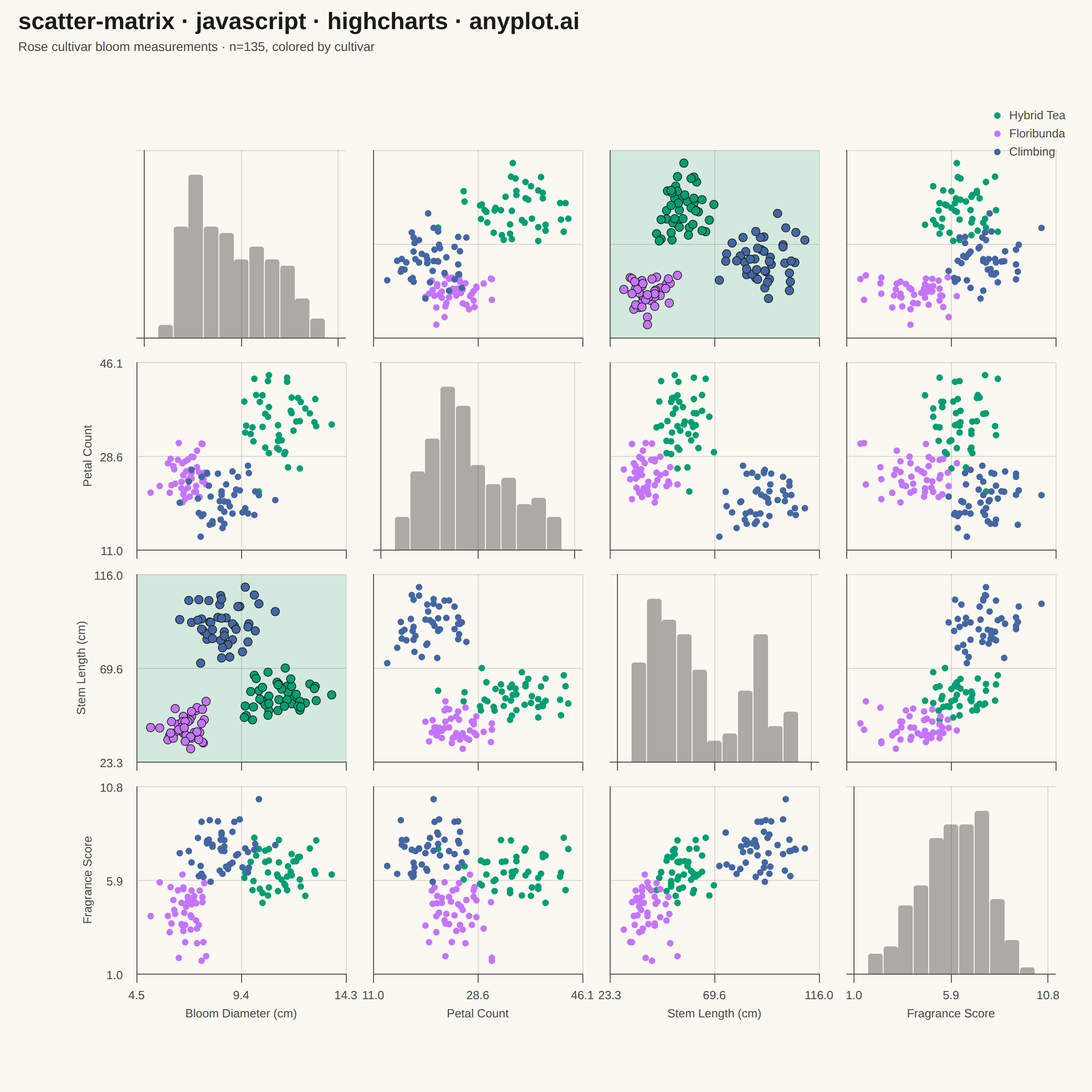
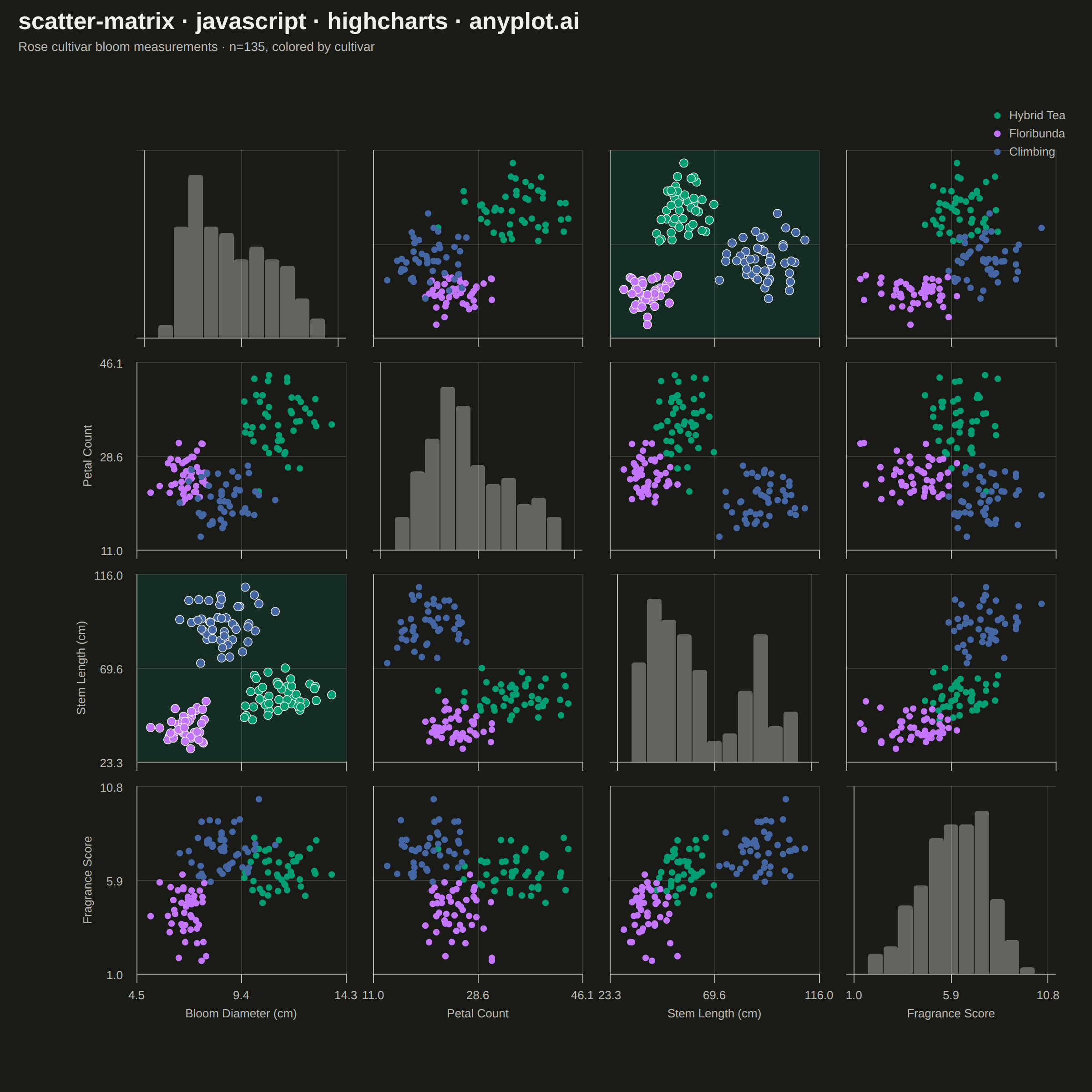
The same plot in 14 other libraries — JavaScript: Chart.js, D3.js, Apache ECharts, MUI X Charts; Python: Altair, Bokeh, lets-plot, Matplotlib, Plotly, plotnine, Pygal, Seaborn; R: ggplot2; Julia: Makie.jl. Compare all 15 side by side: Scatter Plot Matrix in Python, R, Julia and JavaScript.
A grid of scatter plots showing all pairwise relationships between multiple variables, with histograms or kernel density estimates on the diagonal. This comprehensive visualization enables simultaneous exploration of correlations and distributions across an entire dataset, making it invaluable for understanding multivariate data structure at a glance. Also known as a pairplot or SPLOM (Scatter Plot Matrix).
// anyplot.ai
// scatter-matrix: Scatter Plot Matrix
// Library: highcharts 12.6.0 | JavaScript 22.23.2
// Quality: 92/100 | Created: 2026-09-09
//# anyplot-orientation: square

const t = window.ANYPLOT_TOKENS;

// --- Data (in-memory, deterministic fixed-seed PRNG) -------------------------
// Rose cultivar bloom measurements — 3 cultivars, 4 continuous traits, 45
// specimens each. The cultivars cluster distinctly across the traits, which is
// what a scatter plot matrix is for: spot the pairwise correlations and the
// group separation at a glance.
function mulberry32(seed) {
  return function () {
    seed = (seed + 0x6d2b79f5) | 0;
    let x = Math.imul(seed ^ (seed >>> 15), 1 | seed);
    x = (x + Math.imul(x ^ (x >>> 7), 61 | x)) ^ x;
    return ((x ^ (x >>> 14)) >>> 0) / 4294967296;
  };
}
const rand = mulberry32(42);
function randNormal(mean, std) {
  const u1 = Math.max(rand(), 1e-9);
  const u2 = rand();
  const z = Math.sqrt(-2 * Math.log(u1)) * Math.cos(2 * Math.PI * u2);
  return mean + z * std;
}

const variables = [
  { key: "bloom", label: "Bloom Diameter (cm)" },
  { key: "petals", label: "Petal Count" },
  { key: "stem", label: "Stem Length (cm)" },
  { key: "fragrance", label: "Fragrance Score" },
];

const cultivars = [
  {
    name: "Hybrid Tea",
    n: 45,
    mean: { bloom: 11.0, petals: 35, stem: 55, fragrance: 6.5 },
    std: { bloom: 1.1, petals: 4, stem: 6, fragrance: 1.0 },
  },
  {
    name: "Floribunda",
    n: 45,
    mean: { bloom: 7.0, petals: 25, stem: 40, fragrance: 4.5 },
    std: { bloom: 0.8, petals: 3, stem: 5, fragrance: 1.1 },
  },
  {
    name: "Climbing",
    n: 45,
    mean: { bloom: 8.5, petals: 20, stem: 90, fragrance: 7.5 },
    std: { bloom: 0.9, petals: 3, stem: 10, fragrance: 0.9 },
  },
];

cultivars.forEach((c) => {
  c.data = { bloom: [], petals: [], stem: [], fragrance: [] };
  for (let k = 0; k < c.n; k++) {
    variables.forEach((v) => {
      c.data[v.key].push(randNormal(c.mean[v.key], c.std[v.key]));
    });
  }
});

const combined = {};
variables.forEach((v) => {
  combined[v.key] = cultivars.flatMap((c) => c.data[v.key]);
  const rawMin = Math.min(...combined[v.key]);
  const rawMax = Math.max(...combined[v.key]);
  const pad = (rawMax - rawMin) * 0.08;
  v.rawMin = rawMin;
  v.rawMax = rawMax;
  v.min = rawMin - pad;
  v.max = rawMax + pad;
});

// Identify the pairwise relationship with the clearest cultivar separation so
// the matrix can give the viewer a "headline" cell to anchor on, rather than
// relying purely on the viewer noticing cluster separation unaided. The score
// is the worst-case (minimum) standardized distance between any two cultivar
// centroids for that variable pair — the pair that maximizes this is the one
// where every cultivar is most confidently distinguishable from every other.
function stdDev(values) {
  const mean = values.reduce((a, b) => a + b, 0) / values.length;
  return Math.sqrt(values.reduce((a, b) => a + (b - mean) ** 2, 0) / values.length);
}
function pairSeparation(iKey, jKey) {
  const si = stdDev(combined[iKey]);
  const sj = stdDev(combined[jKey]);
  let minDist = Infinity;
  for (let a = 0; a < cultivars.length; a++) {
    for (let b = a + 1; b < cultivars.length; b++) {
      const dx = (cultivars[a].mean[iKey] - cultivars[b].mean[iKey]) / si;
      const dy = (cultivars[a].mean[jKey] - cultivars[b].mean[jKey]) / sj;
      minDist = Math.min(minDist, Math.hypot(dx, dy));
    }
  }
  return minDist;
}
let bestPair = [0, 1];
let bestScore = -Infinity;
for (let i = 0; i < variables.length; i++) {
  for (let j = i + 1; j < variables.length; j++) {
    const score = pairSeparation(variables[i].key, variables[j].key);
    if (score > bestScore) {
      bestScore = score;
      bestPair = [i, j];
    }
  }
}

function histogram(values, min, max, bins) {
  const width = (max - min) / bins;
  const counts = new Array(bins).fill(0);
  values.forEach((value) => {
    let idx = Math.floor((value - min) / width);
    if (idx >= bins) idx = bins - 1;
    if (idx < 0) idx = 0;
    counts[idx] += 1;
  });
  return counts.map((count, idx) => ({ x: min + width * (idx + 0.5), y: count }));
}

// --- Grid geometry -----------------------------------------------------------
// Highcharts core has no SPLOM series type, so the matrix is built from n*n
// independent xAxis/yAxis pairs positioned as percentages of the plot area —
// one axis pair per cell, aligned min/max down each column and across each
// row. Only the outer edge axes carry tick labels and titles.
const n = variables.length;
const gapPct = 3;
const cellPct = (100 - (n - 1) * gapPct) / n;
const cellStart = (idx) => idx * (cellPct + gapPct);

const xAxes = [];
const yAxes = [];
const series = [];

for (let row = 0; row < n; row++) {
  for (let col = 0; col < n; col++) {
    const colVar = variables[col];
    const rowVar = variables[row];
    const isDiagonal = row === col;
    const isBottomRow = row === n - 1;
    const isLeftCol = col === 0;
    const isHeadlinePair =
      !isDiagonal && ((row === bestPair[0] && col === bestPair[1]) || (row === bestPair[1] && col === bestPair[0]));
    const left = `${cellStart(col)}%`;
    const top = `${cellStart(row)}%`;
    const width = `${cellPct}%`;
    const height = `${cellPct}%`;

    // `lineWidth` on a multi-axis grid like this one draws the axis line at
    // its "crossing" value on the paired axis (often 0), not at this cell's
    // own box edge — a `plotLines` entry at the axis's own min is a reliable
    // substitute since it resolves purely through this axis's own toPixels().
    // `tickAmount` (even with startOnTick/endOnTick disabled) makes Highcharts
    // silently round the rendered extremes to "nice" numbers away from the
    // explicit min/max, which then desyncs that plotLine from the true edge —
    // explicit `tickPositions` sidesteps the rounding entirely.
    const bins = isDiagonal ? histogram(combined[colVar.key], colVar.rawMin, colVar.rawMax, 11) : null;
    const yMin = isDiagonal ? 0 : rowVar.min;
    const yMax = isDiagonal ? Math.max(...bins.map((b) => b.y)) * 1.15 : rowVar.max;
    const tickFormatter = function () {
      return Highcharts.numberFormat(this.value, 1);
    };

    xAxes.push({
      left,
      top,
      width,
      height,
      // Every axis defaults to accumulating offset with sibling axes on the
      // same side (as if stacking multiple y-axes outward) — with 16 of them
      // that pushes later cells' labels far past the fixed chart margin.
      // offset: 0 pins each axis's labels flush to its own box instead.
      offset: 0,
      min: colVar.min,
      max: colVar.max,
      startOnTick: false,
      endOnTick: false,
      tickPositions: [colVar.min, (colVar.min + colVar.max) / 2, colVar.max],
      gridLineWidth: 1,
      gridLineColor: t.grid,
      lineWidth: 0,
      tickColor: t.inkSoft,
      plotLines: [{ value: colVar.min, color: t.inkSoft, width: 1, zIndex: 5 }],
      // A faint full-height tint on the headline pair's own axis box (each
      // mini-axis renders plotBands within its own left/top/width/height —
      // the same isolation that keeps plotLines confined per cell) spotlights
      // the most cleanly separated relationship without touching the others.
      plotBands: isHeadlinePair
        ? [{ from: colVar.min, to: colVar.max, color: Highcharts.color(t.palette[0]).setOpacity(0.08).get(), zIndex: 0 }]
        : undefined,
      labels: {
        enabled: isBottomRow,
        formatter: tickFormatter,
        style: { color: t.inkSoft, fontSize: "13px" },
      },
      title: isBottomRow
        ? { text: colVar.label, style: { color: t.inkSoft, fontSize: "13px" } }
        : { text: null },
    });

    yAxes.push({
      left,
      top,
      width,
      height,
      offset: 0,
      min: yMin,
      max: yMax,
      startOnTick: false,
      endOnTick: false,
      tickPositions: isDiagonal ? [yMin, yMax] : [yMin, (yMin + yMax) / 2, yMax],
      gridLineWidth: 1,
      gridLineColor: t.grid,
      lineWidth: 0,
      tickColor: t.inkSoft,
      plotLines: [{ value: yMin, color: t.inkSoft, width: 1, zIndex: 5 }],
      plotBands: isHeadlinePair
        ? [{ from: yMin, to: yMax, color: Highcharts.color(t.palette[0]).setOpacity(0.08).get(), zIndex: 0 }]
        : undefined,
      labels: {
        enabled: !isDiagonal && isLeftCol,
        formatter: tickFormatter,
        style: { color: t.inkSoft, fontSize: "13px" },
      },
      title:
        !isDiagonal && isLeftCol
          ? { text: rowVar.label, style: { color: t.inkSoft, fontSize: "13px" } }
          : { text: null },
    });

    const idx = row * n + col;
    if (isDiagonal) {
      series.push({
        type: "column",
        name: `${colVar.label} distribution`,
        data: bins,
        xAxis: idx,
        yAxis: idx,
        color: Highcharts.color(t.ink).setOpacity(0.35).get(),
        borderWidth: 0,
        pointPadding: 0.05,
        groupPadding: 0,
        showInLegend: false,
        enableMouseTracking: false,
      });
    } else {
      cultivars.forEach((c, cIdx) => {
        const data = c.data[colVar.key].map((xValue, k) => [xValue, c.data[rowVar.key][k]]);
        series.push({
          type: "scatter",
          name: c.name,
          data,
          xAxis: idx,
          yAxis: idx,
          color: t.palette[cIdx],
          marker: isHeadlinePair
            ? { radius: 4.6, symbol: "circle", fillOpacity: 0.8, lineWidth: 0.75, lineColor: t.ink }
            : { radius: 3.6, symbol: "circle", fillOpacity: 0.7, lineWidth: 0 },
          showInLegend: row === 1 && col === 0,
        });
      });
    }
  }
}

// --- Chart ---------------------------------------------------------------
Highcharts.chart("container", {
  chart: {
    type: "scatter",
    backgroundColor: "transparent",
    animation: false,
    style: { fontFamily: "inherit" },
    marginLeft: 150,
    marginRight: 40,
    marginTop: 165,
    marginBottom: 130,
  },
  credits: { enabled: false },
  accessibility: { enabled: false },
  title: {
    text: "scatter-matrix · javascript · highcharts · anyplot.ai",
    align: "left",
    x: 10,
    style: { color: t.ink, fontSize: "26px", fontWeight: "600" },
  },
  subtitle: {
    text: "Rose cultivar bloom measurements · n=135, colored by cultivar",
    align: "left",
    x: 10,
    style: { color: t.inkSoft, fontSize: "14px" },
  },
  legend: {
    align: "right",
    verticalAlign: "top",
    layout: "vertical",
    x: -10,
    y: 100,
    itemStyle: { color: t.inkSoft, fontSize: "13px" },
    itemHoverStyle: { color: t.ink },
    symbolRadius: 6,
  },
  xAxis: xAxes,
  yAxis: yAxes,
  plotOptions: {
    series: { animation: false },
  },
  tooltip: {
    pointFormat: "{series.name}<br/>x: {point.x:.1f}, y: {point.y:.1f}",
  },
  series,
});
Runnable source as JSON, for any HTTP client: https://api.anyplot.ai/specs/scatter-matrix/highcharts/code. Any spec id and library id listed in llms-full.txt fit the same URL shape; every URL below is complete and callable.
{
  "spec_id": "scatter-matrix",
  "language": "javascript",
  "library": "highcharts",
  "page": "https://anyplot.ai/scatter-matrix/javascript/highcharts",
  "hub": "https://anyplot.ai/scatter-matrix",
  "code_json": "https://api.anyplot.ai/specs/scatter-matrix/highcharts/code",
  "spec_json": "https://api.anyplot.ai/specs/scatter-matrix",
  "render_light_png": "https://storage.googleapis.com/anyplot-images/plots/scatter-matrix/javascript/highcharts/plot-light.png",
  "render_dark_png": "https://storage.googleapis.com/anyplot-images/plots/scatter-matrix/javascript/highcharts/plot-dark.png",
  "interactive_light_html": "https://storage.googleapis.com/anyplot-images/plots/scatter-matrix/javascript/highcharts/plot-light.html",
  "interactive_dark_html": "https://storage.googleapis.com/anyplot-images/plots/scatter-matrix/javascript/highcharts/plot-dark.html",
  "quality_score": 92.0,
  "license": "MIT",
  "guide": "https://anyplot.ai/llms.txt"
}
Part of Scatter Plot Matrix on anyplot.ai.