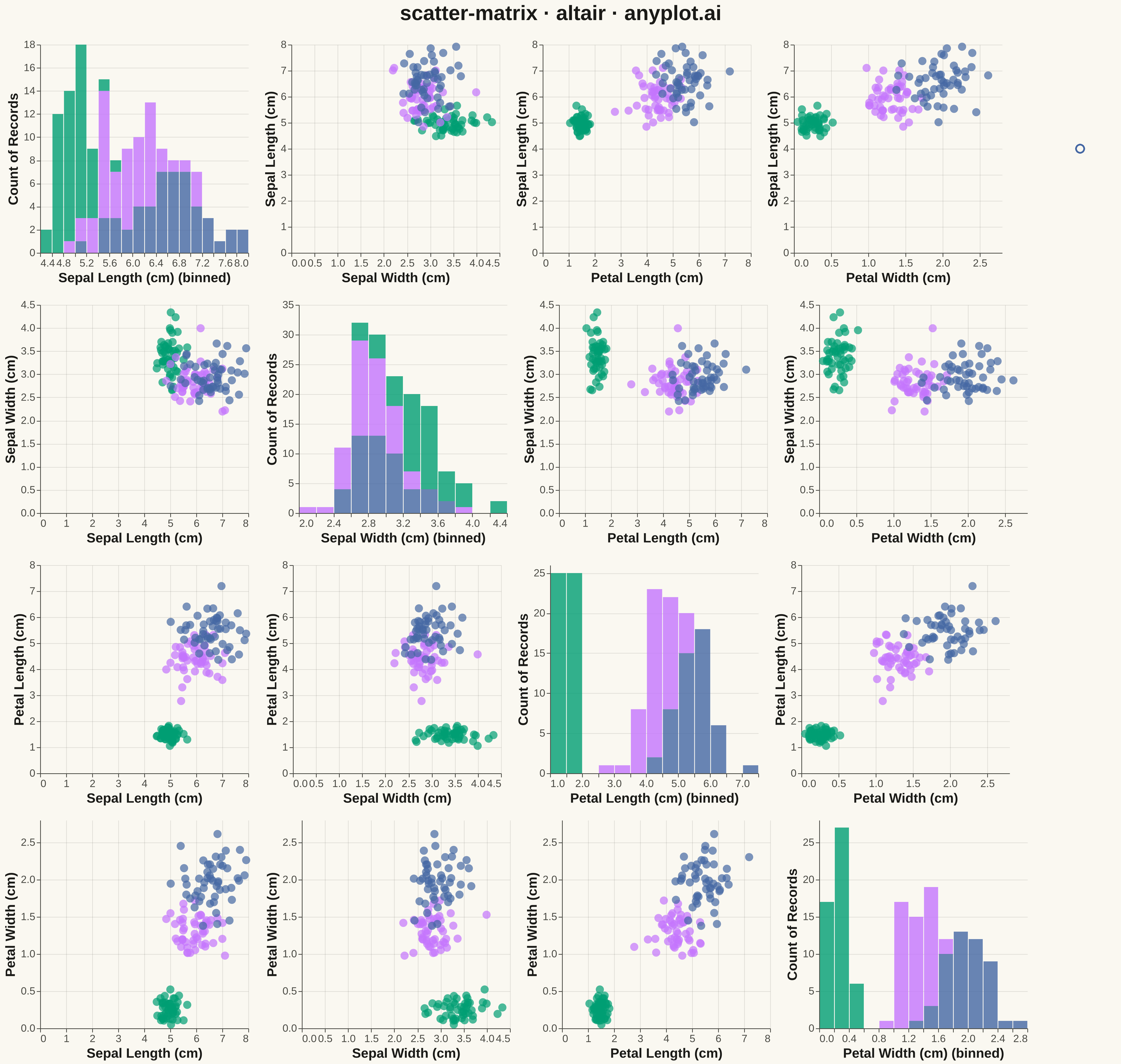
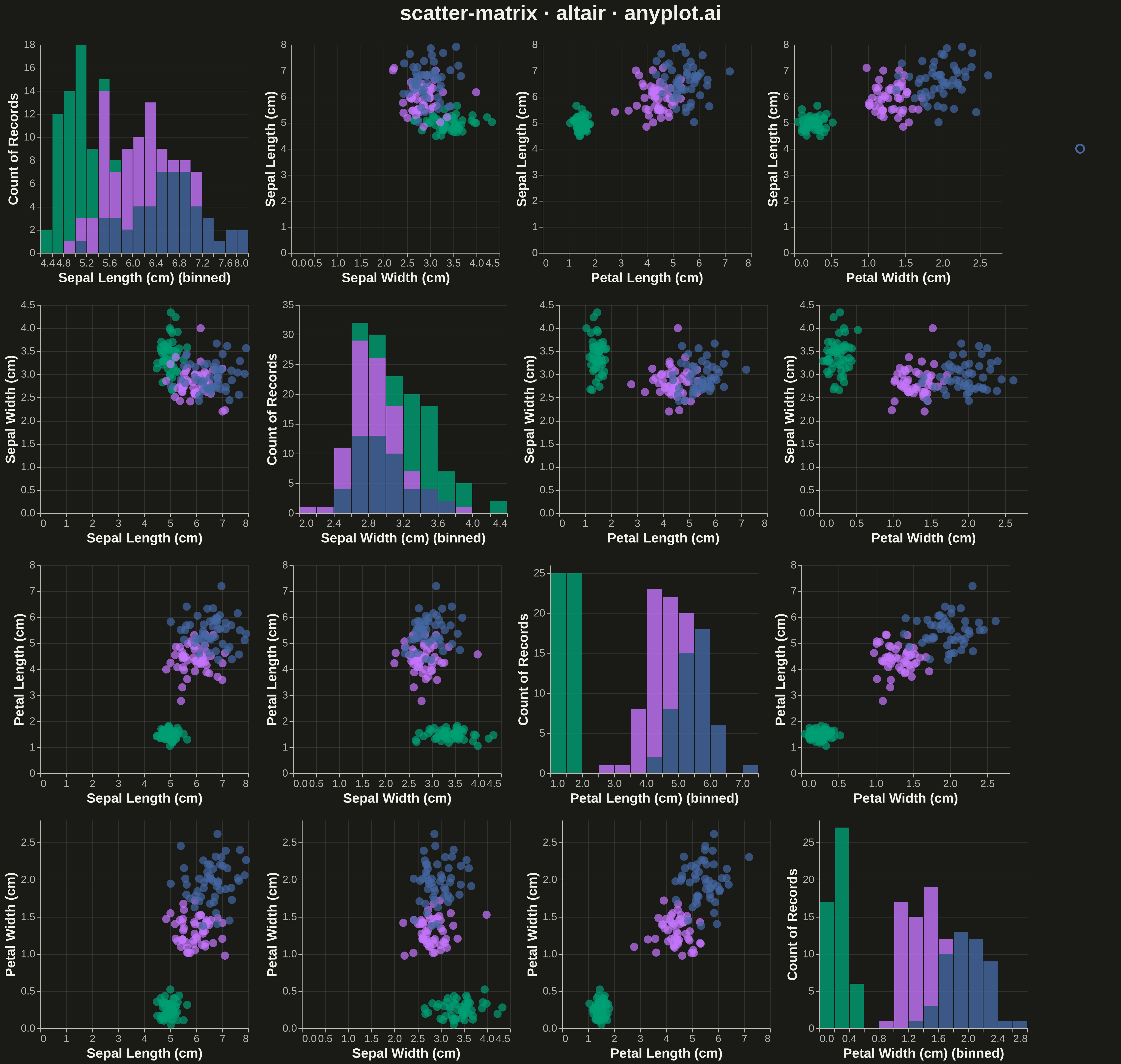
A grid of scatter plots showing all pairwise relationships between multiple variables, with histograms or kernel density estimates on the diagonal. This comprehensive visualization enables simultaneous exploration of correlations and distributions across an entire dataset, making it invaluable for understanding multivariate data structure at a glance. Also known as a pairplot or SPLOM (Scatter Plot Matrix).
""" anyplot.ai
scatter-matrix: Scatter Plot Matrix
Library: altair 6.1.0 | Python 3.13.13
Quality: 82/100 | Updated: 2026-05-09
"""

import os
import sys


# Handle module shadowing by removing current directory from path
sys.path = [p for p in sys.path if os.path.abspath(p) != os.getcwd()]

import altair as alt
import numpy as np
import pandas as pd


# Theme tokens
THEME = os.getenv("ANYPLOT_THEME", "light")
PAGE_BG = "#FAF8F1" if THEME == "light" else "#1A1A17"
ELEVATED_BG = "#FFFDF6" if THEME == "light" else "#242420"
INK = "#1A1A17" if THEME == "light" else "#F0EFE8"
INK_SOFT = "#4A4A44" if THEME == "light" else "#B8B7B0"

# Okabe-Ito palette (first series always #009E73)
IMPRINT = ["#009E73", "#C475FD", "#4467A3"]

# Data - Iris-like dataset with 4 variables and 3 species
np.random.seed(42)

n_per_species = 50
data = []

# Setosa - smaller flowers
for _ in range(n_per_species):
    data.append(
        {
            "Sepal Length (cm)": np.random.normal(5.0, 0.35),
            "Sepal Width (cm)": np.random.normal(3.4, 0.38),
            "Petal Length (cm)": np.random.normal(1.5, 0.17),
            "Petal Width (cm)": np.random.normal(0.25, 0.1),
            "Species": "Setosa",
        }
    )

# Versicolor - medium flowers
for _ in range(n_per_species):
    data.append(
        {
            "Sepal Length (cm)": np.random.normal(5.9, 0.52),
            "Sepal Width (cm)": np.random.normal(2.8, 0.31),
            "Petal Length (cm)": np.random.normal(4.3, 0.47),
            "Petal Width (cm)": np.random.normal(1.3, 0.2),
            "Species": "Versicolor",
        }
    )

# Virginica - larger flowers
for _ in range(n_per_species):
    data.append(
        {
            "Sepal Length (cm)": np.random.normal(6.6, 0.64),
            "Sepal Width (cm)": np.random.normal(3.0, 0.32),
            "Petal Length (cm)": np.random.normal(5.5, 0.55),
            "Petal Width (cm)": np.random.normal(2.0, 0.27),
            "Species": "Virginica",
        }
    )

df = pd.DataFrame(data)

# Variables for the scatter matrix
variables = ["Sepal Length (cm)", "Sepal Width (cm)", "Petal Length (cm)", "Petal Width (cm)"]

# Color scale using Okabe-Ito palette
color_scale = alt.Scale(domain=["Setosa", "Versicolor", "Virginica"], range=IMPRINT)

# Build scatter matrix grid with histograms on diagonal
charts = []

for row_var in variables:
    row_charts = []
    for col_var in variables:
        if row_var == col_var:
            # Diagonal: histogram
            hist = (
                alt.Chart(df)
                .mark_bar(opacity=0.8)
                .encode(
                    alt.X(f"{col_var}:Q", bin=alt.Bin(maxbins=20), axis=alt.Axis(labelFontSize=14, titleFontSize=18)),
                    alt.Y("count():Q", axis=alt.Axis(labelFontSize=14, titleFontSize=18)),
                    alt.Color("Species:N", scale=color_scale, legend=None),
                )
                .properties(width=280, height=280)
            )
            row_charts.append(hist)
        else:
            # Off-diagonal: scatter plot
            scatter = (
                alt.Chart(df)
                .mark_circle(size=120, opacity=0.7)
                .encode(
                    alt.X(f"{col_var}:Q", axis=alt.Axis(labelFontSize=14, titleFontSize=18)),
                    alt.Y(f"{row_var}:Q", axis=alt.Axis(labelFontSize=14, titleFontSize=18)),
                    alt.Color("Species:N", scale=color_scale, legend=None),
                    tooltip=[
                        "Species:N",
                        alt.Tooltip(f"{col_var}:Q", format=".2f"),
                        alt.Tooltip(f"{row_var}:Q", format=".2f"),
                    ],
                )
                .properties(width=280, height=280)
            )
            row_charts.append(scatter)

    charts.append(alt.hconcat(*row_charts))

# Combine rows
scatter_matrix = alt.vconcat(*charts)

# Add legend
legend = (
    alt.Chart(df)
    .mark_point(size=120)
    .encode(
        alt.Color(
            "Species:N",
            scale=color_scale,
            legend=alt.Legend(
                title="Species",
                titleFontSize=24,
                labelFontSize=20,
                symbolSize=350,
                orient="right",
                titlePadding=15,
                labelPadding=12,
            ),
        )
    )
    .properties(width=100, height=280)
)

# Combine scatter matrix with legend
final_chart = alt.hconcat(scatter_matrix, legend)

# Apply theme-adaptive styling and title
chart = (
    final_chart.properties(
        title=alt.Title(text="scatter-matrix · altair · anyplot.ai", fontSize=28, anchor="middle", offset=20),
        background=PAGE_BG,
    )
    .configure_axis(
        domainColor=INK_SOFT, tickColor=INK_SOFT, gridColor=INK, gridOpacity=0.10, labelColor=INK_SOFT, titleColor=INK
    )
    .configure_view(fill=PAGE_BG, stroke=INK_SOFT, strokeWidth=0)
    .configure_title(color=INK, fontSize=28)
    .configure_legend(fillColor=ELEVATED_BG, strokeColor=INK_SOFT, labelColor=INK_SOFT, titleColor=INK)
)

# Save outputs
chart.save(f"plot-{THEME}.png", scale_factor=3.0)
chart.save(f"plot-{THEME}.html")
Runnable source as JSON, for any HTTP client: https://api.anyplot.ai/specs/scatter-matrix/altair/code. Any spec id and library id listed in llms-full.txt fit the same URL shape; every URL below is complete and callable.
{
  "spec_id": "scatter-matrix",
  "language": "python",
  "library": "altair",
  "page": "https://anyplot.ai/scatter-matrix/python/altair",
  "hub": "https://anyplot.ai/scatter-matrix",
  "code_json": "https://api.anyplot.ai/specs/scatter-matrix/altair/code",
  "spec_json": "https://api.anyplot.ai/specs/scatter-matrix",
  "render_light_png": "https://storage.googleapis.com/anyplot-images/plots/scatter-matrix/python/altair/plot-light.png",
  "render_dark_png": "https://storage.googleapis.com/anyplot-images/plots/scatter-matrix/python/altair/plot-dark.png",
  "interactive_light_html": "https://storage.googleapis.com/anyplot-images/plots/scatter-matrix/python/altair/plot-light.html",
  "interactive_dark_html": "https://storage.googleapis.com/anyplot-images/plots/scatter-matrix/python/altair/plot-dark.html",
  "quality_score": 82.0,
  "license": "MIT",
  "guide": "https://anyplot.ai/llms.txt"
}
Part of Scatter Plot Matrix on anyplot.ai.