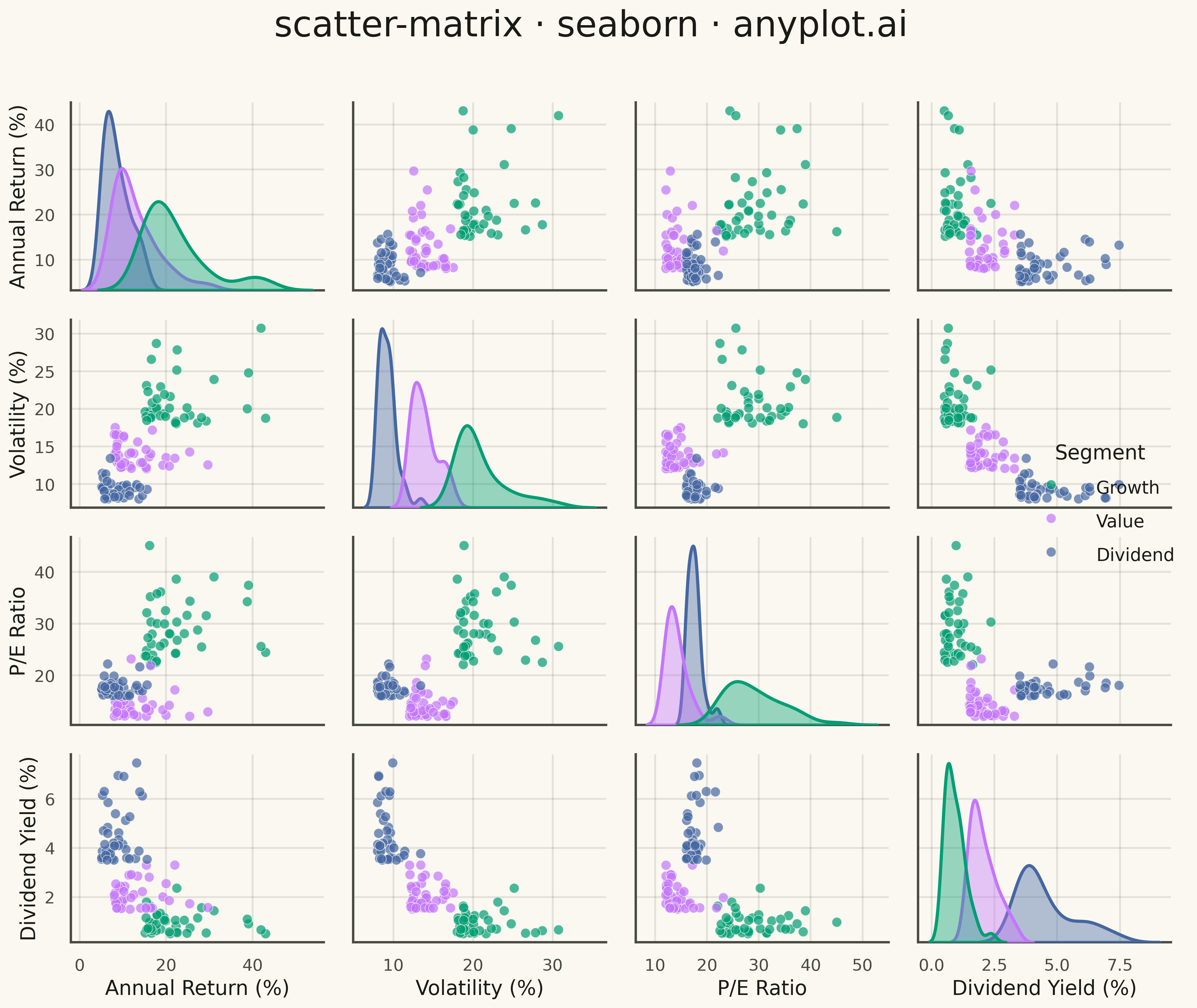
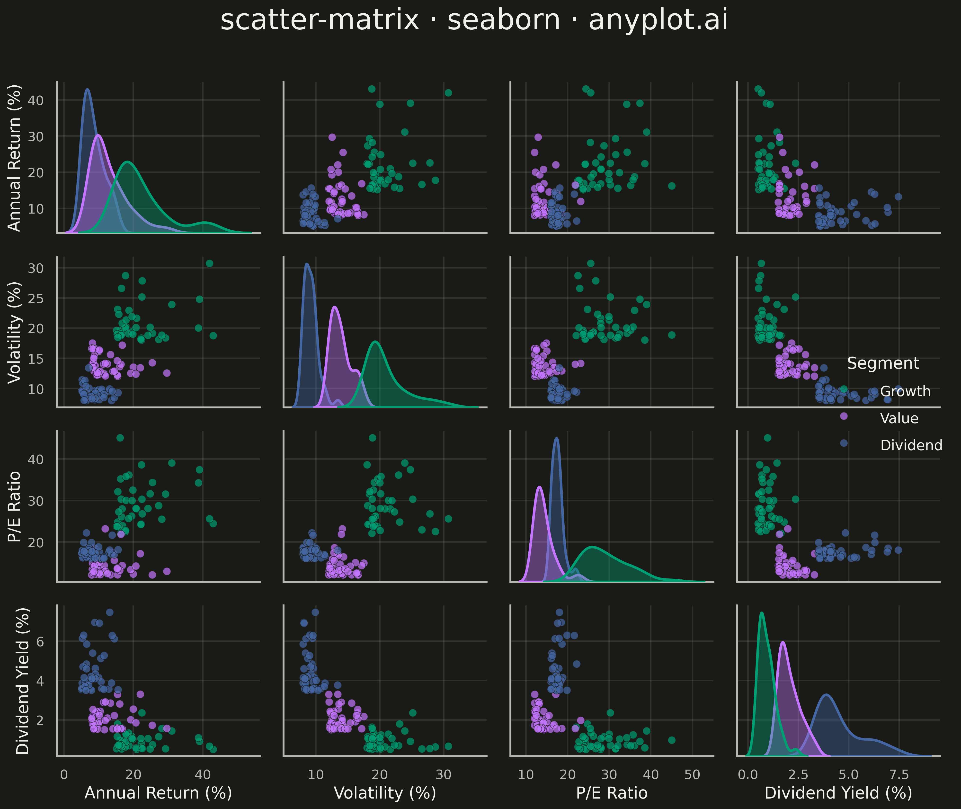
A grid of scatter plots showing all pairwise relationships between multiple variables, with histograms or kernel density estimates on the diagonal. This comprehensive visualization enables simultaneous exploration of correlations and distributions across an entire dataset, making it invaluable for understanding multivariate data structure at a glance. Also known as a pairplot or SPLOM (Scatter Plot Matrix).
""" anyplot.ai
scatter-matrix: Scatter Plot Matrix
Library: seaborn 0.13.2 | Python 3.13.13
Quality: 92/100 | Updated: 2026-05-09
"""

import os

import matplotlib.pyplot as plt
import numpy as np
import pandas as pd
import seaborn as sns


# Theme tokens
THEME = os.getenv("ANYPLOT_THEME", "light")
PAGE_BG = "#FAF8F1" if THEME == "light" else "#1A1A17"
ELEVATED_BG = "#FFFDF6" if THEME == "light" else "#242420"
INK = "#1A1A17" if THEME == "light" else "#F0EFE8"
INK_SOFT = "#4A4A44" if THEME == "light" else "#B8B7B0"

# Okabe-Ito palette
IMPRINT = ["#009E73", "#C475FD", "#4467A3"]

# Data: Financial metrics across market segments
np.random.seed(42)
n_samples = 120

# Three market segments
segments = np.repeat(["Growth", "Value", "Dividend"], n_samples // 3)

# Generate financial metrics with realistic distributions
data = {
    "Annual Return (%)": np.concatenate(
        [
            np.random.exponential(8, n_samples // 3) + 15,  # Growth: high return
            np.random.exponential(5, n_samples // 3) + 8,  # Value: moderate return
            np.random.exponential(4, n_samples // 3) + 5,  # Dividend: steady return
        ]
    ),
    "Volatility (%)": np.concatenate(
        [
            np.random.exponential(3, n_samples // 3) + 18,  # Growth: high volatility
            np.random.exponential(2, n_samples // 3) + 12,  # Value: medium volatility
            np.random.exponential(1.5, n_samples // 3) + 8,  # Dividend: low volatility
        ]
    ),
    "P/E Ratio": np.concatenate(
        [
            np.random.exponential(5, n_samples // 3) + 22,  # Growth: high multiples
            np.random.exponential(3, n_samples // 3) + 12,  # Value: low multiples
            np.random.exponential(2, n_samples // 3) + 16,  # Dividend: moderate multiples
        ]
    ),
    "Dividend Yield (%)": np.concatenate(
        [
            np.random.exponential(0.4, n_samples // 3) + 0.5,  # Growth: low yield
            np.random.exponential(0.6, n_samples // 3) + 1.5,  # Value: moderate yield
            np.random.exponential(0.8, n_samples // 3) + 3.5,  # Dividend: high yield
        ]
    ),
    "Segment": segments,
}

df = pd.DataFrame(data)

# Set theme for the entire figure
sns.set_theme(
    style="whitegrid",
    rc={
        "figure.facecolor": PAGE_BG,
        "axes.facecolor": PAGE_BG,
        "axes.edgecolor": INK_SOFT,
        "axes.labelcolor": INK,
        "text.color": INK,
        "xtick.color": INK_SOFT,
        "ytick.color": INK_SOFT,
        "grid.color": INK,
        "grid.alpha": 0.10,
        "grid.linewidth": 0.8,
        "legend.facecolor": ELEVATED_BG,
        "legend.edgecolor": INK_SOFT,
    },
)

sns.set_context("talk", font_scale=1.2)

# Create pairplot with scatter matrices
g = sns.pairplot(
    df,
    hue="Segment",
    palette=IMPRINT,
    diag_kind="kde",
    plot_kws={"s": 60, "alpha": 0.7, "edgecolor": PAGE_BG, "linewidth": 0.5},
    diag_kws={"linewidth": 2.5, "fill": True, "alpha": 0.4},
    corner=False,
    height=2.8,
    aspect=1.0,
)

# Update title
g.figure.suptitle("scatter-matrix · seaborn · anyplot.ai", fontsize=28, y=1.00, fontweight="medium")

# Update legend using seaborn's move_legend (non-private API)
if g._legend is not None:
    g._legend.set_title("Segment")
    g._legend.get_title().set_fontsize(16)
    for text in g._legend.get_texts():
        text.set_fontsize(14)

# Adjust label sizes
for ax in g.axes.flatten():
    if ax is not None:
        ax.tick_params(axis="both", labelsize=13)
        xlabel = ax.get_xlabel()
        ylabel = ax.get_ylabel()
        if xlabel:
            ax.set_xlabel(xlabel, fontsize=16, color=INK)
        if ylabel:
            ax.set_ylabel(ylabel, fontsize=16, color=INK)

plt.tight_layout()
g.figure.savefig(f"plot-{THEME}.png", dpi=300, bbox_inches="tight", facecolor=PAGE_BG)
Runnable source as JSON, for any HTTP client: https://api.anyplot.ai/specs/scatter-matrix/seaborn/code. Any spec id and library id listed in llms-full.txt fit the same URL shape; every URL below is complete and callable.
{
  "spec_id": "scatter-matrix",
  "language": "python",
  "library": "seaborn",
  "page": "https://anyplot.ai/scatter-matrix/python/seaborn",
  "hub": "https://anyplot.ai/scatter-matrix",
  "code_json": "https://api.anyplot.ai/specs/scatter-matrix/seaborn/code",
  "spec_json": "https://api.anyplot.ai/specs/scatter-matrix",
  "render_light_png": "https://storage.googleapis.com/anyplot-images/plots/scatter-matrix/python/seaborn/plot-light.png",
  "render_dark_png": "https://storage.googleapis.com/anyplot-images/plots/scatter-matrix/python/seaborn/plot-dark.png",
  "quality_score": 92.0,
  "license": "MIT",
  "guide": "https://anyplot.ai/llms.txt"
}
Part of Scatter Plot Matrix on anyplot.ai.