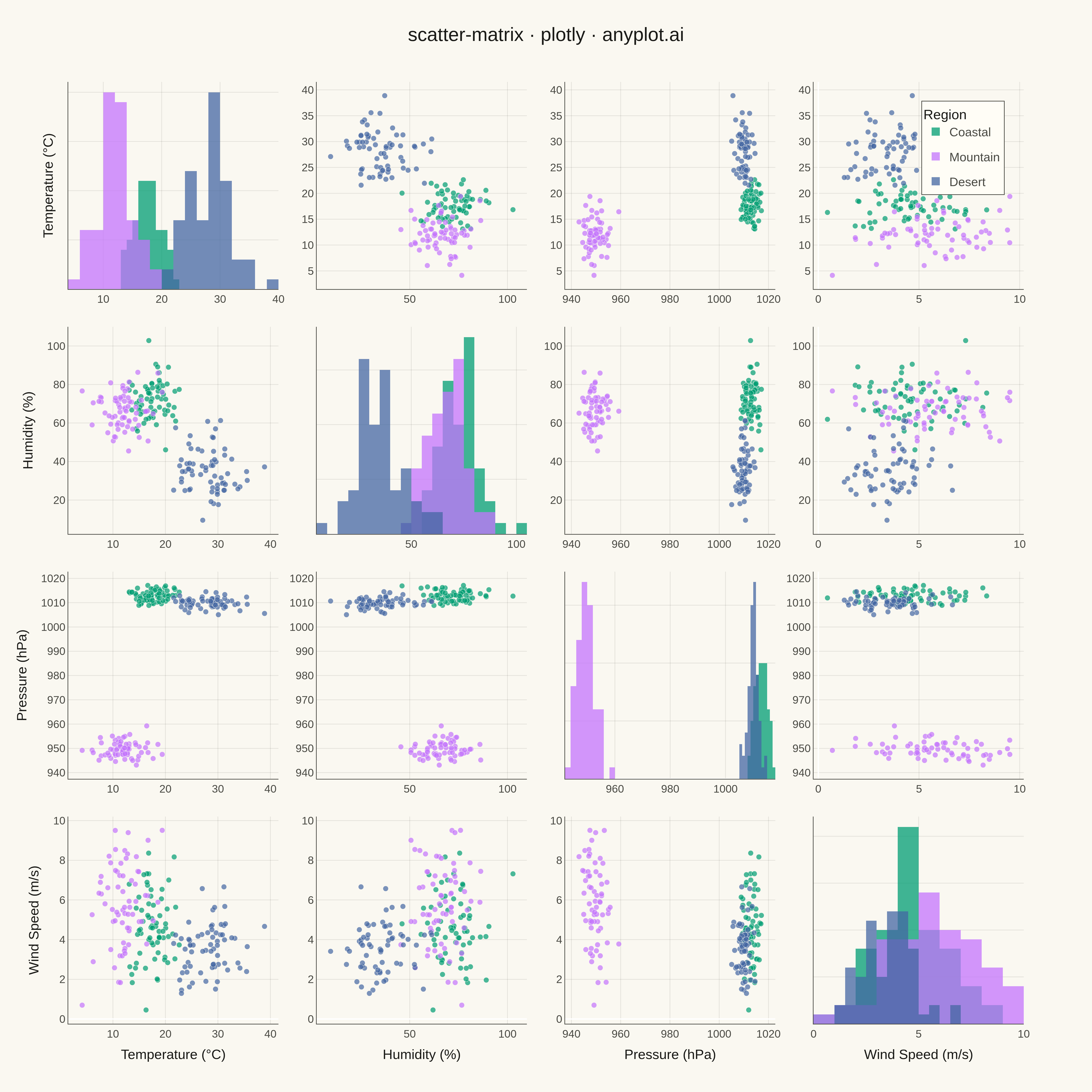
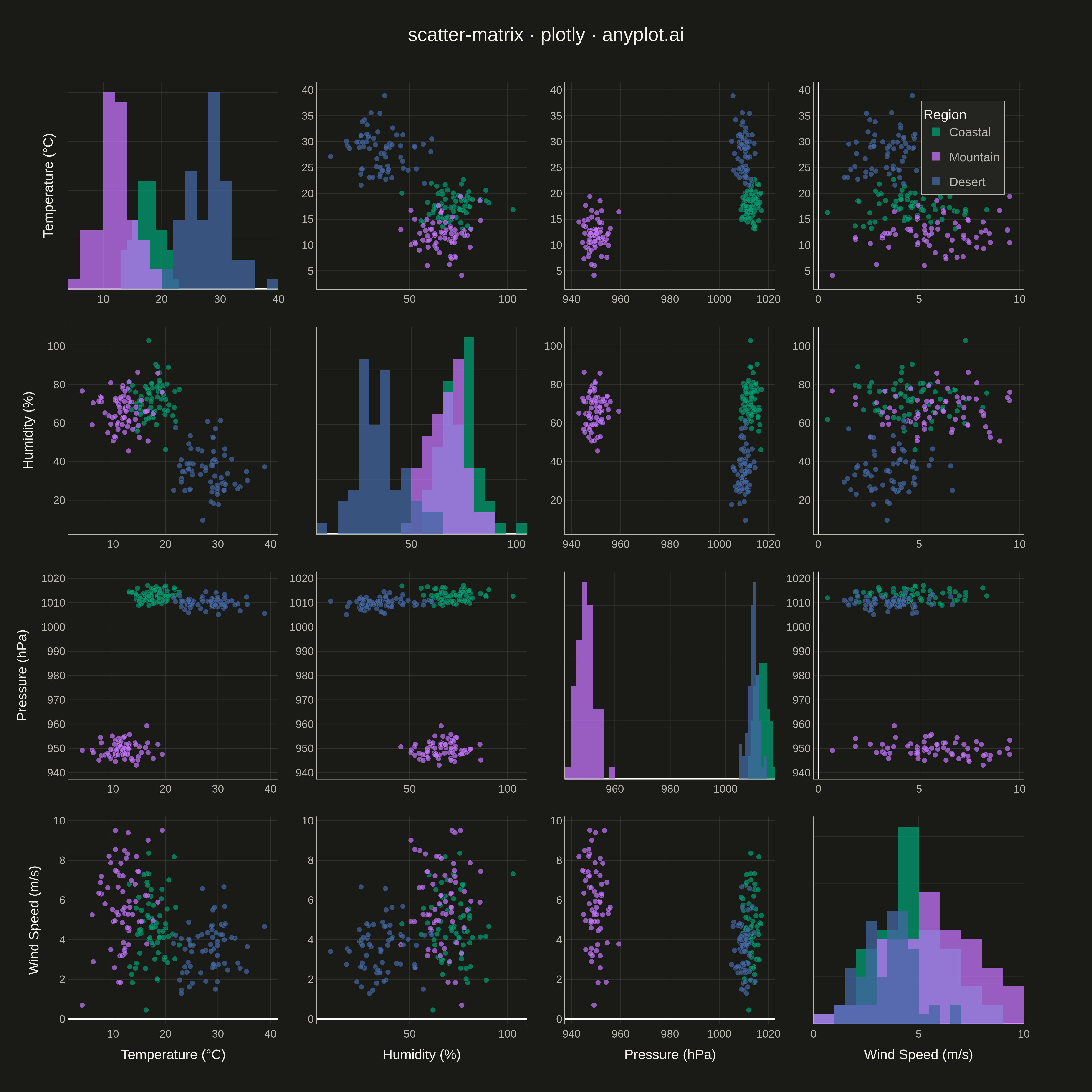
A grid of scatter plots showing all pairwise relationships between multiple variables, with histograms or kernel density estimates on the diagonal. This comprehensive visualization enables simultaneous exploration of correlations and distributions across an entire dataset, making it invaluable for understanding multivariate data structure at a glance. Also known as a pairplot or SPLOM (Scatter Plot Matrix).
""" anyplot.ai
scatter-matrix: Scatter Plot Matrix
Library: plotly 6.7.0 | Python 3.13.13
Quality: 89/100 | Updated: 2026-05-09
"""

import os

import numpy as np
import pandas as pd
import plotly.graph_objects as go
from plotly.subplots import make_subplots


# Theme tokens
THEME = os.getenv("ANYPLOT_THEME", "light")
PAGE_BG = "#FAF8F1" if THEME == "light" else "#1A1A17"
ELEVATED_BG = "#FFFDF6" if THEME == "light" else "#242420"
INK = "#1A1A17" if THEME == "light" else "#F0EFE8"
INK_SOFT = "#4A4A44" if THEME == "light" else "#B8B7B0"
GRID = "rgba(26,26,23,0.10)" if THEME == "light" else "rgba(240,239,232,0.10)"

# Okabe-Ito palette
IMPRINT = [
    "#009E73",  # bluish green (brand, first series)
    "#C475FD",  # vermillion
    "#4467A3",  # blue
]

# Data - Weather station measurements across 4 variables
np.random.seed(42)
n = 200

# Weather data: daily measurements from 3 different geographic regions
region = np.repeat(["Coastal", "Mountain", "Desert"], n // 3)

# Temperature (°C) - region-specific distributions
temperature = np.concatenate(
    [
        np.random.normal(18, 2.5, n // 3),  # Coastal - moderate
        np.random.normal(12, 3.0, n // 3),  # Mountain - cooler
        np.random.normal(28, 4.0, n // 3),  # Desert - hot
    ]
)

# Humidity (%) - inverse to temperature
humidity = np.concatenate(
    [
        np.random.normal(72, 8, n // 3),  # Coastal - high
        np.random.normal(65, 10, n // 3),  # Mountain - moderate
        np.random.normal(35, 12, n // 3),  # Desert - low
    ]
)

# Pressure (hPa) - region-specific
pressure = np.concatenate(
    [
        np.random.normal(1013, 2, n // 3),  # Coastal - sea level
        np.random.normal(950, 3, n // 3),  # Mountain - high altitude
        np.random.normal(1010, 2, n // 3),  # Desert - high
    ]
)

# Wind speed (m/s) - variable by region
wind_speed = np.concatenate(
    [
        np.random.normal(4.5, 1.5, n // 3),  # Coastal - breezy
        np.random.normal(6.0, 2.0, n // 3),  # Mountain - stronger winds
        np.random.normal(3.5, 1.2, n // 3),  # Desert - lighter winds
    ]
)

df = pd.DataFrame(
    {
        "Temperature (°C)": temperature,
        "Humidity (%)": humidity,
        "Pressure (hPa)": pressure,
        "Wind Speed (m/s)": wind_speed,
        "Region": region,
    }
)

# Variables for matrix
dimensions = ["Temperature (°C)", "Humidity (%)", "Pressure (hPa)", "Wind Speed (m/s)"]
region_list = ["Coastal", "Mountain", "Desert"]
region_colors = {"Coastal": IMPRINT[0], "Mountain": IMPRINT[1], "Desert": IMPRINT[2]}
n_dims = len(dimensions)

# Create subplots grid
fig = make_subplots(rows=n_dims, cols=n_dims, horizontal_spacing=0.04, vertical_spacing=0.04)

# Track legend status
legend_added = dict.fromkeys(region_list, False)

# Build scatter matrix with histograms on diagonal
for i, dim_y in enumerate(dimensions):
    for j, dim_x in enumerate(dimensions):
        row, col = i + 1, j + 1

        if i == j:
            # Diagonal: histograms
            for region in region_list:
                mask = df["Region"] == region
                fig.add_trace(
                    go.Histogram(
                        x=df.loc[mask, dim_x],
                        name=region,
                        marker=dict(color=region_colors[region]),
                        opacity=0.75,
                        showlegend=not legend_added[region],
                        legendgroup=region,
                        nbinsx=15,
                    ),
                    row=row,
                    col=col,
                )
                legend_added[region] = True
            fig.update_xaxes(showticklabels=True, row=row, col=col)
            fig.update_yaxes(showticklabels=False, row=row, col=col)
        else:
            # Off-diagonal: scatter plots
            for region in region_list:
                mask = df["Region"] == region
                fig.add_trace(
                    go.Scatter(
                        x=df.loc[mask, dim_x],
                        y=df.loc[mask, dim_y],
                        mode="markers",
                        name=region,
                        marker=dict(
                            color=region_colors[region], size=8, opacity=0.7, line=dict(width=0.5, color=PAGE_BG)
                        ),
                        showlegend=False,
                        legendgroup=region,
                    ),
                    row=row,
                    col=col,
                )

        # Add axis labels on edges only
        if i == n_dims - 1:
            fig.update_xaxes(title_text=dim_x, row=row, col=col, title_font=dict(size=20, color=INK))
        if j == 0:
            fig.update_yaxes(title_text=dim_y, row=row, col=col, title_font=dict(size=20, color=INK))

# Update overall layout
fig.update_layout(
    title=dict(text="scatter-matrix · plotly · anyplot.ai", font=dict(size=28, color=INK), x=0.5, xanchor="center"),
    paper_bgcolor=PAGE_BG,
    plot_bgcolor=PAGE_BG,
    font=dict(size=16, color=INK),
    legend=dict(
        bgcolor=ELEVATED_BG,
        bordercolor=INK_SOFT,
        borderwidth=1,
        font=dict(size=18, color=INK_SOFT),
        title=dict(text="Region", font=dict(size=20, color=INK)),
        yanchor="top",
        y=0.98,
        xanchor="right",
        x=0.98,
    ),
    showlegend=True,
    barmode="overlay",
    margin=dict(l=100, r=100, t=120, b=100),
)

# Update all axes with theme-adaptive colors
fig.update_xaxes(tickfont=dict(size=16, color=INK_SOFT), showgrid=True, gridwidth=1, gridcolor=GRID, linecolor=INK_SOFT)
fig.update_yaxes(tickfont=dict(size=16, color=INK_SOFT), showgrid=True, gridwidth=1, gridcolor=GRID, linecolor=INK_SOFT)

# Save as PNG (square format for matrix)
fig.write_image(f"plot-{THEME}.png", width=1600, height=1600, scale=3)

# Save interactive HTML
fig.write_html(f"plot-{THEME}.html", include_plotlyjs="cdn")
Runnable source as JSON, for any HTTP client: https://api.anyplot.ai/specs/scatter-matrix/plotly/code. Any spec id and library id listed in llms-full.txt fit the same URL shape; every URL below is complete and callable.
{
  "spec_id": "scatter-matrix",
  "language": "python",
  "library": "plotly",
  "page": "https://anyplot.ai/scatter-matrix/python/plotly",
  "hub": "https://anyplot.ai/scatter-matrix",
  "code_json": "https://api.anyplot.ai/specs/scatter-matrix/plotly/code",
  "spec_json": "https://api.anyplot.ai/specs/scatter-matrix",
  "render_light_png": "https://storage.googleapis.com/anyplot-images/plots/scatter-matrix/python/plotly/plot-light.png",
  "render_dark_png": "https://storage.googleapis.com/anyplot-images/plots/scatter-matrix/python/plotly/plot-dark.png",
  "interactive_light_html": "https://storage.googleapis.com/anyplot-images/plots/scatter-matrix/python/plotly/plot-light.html",
  "interactive_dark_html": "https://storage.googleapis.com/anyplot-images/plots/scatter-matrix/python/plotly/plot-dark.html",
  "quality_score": 89.0,
  "license": "MIT",
  "guide": "https://anyplot.ai/llms.txt"
}
Part of Scatter Plot Matrix on anyplot.ai.