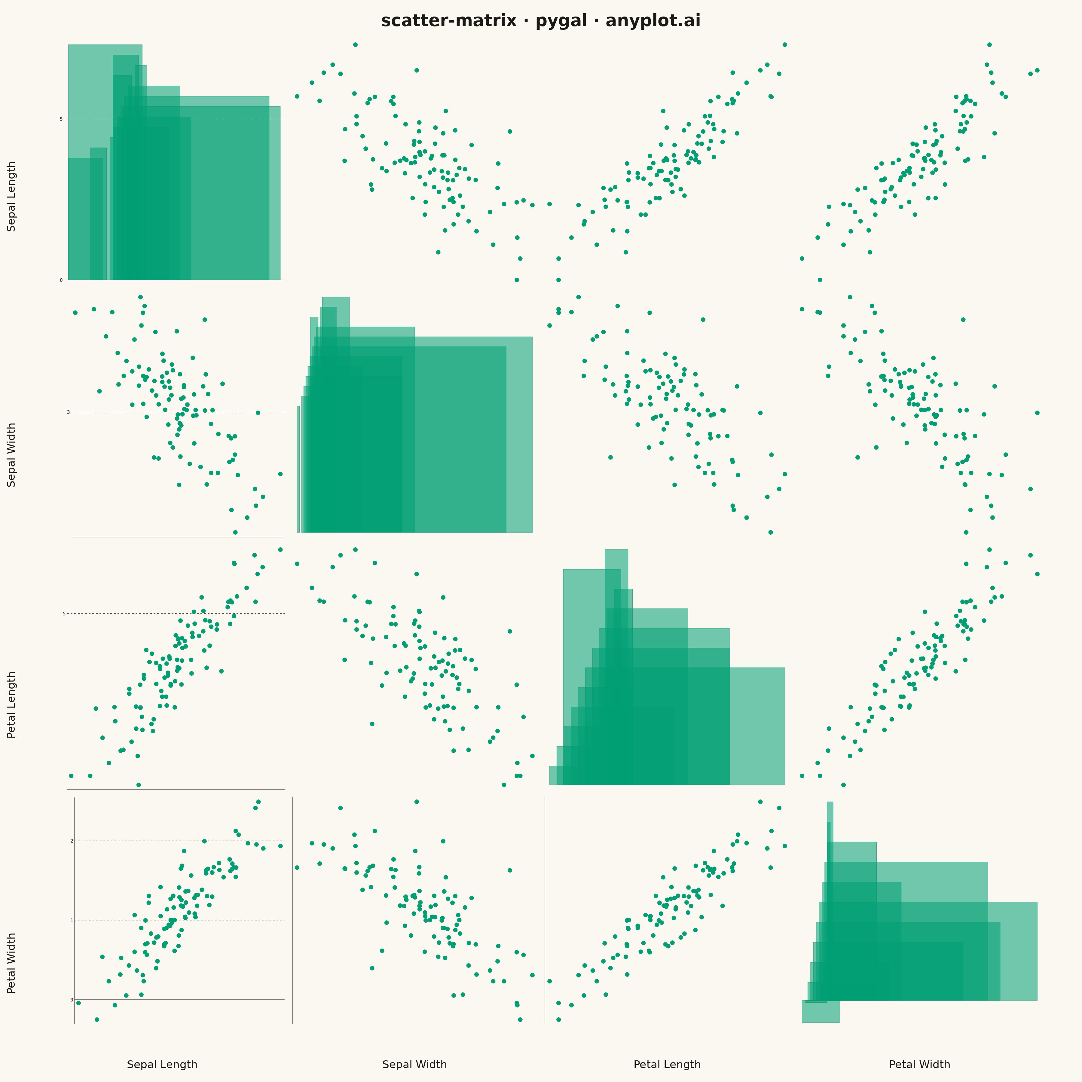
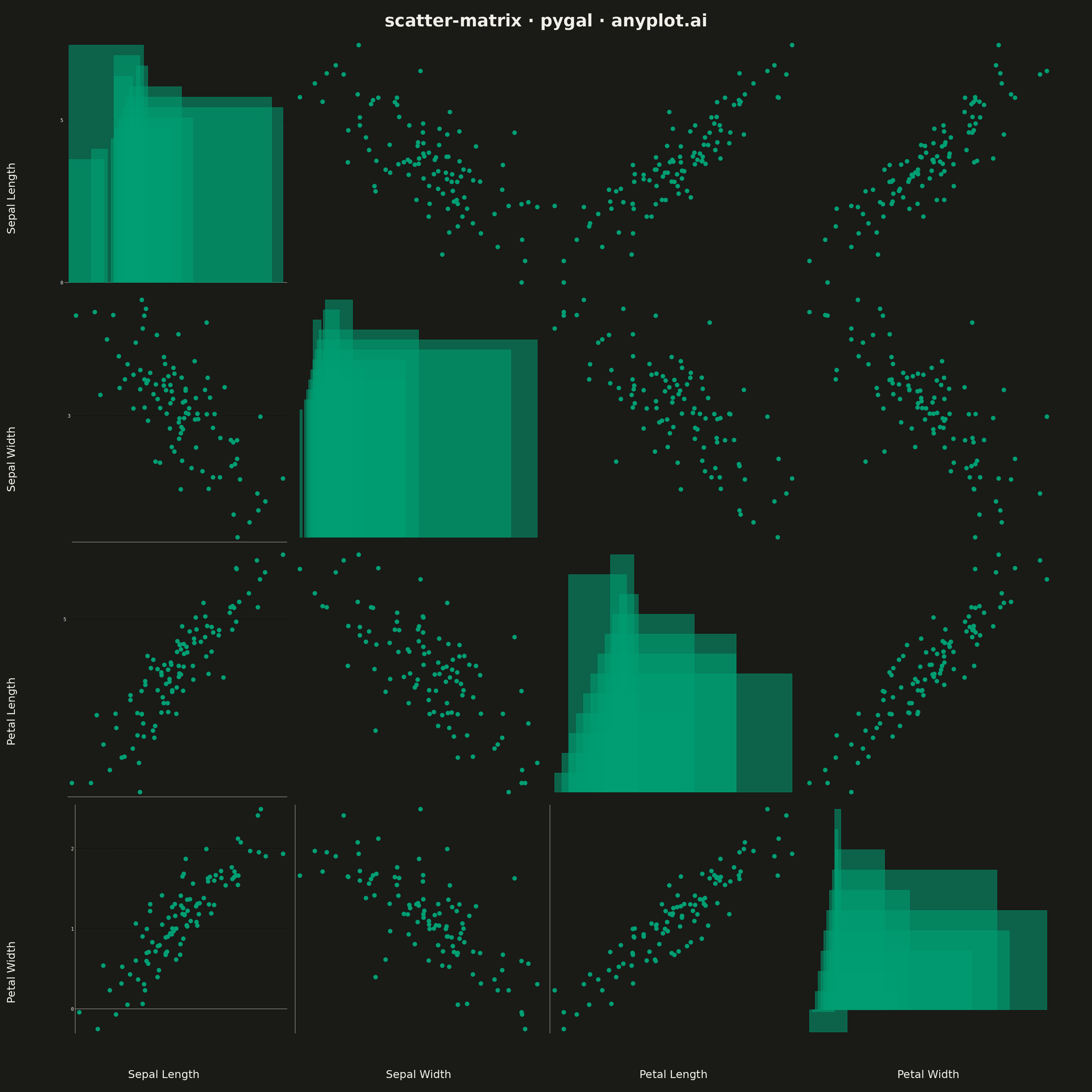
A grid of scatter plots showing all pairwise relationships between multiple variables, with histograms or kernel density estimates on the diagonal. This comprehensive visualization enables simultaneous exploration of correlations and distributions across an entire dataset, making it invaluable for understanding multivariate data structure at a glance. Also known as a pairplot or SPLOM (Scatter Plot Matrix).
""" anyplot.ai
scatter-matrix: Scatter Plot Matrix
Library: pygal 3.1.0 | Python 3.13.13
Quality: 66/100 | Updated: 2026-05-09
"""

from io import BytesIO

import cairosvg
import numpy as np
import pygal
from PIL import Image, ImageDraw, ImageFont
from pygal.style import Style


# Data - Iris-like dataset with 4 variables
np.random.seed(42)
n_samples = 100

# Create correlated multivariate data with both positive and negative correlations
base = np.random.randn(n_samples)
sepal_length = 5.8 + base * 0.8 + np.random.randn(n_samples) * 0.3
sepal_width = 3.0 - base * 0.4 + np.random.randn(n_samples) * 0.25  # Negative correlation with sepal_length
petal_length = 3.8 + base * 1.5 + np.random.randn(n_samples) * 0.4
petal_width = 1.2 + base * 0.6 + np.random.randn(n_samples) * 0.2

variables = {
    "Sepal Length": sepal_length,
    "Sepal Width": sepal_width,
    "Petal Length": petal_length,
    "Petal Width": petal_width,
}
var_names = list(variables.keys())
n_vars = len(var_names)

# Style configuration with improved transparency for overlapping points
custom_style = Style(
    background="white",
    plot_background="#f8f8f8",
    foreground="#333",
    foreground_strong="#333",
    foreground_subtle="#666",
    colors=("#306998", "#FFD43B", "#4B8BBE", "#FFE873"),
    title_font_size=28,
    label_font_size=18,
    major_label_font_size=16,
    legend_font_size=16,
    value_font_size=14,
    opacity=0.55,
    opacity_hover=0.85,
)

# Canvas dimensions
total_width = 3600
total_height = 3600
margin_top = 120
margin_bottom = 120
margin_left = 120
margin_right = 50
plot_area_width = total_width - margin_left - margin_right
plot_area_height = total_height - margin_top - margin_bottom
cell_size = min(plot_area_width, plot_area_height) // n_vars
gap = 10

# Create composite image
composite = Image.new("RGB", (total_width, total_height), "white")

# Render each cell chart and paste into composite
for i in range(n_vars):
    for j in range(n_vars):
        x_pos = margin_left + j * cell_size + gap // 2
        y_pos = margin_top + i * cell_size + gap // 2
        inner_size = cell_size - gap

        var_x = var_names[j]
        var_y = var_names[i]

        if i == j:
            # Diagonal: Histogram
            chart = pygal.Histogram(
                width=inner_size,
                height=inner_size,
                style=custom_style,
                show_legend=False,
                show_x_labels=(i == n_vars - 1),
                show_y_labels=(j == 0),
                x_label_rotation=0,
                show_minor_x_labels=False,
                show_minor_y_labels=False,
                margin_top=8,
                margin_right=8,
                margin_bottom=40 if i == n_vars - 1 else 8,
                margin_left=70 if j == 0 else 8,
                spacing=0,
                truncate_label=-1,
            )

            # Create histogram data
            data = variables[var_x]
            hist, bin_edges = np.histogram(data, bins=12)
            hist_data = [(float(bin_edges[k]), float(bin_edges[k + 1]), float(hist[k])) for k in range(len(hist))]
            chart.add(var_x, hist_data)
        else:
            # Off-diagonal: Scatter plot with smaller dots and better transparency
            chart = pygal.XY(
                width=inner_size,
                height=inner_size,
                style=custom_style,
                show_legend=False,
                show_x_labels=(i == n_vars - 1),
                show_y_labels=(j == 0),
                x_label_rotation=0,
                show_minor_x_labels=False,
                show_minor_y_labels=False,
                margin_top=8,
                margin_right=8,
                margin_bottom=40 if i == n_vars - 1 else 8,
                margin_left=70 if j == 0 else 8,
                dots_size=7,
                stroke=False,
                truncate_label=-1,
            )

            # Scatter data as (x, y) tuples
            x_data = variables[var_x]
            y_data = variables[var_y]
            scatter_data = [(float(x_data[k]), float(y_data[k])) for k in range(len(x_data))]
            chart.add("Data", scatter_data)

        # Render chart to PNG bytes
        svg_bytes = chart.render()
        png_bytes = cairosvg.svg2png(bytestring=svg_bytes, output_width=inner_size, output_height=inner_size)
        cell_image = Image.open(BytesIO(png_bytes))

        # Paste into composite
        composite.paste(cell_image, (x_pos, y_pos))

# Add title and labels using PIL
draw = ImageDraw.Draw(composite)

# Try to use a nice font, fall back to default
try:
    title_font = ImageFont.truetype("/usr/share/fonts/truetype/dejavu/DejaVuSans-Bold.ttf", 56)
    label_font = ImageFont.truetype("/usr/share/fonts/truetype/dejavu/DejaVuSans.ttf", 36)
except OSError:
    title_font = ImageFont.load_default()
    label_font = ImageFont.load_default()

# Title
title_text = "scatter-matrix · pygal · pyplots.ai"
title_bbox = draw.textbbox((0, 0), title_text, font=title_font)
title_width = title_bbox[2] - title_bbox[0]
draw.text(((total_width - title_width) // 2, 35), title_text, fill="#333", font=title_font)

# Variable labels along bottom and left
for idx, var_name in enumerate(var_names):
    # Bottom labels
    x_label_pos = margin_left + idx * cell_size + cell_size // 2
    y_label_pos = margin_top + n_vars * cell_size + 40
    bbox = draw.textbbox((0, 0), var_name, font=label_font)
    text_width = bbox[2] - bbox[0]
    draw.text((x_label_pos - text_width // 2, y_label_pos), var_name, fill="#333", font=label_font)

    # Left labels (rotated - draw text vertically, positioned closer to plots)
    x_label_pos = 15
    y_label_pos = margin_top + idx * cell_size + cell_size // 2

    # Create rotated text image
    txt_img = Image.new("RGBA", (350, 60), (255, 255, 255, 0))
    txt_draw = ImageDraw.Draw(txt_img)
    txt_draw.text((0, 0), var_name, fill="#333", font=label_font)
    txt_rotated = txt_img.rotate(90, expand=True)

    # Paste rotated text
    bbox = draw.textbbox((0, 0), var_name, font=label_font)
    text_height = bbox[2] - bbox[0]
    paste_y = y_label_pos - text_height // 2
    composite.paste(txt_rotated, (x_label_pos, paste_y), txt_rotated)

# Save output
composite.save("plot.png", "PNG", dpi=(300, 300))
Runnable source as JSON, for any HTTP client: https://api.anyplot.ai/specs/scatter-matrix/pygal/code. Any spec id and library id listed in llms-full.txt fit the same URL shape; every URL below is complete and callable.
{
  "spec_id": "scatter-matrix",
  "language": "python",
  "library": "pygal",
  "page": "https://anyplot.ai/scatter-matrix/python/pygal",
  "hub": "https://anyplot.ai/scatter-matrix",
  "code_json": "https://api.anyplot.ai/specs/scatter-matrix/pygal/code",
  "spec_json": "https://api.anyplot.ai/specs/scatter-matrix",
  "render_light_png": "https://storage.googleapis.com/anyplot-images/plots/scatter-matrix/python/pygal/plot-light.png",
  "render_dark_png": "https://storage.googleapis.com/anyplot-images/plots/scatter-matrix/python/pygal/plot-dark.png",
  "interactive_light_html": "https://storage.googleapis.com/anyplot-images/plots/scatter-matrix/python/pygal/plot-light.html",
  "interactive_dark_html": "https://storage.googleapis.com/anyplot-images/plots/scatter-matrix/python/pygal/plot-dark.html",
  "quality_score": 66.0,
  "license": "MIT",
  "guide": "https://anyplot.ai/llms.txt"
}
Part of Scatter Plot Matrix on anyplot.ai.