The same plot in 14 other libraries — JavaScript: D3.js, Apache ECharts, Highcharts, MUI X Charts; Python: Altair, Bokeh, lets-plot, Matplotlib, Plotly, plotnine, Pygal, Seaborn; R: ggplot2; Julia: Makie.jl. Compare all 15 side by side: Basic Strip Plot in Python, R, Julia and JavaScript.
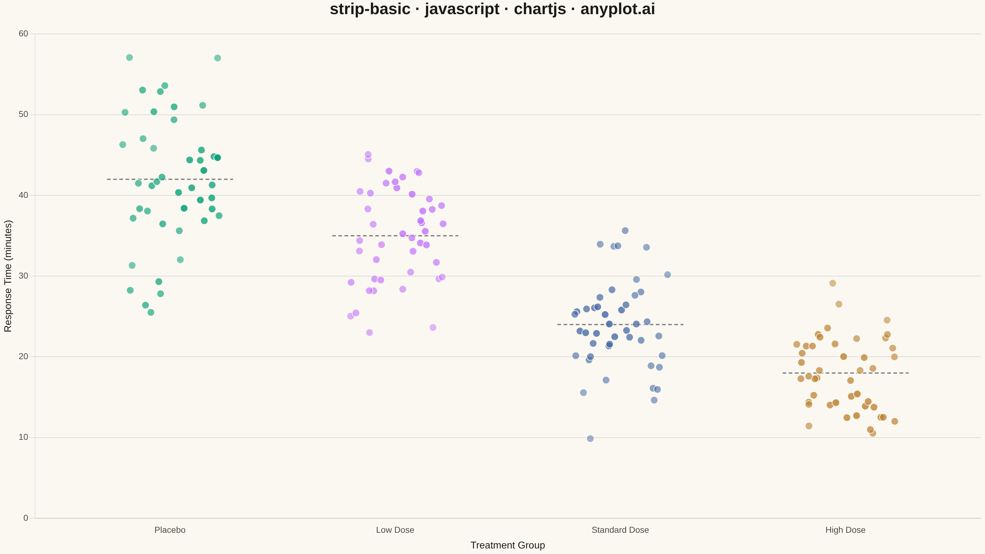
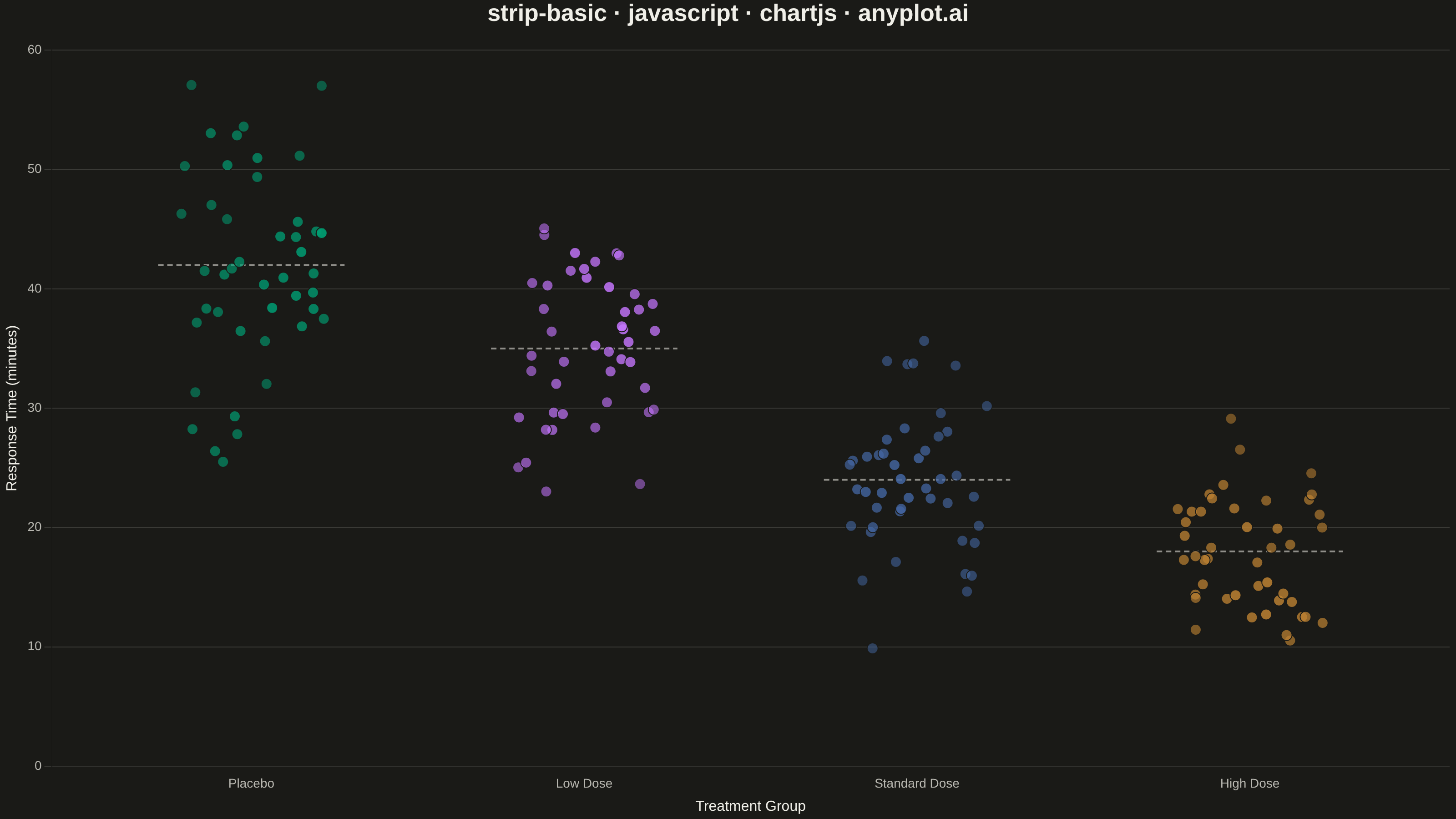
A strip plot displays individual data points for each category along a single axis, with random horizontal jitter applied to reduce overplotting. Unlike box plots or violin plots that show summary statistics, strip plots reveal every observation, making them ideal for small to medium datasets where individual values matter. The random jitter spreads points horizontally within each category to show density through point accumulation.
// anyplot.ai
// strip-basic: Basic Strip Plot
// Library: chartjs 4.4.7 | JavaScript 22.23.1
// Quality: 92/100 | Created: 2026-08-05

const t = window.ANYPLOT_TOKENS;

// --- Data (in-memory, deterministic fixed-seed LCG) -------------------------
// Patient response time (minutes) to a treatment, across escalating drug doses.
function makeLcg(seed) {
  let state = seed;
  return () => {
    state = (state * 1664525 + 1013904223) % 4294967296;
    return state / 4294967296;
  };
}
const rand = makeLcg(42);

function gaussian() {
  const u1 = Math.max(rand(), 1e-9);
  const u2 = rand();
  return Math.sqrt(-2 * Math.log(u1)) * Math.cos(2 * Math.PI * u2);
}

const categories = ["Placebo", "Low Dose", "Standard Dose", "High Dose"];
const groupMeans = [42, 35, 24, 18];
const groupStd = [8, 7, 6, 5];
const perGroup = 45;
const jitterWidth = 0.22;

function withAlpha(hex, alpha) {
  const r = parseInt(hex.slice(1, 3), 16);
  const g = parseInt(hex.slice(3, 5), 16);
  const b = parseInt(hex.slice(5, 7), 16);
  return `rgba(${r}, ${g}, ${b}, ${alpha})`;
}

const groupPoints = categories.map((_, i) =>
  Array.from({ length: perGroup }, () => ({
    x: i + (rand() - 0.5) * 2 * jitterWidth,
    y: Math.max(2, groupMeans[i] + groupStd[i] * gaussian()),
  })),
);

// Local neighbor count per point drives a Chart.js scriptable style function below —
// denser sub-clusters render slightly more saturated, reinforcing the strip plot's
// accumulation-by-overplotting story beyond what a static per-dataset color can show.
const xTol = jitterWidth * 0.6;
const yTol = 3;
function localDensity(points, idx) {
  const p = points[idx];
  let count = 0;
  for (let j = 0; j < points.length; j++) {
    if (j === idx) continue;
    const q = points[j];
    if (Math.abs(q.x - p.x) < xTol && Math.abs(q.y - p.y) < yTol) count++;
  }
  return count;
}

const scatterDatasets = categories.map((label, i) => {
  const points = groupPoints[i];
  const densities = points.map((_, idx) => localDensity(points, idx));
  const maxDensity = Math.max(1, ...densities);
  const baseColor = t.palette[i % t.palette.length];
  return {
    label,
    data: points,
    order: 0,
    pointBackgroundColor: (ctx) => withAlpha(baseColor, 0.5 + 0.35 * (densities[ctx.dataIndex] / maxDensity)),
    pointRadius: 6,
    pointHoverRadius: 6,
    pointBorderWidth: 1,
    pointBorderColor: t.pageBg,
  };
});

// Dashed per-group mean reference lines (spec: "Consider adding horizontal lines for
// group means or medians"), drawn behind the points in the chart's neutral ink tone.
const meanLineDatasets = categories.map((label, i) => ({
  label: `${label} mean`,
  type: "line",
  order: 1,
  data: [
    { x: i - jitterWidth - 0.06, y: groupMeans[i] },
    { x: i + jitterWidth + 0.06, y: groupMeans[i] },
  ],
  borderColor: withAlpha(t.ink, 0.55),
  borderWidth: 2,
  borderDash: [6, 4],
  pointRadius: 0,
  fill: false,
}));

const datasets = [...meanLineDatasets, ...scatterDatasets];

// --- Mount -------------------------------------------------------------------
const canvas = document.createElement("canvas");
document.getElementById("container").appendChild(canvas);

// --- Chart ---------------------------------------------------------------
new Chart(canvas, {
  type: "scatter",
  data: { datasets },
  options: {
    responsive: true,
    maintainAspectRatio: false,
    animation: false,
    parsing: false,
    plugins: {
      title: {
        display: true,
        text: "strip-basic · javascript · chartjs · anyplot.ai",
        color: t.ink,
        font: { size: 26 },
        padding: { bottom: 24 },
      },
      legend: { display: false },
    },
    scales: {
      x: {
        type: "linear",
        min: -0.6,
        max: categories.length - 1 + 0.6,
        ticks: {
          color: t.inkSoft,
          font: { size: 14 },
          stepSize: 1,
          callback: (value) => (Number.isInteger(value) && categories[value] !== undefined ? categories[value] : ""),
        },
        grid: { display: false },
        title: { display: true, text: "Treatment Group", color: t.ink, font: { size: 16 } },
      },
      y: {
        ticks: { color: t.inkSoft, font: { size: 14 } },
        grid: { color: t.grid },
        title: { display: true, text: "Response Time (minutes)", color: t.ink, font: { size: 16 } },
      },
    },
  },
});
Runnable source as JSON, for any HTTP client: https://api.anyplot.ai/specs/strip-basic/chartjs/code. Any spec id and library id listed in llms-full.txt fit the same URL shape; every URL below is complete and callable.
{
  "spec_id": "strip-basic",
  "language": "javascript",
  "library": "chartjs",
  "page": "https://anyplot.ai/strip-basic/javascript/chartjs",
  "hub": "https://anyplot.ai/strip-basic",
  "code_json": "https://api.anyplot.ai/specs/strip-basic/chartjs/code",
  "spec_json": "https://api.anyplot.ai/specs/strip-basic",
  "render_light_png": "https://storage.googleapis.com/anyplot-images/plots/strip-basic/javascript/chartjs/plot-light.png",
  "render_dark_png": "https://storage.googleapis.com/anyplot-images/plots/strip-basic/javascript/chartjs/plot-dark.png",
  "interactive_light_html": "https://storage.googleapis.com/anyplot-images/plots/strip-basic/javascript/chartjs/plot-light.html",
  "interactive_dark_html": "https://storage.googleapis.com/anyplot-images/plots/strip-basic/javascript/chartjs/plot-dark.html",
  "quality_score": 92.0,
  "license": "MIT",
  "guide": "https://anyplot.ai/llms.txt"
}
Part of Basic Strip Plot on anyplot.ai.