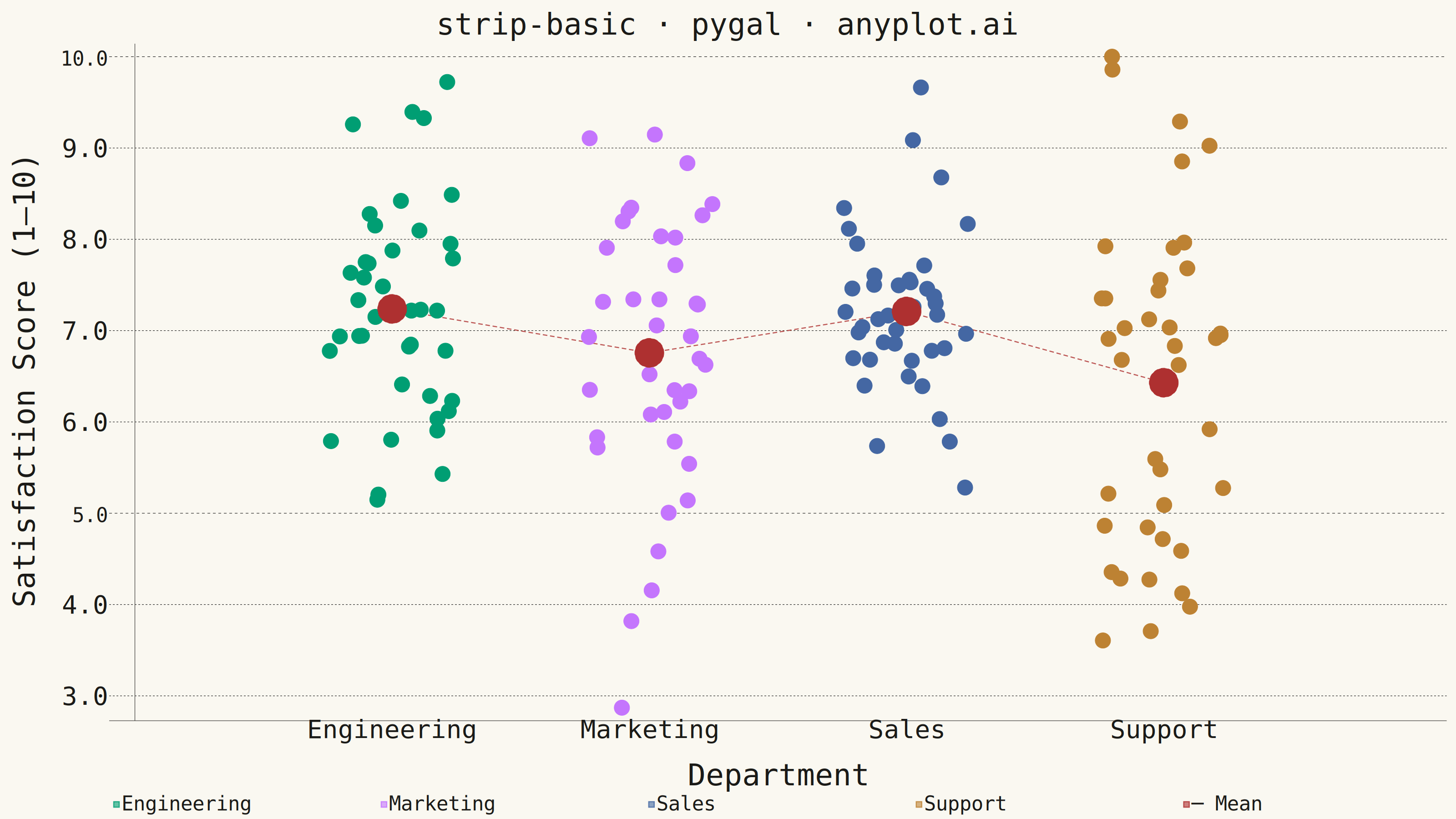
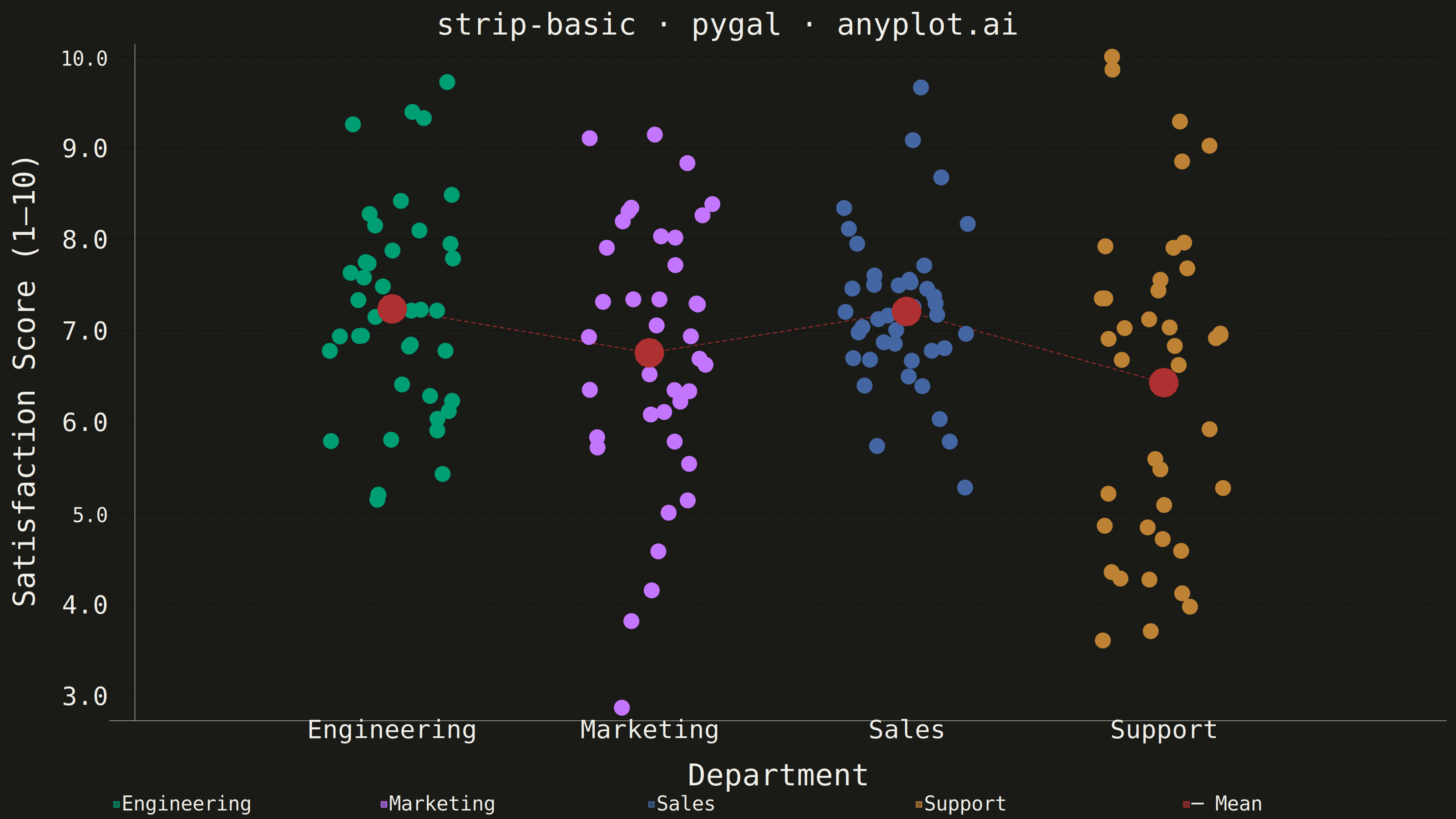
A strip plot displays individual data points for each category along a single axis, with random horizontal jitter applied to reduce overplotting. Unlike box plots or violin plots that show summary statistics, strip plots reveal every observation, making them ideal for small to medium datasets where individual values matter. The random jitter spreads points horizontally within each category to show density through point accumulation.
""" anyplot.ai
strip-basic: Basic Strip Plot
Library: pygal 3.1.3 | Python 3.13.14
Quality: 90/100 | Updated: 2026-08-05
"""

import os

import numpy as np
import pygal
from pygal.style import Style


# Theme tokens
THEME = os.getenv("ANYPLOT_THEME", "light")
PAGE_BG = "#FAF8F1" if THEME == "light" else "#1A1A17"
INK = "#1A1A17" if THEME == "light" else "#F0EFE8"
INK_MUTED = "#6B6A63" if THEME == "light" else "#A8A79F"

IMPRINT = ("#009E73", "#C475FD", "#4467A3", "#BD8233", "#AE3030", "#2ABCCD", "#954477")

# Data — employee satisfaction scores by department (1–10 scale)
np.random.seed(42)
categories = ["Engineering", "Marketing", "Sales", "Support"]
n_per_category = 40

scores = {
    "Engineering": np.clip(np.random.normal(7.5, 1.2, n_per_category), 1, 10),
    "Marketing": np.clip(np.random.normal(6.8, 1.5, n_per_category), 1, 10),
    "Sales": np.clip(np.random.normal(7.2, 1.0, n_per_category), 1, 10),
    "Support": np.clip(np.random.normal(6.5, 1.8, n_per_category), 1, 10),
}

# Style
custom_style = Style(
    background=PAGE_BG,
    plot_background=PAGE_BG,
    foreground=INK,
    foreground_strong=INK,
    foreground_subtle=INK_MUTED,
    colors=IMPRINT,
    title_font_size=66,
    label_font_size=56,
    major_label_font_size=44,
    legend_font_size=44,
    value_font_size=36,
    opacity=0.60,
    stroke_width=2.5,
)

# Chart
chart = pygal.XY(
    width=3200,
    height=1800,
    style=custom_style,
    title="strip-basic · pygal · anyplot.ai",
    x_title="Department",
    y_title="Satisfaction Score (1–10)",
    show_legend=True,
    legend_at_bottom=True,
    legend_at_bottom_columns=5,
    show_x_guides=False,
    show_y_guides=True,
    stroke=False,
    dots_size=17,
    x_label_rotation=0,
)

# Pygal-native tooltip formatting: value_formatter applies to all hover labels
chart.value_formatter = lambda y: f"{y:.1f}"

# X-axis labels aligned to integer positions
chart.x_labels = ["", "Engineering", "Marketing", "Sales", "Support", ""]
chart.xrange = (0, 5)

# Add jittered points per category; per-point dicts enrich HTML tooltips
for i, cat in enumerate(categories, start=1):
    jitter = np.random.uniform(-0.25, 0.25, n_per_category)
    points = [
        {"value": (float(i + j), float(v)), "label": f"{cat}: {v:.1f}"}
        for j, v in zip(jitter, scores[cat], strict=True)
    ]
    chart.add(cat, points)

# Mean reference markers — one dot per category at the mean position (5th Imprint
# color: #AE3030). Positioned at exact integer x (no jitter) so they stand apart
# from the scattered data cloud. A larger dot plus a dashed connecting line (both
# per-serie overrides on top of the scatter-only global style) makes the reference
# layer unambiguous at a glance, rather than reading as a fifth data category.
mean_points = [
    {"value": (float(i), float(np.mean(scores[cat]))), "label": f"Mean {cat}: {np.mean(scores[cat]):.2f}"}
    for i, cat in enumerate(categories, start=1)
]
chart.add("─ Mean", mean_points, dots_size=32, stroke=True, stroke_style={"width": 4, "dasharray": "10,6"})

# Save
chart.render_to_png(f"plot-{THEME}.png")
with open(f"plot-{THEME}.html", "wb") as f:
    f.write(chart.render())
Runnable source as JSON, for any HTTP client: https://api.anyplot.ai/specs/strip-basic/pygal/code. Any spec id and library id listed in llms-full.txt fit the same URL shape; every URL below is complete and callable.
{
  "spec_id": "strip-basic",
  "language": "python",
  "library": "pygal",
  "page": "https://anyplot.ai/strip-basic/python/pygal",
  "hub": "https://anyplot.ai/strip-basic",
  "code_json": "https://api.anyplot.ai/specs/strip-basic/pygal/code",
  "spec_json": "https://api.anyplot.ai/specs/strip-basic",
  "render_light_png": "https://storage.googleapis.com/anyplot-images/plots/strip-basic/python/pygal/plot-light.png",
  "render_dark_png": "https://storage.googleapis.com/anyplot-images/plots/strip-basic/python/pygal/plot-dark.png",
  "interactive_light_html": "https://storage.googleapis.com/anyplot-images/plots/strip-basic/python/pygal/plot-light.html",
  "interactive_dark_html": "https://storage.googleapis.com/anyplot-images/plots/strip-basic/python/pygal/plot-dark.html",
  "quality_score": 90.0,
  "license": "MIT",
  "guide": "https://anyplot.ai/llms.txt"
}
Part of Basic Strip Plot on anyplot.ai.