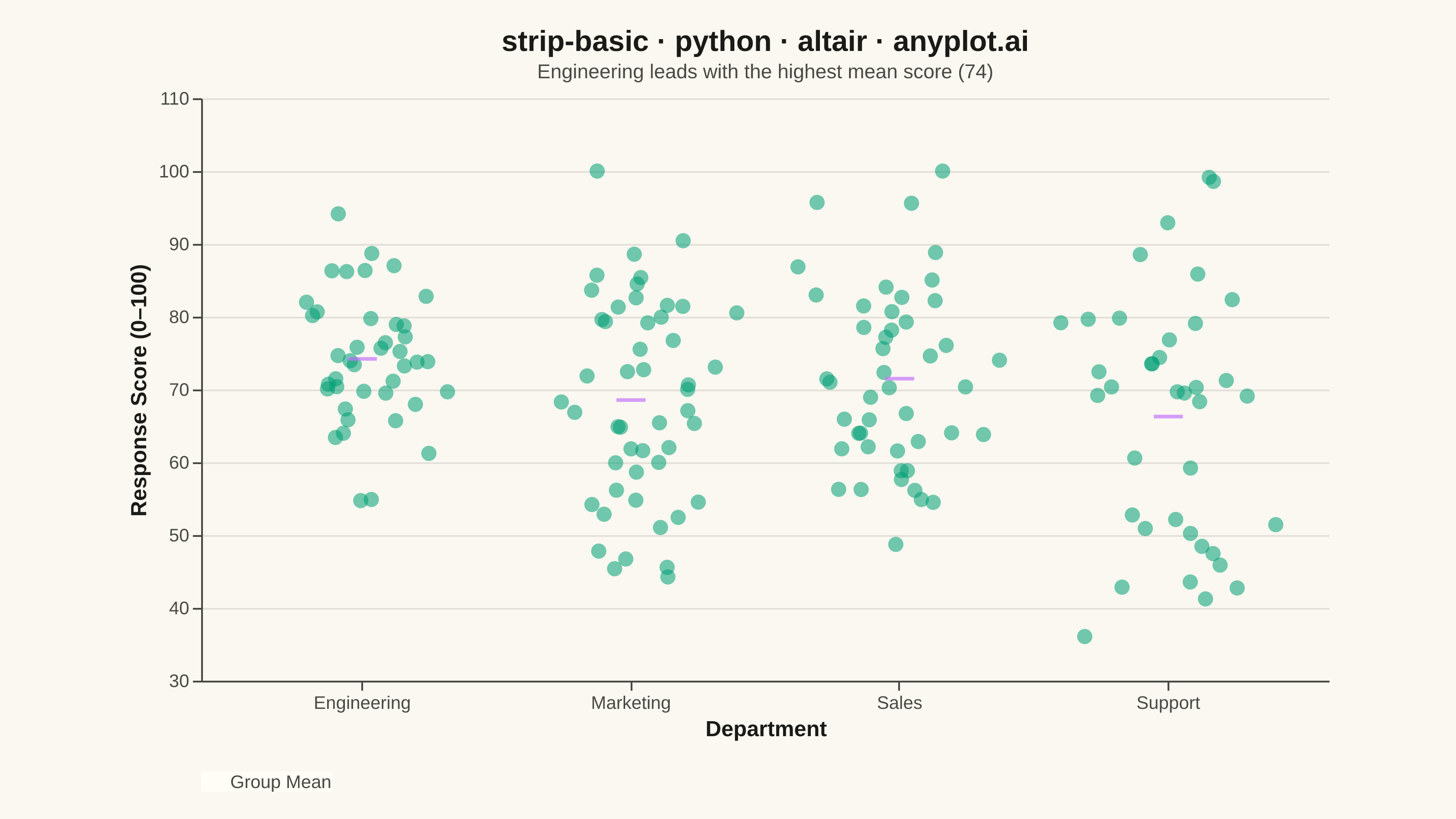
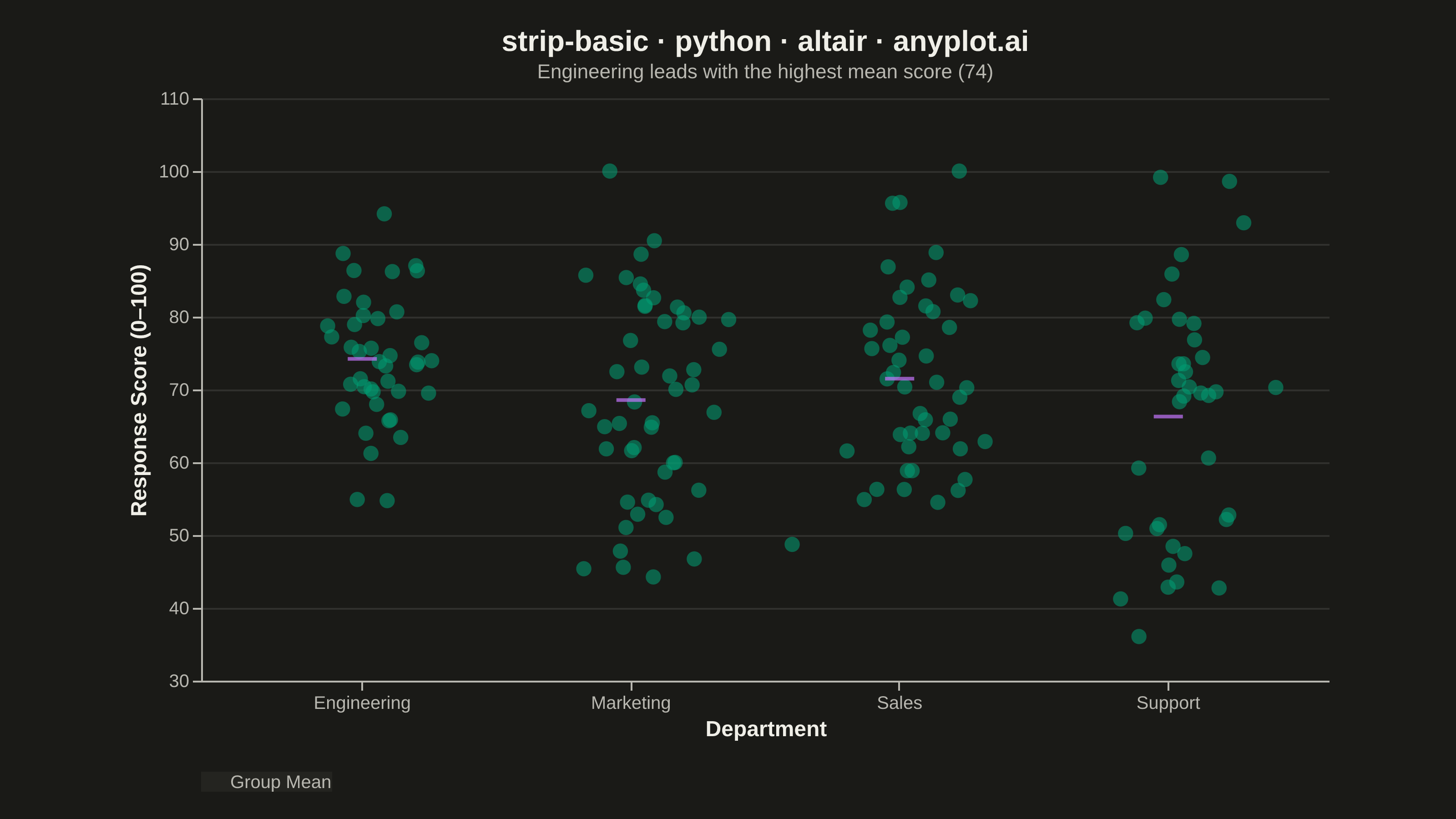
A strip plot displays individual data points for each category along a single axis, with random horizontal jitter applied to reduce overplotting. Unlike box plots or violin plots that show summary statistics, strip plots reveal every observation, making them ideal for small to medium datasets where individual values matter. The random jitter spreads points horizontally within each category to show density through point accumulation.
""" anyplot.ai
strip-basic: Basic Strip Plot
Library: altair 6.2.2 | Python 3.13.14
Quality: 91/100 | Updated: 2026-08-05
"""

import os

import altair as alt
import numpy as np
import pandas as pd
from PIL import Image


# Theme tokens
THEME = os.getenv("ANYPLOT_THEME", "light")
PAGE_BG = "#FAF8F1" if THEME == "light" else "#1A1A17"
ELEVATED_BG = "#FFFDF6" if THEME == "light" else "#242420"
INK = "#1A1A17" if THEME == "light" else "#F0EFE8"
INK_SOFT = "#4A4A44" if THEME == "light" else "#B8B7B0"

BRAND = "#009E73"  # Imprint palette position 1 — always first series
ACCENT = "#C475FD"  # Imprint palette position 2 — mean markers

# Data — survey response scores by department
np.random.seed(42)

departments = ["Engineering", "Marketing", "Sales", "Support"]
distributions = {"Engineering": (75, 10), "Marketing": (68, 15), "Sales": (72, 12), "Support": (65, 18)}

rows = []
for dept in departments:
    mean, std = distributions[dept]
    n = np.random.randint(35, 50)
    scores = np.clip(np.random.normal(mean, std, n), 20, 100)
    for score in scores:
        rows.append({"Department": dept, "Response Score": score})

df = pd.DataFrame(rows)

means = df.groupby("Department")["Response Score"].mean().reset_index()
means.columns = ["Department", "Mean"]
means["Label"] = "Group Mean"

top_dept = means.loc[means["Mean"].idxmax()]
subtitle = f"{top_dept['Department']} leads with the highest mean score ({top_dept['Mean']:.0f})"

# Strip chart with Gaussian jitter via transform_calculate
strip = (
    alt.Chart(df)
    .mark_circle(size=70, opacity=0.55, color=BRAND)
    .encode(
        x=alt.X("Department:N", title="Department", axis=alt.Axis(labelAngle=0)),
        y=alt.Y("Response Score:Q", title="Response Score (0–100)", scale=alt.Scale(domain=[30, 105])),
        xOffset="jitter:Q",
        tooltip=["Department:N", alt.Tooltip("Response Score:Q", format=".1f")],
    )
    .transform_calculate(jitter="sqrt(-2*log(random()))*cos(2*PI*random())*0.27")
)

# Mean reference ticks with legend entry
mean_ticks = (
    alt.Chart(means)
    .mark_tick(thickness=2, size=16)
    .encode(
        x=alt.X("Department:N"),
        y=alt.Y("Mean:Q"),
        color=alt.Color(
            "Label:N",
            scale=alt.Scale(domain=["Group Mean"], range=[ACCENT]),
            legend=alt.Legend(
                title="",
                orient="bottom",
                direction="horizontal",
                labelFontSize=10,
                symbolType="stroke",
                symbolStrokeWidth=2,
                symbolSize=90,
            ),
        ),
        tooltip=[alt.Tooltip("Mean:Q", format=".1f", title="Group Mean")],
    )
)

# Combine and apply theme-adaptive chrome
chart = (
    alt.layer(strip, mean_ticks)
    .properties(
        width=620,
        height=320,
        padding={"left": 0, "right": 0, "top": 0, "bottom": 0},
        title=alt.Title(
            "strip-basic · python · altair · anyplot.ai",
            subtitle=subtitle,
            fontSize=16,
            subtitleFontSize=11,
            subtitleColor=INK_SOFT,
        ),
        background=PAGE_BG,
    )
    .configure_view(fill=PAGE_BG, strokeWidth=0, continuousWidth=620, continuousHeight=320)
    .configure_axis(
        domainColor=INK_SOFT,
        tickColor=INK_SOFT,
        gridColor=INK,
        gridOpacity=0.10,
        labelColor=INK_SOFT,
        titleColor=INK,
        labelFontSize=10,
        titleFontSize=12,
    )
    .configure_title(color=INK)
    .configure_legend(fillColor=ELEVATED_BG, labelColor=INK_SOFT, titleColor=INK, titleFontSize=10)
)

# Save — pad to the canonical 3200x1800 target (vl-convert never overshoots this small a view)
chart.save(f"plot-{THEME}.png", scale_factor=4.0)

TW, TH = 3200, 1800
_img = Image.open(f"plot-{THEME}.png").convert("RGB")
_w, _h = _img.size
if _w > TW or _h > TH:
    raise SystemExit(
        f"altair vl-convert produced {_w}x{_h}, exceeds target {TW}x{TH}. "
        f"Shrink chart .properties(width=, height=) values and re-render."
    )
if _w < TW or _h < TH:
    _canvas = Image.new("RGB", (TW, TH), PAGE_BG)
    _canvas.paste(_img, ((TW - _w) // 2, (TH - _h) // 2))
    _canvas.save(f"plot-{THEME}.png")

chart.save(f"plot-{THEME}.html")
Runnable source as JSON, for any HTTP client: https://api.anyplot.ai/specs/strip-basic/altair/code. Any spec id and library id listed in llms-full.txt fit the same URL shape; every URL below is complete and callable.
{
  "spec_id": "strip-basic",
  "language": "python",
  "library": "altair",
  "page": "https://anyplot.ai/strip-basic/python/altair",
  "hub": "https://anyplot.ai/strip-basic",
  "code_json": "https://api.anyplot.ai/specs/strip-basic/altair/code",
  "spec_json": "https://api.anyplot.ai/specs/strip-basic",
  "render_light_png": "https://storage.googleapis.com/anyplot-images/plots/strip-basic/python/altair/plot-light.png",
  "render_dark_png": "https://storage.googleapis.com/anyplot-images/plots/strip-basic/python/altair/plot-dark.png",
  "interactive_light_html": "https://storage.googleapis.com/anyplot-images/plots/strip-basic/python/altair/plot-light.html",
  "interactive_dark_html": "https://storage.googleapis.com/anyplot-images/plots/strip-basic/python/altair/plot-dark.html",
  "quality_score": 91.0,
  "license": "MIT",
  "guide": "https://anyplot.ai/llms.txt"
}
Part of Basic Strip Plot on anyplot.ai.