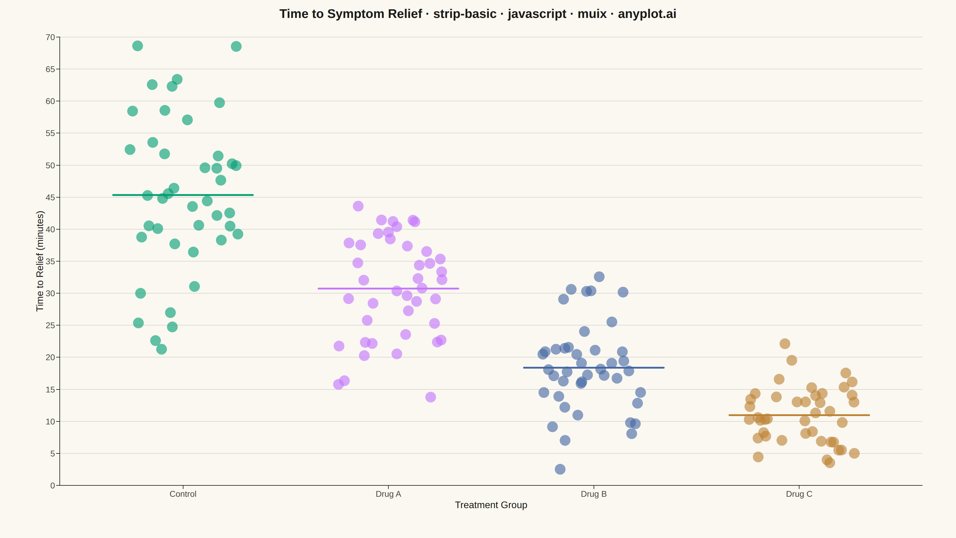
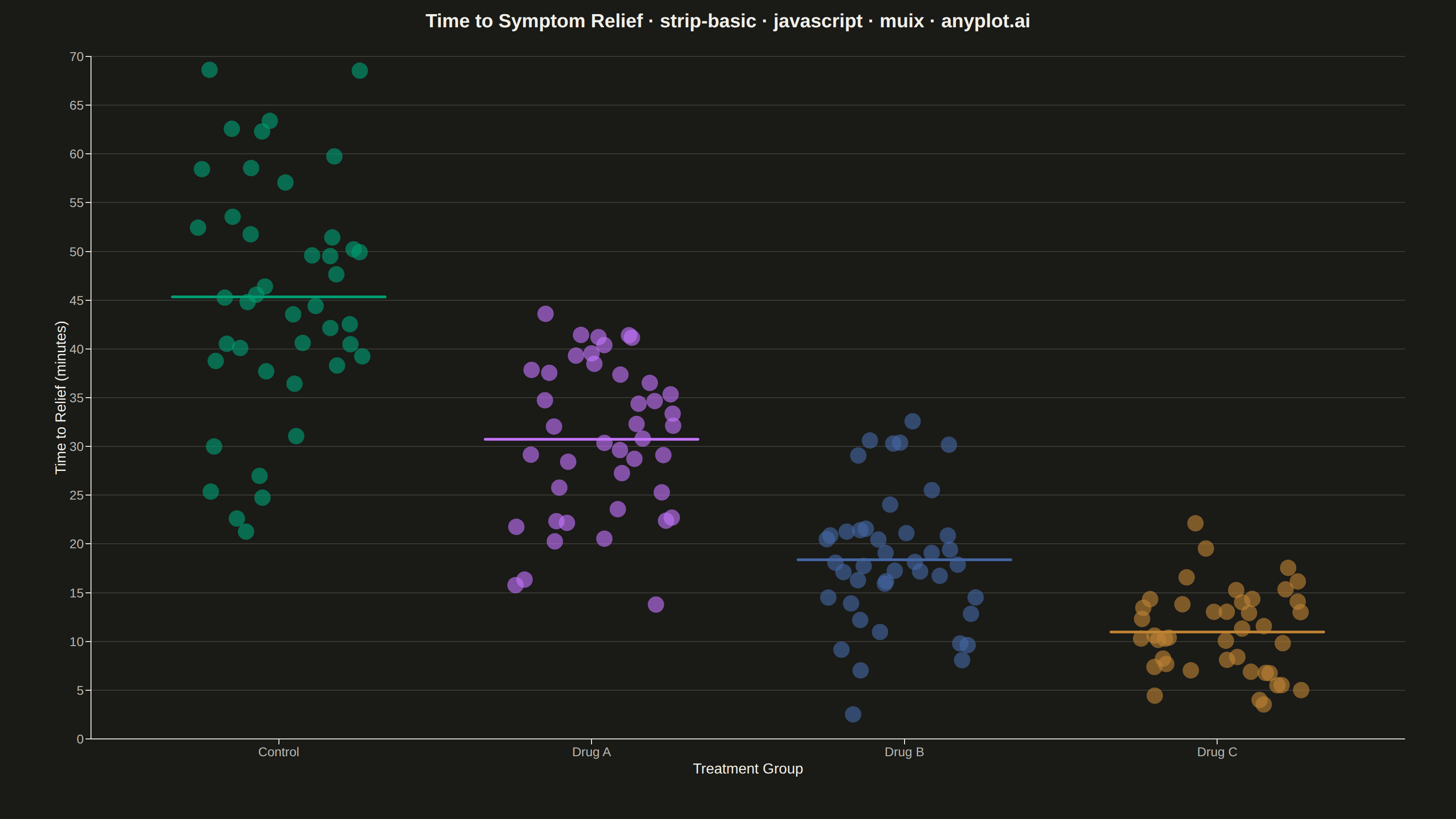
The same plot in 14 other libraries — JavaScript: Chart.js, D3.js, Apache ECharts, Highcharts; Python: Altair, Bokeh, lets-plot, Matplotlib, Plotly, plotnine, Pygal, Seaborn; R: ggplot2; Julia: Makie.jl. Compare all 15 side by side: Basic Strip Plot in Python, R, Julia and JavaScript.
A strip plot displays individual data points for each category along a single axis, with random horizontal jitter applied to reduce overplotting. Unlike box plots or violin plots that show summary statistics, strip plots reveal every observation, making them ideal for small to medium datasets where individual values matter. The random jitter spreads points horizontally within each category to show density through point accumulation.
// anyplot.ai
// strip-basic: Basic Strip Plot
// Library: muix 7.29.1 | JavaScript 22.23.1
// Quality: 86/100 | Created: 2026-08-05

import { ChartContainer } from "@mui/x-charts/ChartContainer";
import { ScatterPlot } from "@mui/x-charts/ScatterChart";
import { ChartsXAxis } from "@mui/x-charts/ChartsXAxis";
import { ChartsYAxis } from "@mui/x-charts/ChartsYAxis";
import { ChartsGrid } from "@mui/x-charts/ChartsGrid";
import { useXScale, useYScale } from "@mui/x-charts/hooks";

const t = window.ANYPLOT_TOKENS;
const { width, height } = window.ANYPLOT_SIZE;

// Reproducible LCG (seed 42) — the browser harness has no seeded Math.random()
let seed = 42;
function rng() {
  seed = (1664525 * seed + 1013904223) >>> 0;
  return seed / 4294967296;
}

// Box-Muller transform for approximately-normal samples from the LCG stream
function gaussian() {
  const u1 = Math.max(rng(), 1e-9);
  const u2 = rng();
  return Math.sqrt(-2 * Math.log(u1)) * Math.cos(2 * Math.PI * u2);
}

function hexToRgba(hex, alpha) {
  const n = parseInt(hex.slice(1), 16);
  return `rgba(${(n >> 16) & 255}, ${(n >> 8) & 255}, ${n & 255}, ${alpha})`;
}

// Time to symptom relief (minutes) after treatment, four groups
const GROUPS = [
  { name: "Control", mean: 46, std: 12, n: 42 },
  { name: "Drug A", mean: 30, std: 10, n: 42 },
  { name: "Drug B", mean: 19, std: 7, n: 42 },
  { name: "Drug C", mean: 11, std: 5, n: 42 },
];

const JITTER_WIDTH = 0.27; // wide spread within each category to reduce point-on-point overlap
const POINT_ALPHA = 0.62; // frequent overlap at n=42 per group
const MEAN_LINE_HALF_WIDTH = 0.34; // spans slightly beyond the jittered point cloud

// Each group's own observations drive its mean line, so the marker reflects
// the actual sampled data rather than the underlying distribution parameter.
const GROUP_DATA = GROUPS.map((group, i) => {
  const points = Array.from({ length: group.n }, (_, j) => ({
    x: i + (rng() * 2 - 1) * JITTER_WIDTH,
    y: Math.max(2, group.mean + group.std * gaussian()),
    id: `${group.name}-${j}`,
  }));
  const observedMean = points.reduce((sum, p) => sum + p.y, 0) / points.length;
  return { ...group, points, observedMean };
});

const series = GROUP_DATA.map((group, i) => ({
  type: "scatter",
  id: group.name,
  label: group.name,
  color: hexToRgba(t.palette[i], POINT_ALPHA),
  markerSize: 9,
  data: group.points,
}));

// Short, bold underline per category at its observed mean — reinforces the
// Control-to-Drug-C decreasing-effect story the spec asks to highlight.
function MeanLines() {
  const xScale = useXScale("group");
  const yScale = useYScale("time");
  return (
    <g>
      {GROUP_DATA.map((group, i) => {
        const y = yScale(group.observedMean);
        return (
          <line
            key={group.name}
            x1={xScale(i - MEAN_LINE_HALF_WIDTH)}
            x2={xScale(i + MEAN_LINE_HALF_WIDTH)}
            y1={y}
            y2={y}
            stroke={t.palette[i]}
            strokeWidth={3}
            strokeLinecap="round"
          />
        );
      })}
    </g>
  );
}

const TITLE = "Time to Symptom Relief · strip-basic · javascript · muix · anyplot.ai";
const TITLE_FONT_SIZE = Math.round(22 * Math.min(1, 67 / TITLE.length)); // scale down past the 67-char baseline

export default function Chart() {
  return (
    <ChartContainer
      width={width}
      height={height}
      margin={{ top: 62, right: 56, bottom: 88, left: 100 }}
      sx={{ "& .MuiChartsAxis-top, & .MuiChartsAxis-right": { display: "none" } }}
      series={series}
      xAxis={[
        {
          id: "group",
          min: -0.6,
          max: GROUPS.length - 1 + 0.6,
          tickInterval: GROUPS.map((_, i) => i),
          valueFormatter: (v) => GROUPS[Math.round(v)]?.name ?? "",
          label: "Treatment Group",
          tickLabelStyle: { fontSize: 14, fill: t.inkSoft },
          labelStyle: { fontSize: 16, fill: t.ink },
        },
      ]}
      yAxis={[
        {
          id: "time",
          min: 0,
          label: "Time to Relief (minutes)",
          tickLabelStyle: { fontSize: 14, fill: t.inkSoft },
          labelStyle: { fontSize: 16, fill: t.ink },
        },
      ]}
    >
      <ChartsGrid horizontal />
      <ScatterPlot skipAnimation />
      <MeanLines />
      <ChartsXAxis
        axisId="group"
        tickLabelStyle={{ fontSize: 14, fill: t.inkSoft }}
        labelStyle={{ fontSize: 16, fill: t.ink }}
      />
      <ChartsYAxis
        axisId="time"
        tickLabelStyle={{ fontSize: 14, fill: t.inkSoft }}
        labelStyle={{ fontSize: 16, fill: t.ink }}
      />
      <text x={width / 2} y={30} textAnchor="middle" fontSize={TITLE_FONT_SIZE} fontWeight={600} fill={t.ink}>
        {TITLE}
      </text>
    </ChartContainer>
  );
}
Runnable source as JSON, for any HTTP client: https://api.anyplot.ai/specs/strip-basic/muix/code. Any spec id and library id listed in llms-full.txt fit the same URL shape; every URL below is complete and callable.
{
  "spec_id": "strip-basic",
  "language": "javascript",
  "library": "muix",
  "page": "https://anyplot.ai/strip-basic/javascript/muix",
  "hub": "https://anyplot.ai/strip-basic",
  "code_json": "https://api.anyplot.ai/specs/strip-basic/muix/code",
  "spec_json": "https://api.anyplot.ai/specs/strip-basic",
  "render_light_png": "https://storage.googleapis.com/anyplot-images/plots/strip-basic/javascript/muix/plot-light.png",
  "render_dark_png": "https://storage.googleapis.com/anyplot-images/plots/strip-basic/javascript/muix/plot-dark.png",
  "interactive_light_html": "https://storage.googleapis.com/anyplot-images/plots/strip-basic/javascript/muix/plot-light.html",
  "interactive_dark_html": "https://storage.googleapis.com/anyplot-images/plots/strip-basic/javascript/muix/plot-dark.html",
  "quality_score": 86.0,
  "license": "MIT",
  "guide": "https://anyplot.ai/llms.txt"
}
Part of Basic Strip Plot on anyplot.ai.