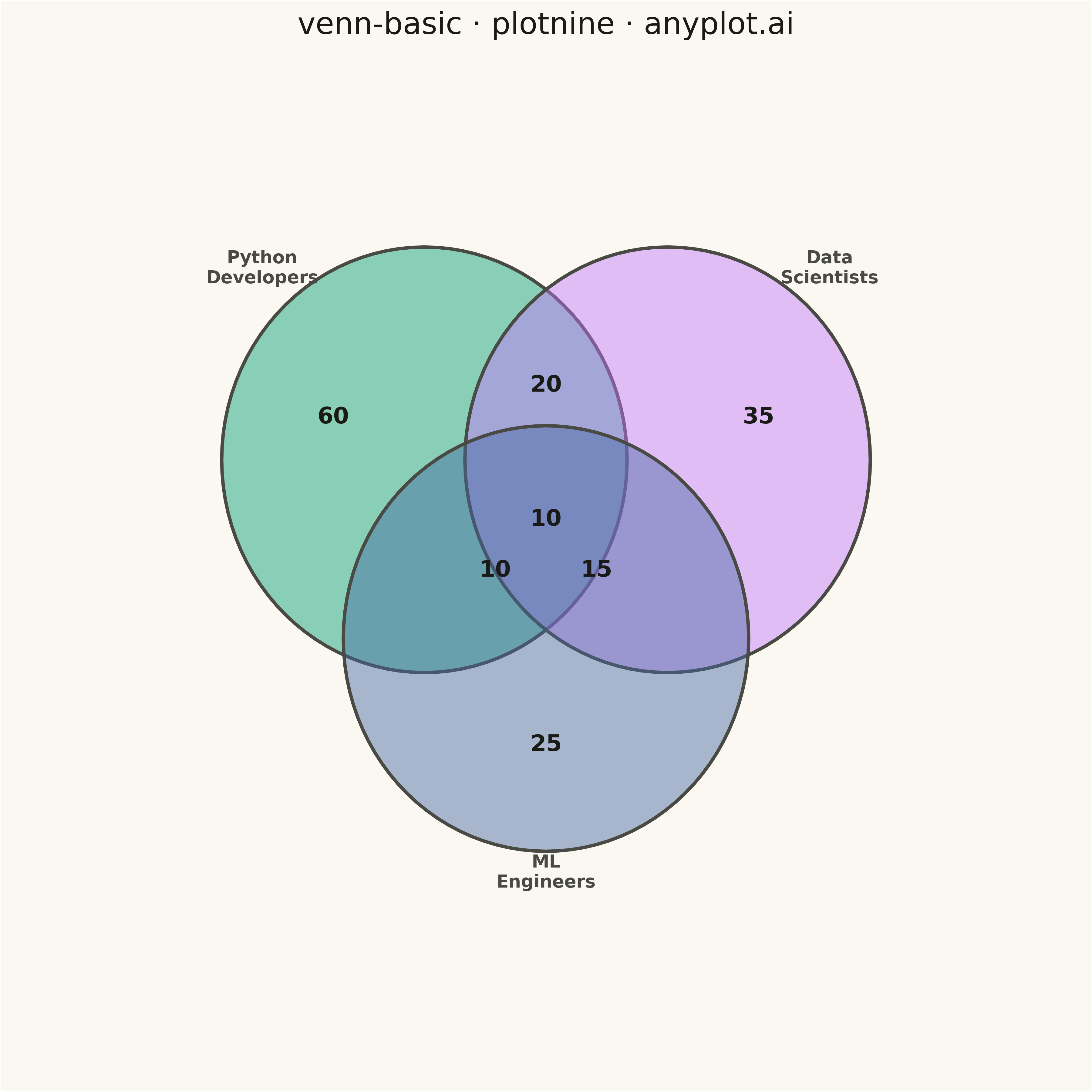
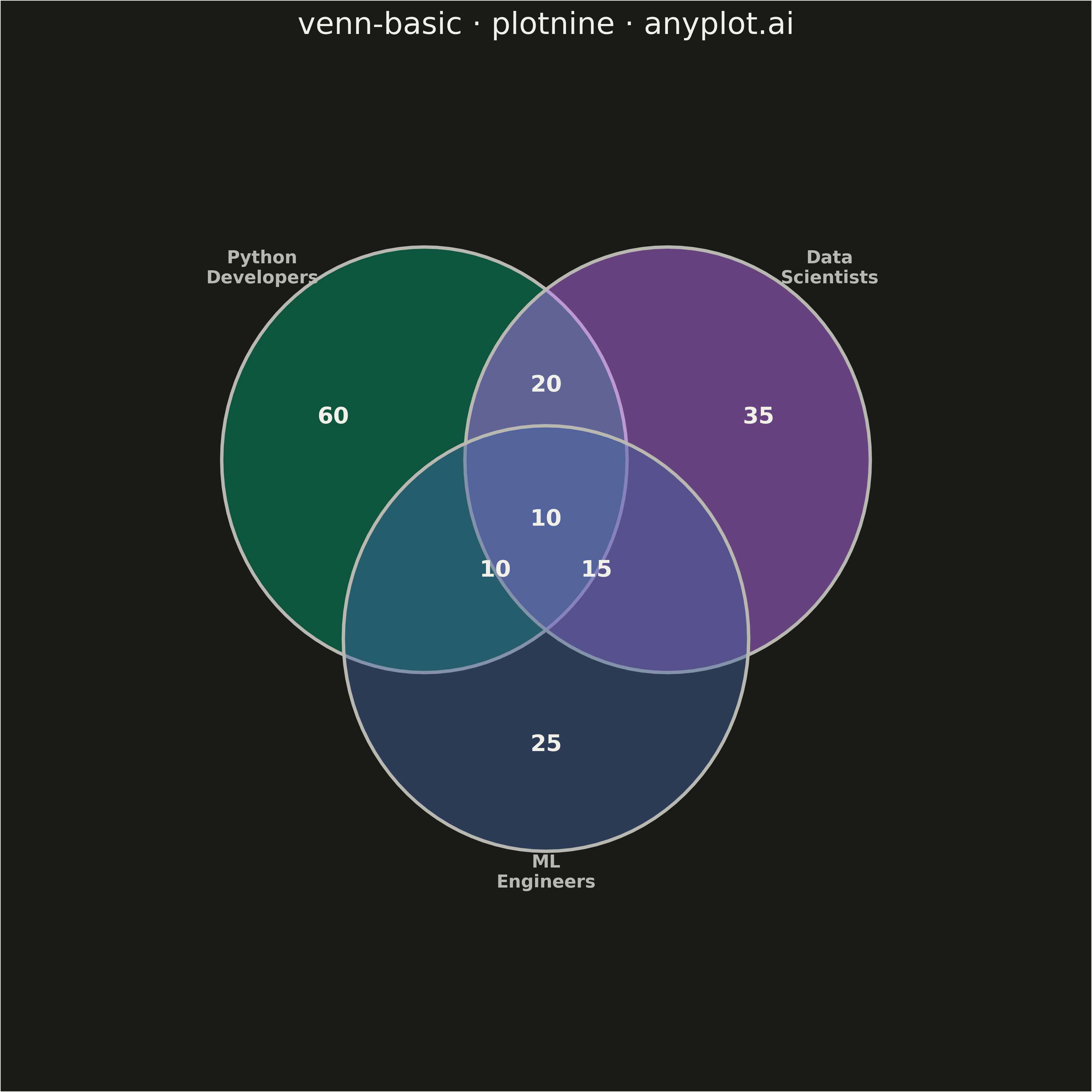
A Venn diagram visualizes the logical relationships between two or three sets using overlapping circles. Each circle represents a set, and overlapping regions show elements shared between sets. This classic visualization is ideal for showing intersections, unions, and exclusive memberships, making abstract set relationships immediately intuitive.
""" anyplot.ai
venn-basic: Venn Diagram
Library: plotnine 0.15.4 | Python 3.13.13
Quality: 83/100 | Updated: 2026-05-11
"""

import math
import os

import numpy as np
import pandas as pd
from plotnine import (
    aes,
    element_blank,
    element_rect,
    element_text,
    geom_polygon,
    geom_text,
    ggplot,
    labs,
    scale_fill_manual,
    scale_x_continuous,
    scale_y_continuous,
    theme,
)


THEME = os.getenv("ANYPLOT_THEME", "light")
PAGE_BG = "#FAF8F1" if THEME == "light" else "#1A1A17"
INK = "#1A1A17" if THEME == "light" else "#F0EFE8"
INK_SOFT = "#4A4A44" if THEME == "light" else "#B8B7B0"

# Okabe-Ito palette - first three colors for three-set Venn
IMPRINT = ["#009E73", "#C475FD", "#4467A3"]

# Data - Three overlapping sets representing skills in a tech team
# Set A: Python developers (100 people)
# Set B: Data Scientists (80 people)
# Set C: ML Engineers (60 people)
# Overlaps: A∩B=30, A∩C=20, B∩C=25, A∩B∩C=10

set_labels = ["Python\nDevelopers", "Data\nScientists", "ML\nEngineers"]
# Region counts (exclusive to each region)
# A only: 100 - 30 - 20 + 10 = 60
# B only: 80 - 30 - 25 + 10 = 35
# C only: 60 - 20 - 25 + 10 = 25
# A∩B only: 30 - 10 = 20
# A∩C only: 20 - 10 = 10
# B∩C only: 25 - 10 = 15
# A∩B∩C: 10

region_counts = {"A_only": 60, "B_only": 35, "C_only": 25, "AB_only": 20, "AC_only": 10, "BC_only": 15, "ABC": 10}

# Circle positions for 3-set Venn diagram
# Circles arranged in a triangle formation with significant overlap
radius = 5
offset = radius * 0.6  # Controls overlap amount
n_points = 100

# Circle centers
centers = {
    "A": (-offset, offset * 0.5),  # Top-left
    "B": (offset, offset * 0.5),  # Top-right
    "C": (0, -offset * 0.9),  # Bottom
}

# Create circle polygons
circle_rows = []
circle_id = 0
for label, (cx, cy) in centers.items():
    angles = np.linspace(0, 2 * math.pi, n_points + 1)
    x_coords = cx + radius * np.cos(angles)
    y_coords = cy + radius * np.sin(angles)
    for i in range(len(x_coords)):
        circle_rows.append({"x": x_coords[i], "y": y_coords[i], "circle_id": circle_id, "set": label})
    circle_id += 1

circle_df = pd.DataFrame(circle_rows)

# Calculate positions for region labels
# A only - left side of circle A
label_A_only = {
    "x": centers["A"][0] - radius * 0.45,
    "y": centers["A"][1] + radius * 0.2,
    "label": str(region_counts["A_only"]),
}

# B only - right side of circle B
label_B_only = {
    "x": centers["B"][0] + radius * 0.45,
    "y": centers["B"][1] + radius * 0.2,
    "label": str(region_counts["B_only"]),
}

# C only - bottom of circle C
label_C_only = {"x": centers["C"][0], "y": centers["C"][1] - radius * 0.5, "label": str(region_counts["C_only"])}

# AB intersection (top center)
label_AB = {"x": 0, "y": centers["A"][1] + radius * 0.35, "label": str(region_counts["AB_only"])}

# AC intersection (bottom-left)
label_AC = {
    "x": centers["A"][0] + radius * 0.35,
    "y": (centers["A"][1] + centers["C"][1]) / 2 - radius * 0.1,
    "label": str(region_counts["AC_only"]),
}

# BC intersection (bottom-right)
label_BC = {
    "x": centers["B"][0] - radius * 0.35,
    "y": (centers["B"][1] + centers["C"][1]) / 2 - radius * 0.1,
    "label": str(region_counts["BC_only"]),
}

# ABC intersection (center)
centroid_x = (centers["A"][0] + centers["B"][0] + centers["C"][0]) / 3
centroid_y = (centers["A"][1] + centers["B"][1] + centers["C"][1]) / 3
label_ABC = {"x": centroid_x, "y": centroid_y, "label": str(region_counts["ABC"])}

# Create label dataframes
count_labels_df = pd.DataFrame([label_A_only, label_B_only, label_C_only, label_AB, label_AC, label_BC, label_ABC])

# Set name labels - positioned outside circles
set_name_labels = [
    {"x": centers["A"][0] - radius * 0.8, "y": centers["A"][1] + radius * 0.9, "label": set_labels[0]},
    {"x": centers["B"][0] + radius * 0.8, "y": centers["B"][1] + radius * 0.9, "label": set_labels[1]},
    {"x": centers["C"][0], "y": centers["C"][1] - radius * 1.1, "label": set_labels[2]},
]
set_name_df = pd.DataFrame(set_name_labels)

# Create color mapping dict for sets
color_map = {"A": IMPRINT[0], "B": IMPRINT[1], "C": IMPRINT[2]}

# Plot
plot = (
    ggplot()
    # Draw circles with transparency for overlap visibility
    + geom_polygon(
        aes(x="x", y="y", fill="set", group="circle_id"), data=circle_df, alpha=0.45, color=INK_SOFT, size=1.5
    )
    # Region count labels (larger, bold)
    + geom_text(aes(x="x", y="y", label="label"), data=count_labels_df, size=18, fontweight="bold", color=INK)
    # Set name labels (outside circles)
    + geom_text(aes(x="x", y="y", label="label"), data=set_name_df, size=14, fontweight="bold", color=INK_SOFT)
    # Colors using Okabe-Ito palette
    + scale_fill_manual(values=color_map)
    # Axis scaling for proper aspect ratio
    + scale_x_continuous(limits=(-12, 12))
    + scale_y_continuous(limits=(-12, 10))
    # Title
    + labs(title="venn-basic · plotnine · anyplot.ai")
    # Theme with proper sizing and colors
    + theme(
        figure_size=(12, 12),
        plot_title=element_text(size=24, ha="center", color=INK, fontweight="medium"),
        axis_title=element_blank(),
        axis_text=element_blank(),
        axis_ticks=element_blank(),
        axis_line=element_blank(),
        panel_grid_major=element_blank(),
        panel_grid_minor=element_blank(),
        panel_background=element_rect(fill=PAGE_BG, color=None),
        plot_background=element_rect(fill=PAGE_BG, color=None),
        legend_position="none",
    )
)

# Save
plot.save(f"plot-{THEME}.png", dpi=300)
Runnable source as JSON, for any HTTP client: https://api.anyplot.ai/specs/venn-basic/plotnine/code. Any spec id and library id listed in llms-full.txt fit the same URL shape; every URL below is complete and callable.
{
  "spec_id": "venn-basic",
  "language": "python",
  "library": "plotnine",
  "page": "https://anyplot.ai/venn-basic/python/plotnine",
  "hub": "https://anyplot.ai/venn-basic",
  "code_json": "https://api.anyplot.ai/specs/venn-basic/plotnine/code",
  "spec_json": "https://api.anyplot.ai/specs/venn-basic",
  "render_light_png": "https://storage.googleapis.com/anyplot-images/plots/venn-basic/python/plotnine/plot-light.png",
  "render_dark_png": "https://storage.googleapis.com/anyplot-images/plots/venn-basic/python/plotnine/plot-dark.png",
  "quality_score": 83.0,
  "license": "MIT",
  "guide": "https://anyplot.ai/llms.txt"
}
Part of Venn Diagram on anyplot.ai.