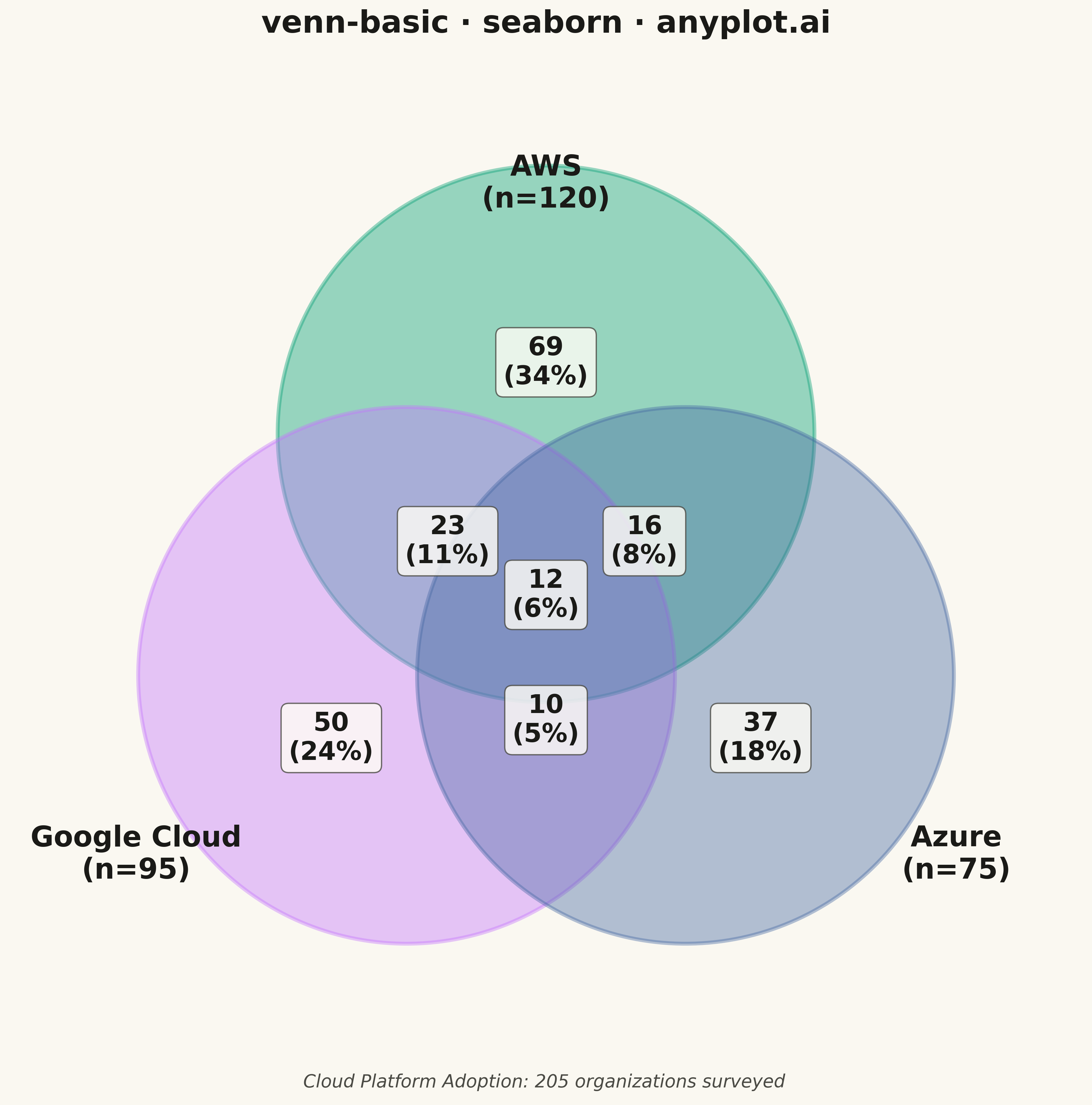
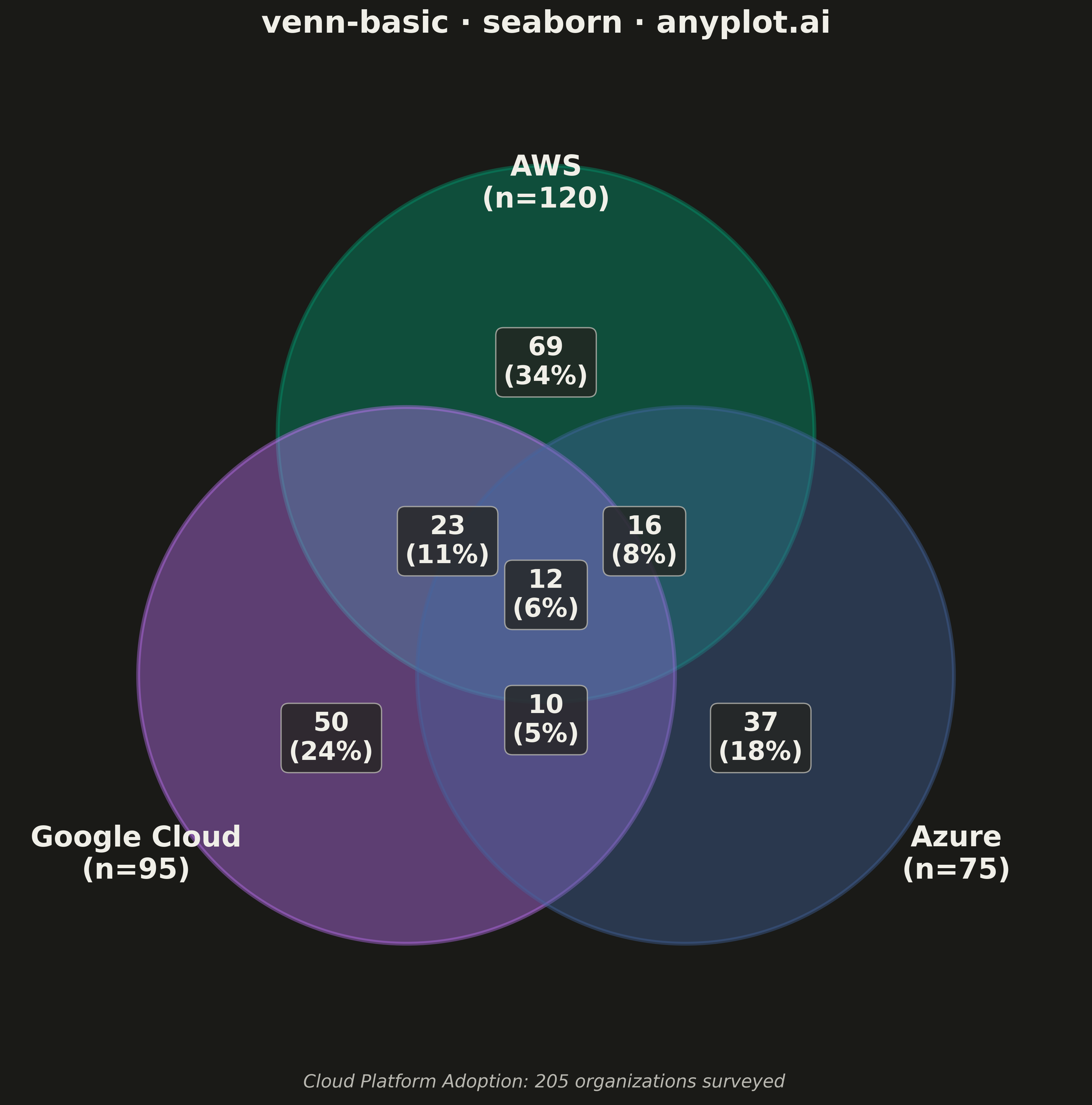
A Venn diagram visualizes the logical relationships between two or three sets using overlapping circles. Each circle represents a set, and overlapping regions show elements shared between sets. This classic visualization is ideal for showing intersections, unions, and exclusive memberships, making abstract set relationships immediately intuitive.
""" anyplot.ai
venn-basic: Venn Diagram
Library: seaborn 0.13.2 | Python 3.13.13
Quality: 91/100 | Updated: 2026-05-11
"""

import os

import matplotlib.patches as mpatches
import matplotlib.pyplot as plt
import numpy as np
import seaborn as sns


THEME = os.getenv("ANYPLOT_THEME", "light")
PAGE_BG = "#FAF8F1" if THEME == "light" else "#1A1A17"
ELEVATED_BG = "#FFFDF6" if THEME == "light" else "#242420"
INK = "#1A1A17" if THEME == "light" else "#F0EFE8"
INK_SOFT = "#4A4A44" if THEME == "light" else "#B8B7B0"

# Okabe-Ito palette (first series always #009E73)
IMPRINT = ["#009E73", "#C475FD", "#4467A3"]

np.random.seed(42)

# Data - Cloud platform adoption across organizations
# Set A: AWS users, Set B: Google Cloud users, Set C: Azure users
set_labels = ["AWS", "Google Cloud", "Azure"]
set_sizes = [120, 95, 75]  # Total in each group
# Overlaps: AB=35, AC=28, BC=22, ABC=12
intersections = {"AB": 35, "AC": 28, "BC": 22, "ABC": 12}

# Calculate exclusive counts for each region
only_a = set_sizes[0] - intersections["AB"] - intersections["AC"] + intersections["ABC"]
only_b = set_sizes[1] - intersections["AB"] - intersections["BC"] + intersections["ABC"]
only_c = set_sizes[2] - intersections["AC"] - intersections["BC"] + intersections["ABC"]
ab_only = intersections["AB"] - intersections["ABC"]
ac_only = intersections["AC"] - intersections["ABC"]
bc_only = intersections["BC"] - intersections["ABC"]
abc = intersections["ABC"]

# Total unique organizations using inclusion-exclusion principle
total_orgs = sum(set_sizes) - sum(intersections.values()) + intersections["ABC"]

# Set seaborn style with theme-adaptive colors
sns.set_theme(
    style="white",
    rc={"figure.facecolor": PAGE_BG, "axes.facecolor": PAGE_BG, "axes.labelcolor": INK, "text.color": INK},
)

# Create figure (square for symmetric diagram)
fig, ax = plt.subplots(figsize=(12, 12), facecolor=PAGE_BG)

# Circle positions (equilateral triangle arrangement)
r = 1.5  # Circle radius
center_offset = 0.9  # Distance from center

# Calculate centers for three overlapping circles
centers = [
    (0, center_offset),  # Top (A - AWS)
    (-center_offset * np.cos(np.pi / 6), -center_offset * np.sin(np.pi / 6)),  # Bottom-left (B - Google Cloud)
    (center_offset * np.cos(np.pi / 6), -center_offset * np.sin(np.pi / 6)),  # Bottom-right (C - Azure)
]

# Draw circles with transparency using Okabe-Ito colors
circles = []
for center, color, label in zip(centers, IMPRINT, set_labels, strict=True):
    circle = mpatches.Circle(center, r, alpha=0.4, facecolor=color, edgecolor=color, linewidth=3, label=label)
    ax.add_patch(circle)
    circles.append(circle)

# Position labels outside circles
label_offset = 2.3
label_positions = [
    (0, label_offset),  # Top
    (-label_offset * np.cos(np.pi / 6) - 0.3, -label_offset * np.sin(np.pi / 6) - 0.3),  # Bottom-left
    (label_offset * np.cos(np.pi / 6) + 0.3, -label_offset * np.sin(np.pi / 6) - 0.3),  # Bottom-right
]

for pos, label, size in zip(label_positions, set_labels, set_sizes, strict=True):
    ax.text(pos[0], pos[1], f"{label}\n(n={size})", ha="center", va="center", fontsize=22, fontweight="bold", color=INK)

# Add counts to each region
# Region positions (approximate centers of each region)
region_positions = {
    "A": (0, 1.3),  # Only AWS
    "B": (-1.2, -0.8),  # Only Google Cloud
    "C": (1.2, -0.8),  # Only Azure
    "AB": (-0.55, 0.3),  # AWS & Google Cloud
    "AC": (0.55, 0.3),  # AWS & Azure
    "BC": (0, -0.7),  # Google Cloud & Azure
    "ABC": (0, 0),  # All three
}

region_counts = {"A": only_a, "B": only_b, "C": only_c, "AB": ab_only, "AC": ac_only, "BC": bc_only, "ABC": abc}

for region, pos in region_positions.items():
    count = region_counts[region]
    pct = count / total_orgs * 100
    ax.text(
        pos[0],
        pos[1],
        f"{count}\n({pct:.0f}%)",
        ha="center",
        va="center",
        fontsize=20,
        fontweight="bold",
        color=INK,
        bbox={"boxstyle": "round,pad=0.3", "facecolor": ELEVATED_BG, "edgecolor": INK_SOFT, "alpha": 0.8},
    )

# Set axis properties - tighter bounds for better canvas utilization
ax.set_xlim(-3.0, 3.0)
ax.set_ylim(-2.8, 3.0)
ax.set_aspect("equal")
ax.axis("off")

# Title
ax.set_title("venn-basic · seaborn · anyplot.ai", fontsize=24, fontweight="bold", pad=20, color=INK)

# Add subtitle annotation explaining data context
fig.text(
    0.5,
    0.02,
    f"Cloud Platform Adoption: {total_orgs} organizations surveyed",
    ha="center",
    va="bottom",
    fontsize=14,
    style="italic",
    color=INK_SOFT,
)

plt.tight_layout()
plt.savefig(f"plot-{THEME}.png", dpi=300, bbox_inches="tight", facecolor=PAGE_BG)
Runnable source as JSON, for any HTTP client: https://api.anyplot.ai/specs/venn-basic/seaborn/code. Any spec id and library id listed in llms-full.txt fit the same URL shape; every URL below is complete and callable.
{
  "spec_id": "venn-basic",
  "language": "python",
  "library": "seaborn",
  "page": "https://anyplot.ai/venn-basic/python/seaborn",
  "hub": "https://anyplot.ai/venn-basic",
  "code_json": "https://api.anyplot.ai/specs/venn-basic/seaborn/code",
  "spec_json": "https://api.anyplot.ai/specs/venn-basic",
  "render_light_png": "https://storage.googleapis.com/anyplot-images/plots/venn-basic/python/seaborn/plot-light.png",
  "render_dark_png": "https://storage.googleapis.com/anyplot-images/plots/venn-basic/python/seaborn/plot-dark.png",
  "quality_score": 91.0,
  "license": "MIT",
  "guide": "https://anyplot.ai/llms.txt"
}
Part of Venn Diagram on anyplot.ai.