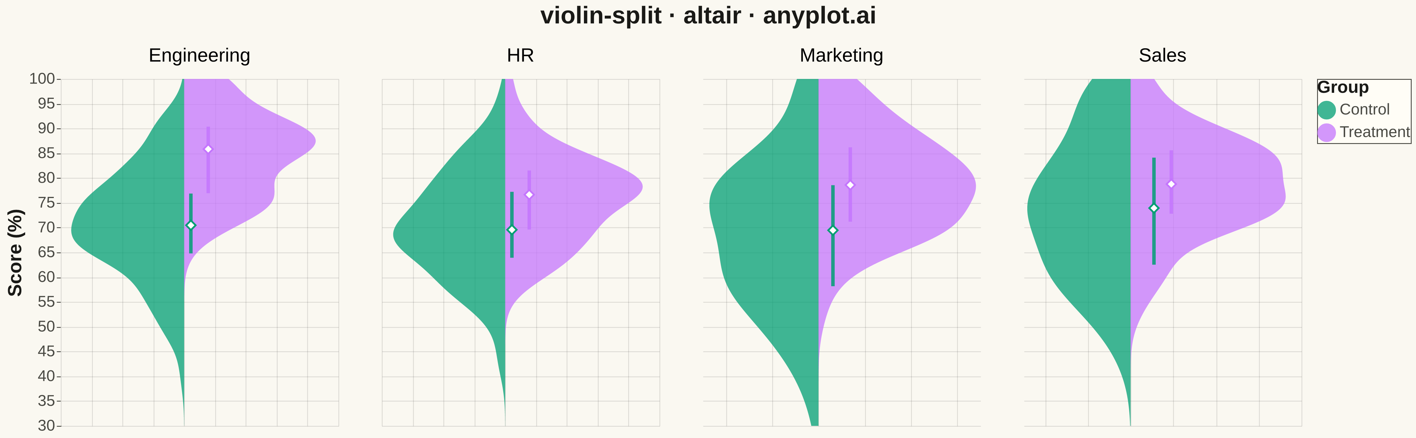
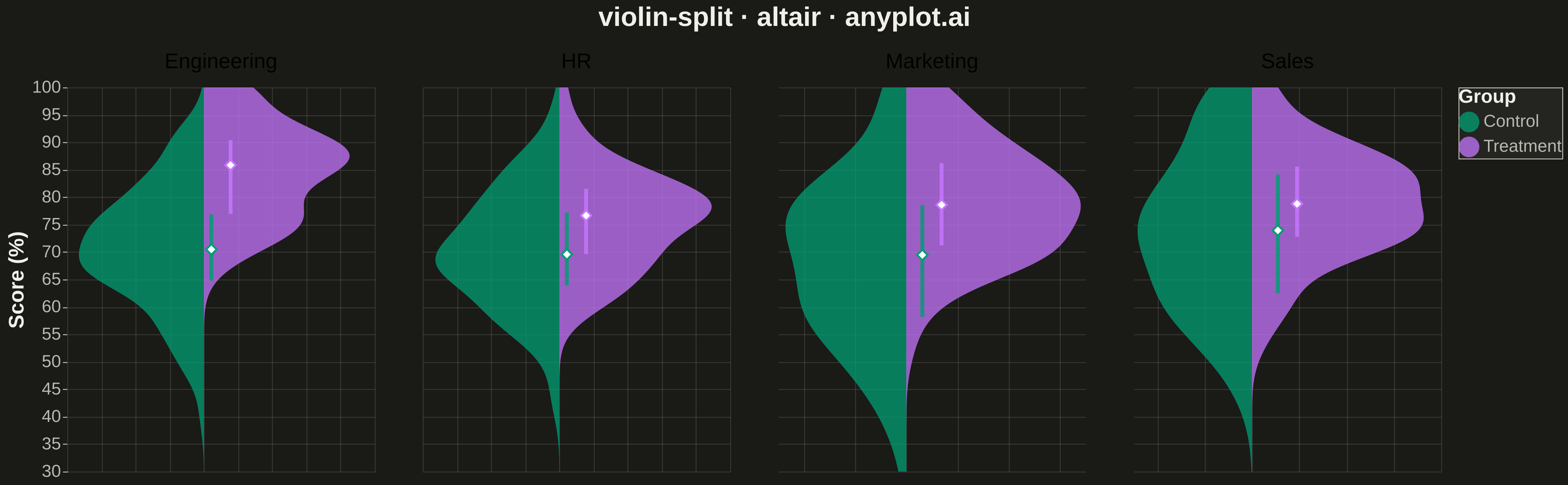
A split violin plot displaying two distributions side-by-side within each violin, with each half representing a different group. Unlike standard violin plots that mirror the same distribution, split violins use the left and right halves to compare two conditions (such as before/after, male/female, or control/treatment) at each category level. This enables direct visual comparison of distribution shapes between paired groups.
""" anyplot.ai
violin-split: Split Violin Plot
Library: altair 6.1.0 | Python 3.13.13
Quality: 95/100 | Updated: 2026-05-08
"""

import os
import sys


# Remove script directory from path to avoid importing this file as altair
script_dir = os.path.dirname(os.path.abspath(__file__))
sys.path = [p for p in sys.path if p != script_dir and p != ""]

import altair as alt
import numpy as np
import pandas as pd


# Theme tokens
THEME = os.getenv("ANYPLOT_THEME", "light")
PAGE_BG = "#FAF8F1" if THEME == "light" else "#1A1A17"
ELEVATED_BG = "#FFFDF6" if THEME == "light" else "#242420"
INK = "#1A1A17" if THEME == "light" else "#F0EFE8"
INK_SOFT = "#4A4A44" if THEME == "light" else "#B8B7B0"

# Okabe-Ito palette (positions 1-2)
IMPRINT = ["#009E73", "#C475FD"]

# Data: Test scores (%) by department comparing control vs treatment groups
np.random.seed(42)

departments = ["Engineering", "Marketing", "Sales", "HR"]
data = []

for dept in departments:
    # Control group - baseline performance
    if dept == "Engineering":
        control_scores = np.random.normal(72, 12, 100)
        treatment_scores = np.random.normal(85, 10, 100)  # Larger improvement
    elif dept == "Marketing":
        control_scores = np.random.normal(68, 15, 100)
        treatment_scores = np.random.normal(78, 12, 100)
    elif dept == "Sales":
        control_scores = np.random.normal(75, 14, 100)
        treatment_scores = np.random.normal(80, 11, 100)
    else:  # HR
        control_scores = np.random.normal(70, 10, 100)
        treatment_scores = np.random.normal(76, 9, 100)

    for score in control_scores:
        data.append({"Department": dept, "Score (%)": np.clip(score, 30, 100), "Group": "Control"})
    for score in treatment_scores:
        data.append({"Department": dept, "Score (%)": np.clip(score, 30, 100), "Group": "Treatment"})

df = pd.DataFrame(data)

# Calculate quartile statistics for inner markers
quartile_data = (
    df.groupby(["Department", "Group"])["Score (%)"]
    .agg(median="median", q1=lambda x: x.quantile(0.25), q3=lambda x: x.quantile(0.75))
    .reset_index()
)

# Merge quartile data back to main dataframe
df_with_quartiles = df.merge(quartile_data, on=["Department", "Group"])

# Create split violin using density transform with xOffset for split
base = alt.Chart().transform_density(
    density="Score (%)", as_=["Score (%)", "density"], groupby=["Department", "Group"], extent=[30, 100]
)

# For split violin: Control goes left (negative), Treatment goes right (positive)
split_violin = (
    base.transform_calculate(signed_density="datum.Group === 'Control' ? -datum.density : datum.density")
    .mark_area(orient="horizontal", opacity=0.75)
    .encode(
        x=alt.X("signed_density:Q", title=None, axis=alt.Axis(labels=False, ticks=False, domain=False), stack=None),
        y=alt.Y("Score (%):Q", title="Score (%)", scale=alt.Scale(domain=[30, 100])),
        color=alt.Color(
            "Group:N",
            scale=alt.Scale(domain=["Control", "Treatment"], range=IMPRINT),
            legend=alt.Legend(
                title="Group",
                titleFontSize=20,
                labelFontSize=18,
                symbolSize=400,
                orient="right",
                fillColor=ELEVATED_BG,
                strokeColor=INK_SOFT,
                titleColor=INK,
                labelColor=INK_SOFT,
            ),
        ),
    )
)

# IQR rule (vertical line from q1 to q3)
iqr_rule = (
    alt.Chart()
    .transform_aggregate(q1="min(q1)", q3="max(q3)", groupby=["Department", "Group"])
    .mark_rule(size=4, opacity=0.85)
    .encode(
        y=alt.Y("q1:Q", scale=alt.Scale(domain=[30, 100])),
        y2="q3:Q",
        xOffset=alt.XOffset("Group:N", scale=alt.Scale(domain=["Control", "Treatment"], range=[-20, 20])),
        color=alt.Color("Group:N", scale=alt.Scale(domain=["Control", "Treatment"], range=IMPRINT)),
    )
)

# Median point marker (diamond shape for visibility)
median_marker = (
    alt.Chart()
    .transform_aggregate(median="min(median)", groupby=["Department", "Group"])
    .mark_point(size=120, filled=True, shape="diamond", opacity=1)
    .encode(
        y=alt.Y("median:Q", scale=alt.Scale(domain=[30, 100])),
        xOffset=alt.XOffset("Group:N", scale=alt.Scale(domain=["Control", "Treatment"], range=[-20, 20])),
        color=alt.value("white"),
        stroke=alt.Color("Group:N", scale=alt.Scale(domain=["Control", "Treatment"], range=IMPRINT)),
        strokeWidth=alt.value(2),
    )
)

# Layer violin, IQR, and median markers with shared data
layered = alt.layer(split_violin, iqr_rule, median_marker, data=df_with_quartiles)

# Facet by department
chart = (
    layered.properties(width=320, height=400)
    .facet(column=alt.Column("Department:N", title=None, header=alt.Header(labelFontSize=22, labelPadding=15)))
    .resolve_scale(x="independent")
    .properties(title=alt.Title("violin-split · altair · anyplot.ai", fontSize=28), background=PAGE_BG)
    .configure_facet(spacing=50)
    .configure_view(stroke=None, fill=PAGE_BG)
    .configure_axis(
        labelFontSize=18,
        titleFontSize=22,
        titleColor=INK,
        labelColor=INK_SOFT,
        domainColor=INK_SOFT,
        tickColor=INK_SOFT,
        gridColor=INK,
        gridOpacity=0.12,
    )
    .configure_title(anchor="middle", offset=20, color=INK)
)

# Save (in script directory)
output_dir = os.path.dirname(os.path.abspath(__file__))
chart.save(os.path.join(output_dir, f"plot-{THEME}.png"), scale_factor=3.0)
chart.save(os.path.join(output_dir, f"plot-{THEME}.html"))
Runnable source as JSON, for any HTTP client: https://api.anyplot.ai/specs/violin-split/altair/code. Any spec id and library id listed in llms-full.txt fit the same URL shape; every URL below is complete and callable.
{
  "spec_id": "violin-split",
  "language": "python",
  "library": "altair",
  "page": "https://anyplot.ai/violin-split/python/altair",
  "hub": "https://anyplot.ai/violin-split",
  "code_json": "https://api.anyplot.ai/specs/violin-split/altair/code",
  "spec_json": "https://api.anyplot.ai/specs/violin-split",
  "render_light_png": "https://storage.googleapis.com/anyplot-images/plots/violin-split/python/altair/plot-light.png",
  "render_dark_png": "https://storage.googleapis.com/anyplot-images/plots/violin-split/python/altair/plot-dark.png",
  "interactive_light_html": "https://storage.googleapis.com/anyplot-images/plots/violin-split/python/altair/plot-light.html",
  "interactive_dark_html": "https://storage.googleapis.com/anyplot-images/plots/violin-split/python/altair/plot-dark.html",
  "quality_score": 95.0,
  "license": "MIT",
  "guide": "https://anyplot.ai/llms.txt"
}
Part of Split Violin Plot on anyplot.ai.