The same plot in 14 other libraries — Python: Altair, Bokeh, lets-plot, Matplotlib, Plotly, plotnine, Pygal, Seaborn; Julia: Makie.jl; JavaScript: Chart.js, D3.js, Apache ECharts, Highcharts, MUI X Charts. Compare all 15 side by side: Split Violin Plot in Python, R, Julia and JavaScript.
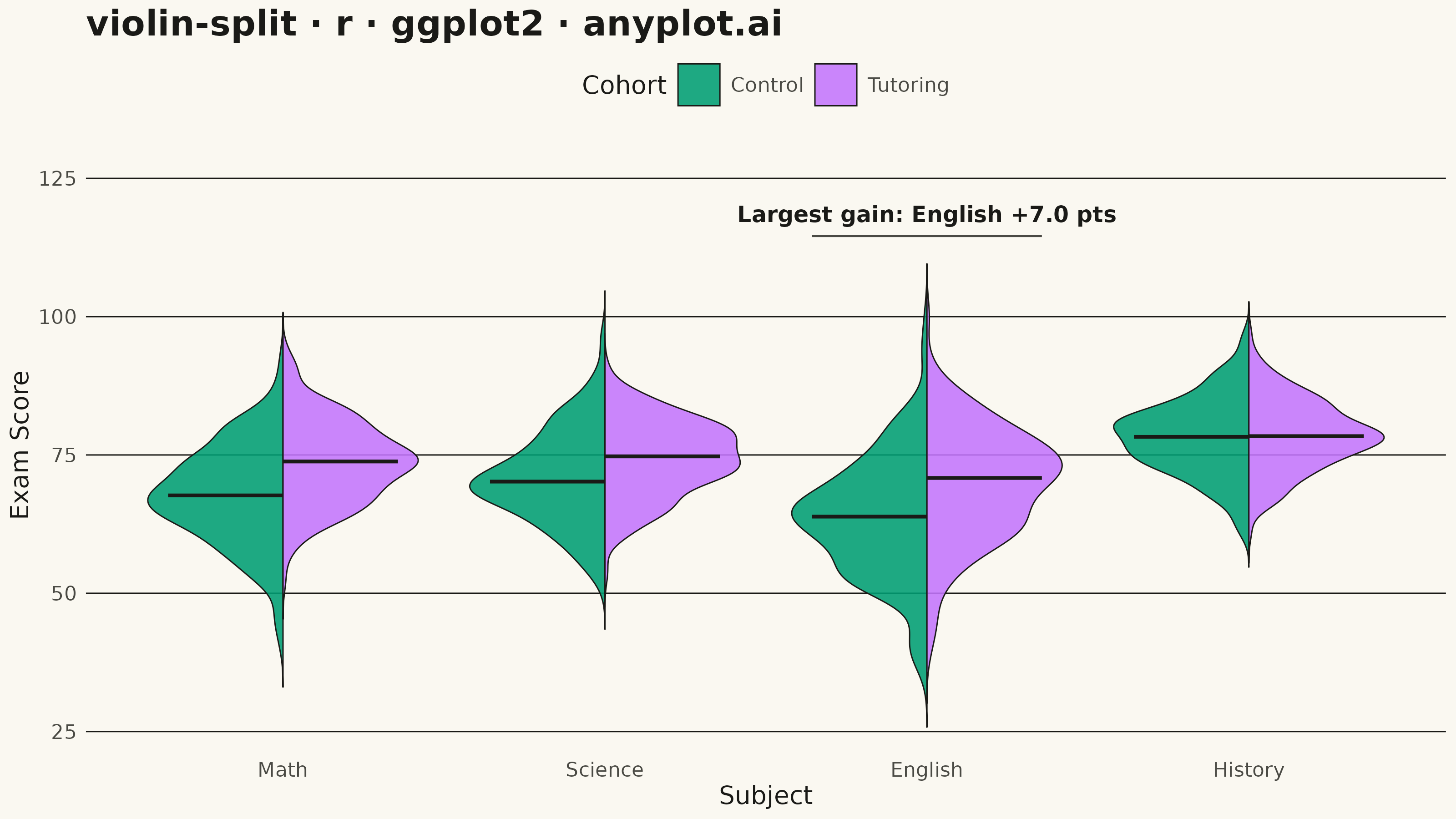
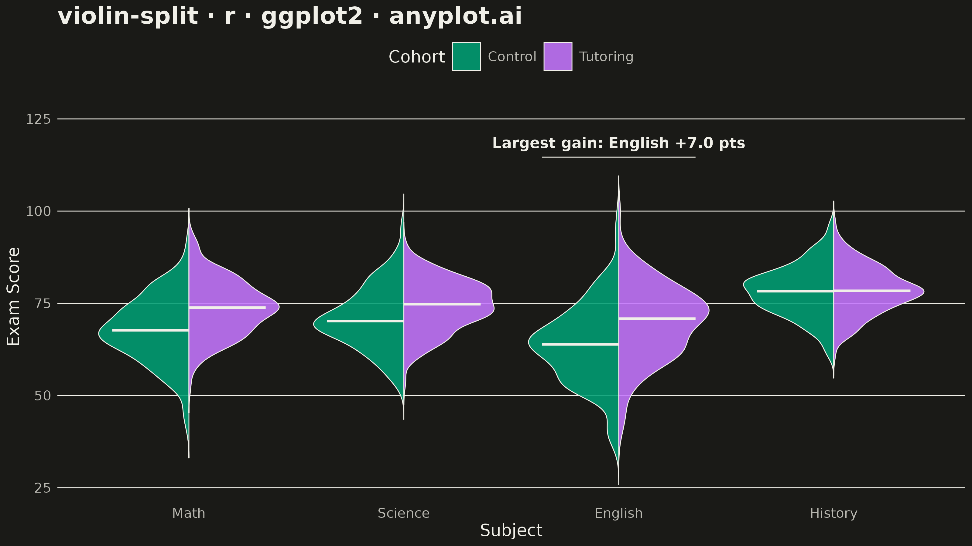
A split violin plot displaying two distributions side-by-side within each violin, with each half representing a different group. Unlike standard violin plots that mirror the same distribution, split violins use the left and right halves to compare two conditions (such as before/after, male/female, or control/treatment) at each category level. This enables direct visual comparison of distribution shapes between paired groups.
#' anyplot.ai
#' violin-split: Split Violin Plot
#' Library: ggplot2 3.5.1 | R 4.4.1
#' Quality: 85/100 | Created: 2026-09-09

library(ggplot2)
library(dplyr)
library(ragg)

set.seed(42)

# --- Theme tokens -------------------------------------------------------------
THEME       <- Sys.getenv("ANYPLOT_THEME", "light")
PAGE_BG     <- if (THEME == "light") "#FAF8F1" else "#1A1A17"
INK         <- if (THEME == "light") "#1A1A17" else "#F0EFE8"
INK_SOFT    <- if (THEME == "light") "#4A4A44" else "#B8B7B0"
IMPRINT_PALETTE <- c("#009E73", "#C475FD", "#4467A3", "#BD8233",
                     "#AE3030", "#2ABCCD", "#954477", "#99B314")

# --- Data -----------------------------------------------------------------
# Exam scores across subjects, comparing a control cohort against a cohort
# that used a new tutoring program.
subjects <- c("Math", "Science", "English", "History")
groups   <- c("Control", "Tutoring")
n_per_group <- 180

score_params <- list(
  Math    = list(Control = c(mean = 68, sd = 9),  Tutoring = c(mean = 74, sd = 8)),
  Science = list(Control = c(mean = 71, sd = 8),  Tutoring = c(mean = 75, sd = 7)),
  English = list(Control = c(mean = 64, sd = 11), Tutoring = c(mean = 70, sd = 9)),
  History = list(Control = c(mean = 78, sd = 7),  Tutoring = c(mean = 79, sd = 7))
)

# Outer lapply walks the 4 subjects, inner lapply walks the 2 cohorts within
# each subject; each leaf draws n_per_group scores from that cohort's
# mean/sd and clamps them to a valid 0-100 exam range. do.call(rbind, ...)
# flattens each level's list-of-data-frames back into a single data frame.
scores <- do.call(rbind, lapply(subjects, function(subj) {
  do.call(rbind, lapply(groups, function(grp) {
    params <- score_params[[subj]][[grp]]
    data.frame(
      subject = subj,
      group   = grp,
      score   = pmin(pmax(rnorm(n_per_group, params["mean"], params["sd"]), 0), 100)
    )
  }))
}))

# --- Split-violin geometry --------------------------------------------------
# ggplot2 has no native split-violin geom; build each half as a closed
# polygon from a kernel density estimate — the outer edge traces the
# density curve, the inner edge runs straight down the category center so
# both halves meet exactly on the shared axis.
subject_positions <- setNames(seq_along(subjects), subjects)
half_width <- 0.42

# Same subject/cohort nesting as above, but each leaf builds one polygon:
# the outer ring follows the KDE curve (scaled to half_width and mirrored
# left/right by `side`), the inner ring is a straight vertical line back
# down the category center — closing the ring exactly on the shared axis.
violin_polygons <- do.call(rbind, lapply(subjects, function(subj) {
  do.call(rbind, lapply(groups, function(grp) {
    values <- scores$score[scores$subject == subj & scores$group == grp]
    dens   <- density(values, n = 256)
    scaled <- dens$y / max(dens$y) * half_width
    center <- subject_positions[[subj]]
    side   <- if (grp == groups[1]) -1 else 1
    outer  <- data.frame(x = center + side * scaled, y = dens$x)
    inner  <- data.frame(x = rep(center, length(dens$x)), y = rev(dens$x))
    data.frame(rbind(outer, inner),
               subject = subj, group = grp,
               poly_id = paste(subj, grp, sep = "_"))
  }))
}))

medians <- scores %>%
  group_by(subject, group) %>%
  summarise(median_score = median(score), .groups = "drop") %>%
  mutate(
    center  = subject_positions[subject],
    side    = ifelse(group == groups[1], -1, 1),
    x_start = center,
    x_end   = center + side * half_width * 0.85
  )

# --- Storytelling callout ---------------------------------------------------
# Identify the subject with the largest Tutoring-vs-Control median gap and
# call it out directly on the chart, so the strongest program effect is
# immediately visible rather than left for the reader to eyeball.
gap_by_subject <- sapply(subjects, function(subj) {
  ctrl <- medians$median_score[medians$subject == subj & medians$group == "Control"]
  tut  <- medians$median_score[medians$subject == subj & medians$group == "Tutoring"]
  tut - ctrl
})
focus_subject <- names(which.max(abs(gap_by_subject)))
focus_gap     <- gap_by_subject[[focus_subject]]
focus_center  <- subject_positions[[focus_subject]]
focus_top     <- max(violin_polygons$y[violin_polygons$subject == focus_subject]) + 5

callout_bracket <- data.frame(
  x    = focus_center - half_width * 0.85,
  xend = focus_center + half_width * 0.85,
  y    = focus_top,
  yend = focus_top
)
callout_label <- data.frame(
  x     = focus_center,
  y     = focus_top + 4,
  label = sprintf("Largest gain: %s %+.1f pts", focus_subject, focus_gap)
)

# --- Plot --------------------------------------------------------------------
p <- ggplot() +
  geom_polygon(data = violin_polygons,
               aes(x = x, y = y, group = poly_id, fill = group),
               color = INK, linewidth = 0.25, alpha = 0.88) +
  geom_segment(data = medians,
               aes(x = x_start, xend = x_end, y = median_score, yend = median_score),
               color = INK, linewidth = 0.7) +
  geom_segment(data = callout_bracket,
               aes(x = x, xend = xend, y = y, yend = yend),
               color = INK_SOFT, linewidth = 0.4) +
  geom_text(data = callout_label,
            aes(x = x, y = y, label = label),
            color = INK, size = 3.1, fontface = "bold") +
  scale_fill_manual(values = c(IMPRINT_PALETTE[1], IMPRINT_PALETTE[2]), name = "Cohort") +
  scale_x_continuous(breaks = subject_positions, labels = names(subject_positions)) +
  scale_y_continuous(expand = expansion(mult = c(0.05, 0.15))) +
  labs(
    title = "violin-split · r · ggplot2 · anyplot.ai",
    x = "Subject",
    y = "Exam Score"
  ) +
  theme_minimal(base_size = 8) +
  theme(
    plot.background    = element_rect(fill = PAGE_BG, color = PAGE_BG),
    panel.background   = element_rect(fill = PAGE_BG, color = NA),
    panel.grid.major.x = element_blank(),
    panel.grid.minor   = element_blank(),
    panel.grid.major.y = element_line(color = INK, linewidth = 0.25),
    axis.title         = element_text(color = INK, size = 10),
    axis.text          = element_text(color = INK_SOFT, size = 8),
    axis.ticks         = element_blank(),
    plot.title         = element_text(color = INK, size = 14, face = "bold"),
    legend.position    = "top",
    legend.background  = element_rect(fill = PAGE_BG, color = NA),
    legend.text        = element_text(color = INK_SOFT, size = 8),
    legend.title       = element_text(color = INK, size = 10)
  )

# --- Save --------------------------------------------------------------------
ggsave(
  filename = sprintf("plot-%s.png", THEME),
  plot     = p,
  device   = ragg::agg_png,
  width    = 8,
  height   = 4.5,
  units    = "in",
  dpi      = 400
)
Runnable source as JSON, for any HTTP client: https://api.anyplot.ai/specs/violin-split/ggplot2/code. Any spec id and library id listed in llms-full.txt fit the same URL shape; every URL below is complete and callable.
{
  "spec_id": "violin-split",
  "language": "r",
  "library": "ggplot2",
  "page": "https://anyplot.ai/violin-split/r/ggplot2",
  "hub": "https://anyplot.ai/violin-split",
  "code_json": "https://api.anyplot.ai/specs/violin-split/ggplot2/code",
  "spec_json": "https://api.anyplot.ai/specs/violin-split",
  "render_light_png": "https://storage.googleapis.com/anyplot-images/plots/violin-split/r/ggplot2/plot-light.png",
  "render_dark_png": "https://storage.googleapis.com/anyplot-images/plots/violin-split/r/ggplot2/plot-dark.png",
  "quality_score": 85.0,
  "license": "MIT",
  "guide": "https://anyplot.ai/llms.txt"
}
Part of Split Violin Plot on anyplot.ai.