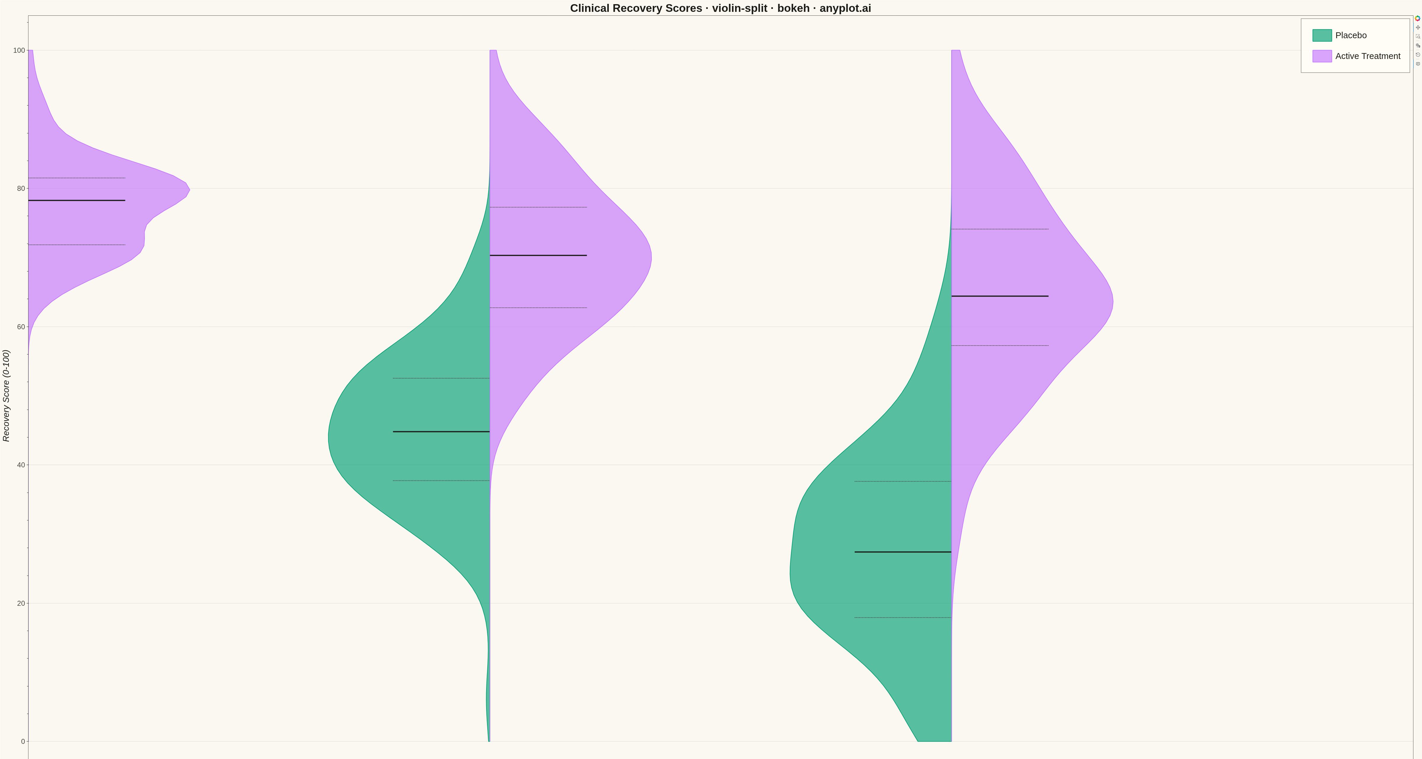
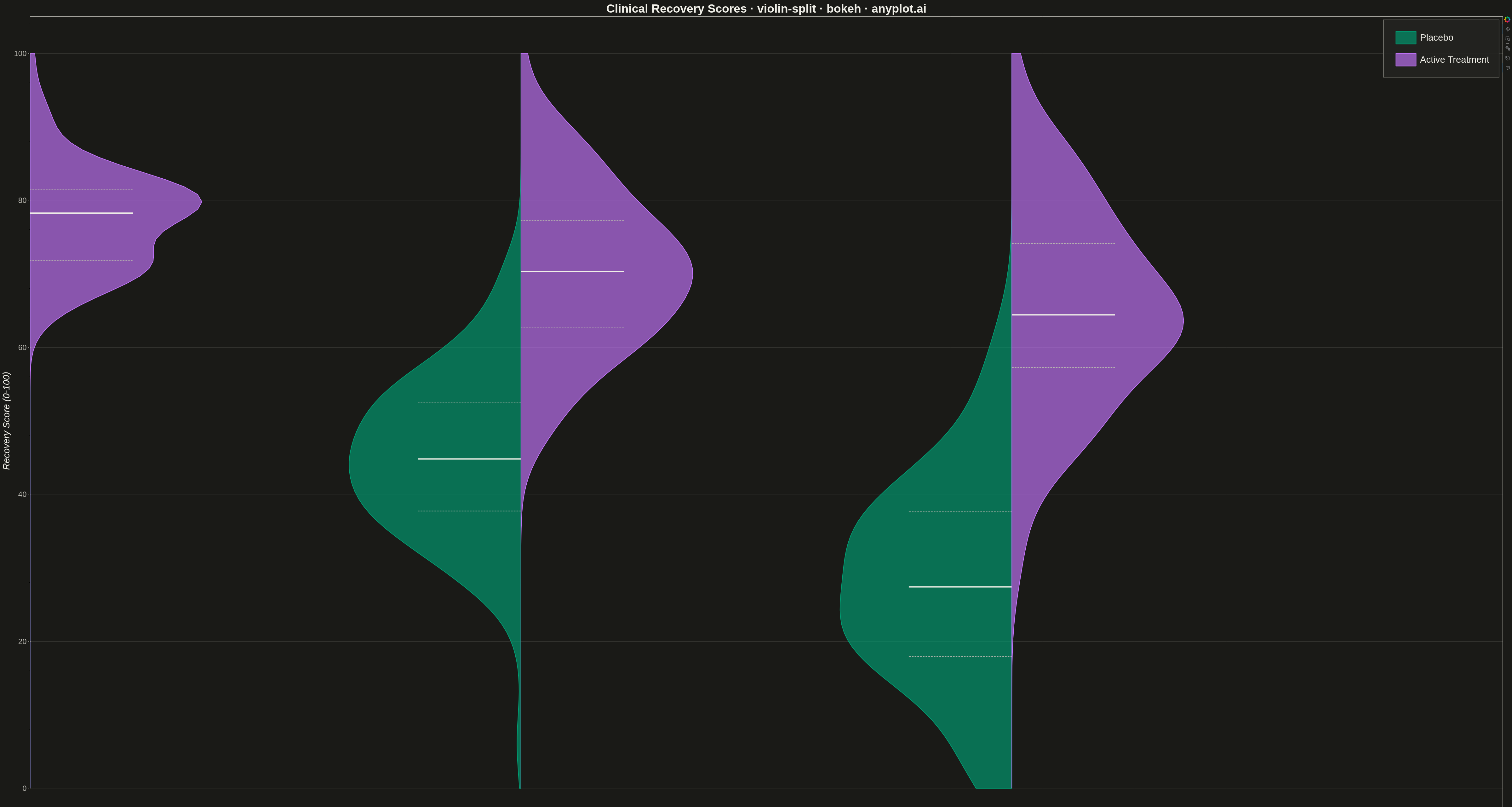
A split violin plot displaying two distributions side-by-side within each violin, with each half representing a different group. Unlike standard violin plots that mirror the same distribution, split violins use the left and right halves to compare two conditions (such as before/after, male/female, or control/treatment) at each category level. This enables direct visual comparison of distribution shapes between paired groups.
""" anyplot.ai
violin-split: Split Violin Plot
Library: bokeh 3.9.0 | Python 3.13.13
Quality: 91/100 | Updated: 2026-05-08
"""

import sys
from pathlib import Path


# Remove script directory from sys.path to avoid shadowing bokeh package
script_dir = str(Path(__file__).parent)
if script_dir in sys.path:
    sys.path.remove(script_dir)
# Also remove if it's sys.path[0]
if sys.path and sys.path[0] == script_dir:
    sys.path.pop(0)

import os
import time

import numpy as np
from bokeh.io import output_file, save
from bokeh.models import HoverTool, Legend, LegendItem
from bokeh.plotting import figure
from selenium import webdriver
from selenium.webdriver.chrome.options import Options


# Change to script directory for output files
os.chdir(Path(__file__).parent)


# Theme configuration
THEME = os.getenv("ANYPLOT_THEME", "light")
PAGE_BG = "#FAF8F1" if THEME == "light" else "#1A1A17"
ELEVATED_BG = "#FFFDF6" if THEME == "light" else "#242420"
INK = "#1A1A17" if THEME == "light" else "#F0EFE8"
INK_SOFT = "#4A4A44" if THEME == "light" else "#B8B7B0"

# Okabe-Ito colors for split groups
COLOR_PLACEBO = "#009E73"  # First series - brand green
COLOR_TREATMENT = "#C475FD"  # Second series - vermillion

# Data - Clinical trial recovery scores (placebo vs active treatment)
np.random.seed(42)

conditions = ["Mild", "Moderate", "Severe"]
split_groups = ["Placebo", "Active Treatment"]
n_per_group = 120

# Generate realistic recovery improvement data (0-100 scale)
data = []
for cond in conditions:
    # Base recovery varies by condition severity
    base = {"Mild": 65, "Moderate": 45, "Severe": 30}[cond]
    improvement = {"Mild": 12, "Moderate": 25, "Severe": 35}[cond]
    spread = {"Mild": 8, "Moderate": 12, "Severe": 15}[cond]

    # Placebo group - lower improvement
    placebo = np.clip(np.random.normal(base, spread, n_per_group), 0, 100)
    for v in placebo:
        data.append({"category": cond, "value": v, "split_group": "Placebo"})

    # Active treatment - higher improvement
    treatment = np.clip(np.random.normal(base + improvement, spread * 0.85, n_per_group), 0, 100)
    for v in treatment:
        data.append({"category": cond, "value": v, "split_group": "Active Treatment"})

# Organize data by category and split group
values_by_cat_group = {}
for cat in conditions:
    values_by_cat_group[cat] = {}
    for sg in split_groups:
        values_by_cat_group[cat][sg] = [d["value"] for d in data if d["category"] == cat and d["split_group"] == sg]


def gaussian_kde_numpy(values, n_points=100, y_min=0.0, y_max=100.0):
    """Compute kernel density estimate using Gaussian kernels with bounded domain."""
    values = np.array(values)
    n = len(values)

    # Scott's rule for bandwidth
    std = np.std(values, ddof=1)
    bandwidth = 1.06 * std * n ** (-1 / 5)

    # Grid for evaluation - bounded to data scale
    y_grid = np.linspace(y_min, y_max, n_points)

    # Compute KDE at each grid point
    density = np.zeros(n_points)
    for i, y in enumerate(y_grid):
        kernel_values = np.exp(-0.5 * ((y - values) / bandwidth) ** 2)
        density[i] = np.sum(kernel_values) / (n * bandwidth * np.sqrt(2 * np.pi))

    return y_grid, density


# Create figure
p = figure(
    width=4800,
    height=2700,
    title="Clinical Recovery Scores · violin-split · bokeh · anyplot.ai",
    x_axis_label="Condition Severity",
    y_axis_label="Recovery Score (0-100)",
    x_range=conditions,
    y_range=(-5, 105),
    tools="pan,wheel_zoom,box_zoom,reset",
)

# Width of each violin half
violin_width = 0.35

# Store patches for legend
placebo_patch = None
treatment_patch = None

# Store statistics for hover tooltips
stats_data = {"x": [], "y": [], "group": [], "median": [], "q1": [], "q3": [], "n": []}

# Draw split violins for each category
for i, cat in enumerate(conditions):
    cat_x = i

    for sg in split_groups:
        values = values_by_cat_group[cat][sg]
        y_grid, density = gaussian_kde_numpy(values, y_min=0.0, y_max=100.0)

        # Normalize density to fit within violin width
        max_density = max(density)
        if max_density > 0:
            density_norm = density / max_density * violin_width
        else:
            density_norm = density

        # Build polygon coordinates
        if sg == "Placebo":
            # Left half - density goes negative (left)
            xs = np.concatenate([cat_x - density_norm, [cat_x], [cat_x]])
            ys = np.concatenate([y_grid, [y_grid[-1]], [y_grid[0]]])
            color = COLOR_PLACEBO
        else:
            # Right half - density goes positive (right)
            xs = np.concatenate([[cat_x], cat_x + density_norm, [cat_x]])
            ys = np.concatenate([[y_grid[0]], y_grid, [y_grid[-1]]])
            color = COLOR_TREATMENT

        # Draw violin patch
        patch = p.patch(xs.tolist(), ys.tolist(), fill_color=color, fill_alpha=0.65, line_color=color, line_width=2)

        # Store first patches for legend
        if sg == "Placebo" and placebo_patch is None:
            placebo_patch = patch
        elif sg == "Active Treatment" and treatment_patch is None:
            treatment_patch = patch

        # Add quartile markers
        q1, median, q3 = np.percentile(values, [25, 50, 75])

        # Horizontal offset for quartile lines
        if sg == "Placebo":
            line_start = cat_x - violin_width * 0.6
            line_end = cat_x
        else:
            line_start = cat_x
            line_end = cat_x + violin_width * 0.6

        # Draw quartile lines with theme-adaptive colors
        p.segment(x0=[line_start], y0=[median], x1=[line_end], y1=[median], line_color=INK, line_width=4)
        p.segment(
            x0=[line_start], y0=[q1], x1=[line_end], y1=[q1], line_color=INK_SOFT, line_width=2, line_dash="dashed"
        )
        p.segment(
            x0=[line_start], y0=[q3], x1=[line_end], y1=[q3], line_color=INK_SOFT, line_width=2, line_dash="dashed"
        )

        # Store hover data for this violin
        hover_x = cat_x - violin_width / 2 if sg == "Placebo" else cat_x + violin_width / 2
        stats_data["x"].append(hover_x)
        stats_data["y"].append(median)
        stats_data["group"].append(f"{cat} - {sg}")
        stats_data["median"].append(f"{median:.1f}")
        stats_data["q1"].append(f"{q1:.1f}")
        stats_data["q3"].append(f"{q3:.1f}")
        stats_data["n"].append(str(len(values)))

# Add invisible scatter points for hover tooltips
hover_circles = p.scatter(x=stats_data["x"], y=stats_data["y"], size=30, fill_alpha=0, line_alpha=0)

# Configure HoverTool with statistics
hover = HoverTool(
    renderers=[hover_circles],
    tooltips=[("Group", "@group"), ("Median", "@median"), ("Q1", "@q1"), ("Q3", "@q3"), ("N", "@n")],
)
hover_circles.data_source.data.update(stats_data)
p.add_tools(hover)

# Add legend with theme-adaptive styling
legend = Legend(
    items=[
        LegendItem(label="Placebo", renderers=[placebo_patch]),
        LegendItem(label="Active Treatment", renderers=[treatment_patch]),
    ],
    location="top_right",
)
legend.label_text_font_size = "22pt"
legend.glyph_width = 80
legend.glyph_height = 50
legend.spacing = 20
legend.padding = 30
legend.background_fill_alpha = 0.9
legend.background_fill_color = ELEVATED_BG
legend.border_line_color = INK_SOFT
legend.border_line_width = 2
legend.label_text_color = INK
p.add_layout(legend)

# Style - large text for 4800x2700 canvas
p.title.text_font_size = "28pt"
p.title.align = "center"
p.title.text_color = INK
p.xaxis.axis_label_text_font_size = "22pt"
p.yaxis.axis_label_text_font_size = "22pt"
p.xaxis.axis_label_text_color = INK
p.yaxis.axis_label_text_color = INK
p.xaxis.major_label_text_font_size = "18pt"
p.yaxis.major_label_text_font_size = "18pt"
p.xaxis.major_label_text_color = INK_SOFT
p.yaxis.major_label_text_color = INK_SOFT

# Grid styling
p.xgrid.grid_line_color = None
p.ygrid.grid_line_alpha = 0.15
p.ygrid.grid_line_color = INK

# Axis styling
p.xaxis.axis_line_color = INK_SOFT
p.yaxis.axis_line_color = INK_SOFT
p.xaxis.major_tick_line_color = INK_SOFT
p.yaxis.major_tick_line_color = INK_SOFT
p.outline_line_color = INK_SOFT
p.outline_line_width = 1

# Background
p.background_fill_color = PAGE_BG
p.border_fill_color = PAGE_BG

# Save as HTML
output_file(f"plot-{THEME}.html")
save(p)

# Screenshot with headless Chrome - Selenium 4 / Selenium Manager
W, H = 4800, 2700
opts = Options()
for arg in (
    "--headless=new",
    "--no-sandbox",
    "--disable-dev-shm-usage",
    "--disable-gpu",
    f"--window-size={W},{H}",
    "--hide-scrollbars",
):
    opts.add_argument(arg)
driver = webdriver.Chrome(options=opts)
driver.set_window_size(W, H)
driver.get(f"file://{Path(f'plot-{THEME}.html').resolve()}")
time.sleep(3)
driver.save_screenshot(f"plot-{THEME}.png")
driver.quit()
Runnable source as JSON, for any HTTP client: https://api.anyplot.ai/specs/violin-split/bokeh/code. Any spec id and library id listed in llms-full.txt fit the same URL shape; every URL below is complete and callable.
{
  "spec_id": "violin-split",
  "language": "python",
  "library": "bokeh",
  "page": "https://anyplot.ai/violin-split/python/bokeh",
  "hub": "https://anyplot.ai/violin-split",
  "code_json": "https://api.anyplot.ai/specs/violin-split/bokeh/code",
  "spec_json": "https://api.anyplot.ai/specs/violin-split",
  "render_light_png": "https://storage.googleapis.com/anyplot-images/plots/violin-split/python/bokeh/plot-light.png",
  "render_dark_png": "https://storage.googleapis.com/anyplot-images/plots/violin-split/python/bokeh/plot-dark.png",
  "interactive_light_html": "https://storage.googleapis.com/anyplot-images/plots/violin-split/python/bokeh/plot-light.html",
  "interactive_dark_html": "https://storage.googleapis.com/anyplot-images/plots/violin-split/python/bokeh/plot-dark.html",
  "quality_score": 91.0,
  "license": "MIT",
  "guide": "https://anyplot.ai/llms.txt"
}
Part of Split Violin Plot on anyplot.ai.