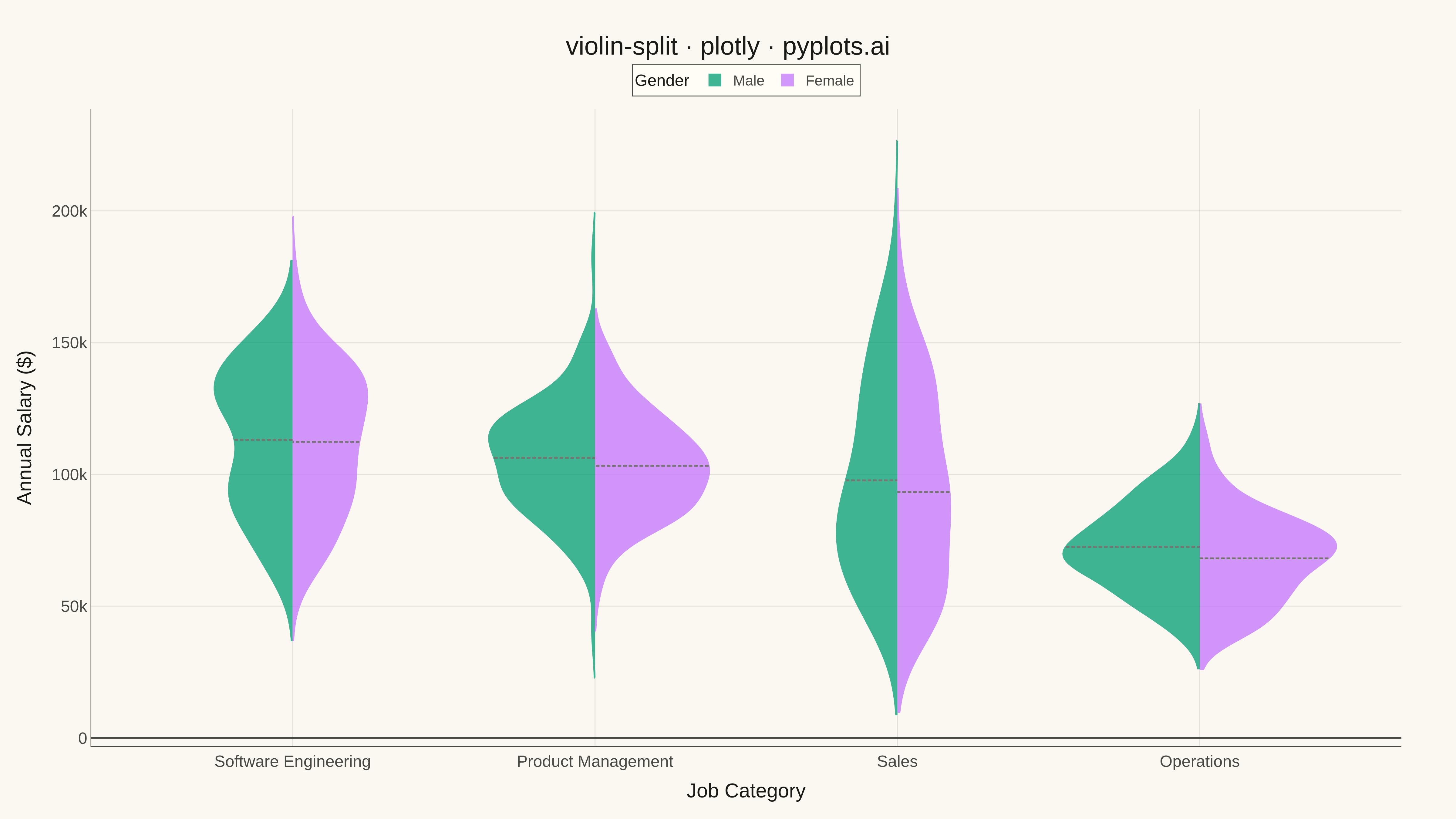
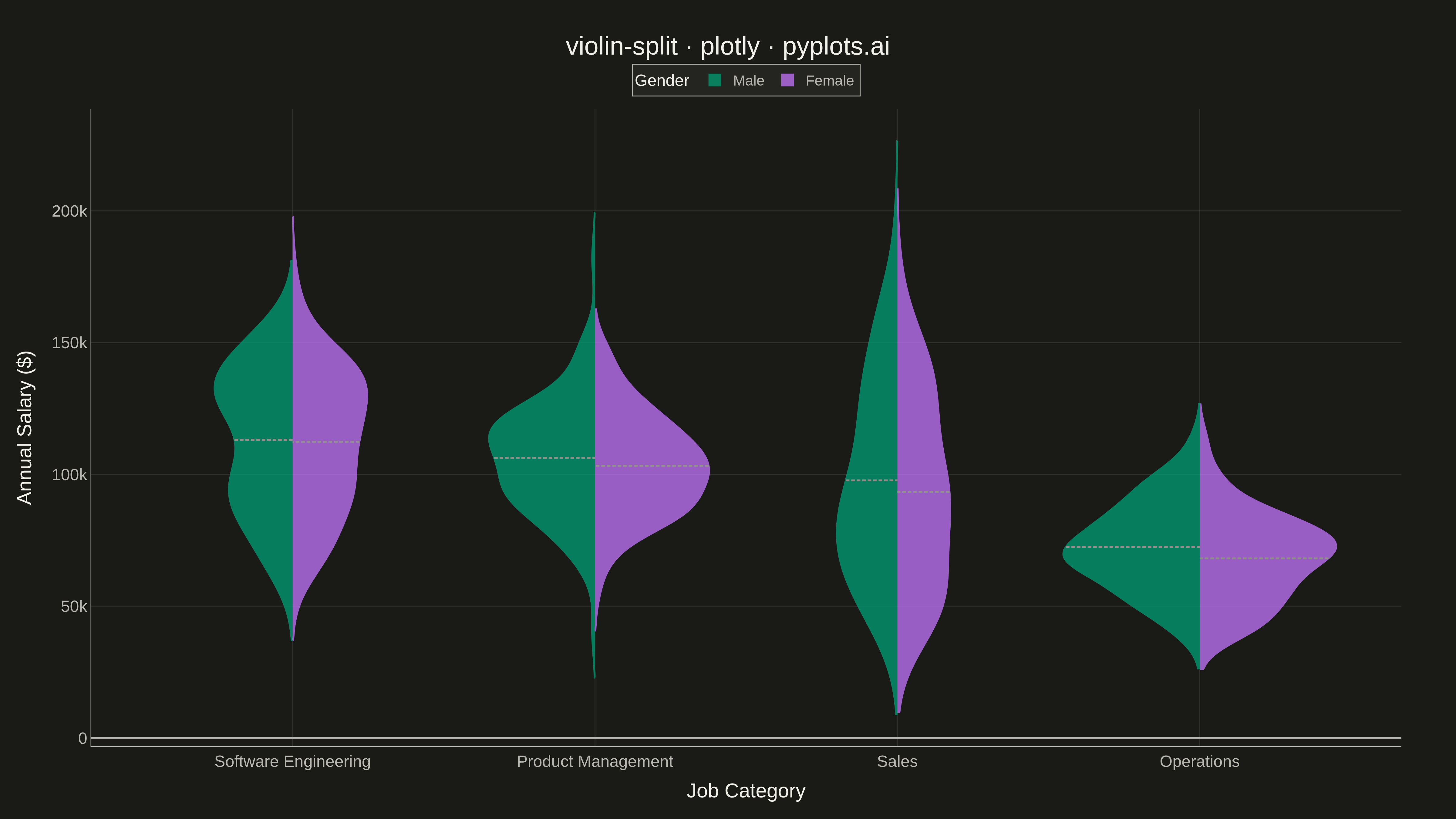
A split violin plot displaying two distributions side-by-side within each violin, with each half representing a different group. Unlike standard violin plots that mirror the same distribution, split violins use the left and right halves to compare two conditions (such as before/after, male/female, or control/treatment) at each category level. This enables direct visual comparison of distribution shapes between paired groups.
""" anyplot.ai
violin-split: Split Violin Plot
Library: plotly 6.7.0 | Python 3.13.13
Quality: 87/100 | Updated: 2026-05-08
"""

import os

import numpy as np
import pandas as pd
import plotly.graph_objects as go


# Theme-adaptive colors
THEME = os.getenv("ANYPLOT_THEME", "light")
PAGE_BG = "#FAF8F1" if THEME == "light" else "#1A1A17"
ELEVATED_BG = "#FFFDF6" if THEME == "light" else "#242420"
INK = "#1A1A17" if THEME == "light" else "#F0EFE8"
INK_SOFT = "#4A4A44" if THEME == "light" else "#B8B7B0"
GRID = "rgba(26,26,23,0.10)" if THEME == "light" else "rgba(240,239,232,0.10)"

# Okabe-Ito palette (first series is always #009E73)
IMPRINT = ["#009E73", "#C475FD", "#4467A3", "#BD8233", "#AE3030", "#2ABCCD", "#954477"]

# Data - Salary distributions by gender across job categories
np.random.seed(42)

categories = ["Software Engineering", "Product Management", "Sales", "Operations"]
n_per_group = 100

data = []
for category in categories:
    # Male (left half) - varied distributions
    if category == "Software Engineering":
        male = np.concatenate(
            [np.random.normal(95000, 18000, n_per_group // 2), np.random.normal(135000, 15000, n_per_group // 2)]
        )
    elif category == "Product Management":
        male = np.random.normal(105000, 20000, n_per_group)
    elif category == "Sales":
        male = np.concatenate(
            [
                np.random.normal(60000, 12000, n_per_group // 3),
                np.random.normal(95000, 15000, n_per_group // 3),
                np.random.normal(140000, 18000, n_per_group // 3),
            ]
        )
    else:  # Operations
        male = np.random.normal(72000, 16000, n_per_group)

    # Female (right half) - varied distributions with different centers
    if category == "Software Engineering":
        female = np.concatenate(
            [np.random.normal(92000, 17000, n_per_group // 2), np.random.normal(132000, 16000, n_per_group // 2)]
        )
    elif category == "Product Management":
        female = np.random.normal(101000, 21000, n_per_group)
    elif category == "Sales":
        female = np.concatenate(
            [
                np.random.normal(58000, 13000, n_per_group // 3),
                np.random.normal(92000, 16000, n_per_group // 3),
                np.random.normal(135000, 19000, n_per_group // 3),
            ]
        )
    else:  # Operations
        female = np.random.normal(68000, 17000, n_per_group)

    # Clamp to reasonable salary range
    male = np.clip(male, 40000, 200000)
    female = np.clip(female, 40000, 200000)

    for val in male:
        data.append({"Category": category, "Salary": val, "Gender": "Male"})
    for val in female:
        data.append({"Category": category, "Salary": val, "Gender": "Female"})

df = pd.DataFrame(data)

# Create split violin plot
fig = go.Figure()

# Add traces for each gender
for gender, okabe_idx in [("Male", 0), ("Female", 1)]:
    subset = df[df["Gender"] == gender]
    side = "negative" if gender == "Male" else "positive"

    fig.add_trace(
        go.Violin(
            x=subset["Category"],
            y=subset["Salary"],
            name=gender,
            side=side,
            line_color=IMPRINT[okabe_idx],
            fillcolor=IMPRINT[okabe_idx],
            opacity=0.75,
            meanline_visible=True,
            meanline_color=INK_SOFT,
            points=False,
            scalemode="width",
            width=0.9,
        )
    )

# Update layout with theme-adaptive styling
fig.update_layout(
    title=dict(text="violin-split · plotly · pyplots.ai", font=dict(size=28, color=INK), x=0.5, xanchor="center"),
    xaxis=dict(
        title=dict(text="Job Category", font=dict(size=22, color=INK)),
        tickfont=dict(size=18, color=INK_SOFT),
        gridcolor=GRID,
        linecolor=INK_SOFT,
        zerolinecolor=INK_SOFT,
    ),
    yaxis=dict(
        title=dict(text="Annual Salary ($)", font=dict(size=22, color=INK)),
        tickfont=dict(size=18, color=INK_SOFT),
        gridcolor=GRID,
        linewidth=0.5,
        linecolor=INK_SOFT,
        zerolinecolor=INK_SOFT,
    ),
    legend=dict(
        title=dict(text="Gender", font=dict(size=18, color=INK)),
        bgcolor=ELEVATED_BG,
        bordercolor=INK_SOFT,
        borderwidth=1,
        font=dict(size=16, color=INK_SOFT),
        orientation="h",
        yanchor="bottom",
        y=1.02,
        xanchor="center",
        x=0.5,
    ),
    paper_bgcolor=PAGE_BG,
    plot_bgcolor=PAGE_BG,
    violingap=0.15,
    violinmode="overlay",
    margin=dict(l=100, r=60, t=120, b=80),
    font=dict(family="sans-serif", color=INK),
)

# Save as PNG and HTML
fig.write_image(f"plot-{THEME}.png", width=1600, height=900, scale=3)
fig.write_html(f"plot-{THEME}.html", include_plotlyjs="cdn")
Runnable source as JSON, for any HTTP client: https://api.anyplot.ai/specs/violin-split/plotly/code. Any spec id and library id listed in llms-full.txt fit the same URL shape; every URL below is complete and callable.
{
  "spec_id": "violin-split",
  "language": "python",
  "library": "plotly",
  "page": "https://anyplot.ai/violin-split/python/plotly",
  "hub": "https://anyplot.ai/violin-split",
  "code_json": "https://api.anyplot.ai/specs/violin-split/plotly/code",
  "spec_json": "https://api.anyplot.ai/specs/violin-split",
  "render_light_png": "https://storage.googleapis.com/anyplot-images/plots/violin-split/python/plotly/plot-light.png",
  "render_dark_png": "https://storage.googleapis.com/anyplot-images/plots/violin-split/python/plotly/plot-dark.png",
  "interactive_light_html": "https://storage.googleapis.com/anyplot-images/plots/violin-split/python/plotly/plot-light.html",
  "interactive_dark_html": "https://storage.googleapis.com/anyplot-images/plots/violin-split/python/plotly/plot-dark.html",
  "quality_score": 87.0,
  "license": "MIT",
  "guide": "https://anyplot.ai/llms.txt"
}
Part of Split Violin Plot on anyplot.ai.