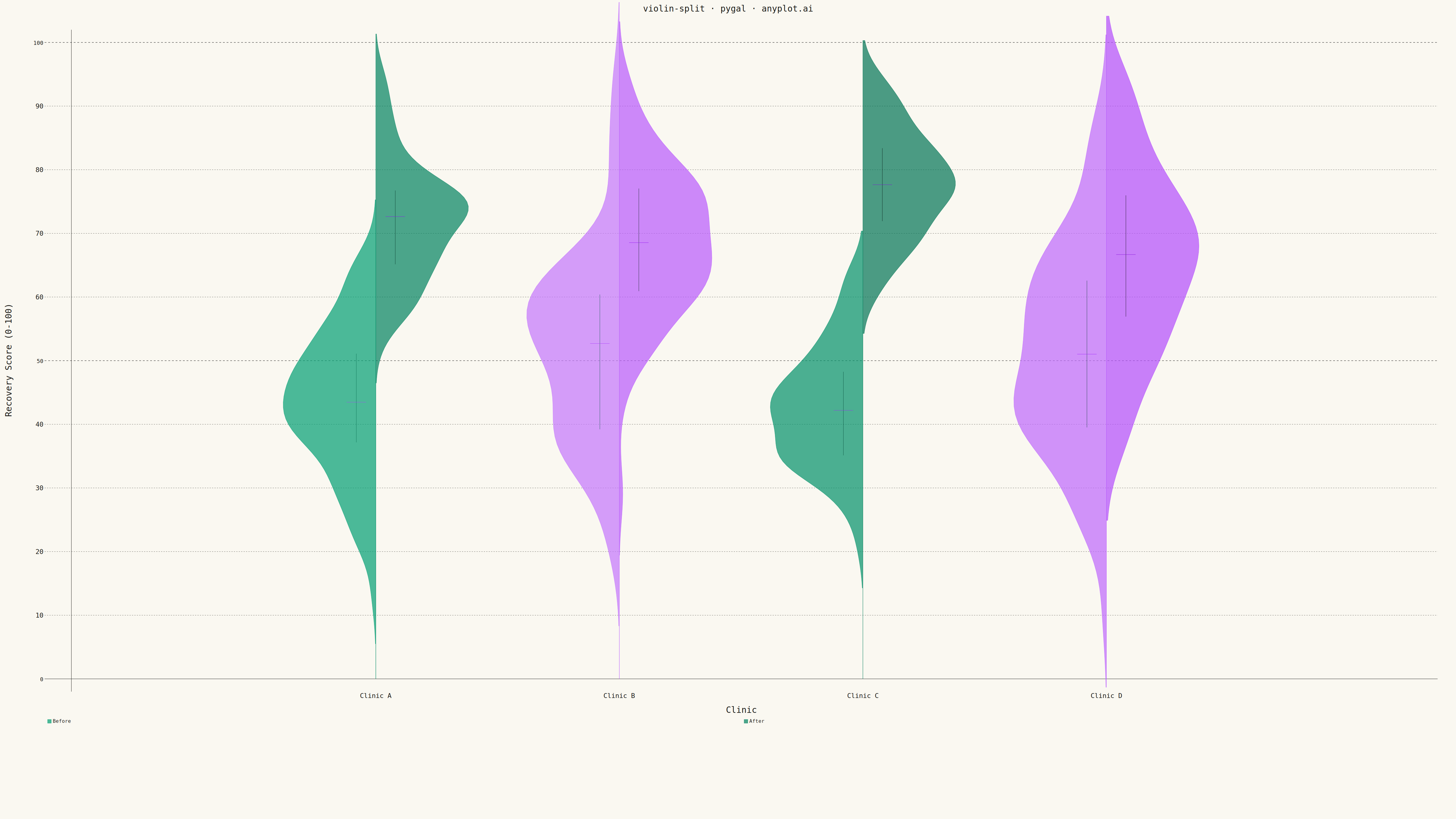
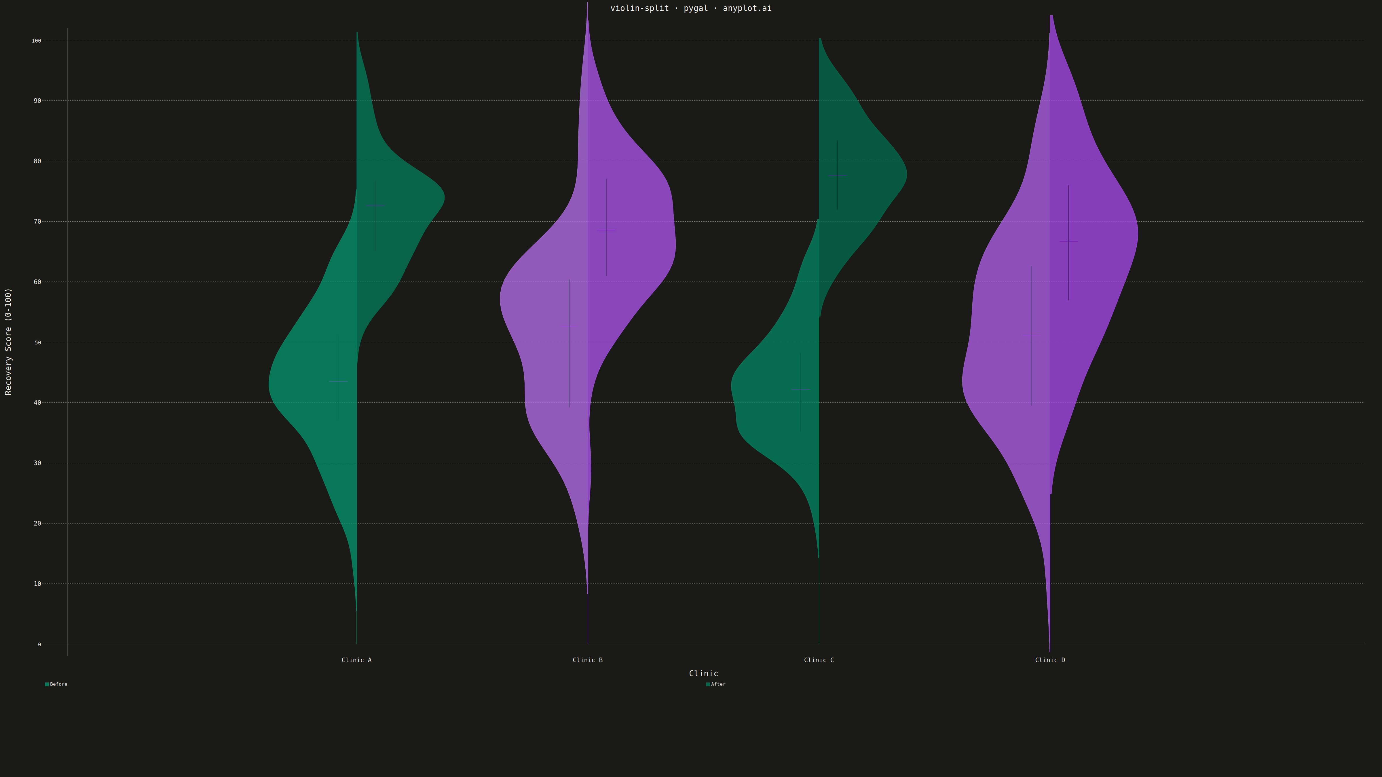
A split violin plot displaying two distributions side-by-side within each violin, with each half representing a different group. Unlike standard violin plots that mirror the same distribution, split violins use the left and right halves to compare two conditions (such as before/after, male/female, or control/treatment) at each category level. This enables direct visual comparison of distribution shapes between paired groups.
""" anyplot.ai
violin-split: Split Violin Plot
Library: pygal 3.1.0 | Python 3.13.13
Quality: 92/100 | Updated: 2026-05-08
"""

import os

import numpy as np
import pygal
from pygal.style import Style


# Theme tokens
THEME = os.getenv("ANYPLOT_THEME", "light")
PAGE_BG = "#FAF8F1" if THEME == "light" else "#1A1A17"
INK = "#1A1A17" if THEME == "light" else "#F0EFE8"
INK_MUTED = "#6B6A63" if THEME == "light" else "#A8A79F"

# Okabe-Ito palette: position 1 (brand green) and position 2 (vermillion)
COLOR_1 = "#009E73"  # Before
COLOR_2 = "#C475FD"  # After

# Data - Patient recovery scores before/after treatment across clinics
np.random.seed(42)
categories = ["Clinic A", "Clinic B", "Clinic C", "Clinic D"]
split_groups = ["Before", "After"]

# Generate realistic before/after data with different improvements per clinic
data = {}
for cat in categories:
    data[cat] = {}
    if cat == "Clinic A":
        data[cat]["Before"] = np.random.normal(45, 12, 80)
        data[cat]["After"] = np.random.normal(72, 10, 80)
    elif cat == "Clinic B":
        data[cat]["Before"] = np.random.normal(50, 15, 80)
        data[cat]["After"] = np.random.normal(68, 12, 80)
    elif cat == "Clinic C":
        data[cat]["Before"] = np.random.normal(42, 10, 80)
        data[cat]["After"] = np.random.normal(78, 8, 80)
    else:  # Clinic D
        data[cat]["Before"] = np.random.normal(55, 18, 80)
        data[cat]["After"] = np.random.normal(65, 14, 80)

# Clip to realistic 0-100 range
for cat in categories:
    for group in split_groups:
        data[cat][group] = np.clip(data[cat][group], 10, 95)

# Custom style for 4800x2700 px canvas
custom_style = Style(
    background=PAGE_BG,
    plot_background=PAGE_BG,
    foreground=INK,
    foreground_strong=INK,
    foreground_subtle=INK_MUTED,
    guide_stroke_color=INK_MUTED,
    colors=(COLOR_1, COLOR_2),
    title_font_size=28,
    label_font_size=22,
    major_label_font_size=18,
    legend_font_size=16,
    value_font_size=14,
    opacity=0.7,
    opacity_hover=0.9,
)

# Create XY chart for split violin plot
chart = pygal.XY(
    width=4800,
    height=2700,
    style=custom_style,
    title="violin-split · pygal · anyplot.ai",
    x_title="Clinic",
    y_title="Recovery Score (0-100)",
    show_legend=True,
    legend_at_bottom=True,
    legend_at_bottom_columns=2,
    stroke=True,
    fill=True,
    dots_size=0,
    show_x_guides=False,
    show_y_guides=True,
    range=(0, 100),
    xrange=(0, 5.5),
    margin=60,
)

# Parameters for violin shapes
violin_width = 0.38
n_points = 80
marker_width = 0.04

# Pre-compute all violin shapes and markers
before_violins = []
after_violins = []
before_markers = []
after_markers = []

for i, category in enumerate(categories):
    center_x = i + 1.25

    for group in split_groups:
        values = data[category][group]

        # Create range of y values for density
        y_min, y_max = values.min(), values.max()
        padding = (y_max - y_min) * 0.15
        y_range = np.linspace(y_min - padding, y_max + padding, n_points)

        # Compute Gaussian KDE using Silverman's rule (inlined)
        n = len(values)
        std = np.std(values)
        iqr = np.percentile(values, 75) - np.percentile(values, 25)
        bandwidth = 0.9 * min(std, iqr / 1.34) * n ** (-0.2)

        density = np.zeros_like(y_range)
        for v in values:
            density += np.exp(-0.5 * ((y_range - v) / bandwidth) ** 2)
        density /= n * bandwidth * np.sqrt(2 * np.pi)

        # Normalize density to desired width
        density = density / density.max() * violin_width

        # Compute quartile statistics
        median = float(np.median(values))
        q1 = float(np.percentile(values, 25))
        q3 = float(np.percentile(values, 75))

        # Create half-violin shape (split violin - each group on one side)
        if group == "Before":
            # Left half - density extends to the left
            half_points = [(center_x - d, y) for y, d in zip(y_range, density, strict=True)]
            half_points = [(center_x, y_range[0])] + half_points + [(center_x, y_range[-1]), (center_x, y_range[0])]
            before_violins.append(half_points)
            before_markers.append((center_x, median, q1, q3, -0.08))
        else:
            # Right half - density extends to the right
            half_points = [(center_x + d, y) for y, d in zip(y_range, density, strict=True)]
            half_points = [(center_x, y_range[0])] + half_points + [(center_x, y_range[-1]), (center_x, y_range[0])]
            after_violins.append(half_points)
            after_markers.append((center_x, median, q1, q3, 0.08))

# Add all "Before" violins first (green, with legend entry for first one only)
for i, violin in enumerate(before_violins):
    label = "Before" if i == 0 else None
    chart.add(label, violin, show_dots=False)

# Add all "After" violins (orange, with legend entry for first one only)
for i, violin in enumerate(after_violins):
    label = "After" if i == 0 else None
    chart.add(label, violin, show_dots=False)

# Add quartile markers for "Before" group (no legend entries)
for center_x, median, q1, q3, offset in before_markers:
    # IQR line (thin vertical line)
    iqr_line = [(center_x + offset, q1), (center_x + offset, q3)]
    chart.add(None, iqr_line, stroke=True, fill=False, show_dots=False, stroke_style={"width": 8})
    # Median marker (small horizontal line)
    median_line = [(center_x + offset - marker_width, median), (center_x + offset + marker_width, median)]
    chart.add(None, median_line, stroke=True, fill=False, show_dots=False, stroke_style={"width": 12})

# Add quartile markers for "After" group (no legend entries)
for center_x, median, q1, q3, offset in after_markers:
    # IQR line
    iqr_line = [(center_x + offset, q1), (center_x + offset, q3)]
    chart.add(None, iqr_line, stroke=True, fill=False, show_dots=False, stroke_style={"width": 8})
    # Median marker
    median_line = [(center_x + offset - marker_width, median), (center_x + offset + marker_width, median)]
    chart.add(None, median_line, stroke=True, fill=False, show_dots=False, stroke_style={"width": 12})

# X-axis labels for categories
chart.x_labels = [
    {"value": 0, "label": ""},
    {"value": 1.25, "label": "Clinic A"},
    {"value": 2.25, "label": "Clinic B"},
    {"value": 3.25, "label": "Clinic C"},
    {"value": 4.25, "label": "Clinic D"},
    {"value": 5.5, "label": ""},
]

# Save outputs
chart.render_to_file(f"plot-{THEME}.html")
chart.render_to_png(f"plot-{THEME}.png")
Runnable source as JSON, for any HTTP client: https://api.anyplot.ai/specs/violin-split/pygal/code. Any spec id and library id listed in llms-full.txt fit the same URL shape; every URL below is complete and callable.
{
  "spec_id": "violin-split",
  "language": "python",
  "library": "pygal",
  "page": "https://anyplot.ai/violin-split/python/pygal",
  "hub": "https://anyplot.ai/violin-split",
  "code_json": "https://api.anyplot.ai/specs/violin-split/pygal/code",
  "spec_json": "https://api.anyplot.ai/specs/violin-split",
  "render_light_png": "https://storage.googleapis.com/anyplot-images/plots/violin-split/python/pygal/plot-light.png",
  "render_dark_png": "https://storage.googleapis.com/anyplot-images/plots/violin-split/python/pygal/plot-dark.png",
  "interactive_light_html": "https://storage.googleapis.com/anyplot-images/plots/violin-split/python/pygal/plot-light.html",
  "interactive_dark_html": "https://storage.googleapis.com/anyplot-images/plots/violin-split/python/pygal/plot-dark.html",
  "quality_score": 92.0,
  "license": "MIT",
  "guide": "https://anyplot.ai/llms.txt"
}
Part of Split Violin Plot on anyplot.ai.