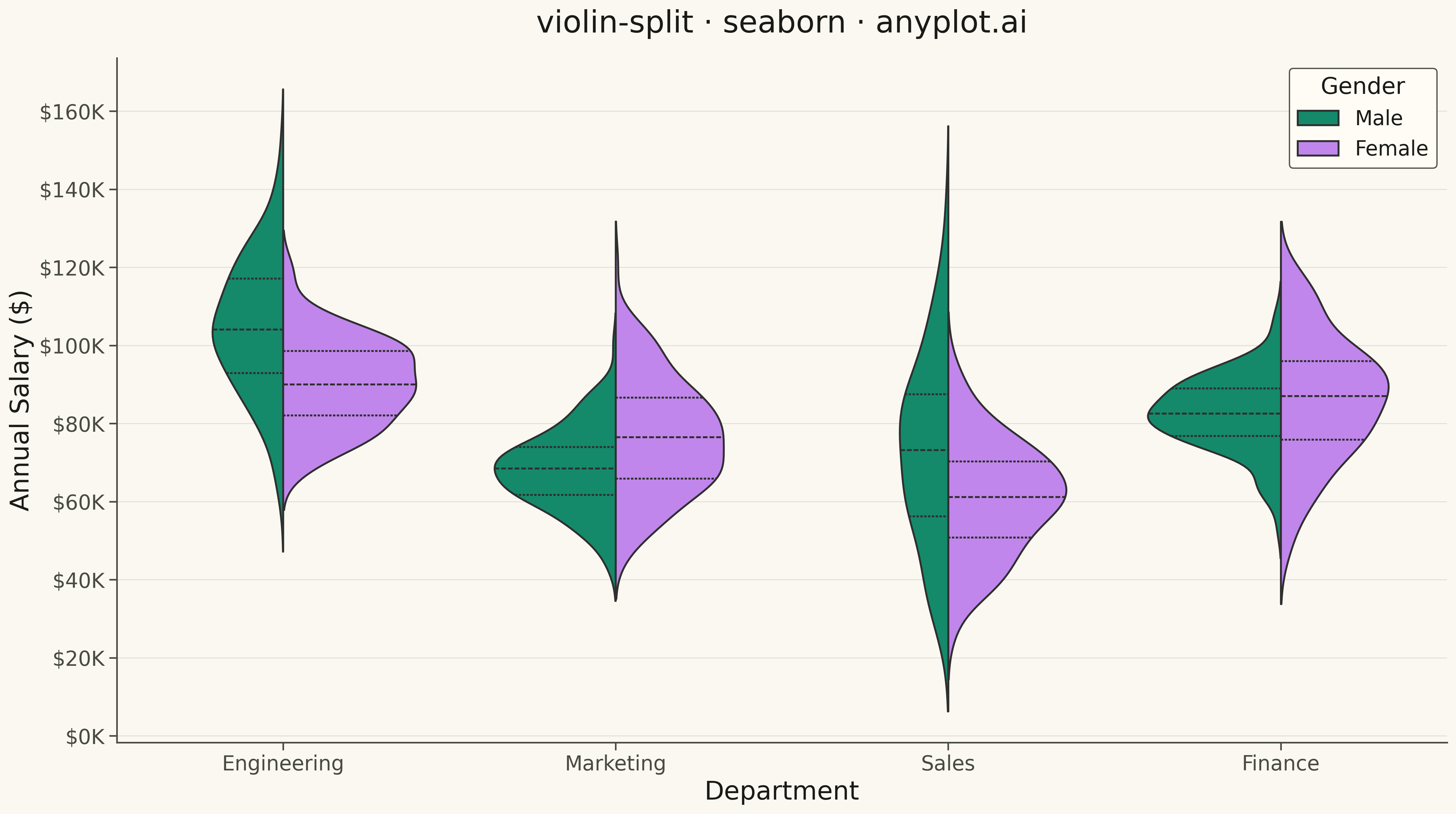
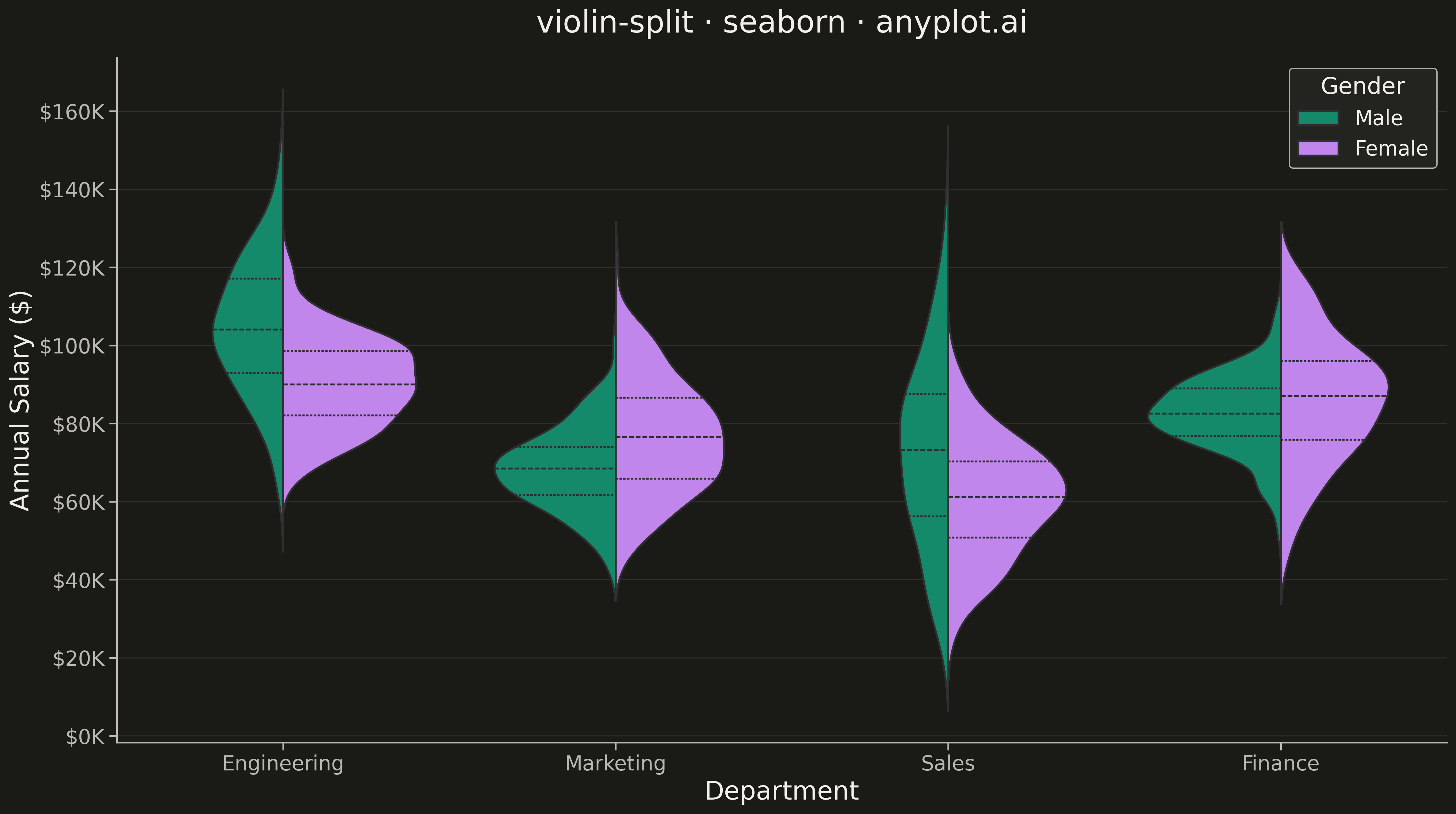
A split violin plot displaying two distributions side-by-side within each violin, with each half representing a different group. Unlike standard violin plots that mirror the same distribution, split violins use the left and right halves to compare two conditions (such as before/after, male/female, or control/treatment) at each category level. This enables direct visual comparison of distribution shapes between paired groups.
""" anyplot.ai
violin-split: Split Violin Plot
Library: seaborn 0.13.2 | Python 3.13.13
Quality: 92/100 | Updated: 2026-05-08
"""

import os

import matplotlib.pyplot as plt
import numpy as np
import pandas as pd
import seaborn as sns


# Theme tokens
THEME = os.getenv("ANYPLOT_THEME", "light")
PAGE_BG = "#FAF8F1" if THEME == "light" else "#1A1A17"
ELEVATED_BG = "#FFFDF6" if THEME == "light" else "#242420"
INK = "#1A1A17" if THEME == "light" else "#F0EFE8"
INK_SOFT = "#4A4A44" if THEME == "light" else "#B8B7B0"

# Okabe-Ito palette - first series always #009E73, second is #C475FD
BRAND = "#009E73"
SECONDARY = "#C475FD"

# Data - Salary comparison between genders across departments with varied distributions
np.random.seed(42)

departments = ["Engineering", "Marketing", "Sales", "Finance"]
genders = ["Male", "Female"]

data = []
# Create diverse salary distributions with distinct patterns per department
# to better showcase split violin comparative power
salary_params = {
    "Engineering": {"Male": (105000, 18000), "Female": (88000, 12000)},
    "Marketing": {"Male": (68000, 10000), "Female": (78000, 14000)},
    "Sales": {"Male": (72000, 22000), "Female": (62000, 14000)},
    "Finance": {"Male": (82000, 11000), "Female": (85000, 16000)},
}

for dept in departments:
    for gender in genders:
        mean, std = salary_params[dept][gender]
        n_samples = np.random.randint(100, 160)
        salaries = np.random.normal(mean, std, n_samples)
        salaries = np.clip(salaries, 25000, 185000)
        for sal in salaries:
            data.append({"Department": dept, "Gender": gender, "Salary": sal})

df = pd.DataFrame(data)

# Set seaborn theme with theme-adaptive colors
sns.set_theme(
    style="ticks",
    rc={
        "figure.facecolor": PAGE_BG,
        "axes.facecolor": PAGE_BG,
        "axes.edgecolor": INK_SOFT,
        "axes.labelcolor": INK,
        "text.color": INK,
        "xtick.color": INK_SOFT,
        "ytick.color": INK_SOFT,
        "grid.color": INK,
        "grid.alpha": 0.10,
        "legend.facecolor": ELEVATED_BG,
        "legend.edgecolor": INK_SOFT,
    },
)

# Plot
fig, ax = plt.subplots(figsize=(16, 9))

sns.violinplot(
    data=df,
    x="Department",
    y="Salary",
    hue="Gender",
    split=True,
    inner="quart",
    palette={"Male": BRAND, "Female": SECONDARY},
    linewidth=1.5,
    ax=ax,
)

# Style
ax.set_title("violin-split · seaborn · anyplot.ai", fontsize=24, fontweight="medium", color=INK, pad=20)
ax.set_xlabel("Department", fontsize=20, color=INK)
ax.set_ylabel("Annual Salary ($)", fontsize=20, color=INK)
ax.tick_params(axis="both", labelsize=16, colors=INK_SOFT)

# Format y-axis as currency
ax.yaxis.set_major_formatter(plt.FuncFormatter(lambda x, p: f"${x / 1000:.0f}K"))

# Remove top and right spines
ax.spines["top"].set_visible(False)
ax.spines["right"].set_visible(False)
for spine in ["left", "bottom"]:
    ax.spines[spine].set_color(INK_SOFT)

# Grid - both axes for better readability
ax.xaxis.grid(False)
ax.yaxis.grid(True, alpha=0.10, linewidth=0.8, color=INK)
ax.set_axisbelow(True)

# Legend styling
legend = ax.legend(title="Gender", fontsize=16, title_fontsize=18, loc="upper right", framealpha=0.95)
legend.get_frame().set_facecolor(ELEVATED_BG)
legend.get_frame().set_edgecolor(INK_SOFT)
legend.get_title().set_color(INK)
for text in legend.get_texts():
    text.set_color(INK)

plt.tight_layout()
plt.savefig(f"plot-{THEME}.png", dpi=300, bbox_inches="tight", facecolor=PAGE_BG)
Runnable source as JSON, for any HTTP client: https://api.anyplot.ai/specs/violin-split/seaborn/code. Any spec id and library id listed in llms-full.txt fit the same URL shape; every URL below is complete and callable.
{
  "spec_id": "violin-split",
  "language": "python",
  "library": "seaborn",
  "page": "https://anyplot.ai/violin-split/python/seaborn",
  "hub": "https://anyplot.ai/violin-split",
  "code_json": "https://api.anyplot.ai/specs/violin-split/seaborn/code",
  "spec_json": "https://api.anyplot.ai/specs/violin-split",
  "render_light_png": "https://storage.googleapis.com/anyplot-images/plots/violin-split/python/seaborn/plot-light.png",
  "render_dark_png": "https://storage.googleapis.com/anyplot-images/plots/violin-split/python/seaborn/plot-dark.png",
  "quality_score": 92.0,
  "license": "MIT",
  "guide": "https://anyplot.ai/llms.txt"
}
Part of Split Violin Plot on anyplot.ai.