The same plot in 14 other libraries — JavaScript: D3.js, Apache ECharts, Highcharts, MUI X Charts; Python: Altair, Bokeh, lets-plot, Matplotlib, Plotly, plotnine, Pygal, Seaborn; R: ggplot2; Julia: Makie.jl. Compare all 15 side by side: Violin Plot with Overlaid Swarm Points in Python, R, Julia and JavaScript.
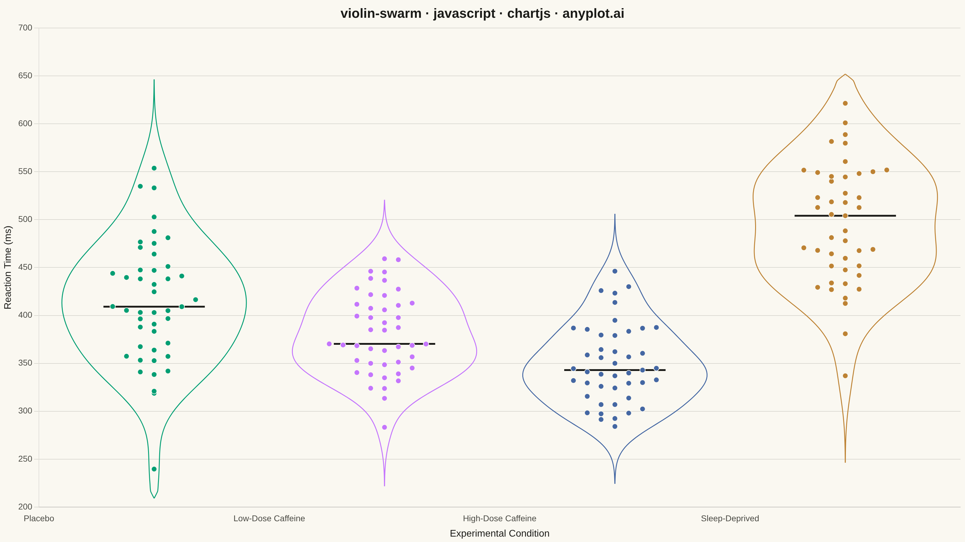
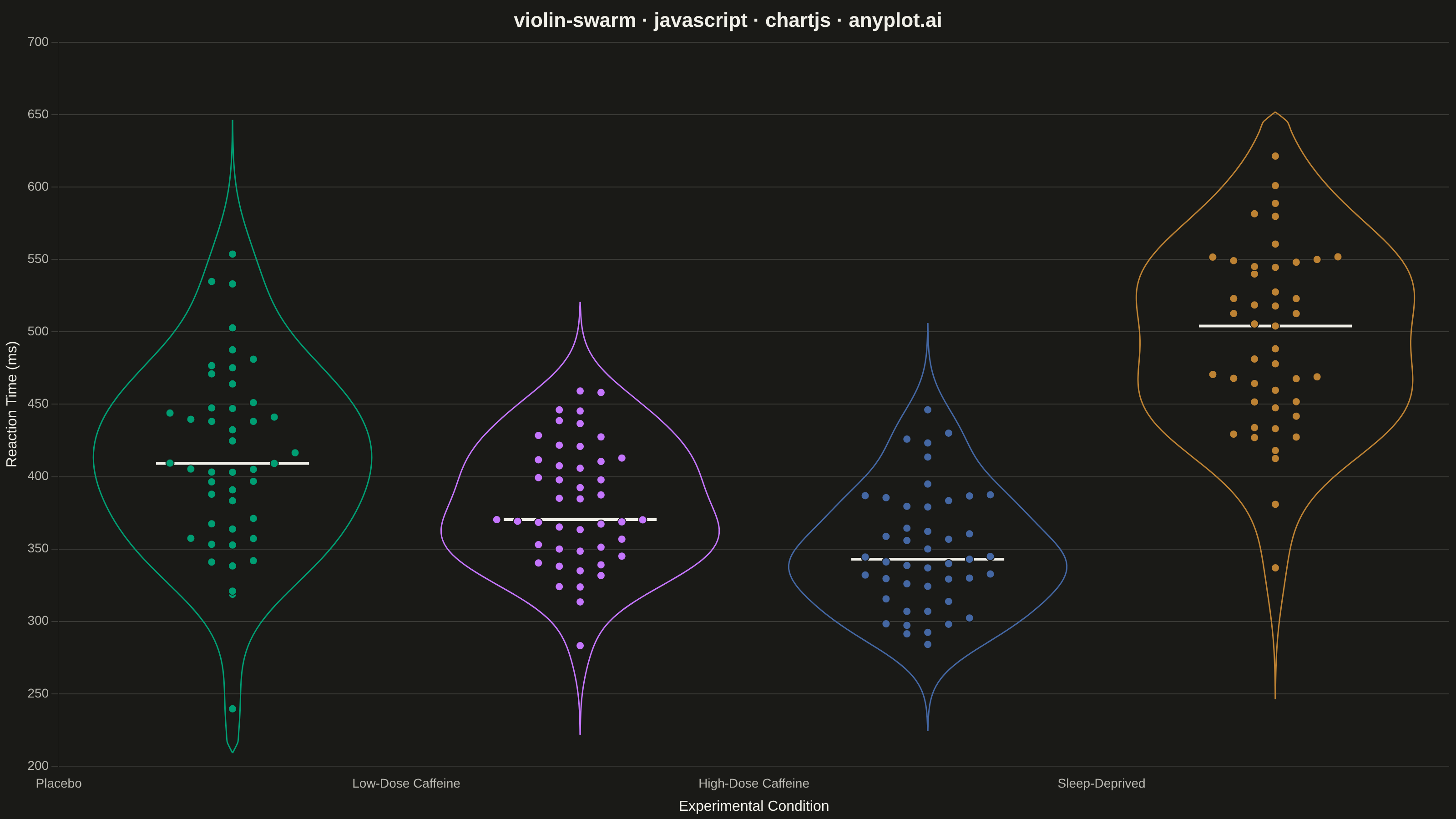
A violin plot with individual data points overlaid as a swarm plot, combining smooth kernel density estimation with raw data visibility. The violin shape shows the distribution density while the swarm points reveal actual observations, enabling viewers to see both the overall distribution pattern and individual data values simultaneously. This hybrid approach provides maximum transparency, showing exactly how many observations exist at each level while maintaining the smooth distribution visualization.
// anyplot.ai
// violin-swarm: Violin Plot with Overlaid Swarm Points
// Library: chartjs 4.4.7 | JavaScript 22.23.2
// Quality: 94/100 | Created: 2026-09-02

const t = window.ANYPLOT_TOKENS;

// --- Data (in-memory, deterministic) ----------------------------------------
// Reaction times (ms) across 4 experimental conditions, 45 trials each.
function mulberry32(seed) {
  let a = seed;
  return function () {
    a |= 0;
    a = (a + 0x6d2b79f5) | 0;
    let z = Math.imul(a ^ (a >>> 15), 1 | a);
    z = (z + Math.imul(z ^ (z >>> 7), 61 | z)) ^ z;
    return ((z ^ (z >>> 14)) >>> 0) / 4294967296;
  };
}
const rand = mulberry32(42);

function randNormal(mean, std) {
  const u1 = Math.max(rand(), 1e-12);
  const u2 = rand();
  const z = Math.sqrt(-2 * Math.log(u1)) * Math.cos(2 * Math.PI * u2);
  return mean + z * std;
}

const CATEGORY_NAMES = ["Placebo", "Low-Dose Caffeine", "High-Dose Caffeine", "Sleep-Deprived"];
const MEANS = [420, 380, 350, 480];
const STDS = [55, 45, 40, 65];
const N_TRIALS = 45;

const rawValues = CATEGORY_NAMES.map((_, i) =>
  Array.from({ length: N_TRIALS }, () => Math.max(150, randNormal(MEANS[i], STDS[i]))),
);

// --- Geometry: kernel density estimate -> violin outline + swarm jitter ----
function median(values) {
  const sorted = [...values].sort((a, b) => a - b);
  const mid = Math.floor(sorted.length / 2);
  return sorted.length % 2 === 0 ? (sorted[mid - 1] + sorted[mid]) / 2 : sorted[mid];
}

function stdDev(values) {
  const mean = values.reduce((a, b) => a + b, 0) / values.length;
  const variance = values.reduce((a, b) => a + (b - mean) ** 2, 0) / values.length;
  return Math.sqrt(variance);
}

function silvermanBandwidth(values) {
  return 1.06 * stdDev(values) * Math.pow(values.length, -0.2);
}

function kdeAt(values, bandwidth, y) {
  let sum = 0;
  for (const v of values) {
    const u = (y - v) / bandwidth;
    sum += Math.exp(-0.5 * u * u);
  }
  return sum / (values.length * bandwidth * Math.sqrt(2 * Math.PI));
}

const allValues = rawValues.flat();
const dataMin = Math.min(...allValues);
const dataMax = Math.max(...allValues);
const pad = (dataMax - dataMin) * 0.08;
const domainMin = dataMin - pad;
const domainMax = dataMax + pad;

const MAX_HALF_WIDTH = 0.4; // violin half-width in x-axis units (category spacing = 1)
const GRID_POINTS = 60;
const KDE_RANGE_SIGMAS = 3; // how far past the min/max observation the outline extends

// Each category gets its own local y-grid (clamped to the shared axis domain) so
// the outline tapers to a point near its own data instead of trailing a thin
// constant-width spike across the full shared axis range.
const categories = CATEGORY_NAMES.map((name, i) => {
  const values = rawValues[i];
  const bandwidth = silvermanBandwidth(values);
  const localMin = Math.max(domainMin, Math.min(...values) - KDE_RANGE_SIGMAS * bandwidth);
  const localMax = Math.min(domainMax, Math.max(...values) + KDE_RANGE_SIGMAS * bandwidth);
  const yGrid = Array.from(
    { length: GRID_POINTS },
    (_, gi) => localMin + ((localMax - localMin) * gi) / (GRID_POINTS - 1),
  );
  const densities = yGrid.map((y) => kdeAt(values, bandwidth, y));
  const maxDensity = Math.max(...densities);
  const halfWidths = densities.map((d) => (MAX_HALF_WIDTH * d) / maxDensity);
  halfWidths[0] = 0;
  halfWidths[halfWidths.length - 1] = 0;
  return { name, values, bandwidth, maxDensity, yGrid, halfWidths };
});

function halfWidthAt(category, y) {
  const d = kdeAt(category.values, category.bandwidth, y);
  return Math.max(0.015, (MAX_HALF_WIDTH * d) / category.maxDensity);
}

// Beeswarm-style jitter: bin observations along y, spread each bin outward
// from the center, clipped so points never leave the violin boundary.
function computeSwarm(category, center) {
  const binCount = 32;
  const binWidth = (domainMax - domainMin) / binCount;
  const bins = Array.from({ length: binCount }, () => []);
  category.values.forEach((v) => {
    const b = Math.min(binCount - 1, Math.max(0, Math.floor((v - domainMin) / binWidth)));
    bins[b].push(v);
  });

  const spacing = 0.06;
  const points = [];
  bins.forEach((bin) => {
    bin.sort((a, b) => a - b);
    bin.forEach((v, j) => {
      const step = Math.ceil(j / 2);
      const sign = j % 2 === 0 ? 1 : -1;
      let offset = j === 0 ? 0 : sign * step * spacing;
      const maxOffset = halfWidthAt(category, v) * 0.9;
      offset = Math.max(-maxOffset, Math.min(maxOffset, offset));
      points.push({ x: center + offset, y: v });
    });
  });
  return points;
}

// --- Mount -------------------------------------------------------------------
const canvas = document.createElement("canvas");
document.getElementById("container").appendChild(canvas);

// --- Chart ---------------------------------------------------------------
// Each category contributes 3 datasets: an invisible-fill "left" boundary line,
// a "right" boundary line that fills back to it (drawing the violin), and a
// scatter dataset of jittered raw observations on top.
const datasets = [];
categories.forEach((category, i) => {
  const center = i + 1;
  const color = t.palette[i % t.palette.length];
  const fillColor = `${color}66`; // ~40% alpha — keeps swarm points visible

  const leftPoints = category.halfWidths.map((hw, gi) => ({ x: center - hw, y: category.yGrid[gi] }));
  const rightPoints = category.halfWidths.map((hw, gi) => ({ x: center + hw, y: category.yGrid[gi] }));

  datasets.push({
    type: "line",
    label: `${category.name} (left edge)`,
    data: leftPoints,
    borderColor: color,
    borderWidth: 1.5,
    pointRadius: 0,
    fill: false,
    tension: 0.2,
  });
  datasets.push({
    type: "line",
    label: category.name,
    data: rightPoints,
    borderColor: color,
    borderWidth: 1.5,
    backgroundColor: fillColor,
    pointRadius: 0,
    fill: "-1",
    tension: 0.2,
  });
  datasets.push({
    type: "scatter",
    label: `${category.name} (observations)`,
    data: computeSwarm(category, center),
    backgroundColor: color,
    borderColor: t.pageBg,
    borderWidth: 1,
    pointRadius: 4.5,
    pointHoverRadius: 6.5,
  });

  // Secondary emphasis device: a short bold tick marking the median, so the
  // central tendency of each condition reads at a glance alongside the raw spread.
  const medianTickWidth = MAX_HALF_WIDTH * 0.55;
  datasets.push({
    type: "line",
    label: `${category.name} (median)`,
    data: [
      { x: center - medianTickWidth, y: median(category.values) },
      { x: center + medianTickWidth, y: median(category.values) },
    ],
    borderColor: t.ink,
    borderWidth: 3,
    pointRadius: 0,
    fill: false,
    tension: 0,
  });
});

new Chart(canvas, {
  type: "line",
  data: { datasets },
  options: {
    responsive: true,
    maintainAspectRatio: false,
    animation: false,
    plugins: {
      title: {
        display: true,
        text: "violin-swarm · javascript · chartjs · anyplot.ai",
        color: t.ink,
        font: { size: 22 },
      },
      legend: { display: false },
      tooltip: {
        filter: (item) => item.dataset.type === "scatter",
        callbacks: {
          title: (items) => CATEGORY_NAMES[Math.round(items[0].parsed.x) - 1] ?? "",
          label: (item) => `${Math.round(item.parsed.y)} ms`,
        },
      },
    },
    scales: {
      x: {
        type: "linear",
        min: 0.5,
        max: CATEGORY_NAMES.length + 0.5,
        ticks: {
          stepSize: 1,
          color: t.inkSoft,
          font: { size: 14 },
          callback: (value) => CATEGORY_NAMES[Math.round(value) - 1] ?? "",
        },
        grid: { display: false },
        title: { display: true, text: "Experimental Condition", color: t.ink, font: { size: 16 } },
      },
      y: {
        ticks: { color: t.inkSoft, font: { size: 14 } },
        grid: { color: t.grid },
        title: { display: true, text: "Reaction Time (ms)", color: t.ink, font: { size: 16 } },
      },
    },
  },
});
Runnable source as JSON, for any HTTP client: https://api.anyplot.ai/specs/violin-swarm/chartjs/code. Any spec id and library id listed in llms-full.txt fit the same URL shape; every URL below is complete and callable.
{
  "spec_id": "violin-swarm",
  "language": "javascript",
  "library": "chartjs",
  "page": "https://anyplot.ai/violin-swarm/javascript/chartjs",
  "hub": "https://anyplot.ai/violin-swarm",
  "code_json": "https://api.anyplot.ai/specs/violin-swarm/chartjs/code",
  "spec_json": "https://api.anyplot.ai/specs/violin-swarm",
  "render_light_png": "https://storage.googleapis.com/anyplot-images/plots/violin-swarm/javascript/chartjs/plot-light.png",
  "render_dark_png": "https://storage.googleapis.com/anyplot-images/plots/violin-swarm/javascript/chartjs/plot-dark.png",
  "interactive_light_html": "https://storage.googleapis.com/anyplot-images/plots/violin-swarm/javascript/chartjs/plot-light.html",
  "interactive_dark_html": "https://storage.googleapis.com/anyplot-images/plots/violin-swarm/javascript/chartjs/plot-dark.html",
  "quality_score": 94.0,
  "license": "MIT",
  "guide": "https://anyplot.ai/llms.txt"
}
Part of Violin Plot with Overlaid Swarm Points on anyplot.ai.