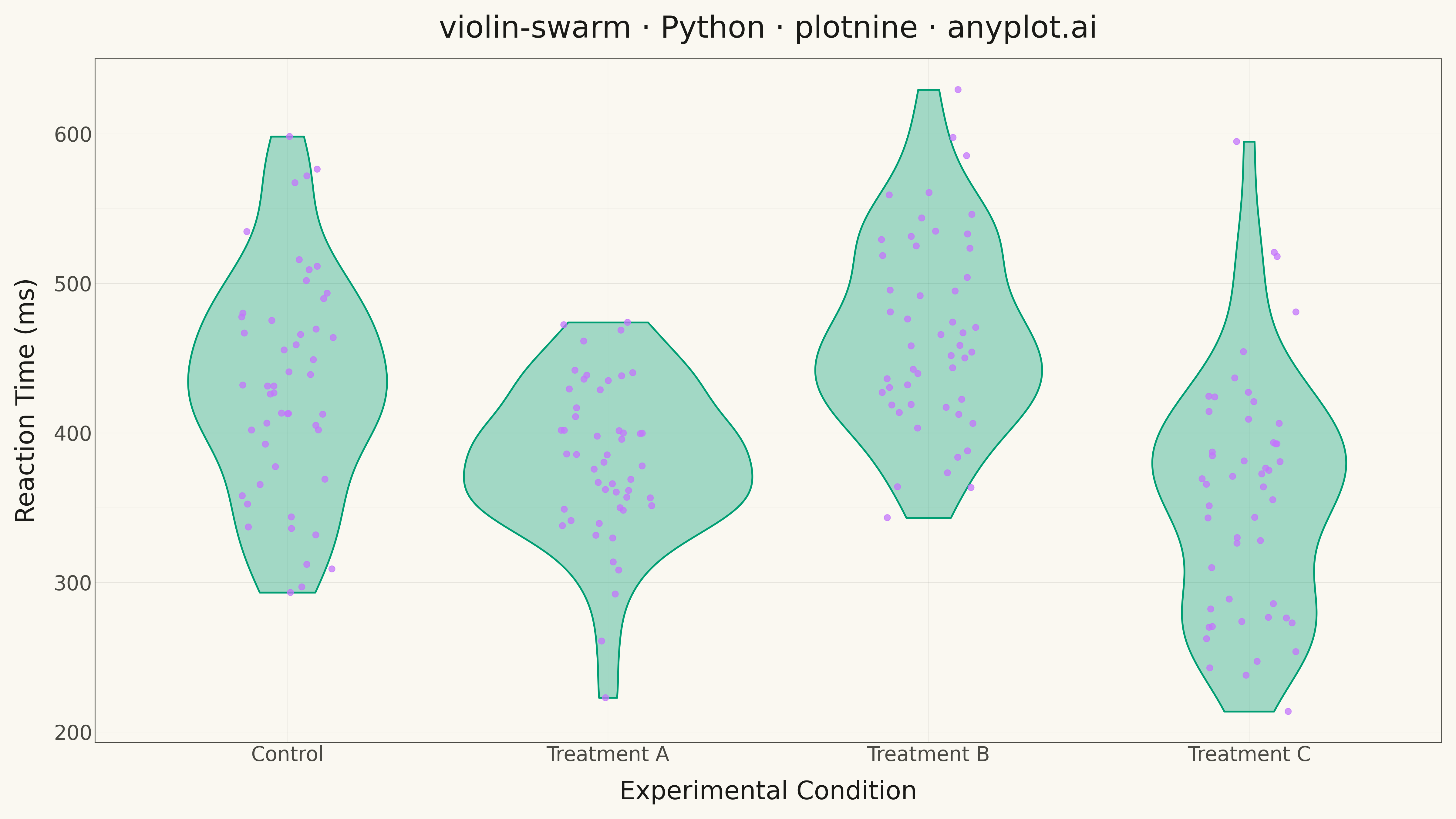
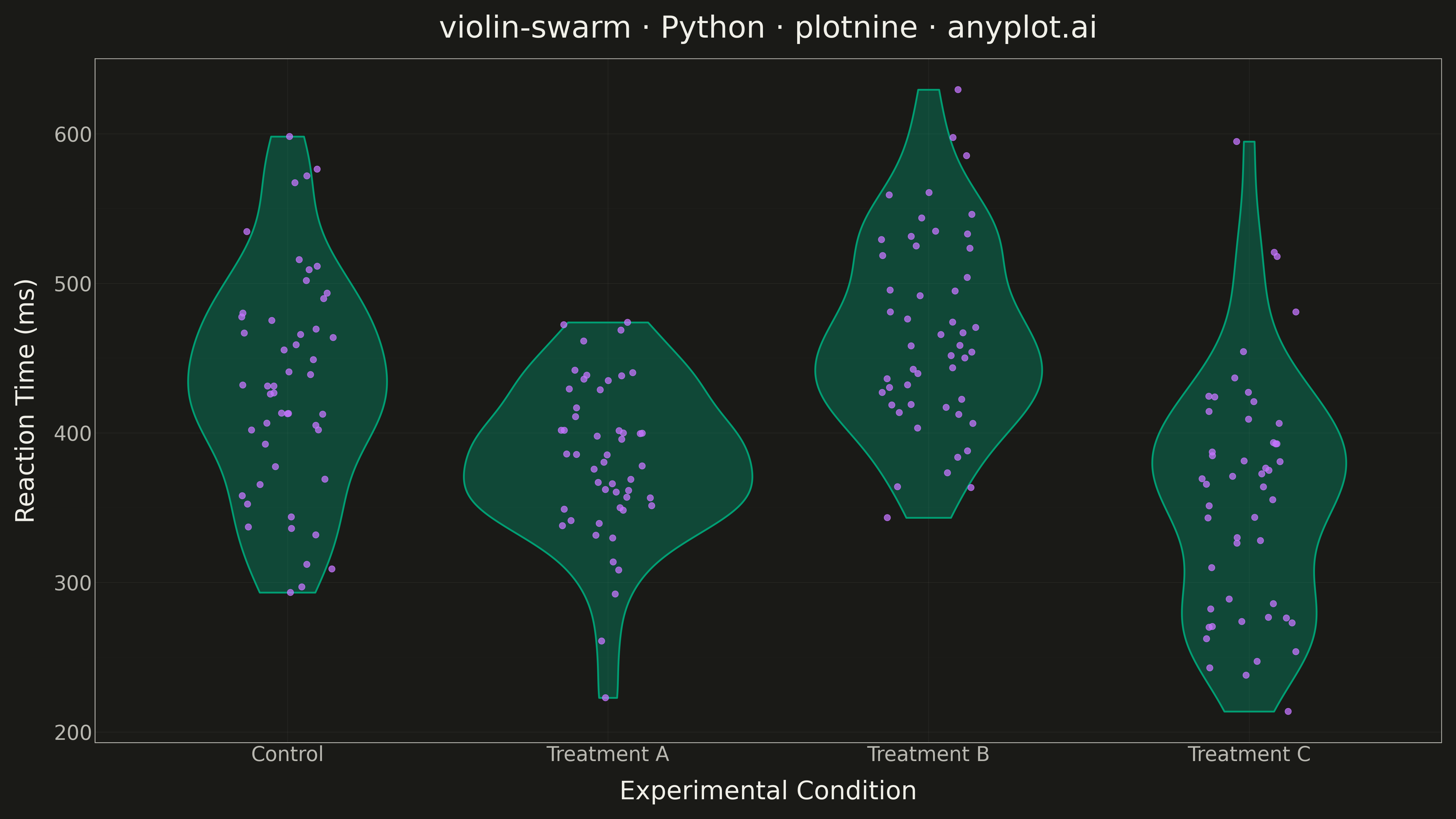
A violin plot with individual data points overlaid as a swarm plot, combining smooth kernel density estimation with raw data visibility. The violin shape shows the distribution density while the swarm points reveal actual observations, enabling viewers to see both the overall distribution pattern and individual data values simultaneously. This hybrid approach provides maximum transparency, showing exactly how many observations exist at each level while maintaining the smooth distribution visualization.
""" anyplot.ai
violin-swarm: Violin Plot with Overlaid Swarm Points
Library: plotnine 0.15.4 | Python 3.13.13
Quality: 90/100 | Updated: 2026-05-18
"""

import os

import numpy as np
import pandas as pd
from plotnine import (
    aes,
    element_line,
    element_rect,
    element_text,
    geom_jitter,
    geom_violin,
    ggplot,
    labs,
    position_jitter,
    theme,
    theme_minimal,
)


# Theme tokens
THEME = os.getenv("ANYPLOT_THEME", "light")
PAGE_BG = "#FAF8F1" if THEME == "light" else "#1A1A17"
ELEVATED_BG = "#FFFDF6" if THEME == "light" else "#242420"
INK = "#1A1A17" if THEME == "light" else "#F0EFE8"
INK_SOFT = "#4A4A44" if THEME == "light" else "#B8B7B0"
BRAND = "#009E73"  # Okabe-Ito position 1
ACCENT = "#C475FD"  # Okabe-Ito position 2

# Data - Reaction times (ms) across 4 experimental conditions
np.random.seed(42)

conditions = ["Control", "Treatment A", "Treatment B", "Treatment C"]
n_per_group = 50

data = []
for condition in conditions:
    if condition == "Control":
        values = np.random.normal(450, 80, n_per_group)
    elif condition == "Treatment A":
        values = np.random.normal(380, 60, n_per_group)
    elif condition == "Treatment B":
        values = np.concatenate(
            [np.random.normal(420, 40, n_per_group // 2), np.random.normal(520, 50, n_per_group // 2)]
        )
    else:  # Treatment C
        values = np.random.normal(350, 90, n_per_group)

    for v in values:
        data.append({"condition": condition, "reaction_time": v})

df = pd.DataFrame(data)
df["condition"] = pd.Categorical(df["condition"], categories=conditions, ordered=True)

# Plot
anyplot_theme = theme(
    plot_background=element_rect(fill=PAGE_BG, color=PAGE_BG),
    panel_background=element_rect(fill=PAGE_BG, color=PAGE_BG),
    panel_grid_major=element_line(color=INK_SOFT, size=0.3, alpha=0.12),
    panel_grid_minor=element_line(color=INK_SOFT, size=0.15, alpha=0.06),
    panel_border=element_rect(color=INK_SOFT, fill=None, size=0.6),
    axis_title=element_text(color=INK, size=20),
    axis_text=element_text(color=INK_SOFT, size=16),
    axis_line=element_line(color=INK_SOFT, size=0.5),
    plot_title=element_text(color=INK, size=24, weight="medium"),
    legend_background=element_rect(fill=ELEVATED_BG, color=INK_SOFT),
    legend_text=element_text(color=INK_SOFT, size=16),
    legend_title=element_text(color=INK, size=16),
    figure_size=(16, 9),
)

plot = (
    ggplot(df, aes(x="condition", y="reaction_time"))
    + geom_violin(fill=BRAND, alpha=0.35, color=BRAND, size=0.8)
    + geom_jitter(position=position_jitter(width=0.15), color=ACCENT, size=2.5, alpha=0.75, stroke=0.3)
    + labs(x="Experimental Condition", y="Reaction Time (ms)", title="violin-swarm · Python · plotnine · anyplot.ai")
    + theme_minimal()
    + anyplot_theme
)

plot.save(f"plot-{THEME}.png", dpi=300, verbose=False)
Runnable source as JSON, for any HTTP client: https://api.anyplot.ai/specs/violin-swarm/plotnine/code. Any spec id and library id listed in llms-full.txt fit the same URL shape; every URL below is complete and callable.
{
  "spec_id": "violin-swarm",
  "language": "python",
  "library": "plotnine",
  "page": "https://anyplot.ai/violin-swarm/python/plotnine",
  "hub": "https://anyplot.ai/violin-swarm",
  "code_json": "https://api.anyplot.ai/specs/violin-swarm/plotnine/code",
  "spec_json": "https://api.anyplot.ai/specs/violin-swarm",
  "render_light_png": "https://storage.googleapis.com/anyplot-images/plots/violin-swarm/python/plotnine/plot-light.png",
  "render_dark_png": "https://storage.googleapis.com/anyplot-images/plots/violin-swarm/python/plotnine/plot-dark.png",
  "quality_score": 90.0,
  "license": "MIT",
  "guide": "https://anyplot.ai/llms.txt"
}
Part of Violin Plot with Overlaid Swarm Points on anyplot.ai.