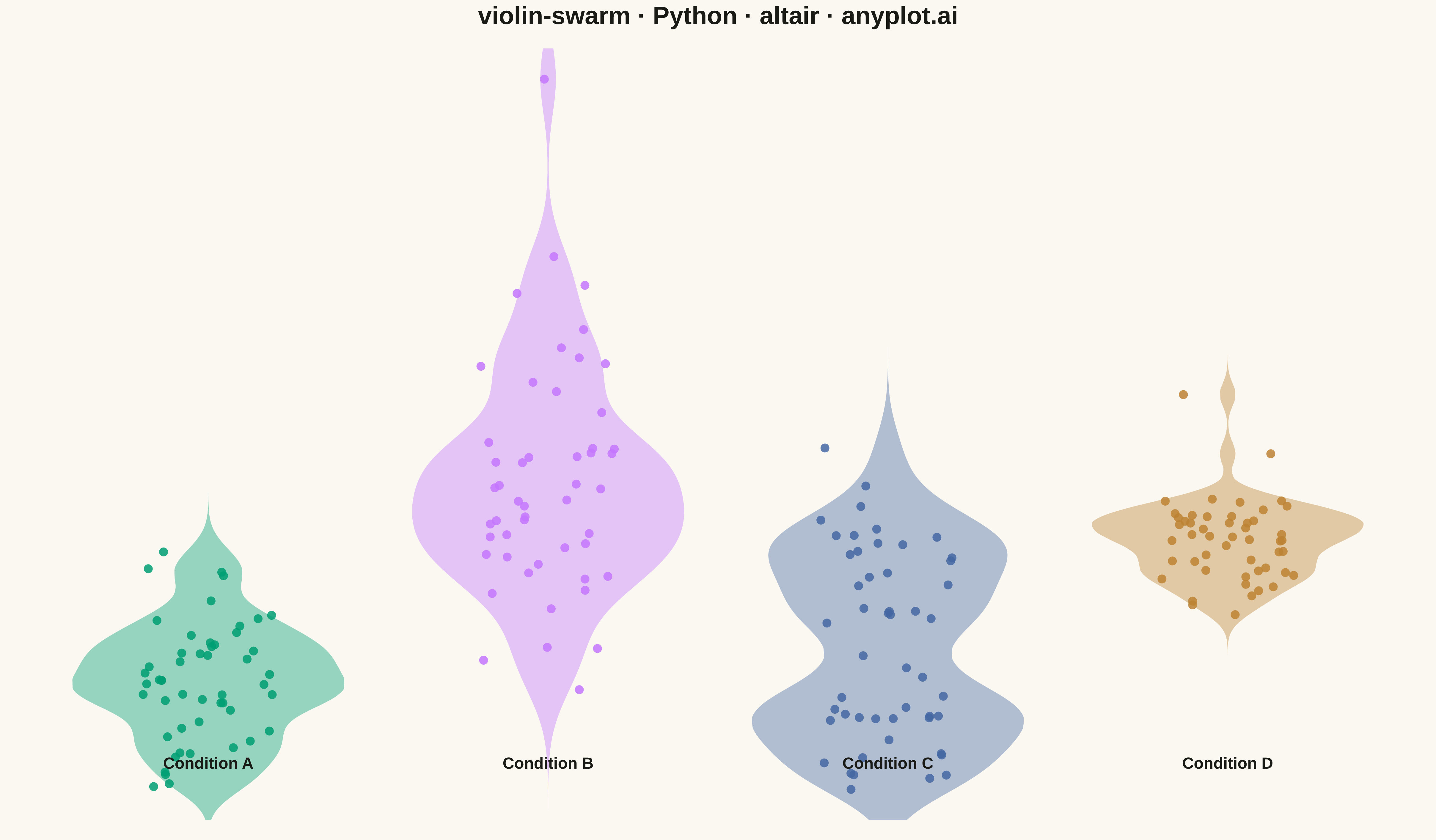
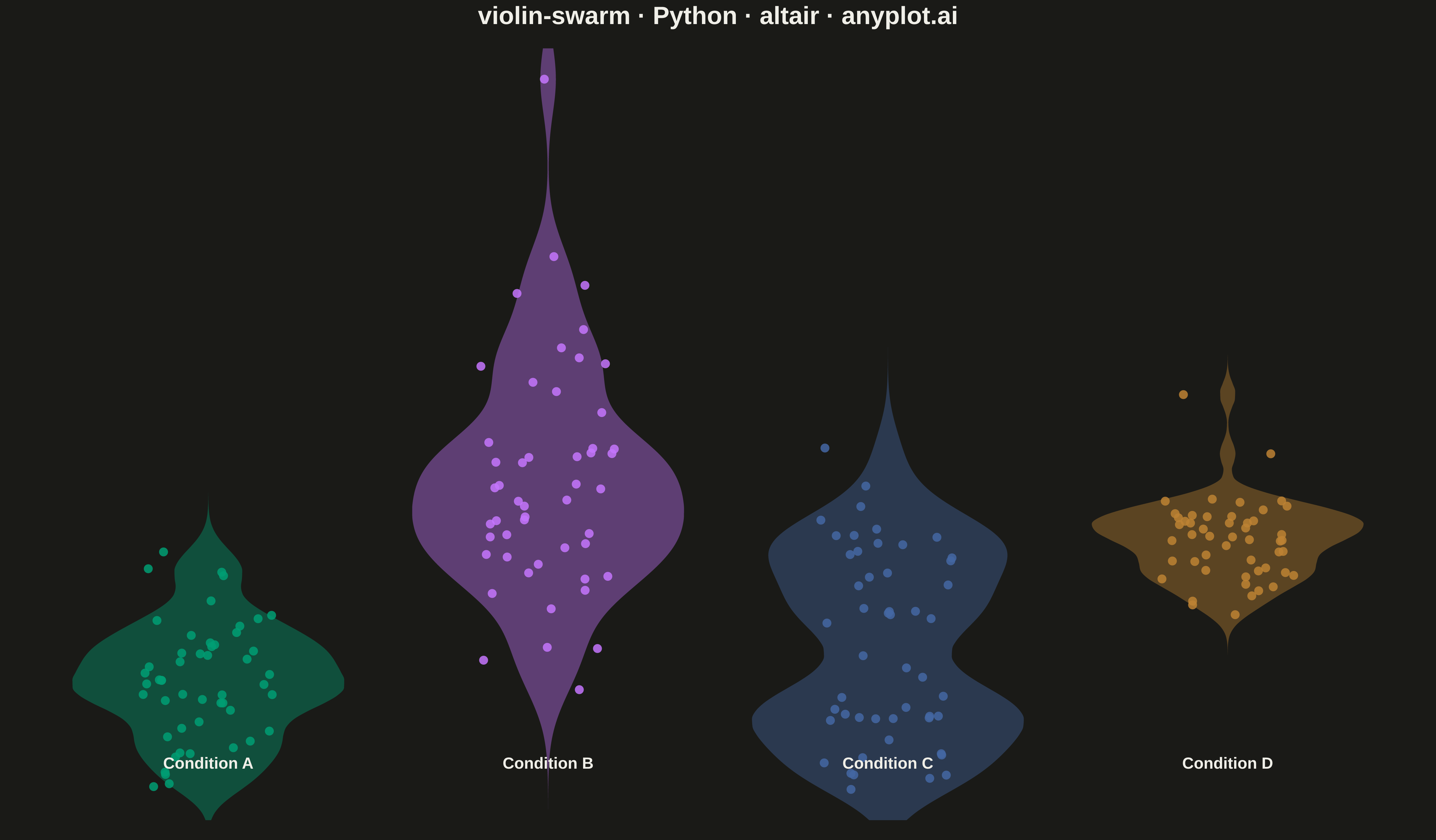
A violin plot with individual data points overlaid as a swarm plot, combining smooth kernel density estimation with raw data visibility. The violin shape shows the distribution density while the swarm points reveal actual observations, enabling viewers to see both the overall distribution pattern and individual data values simultaneously. This hybrid approach provides maximum transparency, showing exactly how many observations exist at each level while maintaining the smooth distribution visualization.
""" anyplot.ai
violin-swarm: Violin Plot with Overlaid Swarm Points
Library: altair 6.1.0 | Python 3.13.13
Quality: 93/100 | Updated: 2026-05-18
"""

import os
import sys


_original_path = sys.path[:]
sys.path = [p for p in sys.path if p not in ("", ".", os.getcwd())]
import altair as alt


sys.path = _original_path

import numpy as np
import pandas as pd
from scipy import stats


# Theme tokens
THEME = os.getenv("ANYPLOT_THEME", "light")
PAGE_BG = "#FAF8F1" if THEME == "light" else "#1A1A17"
ELEVATED_BG = "#FFFDF6" if THEME == "light" else "#242420"
INK = "#1A1A17" if THEME == "light" else "#F0EFE8"
INK_SOFT = "#4A4A44" if THEME == "light" else "#B8B7B0"

# Okabe-Ito palette (first series is ALWAYS #009E73)
IMPRINT = ["#009E73", "#C475FD", "#4467A3", "#BD8233"]

# Data: Reaction times (ms) across 4 experimental conditions
np.random.seed(42)

conditions = ["Condition A", "Condition B", "Condition C", "Condition D"]
n_per_group = 50

data = []
# Different distributions to show variety
for i, condition in enumerate(conditions):
    if i == 0:
        # Normal distribution
        values = np.random.normal(320, 40, n_per_group)
    elif i == 1:
        # Slightly skewed with higher values
        values = np.random.gamma(8, 30, n_per_group) + 200
    elif i == 2:
        # Bimodal-ish (mix of two normals)
        values = np.concatenate(
            [np.random.normal(280, 25, n_per_group // 2), np.random.normal(380, 30, n_per_group // 2)]
        )
    else:
        # Higher mean, tighter spread
        values = np.random.normal(400, 25, n_per_group)

    for v in values:
        data.append({"Condition": condition, "Reaction Time (ms)": v})

df = pd.DataFrame(data)

# Compute kernel density estimates for violin shapes
violin_data = []
y_min = df["Reaction Time (ms)"].min() - 20
y_max = df["Reaction Time (ms)"].max() + 20
y_range = np.linspace(y_min, y_max, 100)

for condition in conditions:
    subset = df[df["Condition"] == condition]["Reaction Time (ms)"]
    kde = stats.gaussian_kde(subset, bw_method=0.3)
    density = kde(y_range)
    # Normalize density to create symmetric violin width
    density_norm = density / density.max() * 0.4

    for y_val, d in zip(y_range, density_norm, strict=True):
        violin_data.append({"Condition": condition, "y": y_val, "width": d})

violin_df = pd.DataFrame(violin_data)

# Add jitter for swarm-like point distribution
np.random.seed(42)
df["jitter"] = np.random.uniform(-0.2, 0.2, len(df))

# Map conditions to x positions
condition_to_x = {c: i for i, c in enumerate(conditions)}
df["x"] = df["Condition"].map(condition_to_x)
df["x_jittered"] = df["x"] + df["jitter"]
violin_df["x"] = violin_df["Condition"].map(condition_to_x)
violin_df["x_left"] = violin_df["x"] - violin_df["width"]
violin_df["x_right"] = violin_df["x"] + violin_df["width"]

# Color scale using Okabe-Ito palette
color_scale = alt.Scale(domain=conditions, range=IMPRINT)

# Y axis scale
y_scale = alt.Scale(domain=[y_min - 10, y_max + 10])

# X axis scale (fixed with padding)
x_scale = alt.Scale(domain=[-0.6, 3.6])

# Violin shapes using area marks
violin = (
    alt.Chart(violin_df)
    .mark_area(opacity=0.4, interpolate="monotone", line=False)
    .encode(
        y=alt.Y(
            "y:Q",
            title="Reaction Time (ms)",
            scale=y_scale,
            axis=alt.Axis(labelFontSize=18, titleFontSize=22, grid=True, gridOpacity=0.10),
        ),
        x=alt.X("x_left:Q", scale=x_scale, axis=None),
        x2="x_right:Q",
        color=alt.Color("Condition:N", scale=color_scale, legend=None),
    )
)

# Swarm-like points with category colors
points = (
    alt.Chart(df)
    .mark_circle(size=100, opacity=0.85)
    .encode(
        y=alt.Y("Reaction Time (ms):Q", scale=y_scale, axis=None),
        x=alt.X("x_jittered:Q", scale=x_scale, axis=None),
        color=alt.Color("Condition:N", scale=color_scale, legend=None),
        tooltip=[
            alt.Tooltip("Condition:N", title="Condition"),
            alt.Tooltip("Reaction Time (ms):Q", title="Time (ms)", format=".1f"),
        ],
    )
)

# X-axis labels as text marks
label_df = pd.DataFrame({"x": [0, 1, 2, 3], "label": conditions, "y": [y_min - 30] * 4})

x_labels = (
    alt.Chart(label_df)
    .mark_text(fontSize=18, fontWeight="bold", color=INK)
    .encode(x=alt.X("x:Q", scale=x_scale), y=alt.value(820), text="label:N")
)

# Combine layers
chart = (
    alt.layer(violin, points, x_labels)
    .properties(
        width=1600,
        height=900,
        background=PAGE_BG,
        title=alt.Title("violin-swarm · Python · altair · anyplot.ai", fontSize=28, anchor="middle", color=INK),
    )
    .configure_view(fill=PAGE_BG, stroke=INK_SOFT, strokeWidth=0)
    .configure_axis(
        domainColor=INK_SOFT, tickColor=INK_SOFT, gridColor=INK, gridOpacity=0.10, labelColor=INK_SOFT, titleColor=INK
    )
)

# Save
chart.save(f"plot-{THEME}.png", scale_factor=3.0)
chart.save(f"plot-{THEME}.html")
Runnable source as JSON, for any HTTP client: https://api.anyplot.ai/specs/violin-swarm/altair/code. Any spec id and library id listed in llms-full.txt fit the same URL shape; every URL below is complete and callable.
{
  "spec_id": "violin-swarm",
  "language": "python",
  "library": "altair",
  "page": "https://anyplot.ai/violin-swarm/python/altair",
  "hub": "https://anyplot.ai/violin-swarm",
  "code_json": "https://api.anyplot.ai/specs/violin-swarm/altair/code",
  "spec_json": "https://api.anyplot.ai/specs/violin-swarm",
  "render_light_png": "https://storage.googleapis.com/anyplot-images/plots/violin-swarm/python/altair/plot-light.png",
  "render_dark_png": "https://storage.googleapis.com/anyplot-images/plots/violin-swarm/python/altair/plot-dark.png",
  "interactive_light_html": "https://storage.googleapis.com/anyplot-images/plots/violin-swarm/python/altair/plot-light.html",
  "interactive_dark_html": "https://storage.googleapis.com/anyplot-images/plots/violin-swarm/python/altair/plot-dark.html",
  "quality_score": 93.0,
  "license": "MIT",
  "guide": "https://anyplot.ai/llms.txt"
}
Part of Violin Plot with Overlaid Swarm Points on anyplot.ai.