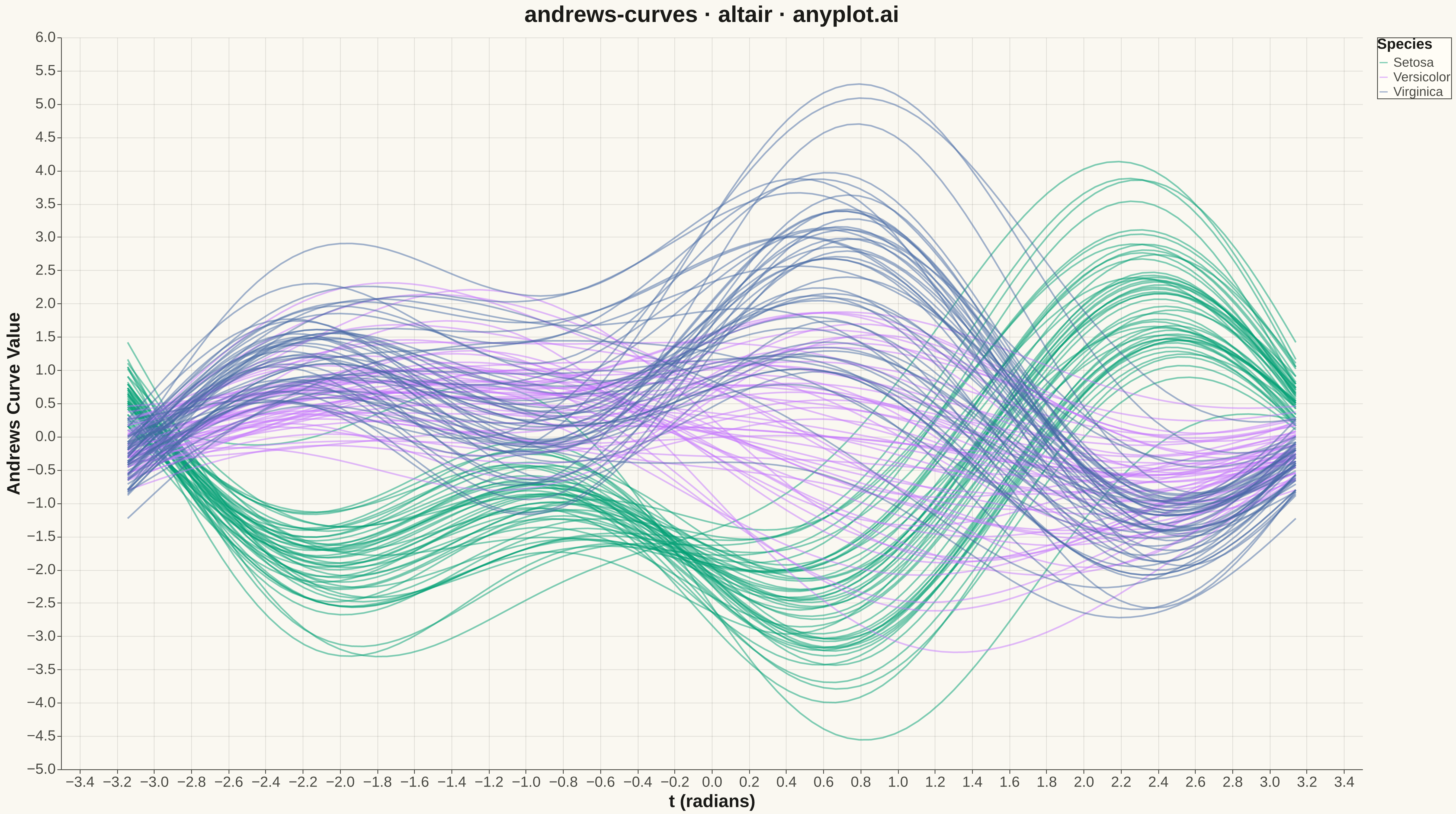
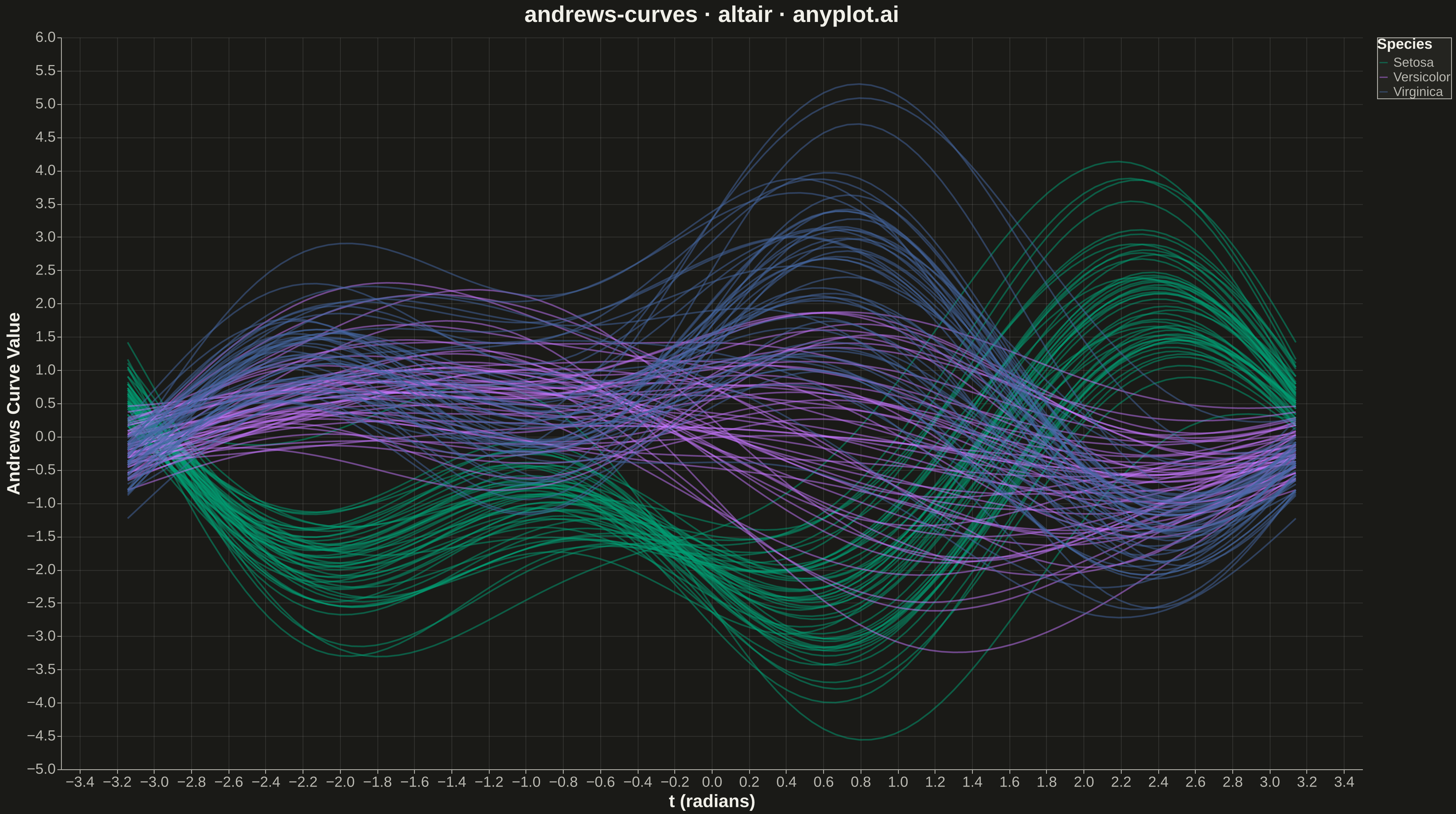
Andrews curves visualization transforms multivariate observations into smooth Fourier series curves. Each data point is represented as a continuous function where variable values become coefficients in a Fourier expansion, producing distinctive wave patterns. This technique enables visual comparison of multivariate patterns, cluster identification, and outlier detection—observations with similar values across variables produce similar curves, while outliers appear as distinctly different patterns.
""" anyplot.ai
andrews-curves: Andrews Curves for Multivariate Data
Library: altair 6.1.0 | Python 3.13.13
Quality: 92/100 | Updated: 2026-05-15
"""

import os
import sys


# Remove script directory from sys.path to avoid importing local altair.py
script_dir = os.path.dirname(os.path.abspath(__file__))
if script_dir in sys.path:
    sys.path.remove(script_dir)

import altair as alt
import numpy as np
import pandas as pd
from sklearn.datasets import load_iris
from sklearn.preprocessing import StandardScaler


# Theme tokens
THEME = os.getenv("ANYPLOT_THEME", "light")
PAGE_BG = "#FAF8F1" if THEME == "light" else "#1A1A17"
ELEVATED_BG = "#FFFDF6" if THEME == "light" else "#242420"
INK = "#1A1A17" if THEME == "light" else "#F0EFE8"
INK_SOFT = "#4A4A44" if THEME == "light" else "#B8B7B0"

# Okabe-Ito palette
IMPRINT = ["#009E73", "#C475FD", "#4467A3"]

# Load and prepare data
np.random.seed(42)
iris = load_iris()
X = iris.data
y = iris.target
species_names = ["Setosa", "Versicolor", "Virginica"]

# Normalize variables to similar scales
scaler = StandardScaler()
X_scaled = scaler.fit_transform(X)

# Andrews curve transformation
# f(t) = x1/sqrt(2) + x2*sin(t) + x3*cos(t) + x4*sin(2t) + x5*cos(2t) + ...
n_points = 100
t = np.linspace(-np.pi, np.pi, n_points)

# Compute Andrews curves for each observation
curves_data = []
for obs_idx in range(len(X_scaled)):
    x = X_scaled[obs_idx]
    curve = np.zeros(n_points)
    curve += x[0] / np.sqrt(2)

    for i in range(1, len(x)):
        freq = (i + 1) // 2
        if i % 2 == 1:
            curve += x[i] * np.sin(freq * t)
        else:
            curve += x[i] * np.cos(freq * t)

    for pt_idx in range(n_points):
        curves_data.append(
            {"t": t[pt_idx], "value": curve[pt_idx], "observation": obs_idx, "species": species_names[y[obs_idx]]}
        )

df = pd.DataFrame(curves_data)

# Create chart
chart = (
    alt.Chart(df)
    .mark_line(opacity=0.5, size=2)
    .encode(
        x=alt.X(
            "t:Q",
            title="t (radians)",
            axis=alt.Axis(labelFontSize=18, titleFontSize=22, labelColor=INK_SOFT, titleColor=INK),
        ),
        y=alt.Y(
            "value:Q",
            title="Andrews Curve Value",
            axis=alt.Axis(labelFontSize=18, titleFontSize=22, labelColor=INK_SOFT, titleColor=INK),
        ),
        color=alt.Color(
            "species:N",
            title="Species",
            scale=alt.Scale(domain=species_names, range=IMPRINT),
            legend=alt.Legend(
                titleFontSize=18,
                labelFontSize=16,
                titleColor=INK,
                labelColor=INK_SOFT,
                fillColor=ELEVATED_BG,
                strokeColor=INK_SOFT,
            ),
        ),
        detail="observation:N",
        tooltip=["species:N", "observation:N"],
    )
    .properties(
        width=1600,
        height=900,
        background=PAGE_BG,
        title=alt.Title("andrews-curves · altair · anyplot.ai", fontSize=28, color=INK),
    )
    .configure_axis(domainColor=INK_SOFT, tickColor=INK_SOFT, gridColor=INK, gridOpacity=0.10)
    .configure_view(fill=PAGE_BG, stroke=None)
    .configure_title(color=INK)
    .configure_legend(
        titleFontSize=18,
        labelFontSize=16,
        titleColor=INK,
        labelColor=INK_SOFT,
        fillColor=ELEVATED_BG,
        strokeColor=INK_SOFT,
    )
)

# Save as PNG and HTML
chart.save(f"plot-{THEME}.png", scale_factor=3.0)
chart.save(f"plot-{THEME}.html")
Runnable source as JSON, for any HTTP client: https://api.anyplot.ai/specs/andrews-curves/altair/code. Any spec id and library id listed in llms-full.txt fit the same URL shape; every URL below is complete and callable.
{
  "spec_id": "andrews-curves",
  "language": "python",
  "library": "altair",
  "page": "https://anyplot.ai/andrews-curves/python/altair",
  "hub": "https://anyplot.ai/andrews-curves",
  "code_json": "https://api.anyplot.ai/specs/andrews-curves/altair/code",
  "spec_json": "https://api.anyplot.ai/specs/andrews-curves",
  "render_light_png": "https://storage.googleapis.com/anyplot-images/plots/andrews-curves/python/altair/plot-light.png",
  "render_dark_png": "https://storage.googleapis.com/anyplot-images/plots/andrews-curves/python/altair/plot-dark.png",
  "interactive_light_html": "https://storage.googleapis.com/anyplot-images/plots/andrews-curves/python/altair/plot-light.html",
  "interactive_dark_html": "https://storage.googleapis.com/anyplot-images/plots/andrews-curves/python/altair/plot-dark.html",
  "quality_score": 92.0,
  "license": "MIT",
  "guide": "https://anyplot.ai/llms.txt"
}
Part of Andrews Curves for Multivariate Data on anyplot.ai.