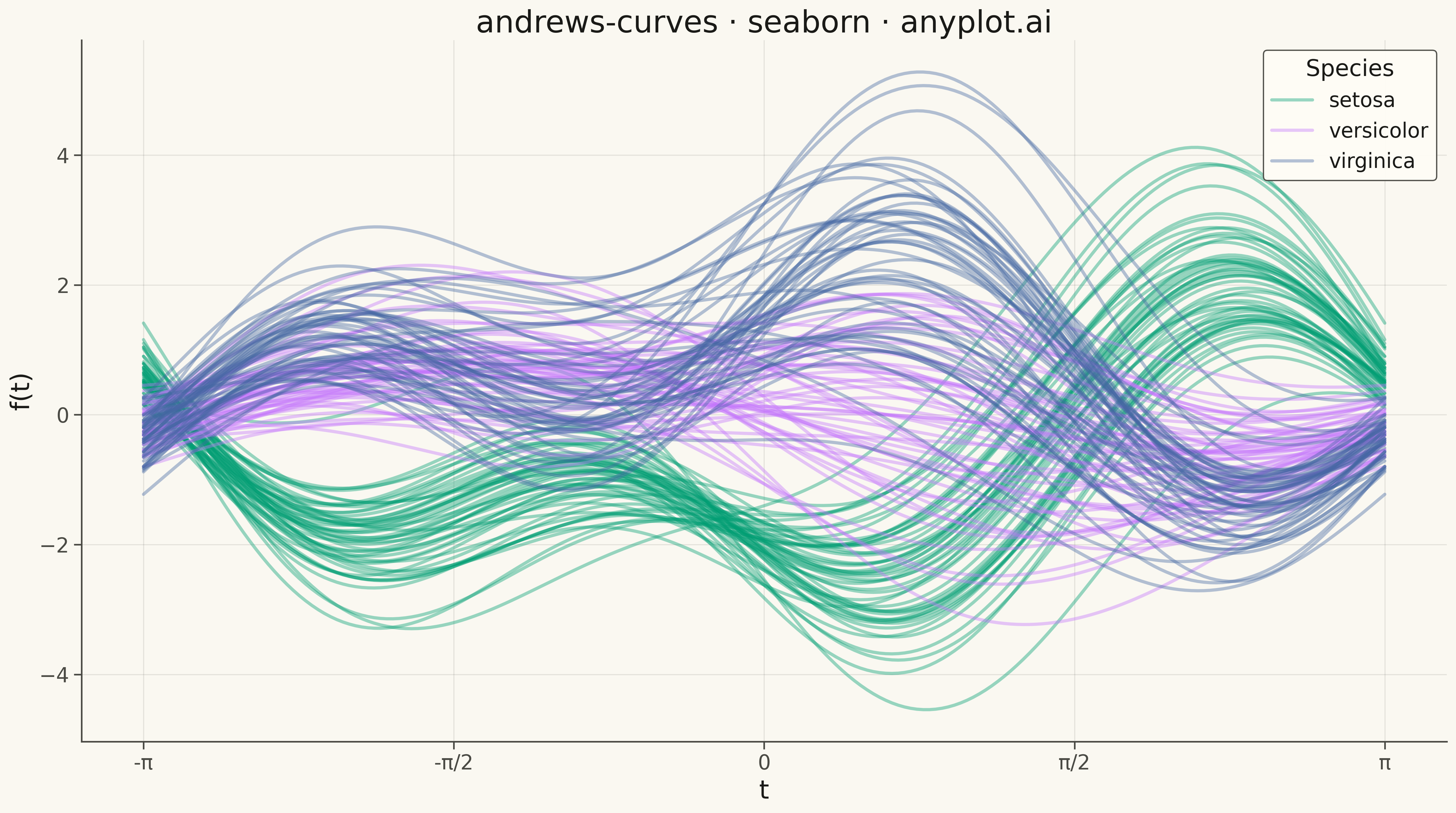
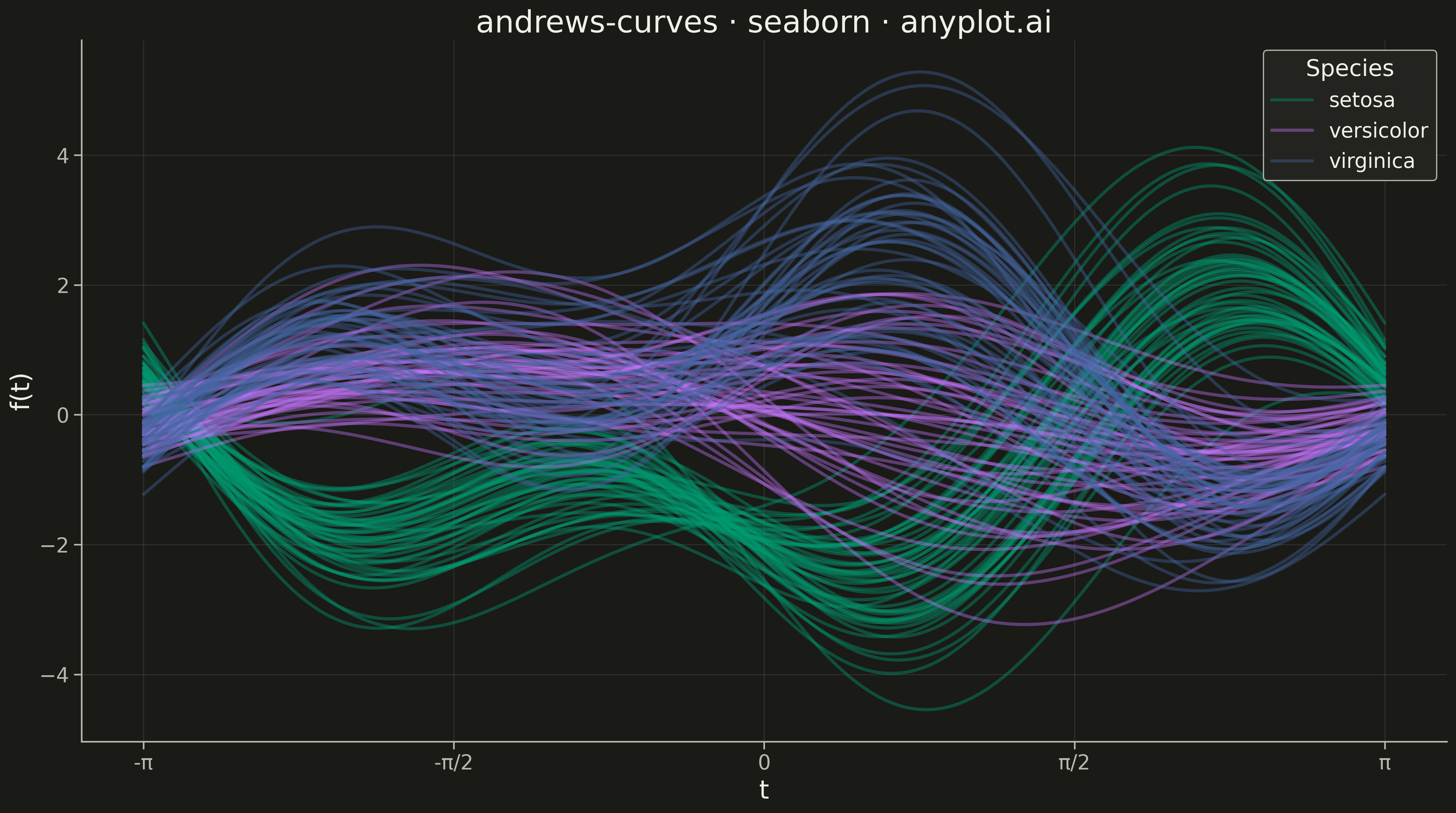
Andrews curves visualization transforms multivariate observations into smooth Fourier series curves. Each data point is represented as a continuous function where variable values become coefficients in a Fourier expansion, producing distinctive wave patterns. This technique enables visual comparison of multivariate patterns, cluster identification, and outlier detection—observations with similar values across variables produce similar curves, while outliers appear as distinctly different patterns.
""" anyplot.ai
andrews-curves: Andrews Curves for Multivariate Data
Library: seaborn 0.13.2 | Python 3.13.13
Quality: 92/100 | Updated: 2026-05-15
"""

import os
import sys


# Handle import shadowing: remove current directory from path to avoid
# importing local matplotlib.py or seaborn.py instead of the real libraries
cwd = os.path.dirname(os.path.abspath(__file__))
sys.path = [p for p in sys.path if not (p == cwd or p.startswith(cwd + os.sep))]

import matplotlib.pyplot as plt
import numpy as np
import pandas as pd
import seaborn as sns


# Theme tokens
THEME = os.getenv("ANYPLOT_THEME", "light")
PAGE_BG = "#FAF8F1" if THEME == "light" else "#1A1A17"
ELEVATED_BG = "#FFFDF6" if THEME == "light" else "#242420"
INK = "#1A1A17" if THEME == "light" else "#F0EFE8"
INK_SOFT = "#4A4A44" if THEME == "light" else "#B8B7B0"

# Okabe-Ito palette (first series always #009E73)
IMPRINT = [
    "#009E73",  # bluish green (brand)
    "#C475FD",  # vermillion
    "#4467A3",  # blue
]

# Data
df = sns.load_dataset("iris")

# Normalize variables to similar scales
features = ["sepal_length", "sepal_width", "petal_length", "petal_width"]
for col in features:
    df[col + "_norm"] = (df[col] - df[col].mean()) / df[col].std()

norm_features = [f + "_norm" for f in features]

# Generate t values from -π to π
t = np.linspace(-np.pi, np.pi, 200)

# Compute Andrews curves for all observations
curves_data = []
for idx, row in df.iterrows():
    values = row[norm_features].values.astype(float)
    # Andrews curve: f(t) = x1/sqrt(2) + x2*sin(t) + x3*cos(t) + x4*sin(2t) + ...
    curve_vals = np.full_like(t, values[0] / np.sqrt(2))
    for i in range(1, len(values)):
        if i % 2 == 1:
            curve_vals = curve_vals + values[i] * np.sin((i + 1) // 2 * t)
        else:
            curve_vals = curve_vals + values[i] * np.cos(i // 2 * t)

    for t_val, y_val in zip(t, curve_vals, strict=True):
        curves_data.append({"t": t_val, "f(t)": y_val, "species": row["species"], "obs_id": idx})

curves_df = pd.DataFrame(curves_data)

# Theme-adaptive seaborn styling
sns.set_theme(
    style="ticks",
    rc={
        "figure.facecolor": PAGE_BG,
        "axes.facecolor": PAGE_BG,
        "axes.edgecolor": INK_SOFT,
        "axes.labelcolor": INK,
        "text.color": INK,
        "xtick.color": INK_SOFT,
        "ytick.color": INK_SOFT,
        "grid.color": INK,
        "grid.alpha": 0.10,
        "legend.facecolor": ELEVATED_BG,
        "legend.edgecolor": INK_SOFT,
    },
)

# Plot
fig, ax = plt.subplots(figsize=(16, 9))

# Plot Andrews curves using lineplot with grouped data
sns.lineplot(
    data=curves_df,
    x="t",
    y="f(t)",
    hue="species",
    palette=IMPRINT,
    alpha=0.4,
    linewidth=2.5,
    units="obs_id",
    estimator=None,
    ax=ax,
)

# Style
ax.set_xlabel("t", fontsize=20, color=INK)
ax.set_ylabel("f(t)", fontsize=20, color=INK)
ax.set_title("andrews-curves · seaborn · anyplot.ai", fontsize=24, color=INK)
ax.tick_params(axis="both", labelsize=16, colors=INK_SOFT)

# Set x-axis ticks to show π values
ax.set_xticks([-np.pi, -np.pi / 2, 0, np.pi / 2, np.pi])
ax.set_xticklabels(["-π", "-π/2", "0", "π/2", "π"], fontsize=16)

# Legend
ax.legend(title="Species", fontsize=16, title_fontsize=18, loc="upper right", framealpha=0.95)

# Grid (subtle, solid lines)
ax.grid(True, alpha=0.10, linewidth=0.8, linestyle="-")
ax.spines["top"].set_visible(False)
ax.spines["right"].set_visible(False)

plt.tight_layout()
plt.savefig(f"plot-{THEME}.png", dpi=300, bbox_inches="tight", facecolor=PAGE_BG)
Runnable source as JSON, for any HTTP client: https://api.anyplot.ai/specs/andrews-curves/seaborn/code. Any spec id and library id listed in llms-full.txt fit the same URL shape; every URL below is complete and callable.
{
  "spec_id": "andrews-curves",
  "language": "python",
  "library": "seaborn",
  "page": "https://anyplot.ai/andrews-curves/python/seaborn",
  "hub": "https://anyplot.ai/andrews-curves",
  "code_json": "https://api.anyplot.ai/specs/andrews-curves/seaborn/code",
  "spec_json": "https://api.anyplot.ai/specs/andrews-curves",
  "render_light_png": "https://storage.googleapis.com/anyplot-images/plots/andrews-curves/python/seaborn/plot-light.png",
  "render_dark_png": "https://storage.googleapis.com/anyplot-images/plots/andrews-curves/python/seaborn/plot-dark.png",
  "quality_score": 92.0,
  "license": "MIT",
  "guide": "https://anyplot.ai/llms.txt"
}
Part of Andrews Curves for Multivariate Data on anyplot.ai.