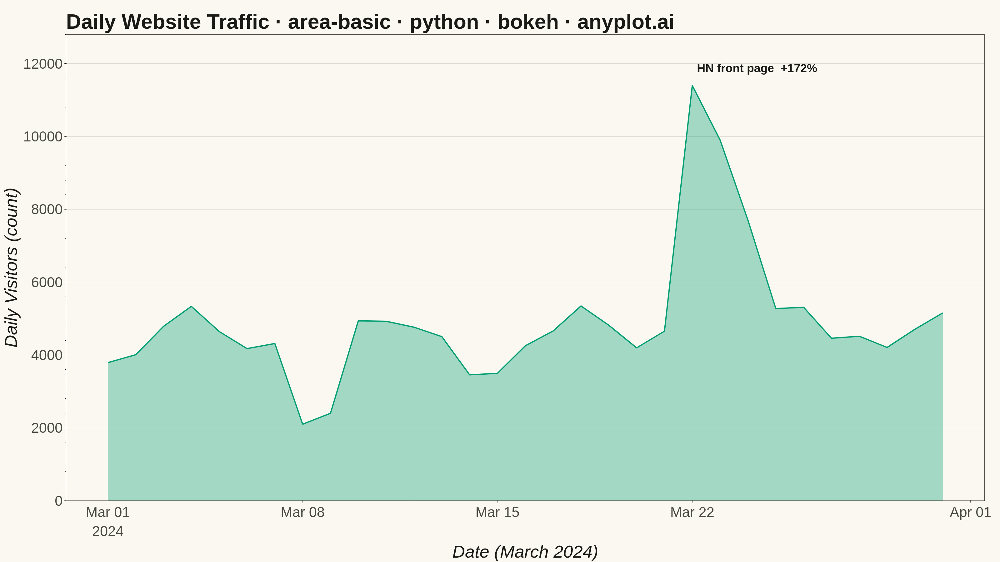
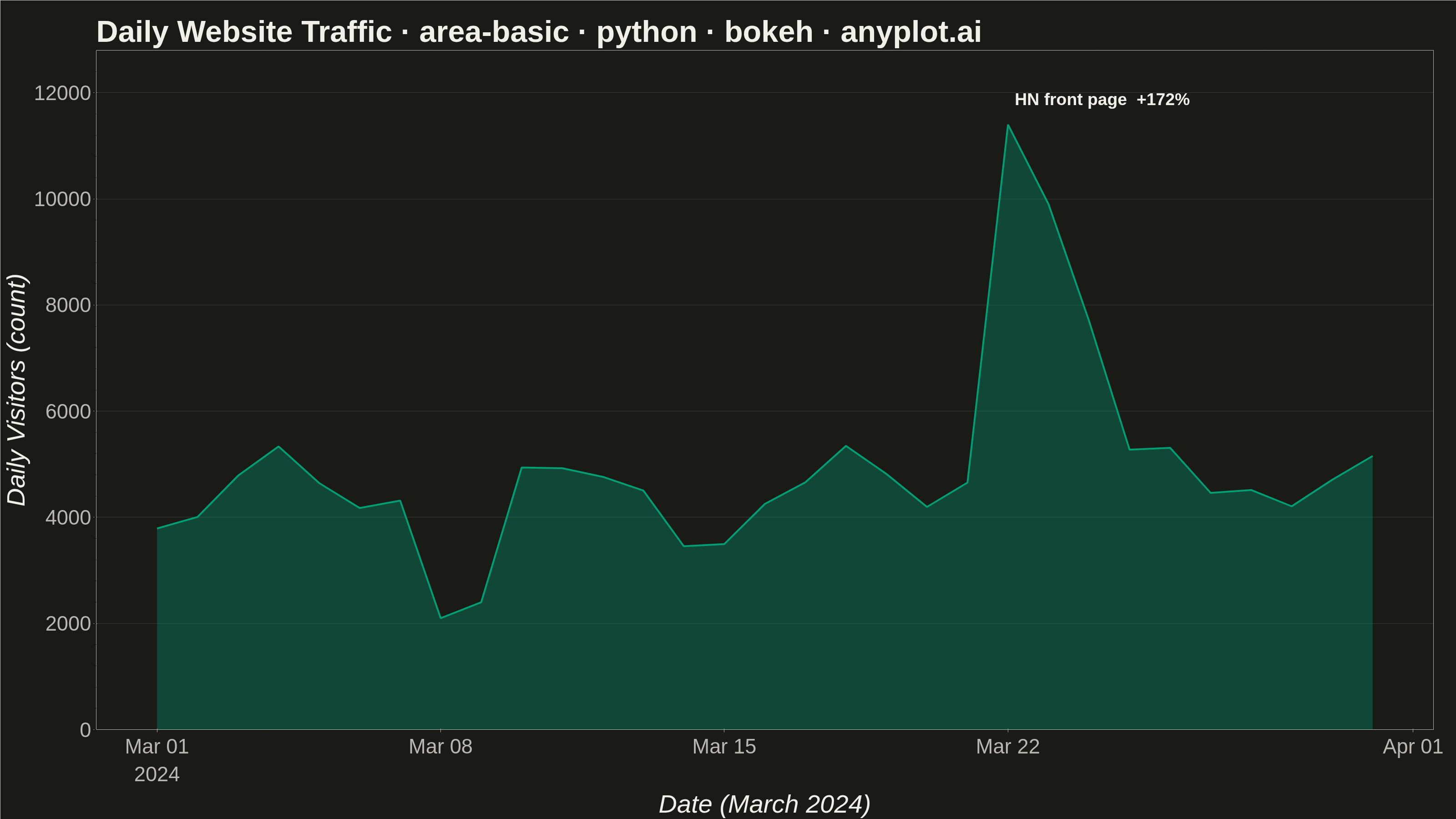
An area chart showing quantitative data over a continuous axis with the area below the line filled. It emphasizes the magnitude of values over time by filling the space between the line and axis, creating visual weight that helps readers understand volume and trends. Particularly effective for showing cumulative totals, resource consumption, or any data where the "amount" is as important as the trend.
""" anyplot.ai
area-basic: Basic Area Chart
Library: bokeh 3.9.0 | Python 3.13.13
Quality: 92/100 | Updated: 2026-05-28
"""

import io
import os
import sys
import time
from pathlib import Path


# Prevent this file's directory from shadowing the installed bokeh package
sys.path = [p for p in sys.path if os.path.abspath(p) != os.path.dirname(os.path.abspath(__file__))]

import numpy as np
import pandas as pd
from bokeh.io import output_file, save
from bokeh.models import ColumnDataSource, HoverTool, Label
from bokeh.plotting import figure
from PIL import Image
from selenium import webdriver
from selenium.webdriver.chrome.options import Options


# Theme tokens
THEME = os.getenv("ANYPLOT_THEME", "light")
PAGE_BG = "#FAF8F1" if THEME == "light" else "#1A1A17"
ELEVATED_BG = "#FFFDF6" if THEME == "light" else "#242420"
INK = "#1A1A17" if THEME == "light" else "#F0EFE8"
INK_SOFT = "#4A4A44" if THEME == "light" else "#B8B7B0"
BRAND = "#009E73"  # Imprint palette position 1 — always first series

# Title with length-aware font scaling
title_str = "Daily Website Traffic · area-basic · python · bokeh · anyplot.ai"
n = len(title_str)
ratio = 67 / n if n > 67 else 1.0
title_fontsize = f"{max(34, round(50 * ratio))}pt"

# Data — tech blog visitors, March 2024
np.random.seed(42)
dates = pd.date_range(start="2024-03-01", periods=31, freq="D")
base_visitors = 4200
trend = np.linspace(0, 800, 31)
weekly_pattern = 600 * np.sin(np.arange(31) * 2 * np.pi / 7 - 1.2)
noise = np.random.randn(31) * 300
visitors = base_visitors + trend + weekly_pattern + noise
visitors = np.maximum(visitors, 1800)

# Traffic dip: scheduled maintenance on day 8–9
visitors[7] = 2100
visitors[8] = 2400

# Viral surge: tutorial hits Hacker News front page on day 22
visitors[21] = 11400
visitors[22] = 9900
visitors[23] = 7700

source = ColumnDataSource(data={"date": dates, "visitors": visitors})

# Figure — 3200×1800 landscape
p = figure(
    width=3200,
    height=1800,
    title=title_str,
    x_axis_label="Date (March 2024)",
    y_axis_label="Daily Visitors (count)",
    x_axis_type="datetime",
    toolbar_location=None,
    min_border_bottom=160,
    min_border_left=180,
    min_border_top=110,
    min_border_right=50,
)

# Area fill + edge line
p.varea(x="date", y1=0, y2="visitors", source=source, fill_color=BRAND, fill_alpha=0.35)
p.line(x="date", y="visitors", source=source, line_color=BRAND, line_width=4)

# Invisible scatter for hover hit targets
p.scatter(x="date", y="visitors", source=source, size=18, fill_alpha=0, line_alpha=0)

# HoverTool with datetime formatter
hover = HoverTool(
    tooltips=[("Date", "@date{%b %d, %Y}"), ("Visitors", "@visitors{0,0}")],
    formatters={"@date": "datetime"},
    mode="vline",
)
p.add_tools(hover)

# Annotation — viral surge event
surge_label = Label(
    x=dates[21],
    y=11700,
    text="HN front page  +172%",
    text_font_size="28pt",
    text_color=INK,
    text_font_style="bold",
    x_offset=15,
    y_offset=0,
)
p.add_layout(surge_label)

# Text sizing — canonical bokeh values for 3200×1800
p.title.text_font_size = title_fontsize
p.xaxis.axis_label_text_font_size = "42pt"
p.yaxis.axis_label_text_font_size = "42pt"
p.xaxis.major_label_text_font_size = "34pt"
p.yaxis.major_label_text_font_size = "34pt"

# Theme-adaptive chrome
p.background_fill_color = PAGE_BG
p.border_fill_color = PAGE_BG
p.outline_line_color = INK_SOFT

p.title.text_color = INK
p.xaxis.axis_label_text_color = INK
p.yaxis.axis_label_text_color = INK
p.xaxis.major_label_text_color = INK_SOFT
p.yaxis.major_label_text_color = INK_SOFT
p.xaxis.axis_line_color = INK_SOFT
p.yaxis.axis_line_color = INK_SOFT
p.xaxis.major_tick_line_color = INK_SOFT
p.yaxis.major_tick_line_color = INK_SOFT

# Grid — subtle, y-axis only for area chart
p.xgrid.grid_line_color = None
p.ygrid.grid_line_color = INK
p.ygrid.grid_line_alpha = 0.15

# Y range with tight headroom for annotation
p.y_range.start = 0
p.y_range.end = 12800

# Save HTML (interactive catalog artifact)
output_file(f"plot-{THEME}.html")
save(p)

# Screenshot with headless Chrome (Selenium 4 / Selenium Manager).
# Chrome's internal UI overhead shrinks the viewport below --window-size by ~139 px.
# Use a taller window (H + 200 buffer) so the viewport is >= H, then crop to exact dims.
W, H = 3200, 1800
opts = Options()
for arg in (
    "--headless=new",
    "--no-sandbox",
    "--disable-dev-shm-usage",
    "--disable-gpu",
    f"--window-size={W},{H + 200}",
    "--hide-scrollbars",
    "--force-device-scale-factor=1",
):
    opts.add_argument(arg)
driver = webdriver.Chrome(options=opts)
driver.set_window_size(W, H + 200)
driver.get(f"file://{Path(f'plot-{THEME}.html').resolve()}")
time.sleep(3)
raw = driver.get_screenshot_as_png()
driver.quit()
img = Image.open(io.BytesIO(raw)).crop((0, 0, W, H))
img.save(f"plot-{THEME}.png")
Runnable source as JSON, for any HTTP client: https://api.anyplot.ai/specs/area-basic/bokeh/code. Any spec id and library id listed in llms-full.txt fit the same URL shape; every URL below is complete and callable.
{
  "spec_id": "area-basic",
  "language": "python",
  "library": "bokeh",
  "page": "https://anyplot.ai/area-basic/python/bokeh",
  "hub": "https://anyplot.ai/area-basic",
  "code_json": "https://api.anyplot.ai/specs/area-basic/bokeh/code",
  "spec_json": "https://api.anyplot.ai/specs/area-basic",
  "render_light_png": "https://storage.googleapis.com/anyplot-images/plots/area-basic/python/bokeh/plot-light.png",
  "render_dark_png": "https://storage.googleapis.com/anyplot-images/plots/area-basic/python/bokeh/plot-dark.png",
  "interactive_light_html": "https://storage.googleapis.com/anyplot-images/plots/area-basic/python/bokeh/plot-light.html",
  "interactive_dark_html": "https://storage.googleapis.com/anyplot-images/plots/area-basic/python/bokeh/plot-dark.html",
  "quality_score": 92.0,
  "license": "MIT",
  "guide": "https://anyplot.ai/llms.txt"
}
Part of Basic Area Chart on anyplot.ai.