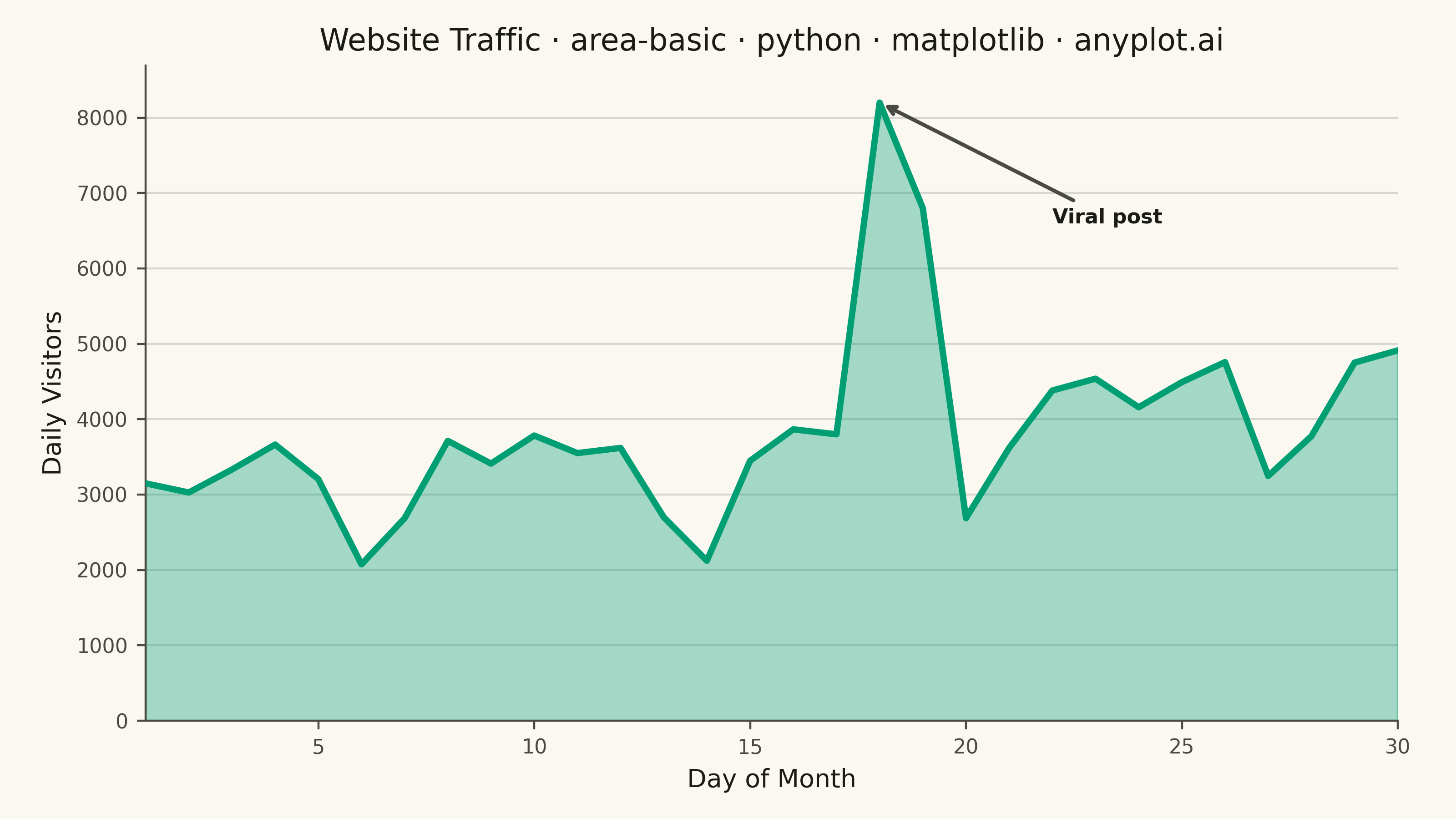
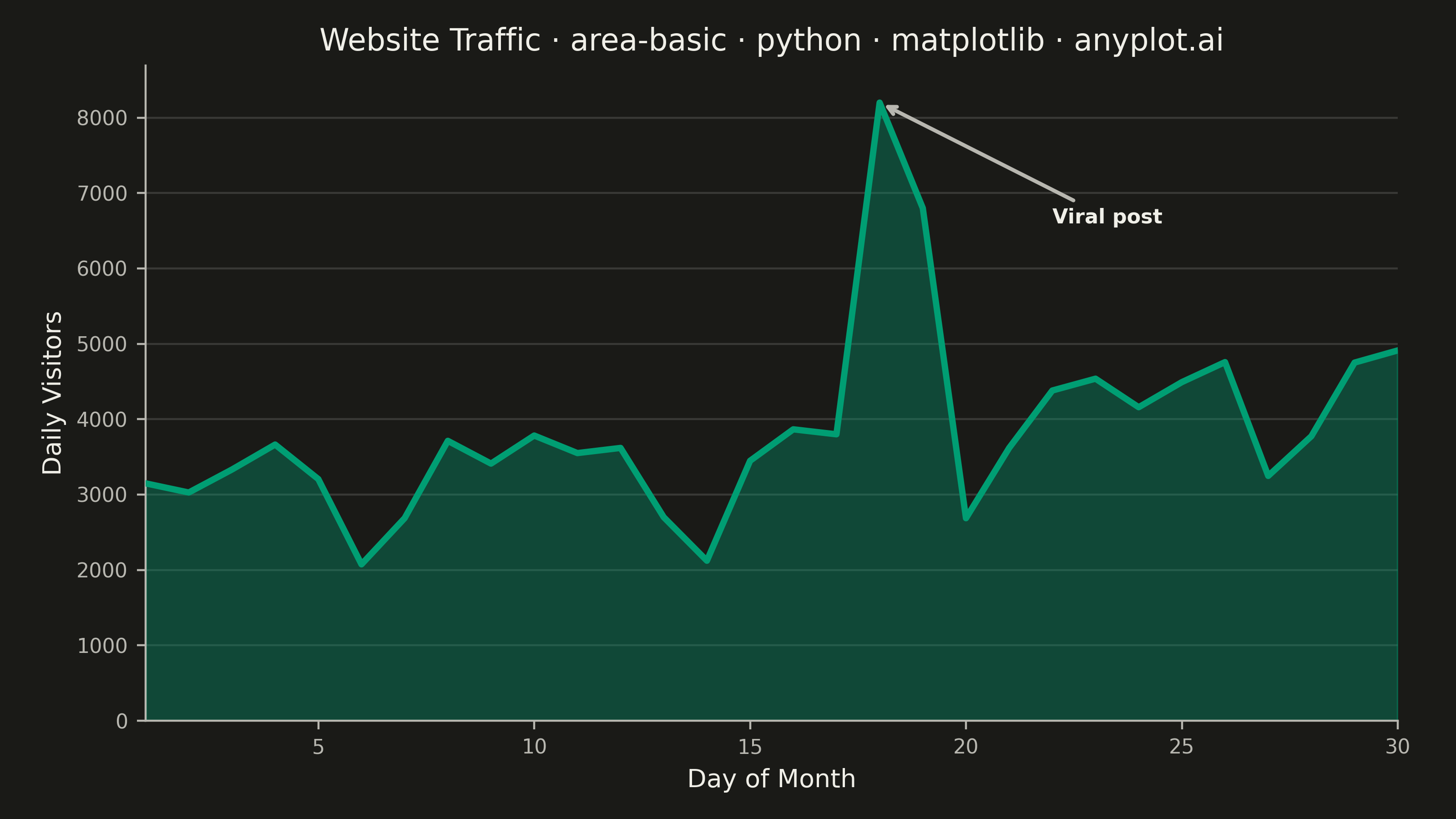
An area chart showing quantitative data over a continuous axis with the area below the line filled. It emphasizes the magnitude of values over time by filling the space between the line and axis, creating visual weight that helps readers understand volume and trends. Particularly effective for showing cumulative totals, resource consumption, or any data where the "amount" is as important as the trend.
""" anyplot.ai
area-basic: Basic Area Chart
Library: matplotlib 3.10.9 | Python 3.13.13
Quality: 90/100 | Updated: 2026-05-28
"""

import os

import matplotlib.pyplot as plt
import numpy as np


# Theme tokens
THEME = os.getenv("ANYPLOT_THEME", "light")
PAGE_BG = "#FAF8F1" if THEME == "light" else "#1A1A17"
ELEVATED_BG = "#FFFDF6" if THEME == "light" else "#242420"
INK = "#1A1A17" if THEME == "light" else "#F0EFE8"
INK_SOFT = "#4A4A44" if THEME == "light" else "#B8B7B0"
BRAND = "#009E73"  # Imprint palette position 1 — ALWAYS first series

# Data - daily website visitors over a month with weekend dips and a viral spike
np.random.seed(42)
days = np.arange(1, 31)
base_visitors = 3000 + np.linspace(0, 2000, 30)  # Upward trend 3k→5k
weekend_effect = np.array([-1200 if d % 7 in (0, 6) else 0 for d in days])
noise = np.random.randn(30) * 300
visitors = base_visitors + weekend_effect + noise
visitors[17] = 8200  # Viral blog post spike on day 18
visitors[18] = 6800
visitors = np.clip(visitors, 1000, 10000)

# Title with fontsize scaled to length
title = "Website Traffic · area-basic · python · matplotlib · anyplot.ai"
n = len(title)
title_fontsize = max(8, round(12 * 67 / n)) if n > 67 else 12

# Plot
fig, ax = plt.subplots(figsize=(8, 4.5), dpi=400, facecolor=PAGE_BG)
ax.set_facecolor(PAGE_BG)

y_max = visitors.max() * 1.06

ax.fill_between(days, visitors, alpha=0.35, color=BRAND, zorder=2)
ax.plot(days, visitors, color=BRAND, linewidth=2.5, zorder=3)

# Viral post annotation — to the right of the spike to avoid ceiling crowding
ax.annotate(
    "Viral post",
    xy=(18, visitors[17]),
    xytext=(22, 6600),
    fontsize=8,
    color=INK,
    fontweight="bold",
    arrowprops={"arrowstyle": "->", "color": INK_SOFT, "lw": 1.5},
    zorder=4,
)

# Style
ax.set_xlabel("Day of Month", fontsize=10, color=INK)
ax.set_ylabel("Daily Visitors", fontsize=10, color=INK)
ax.set_title(title, fontsize=title_fontsize, fontweight="medium", color=INK)
ax.tick_params(axis="both", labelsize=8, colors=INK_SOFT)
ax.set_xlim(1, 30)
ax.set_ylim(0, y_max)
ax.yaxis.grid(True, alpha=0.15, linewidth=0.8, color=INK)
ax.spines["top"].set_visible(False)
ax.spines["right"].set_visible(False)
for s in ("left", "bottom"):
    ax.spines[s].set_color(INK_SOFT)

fig.subplots_adjust(left=0.10, right=0.96, top=0.92, bottom=0.12)

# Save
plt.savefig(f"plot-{THEME}.png", dpi=400, facecolor=PAGE_BG)
Runnable source as JSON, for any HTTP client: https://api.anyplot.ai/specs/area-basic/matplotlib/code. Any spec id and library id listed in llms-full.txt fit the same URL shape; every URL below is complete and callable.
{
  "spec_id": "area-basic",
  "language": "python",
  "library": "matplotlib",
  "page": "https://anyplot.ai/area-basic/python/matplotlib",
  "hub": "https://anyplot.ai/area-basic",
  "code_json": "https://api.anyplot.ai/specs/area-basic/matplotlib/code",
  "spec_json": "https://api.anyplot.ai/specs/area-basic",
  "render_light_png": "https://storage.googleapis.com/anyplot-images/plots/area-basic/python/matplotlib/plot-light.png",
  "render_dark_png": "https://storage.googleapis.com/anyplot-images/plots/area-basic/python/matplotlib/plot-dark.png",
  "quality_score": 90.0,
  "license": "MIT",
  "guide": "https://anyplot.ai/llms.txt"
}
Part of Basic Area Chart on anyplot.ai.