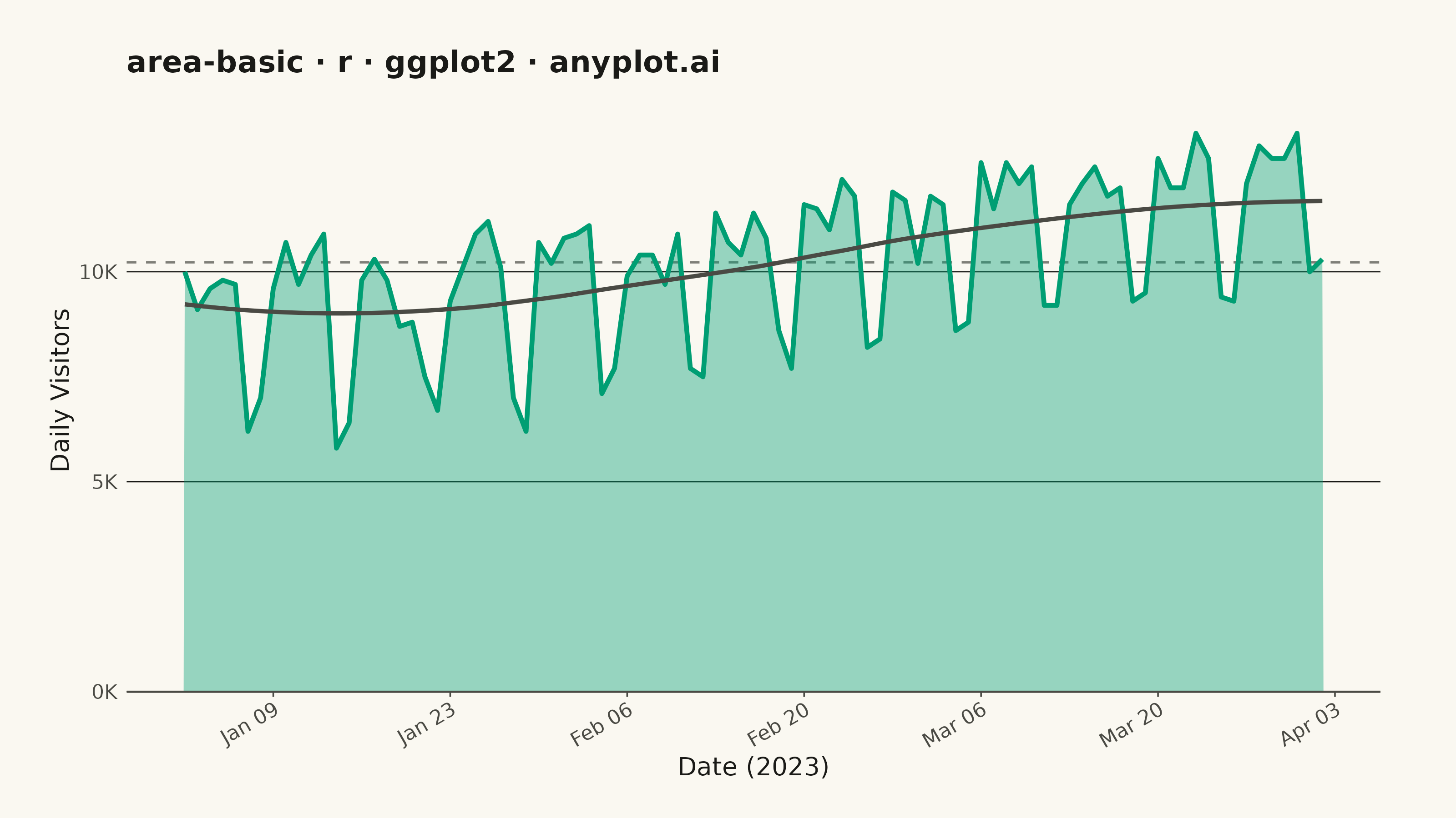
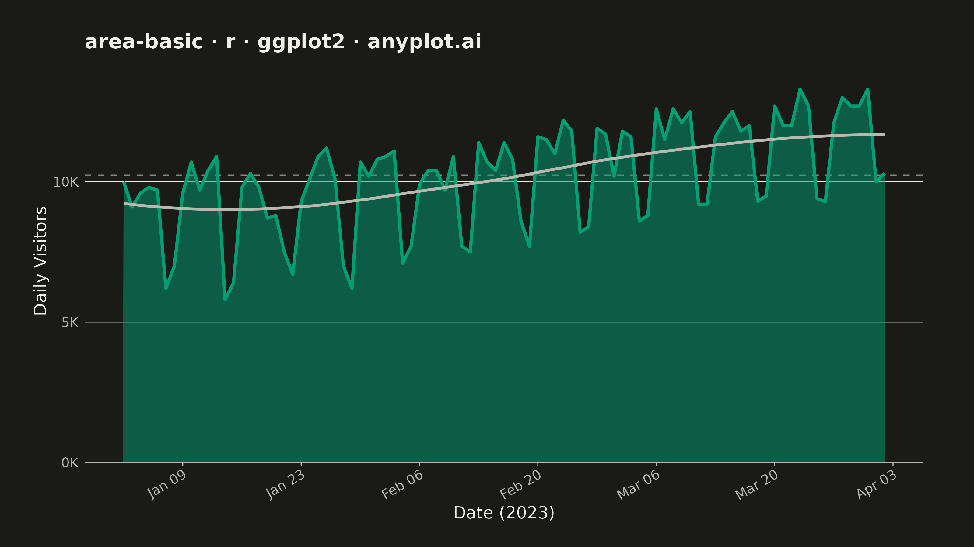
The same plot in 14 other libraries — Python: Altair, Bokeh, lets-plot, Matplotlib, Plotly, plotnine, Pygal, Seaborn; Julia: Makie.jl; JavaScript: Chart.js, D3.js, Apache ECharts, Highcharts, MUI X Charts. Compare all 15 side by side: Basic Area Chart in Python, R, Julia and JavaScript.
An area chart showing quantitative data over a continuous axis with the area below the line filled. It emphasizes the magnitude of values over time by filling the space between the line and axis, creating visual weight that helps readers understand volume and trends. Particularly effective for showing cumulative totals, resource consumption, or any data where the "amount" is as important as the trend.
#' anyplot.ai
#' area-basic: Basic Area Chart
#' Library: ggplot2 3.5.1 | R 4.4.1
#' Quality: 90/100 | Created: 2026-05-28

library(ggplot2)
library(scales)
library(ragg)

set.seed(42)

# --- Theme tokens -----------------------------------------------------------
THEME       <- Sys.getenv("ANYPLOT_THEME", "light")
PAGE_BG     <- if (THEME == "light") "#FAF8F1" else "#1A1A17"
INK         <- if (THEME == "light") "#1A1A17" else "#F0EFE8"
INK_SOFT    <- if (THEME == "light") "#4A4A44" else "#B8B7B0"
# Raise alpha in dark theme — alpha=0.35 over #1A1A17 composites to near-opaque forest green
FILL_ALPHA  <- if (THEME == "light") 0.40 else 0.50

IMPRINT_PALETTE <- c(
  "#009E73", "#C475FD", "#4467A3", "#BD8233",
  "#AE3030", "#2ABCCD", "#954477", "#99B314"
)

# --- Data -------------------------------------------------------------------
# Daily website visitors (thousands) over 13 weeks starting Monday Jan 2 2023
days <- seq.Date(as.Date("2023-01-02"), by = "day", length.out = 91)
day_num <- seq_along(days)
day_of_week <- as.integer(format(days, "%u"))  # 1=Mon ... 7=Sun
weekend <- day_of_week %in% c(6L, 7L)

base_visitors  <- 8.5 + 0.04 * day_num
weekly_effect  <- ifelse(weekend, -2.5, 0.8)
noise          <- rnorm(91, 0, 0.5)
visitors_k     <- round(pmax(1, base_visitors + weekly_effect + noise), 1)

df <- data.frame(date = days, visitors = visitors_k)
avg_visitors   <- mean(df$visitors)

# --- Plot -------------------------------------------------------------------
plot_title <- "area-basic · r · ggplot2 · anyplot.ai"

p <- ggplot(df, aes(x = date, y = visitors)) +
  # Period average reference — drawn first so area fill sits above it
  geom_hline(
    yintercept = avg_visitors,
    color      = INK_SOFT,
    linewidth  = 0.45,
    linetype   = "dashed",
    alpha      = 0.7
  ) +
  geom_area(fill = IMPRINT_PALETTE[1], alpha = FILL_ALPHA) +
  geom_line(color = IMPRINT_PALETTE[1], linewidth = 0.9) +
  # Loess trend line — makes the underlying upward growth arc explicit
  geom_smooth(
    method    = "loess",
    formula   = y ~ x,
    se        = FALSE,
    color     = INK_SOFT,
    linewidth = 0.8,
    linetype  = "solid",
    span      = 0.65
  ) +
  scale_x_date(date_labels = "%b %d", date_breaks = "2 weeks") +
  scale_y_continuous(
    labels = label_comma(suffix = "K", accuracy = 1),
    limits = c(0, NA),
    expand = expansion(mult = c(0, 0.08))
  ) +
  labs(
    title = plot_title,
    x     = "Date (2023)",
    y     = "Daily Visitors"
  ) +
  theme_minimal(base_size = 8) +
  theme(
    plot.background    = element_rect(fill = PAGE_BG, color = PAGE_BG),
    panel.background   = element_rect(fill = PAGE_BG, color = NA),
    panel.grid.major.x = element_blank(),
    panel.grid.minor.x = element_blank(),
    panel.grid.major.y = element_line(color = INK, linewidth = 0.2),
    panel.grid.minor.y = element_blank(),
    panel.border       = element_blank(),
    axis.line.x        = element_line(color = INK_SOFT, linewidth = 0.4),
    axis.ticks.x       = element_line(color = INK_SOFT, linewidth = 0.3),
    axis.ticks.y       = element_blank(),
    axis.title         = element_text(color = INK,      size = 10),
    axis.text          = element_text(color = INK_SOFT, size = 8),
    axis.text.x        = element_text(angle = 30, hjust = 1),
    plot.title         = element_text(color = INK,      size = 12, face = "bold"),
    plot.margin        = margin(20, 30, 15, 20, unit = "pt")
  )

# --- Save -------------------------------------------------------------------
ggsave(
  filename = sprintf("plot-%s.png", THEME),
  plot     = p,
  device   = ragg::agg_png,
  width    = 8,
  height   = 4.5,
  units    = "in",
  dpi      = 400
)
Runnable source as JSON, for any HTTP client: https://api.anyplot.ai/specs/area-basic/ggplot2/code. Any spec id and library id listed in llms-full.txt fit the same URL shape; every URL below is complete and callable.
{
  "spec_id": "area-basic",
  "language": "r",
  "library": "ggplot2",
  "page": "https://anyplot.ai/area-basic/r/ggplot2",
  "hub": "https://anyplot.ai/area-basic",
  "code_json": "https://api.anyplot.ai/specs/area-basic/ggplot2/code",
  "spec_json": "https://api.anyplot.ai/specs/area-basic",
  "render_light_png": "https://storage.googleapis.com/anyplot-images/plots/area-basic/r/ggplot2/plot-light.png",
  "render_dark_png": "https://storage.googleapis.com/anyplot-images/plots/area-basic/r/ggplot2/plot-dark.png",
  "quality_score": 90.0,
  "license": "MIT",
  "guide": "https://anyplot.ai/llms.txt"
}
Part of Basic Area Chart on anyplot.ai.