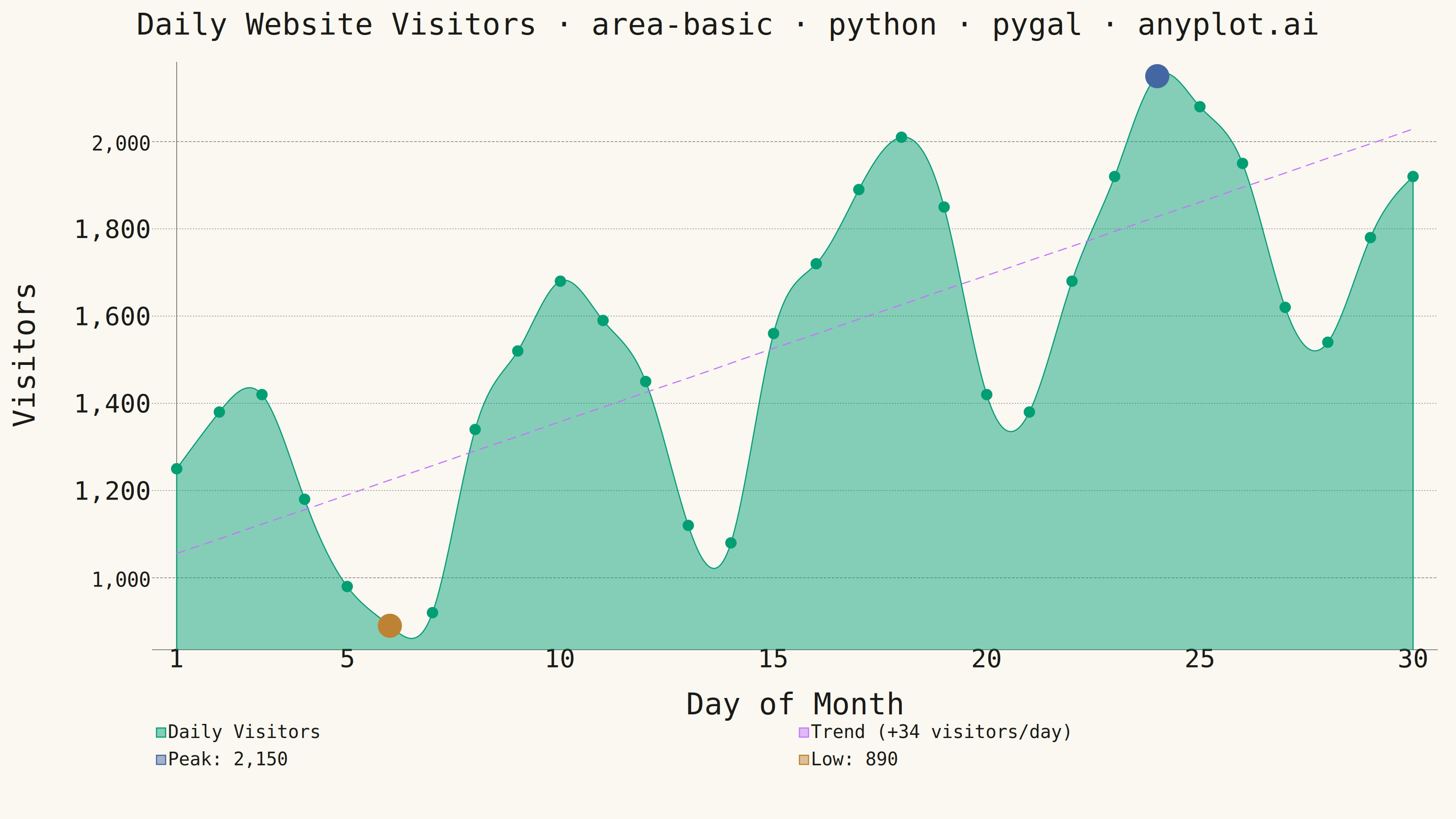
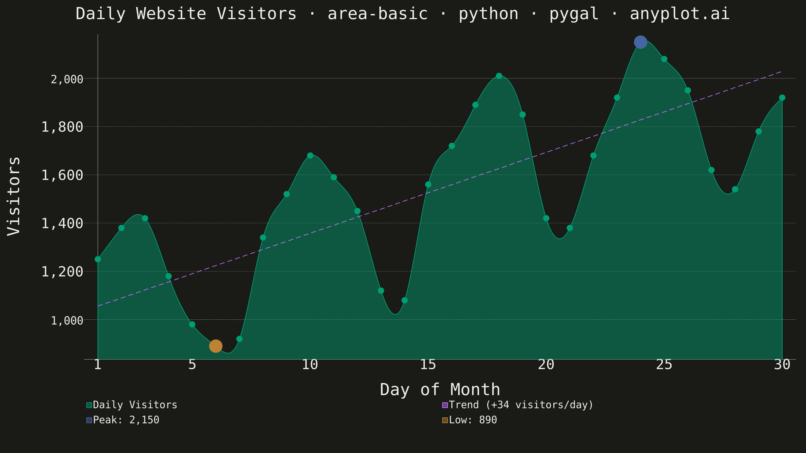
An area chart showing quantitative data over a continuous axis with the area below the line filled. It emphasizes the magnitude of values over time by filling the space between the line and axis, creating visual weight that helps readers understand volume and trends. Particularly effective for showing cumulative totals, resource consumption, or any data where the "amount" is as important as the trend.
""" anyplot.ai
area-basic: Basic Area Chart
Library: pygal 3.1.0 | Python 3.13.13
Quality: 89/100 | Updated: 2026-05-28
"""

import os
import sys


# Script is named pygal.py — remove its directory from sys.path first so
# 'import pygal' resolves to the installed package, not this file.
sys.path = [p for p in sys.path if p != os.path.dirname(os.path.abspath(__file__))]

import pygal
from pygal.style import Style


# Theme tokens
THEME = os.getenv("ANYPLOT_THEME", "light")
PAGE_BG = "#FAF8F1" if THEME == "light" else "#1A1A17"
INK = "#1A1A17" if THEME == "light" else "#F0EFE8"
INK_SOFT = "#4A4A44" if THEME == "light" else "#B8B7B0"
INK_MUTED = "#6B6A63" if THEME == "light" else "#A8A79F"

IMPRINT_PALETTE = ("#009E73", "#C475FD", "#4467A3", "#BD8233", "#AE3030", "#2ABCCD", "#954477", "#99B314")

# Data — daily website visitors over a month (three distinct phases)
days = list(range(1, 31))
visitors = [
    1250,
    1380,
    1420,
    1180,
    980,
    890,
    920,  # Week 1: baseline, weekend dip
    1340,
    1520,
    1680,
    1590,
    1450,
    1120,
    1080,  # Week 2: recovery, mid-month dip
    1560,
    1720,
    1890,
    2010,
    1850,
    1420,
    1380,  # Week 3: growth phase
    1680,
    1920,
    2150,
    2080,
    1950,
    1620,
    1540,  # Week 4: peak plateau
    1780,
    1920,  # Final uptick
]

peak_idx = visitors.index(max(visitors))
low_idx = visitors.index(min(visitors))

n = len(visitors)
first_half_avg = sum(visitors[: n // 2]) / (n // 2)
second_half_avg = sum(visitors[n // 2 :]) / (n // 2)
slope = (second_half_avg - first_half_avg) / (n // 2)
trend_start = first_half_avg - slope * (n // 4)
trend = [trend_start + slope * i for i in range(n)]

title = "Daily Website Visitors · area-basic · python · pygal · anyplot.ai"
title_font_size = round(66 * 67 / len(title)) if len(title) > 67 else 66

# Custom style — Imprint palette, theme-adaptive chrome, canonical font sizes
custom_style = Style(
    background=PAGE_BG,
    plot_background=PAGE_BG,
    foreground=INK,
    foreground_strong=INK,
    foreground_subtle=INK_MUTED,
    colors=IMPRINT_PALETTE,
    title_font_size=title_font_size,
    label_font_size=56,
    major_label_font_size=44,
    legend_font_size=40,
    value_font_size=36,
    stroke_width=2.5,
    opacity=0.47,
    opacity_hover=0.65,
    guide_stroke_color=INK_MUTED,
    guide_stroke_dasharray="3,3",
    major_guide_stroke_color=INK_SOFT,
    major_guide_stroke_dasharray="6,3",
    stroke_opacity=1.0,
    stroke_opacity_hover=1.0,
    tooltip_border_radius=8,
)

# Area chart — cubic interpolation for smooth, visually appealing curves
chart = pygal.Line(
    width=3200,
    height=1800,
    title=title,
    x_title="Day of Month",
    y_title="Visitors",
    style=custom_style,
    fill=True,
    show_dots=True,
    dots_size=12,
    stroke_style={"width": 5},
    show_y_guides=True,
    show_x_guides=False,
    x_label_rotation=0,
    show_legend=True,
    legend_at_bottom=True,
    legend_box_size=20,
    value_formatter=lambda x: f"{x:,.0f}",
    x_value_formatter=lambda x: f"Day {x}",
    interpolate="cubic",
    interpolation_precision=250,
    min_scale=4,
    max_scale=8,
    margin_bottom=120,
    margin_left=80,
    margin_right=40,
    margin_top=60,
    spacing=10,
    tooltip_border_radius=8,
    tooltip_fancy_mode=True,
    show_only_major_dots=False,
)

# Main area series (brand green — Imprint palette position 1)
chart.add("Daily Visitors", visitors, fill=True, stroke_style={"width": 5})

# Trend line — dashed, no fill (palette position 2: lavender) — secondary context
chart.add(
    f"Trend (+{slope:.0f} visitors/day)",
    [round(t) for t in trend],
    fill=False,
    show_dots=False,
    stroke_style={"width": 3, "dasharray": "20, 12"},
)

# Peak marker — single-value sparse series; one non-None point needs no stroke suppression
peak_series = [None] * n
peak_series[peak_idx] = {
    "value": visitors[peak_idx],
    "label": f"Day {peak_idx + 1}: {visitors[peak_idx]:,} visitors (+{round((visitors[peak_idx] / visitors[0] - 1) * 100)}% vs Day 1)",
}
chart.add(f"Peak: {visitors[peak_idx]:,}", peak_series, fill=False, show_dots=True, dots_size=26)

# Low marker — single-value sparse series
low_series = [None] * n
low_series[low_idx] = {
    "value": visitors[low_idx],
    "label": f"Day {low_idx + 1}: {visitors[low_idx]:,} visitors ({round((visitors[low_idx] / visitors[0] - 1) * 100):+d}% vs Day 1)",
}
chart.add(f"Low: {visitors[low_idx]:,}", low_series, fill=False, show_dots=True, dots_size=26)

# X-axis labels — major every 5th day for clean spacing
chart.x_labels = [str(d) if d % 5 == 0 or d == 1 else "" for d in days]

# Save PNG and interactive HTML
chart.render_to_png(f"plot-{THEME}.png")
with open(f"plot-{THEME}.html", "wb") as f:
    f.write(chart.render())
Runnable source as JSON, for any HTTP client: https://api.anyplot.ai/specs/area-basic/pygal/code. Any spec id and library id listed in llms-full.txt fit the same URL shape; every URL below is complete and callable.
{
  "spec_id": "area-basic",
  "language": "python",
  "library": "pygal",
  "page": "https://anyplot.ai/area-basic/python/pygal",
  "hub": "https://anyplot.ai/area-basic",
  "code_json": "https://api.anyplot.ai/specs/area-basic/pygal/code",
  "spec_json": "https://api.anyplot.ai/specs/area-basic",
  "render_light_png": "https://storage.googleapis.com/anyplot-images/plots/area-basic/python/pygal/plot-light.png",
  "render_dark_png": "https://storage.googleapis.com/anyplot-images/plots/area-basic/python/pygal/plot-dark.png",
  "interactive_light_html": "https://storage.googleapis.com/anyplot-images/plots/area-basic/python/pygal/plot-light.html",
  "interactive_dark_html": "https://storage.googleapis.com/anyplot-images/plots/area-basic/python/pygal/plot-dark.html",
  "quality_score": 89.0,
  "license": "MIT",
  "guide": "https://anyplot.ai/llms.txt"
}
Part of Basic Area Chart on anyplot.ai.