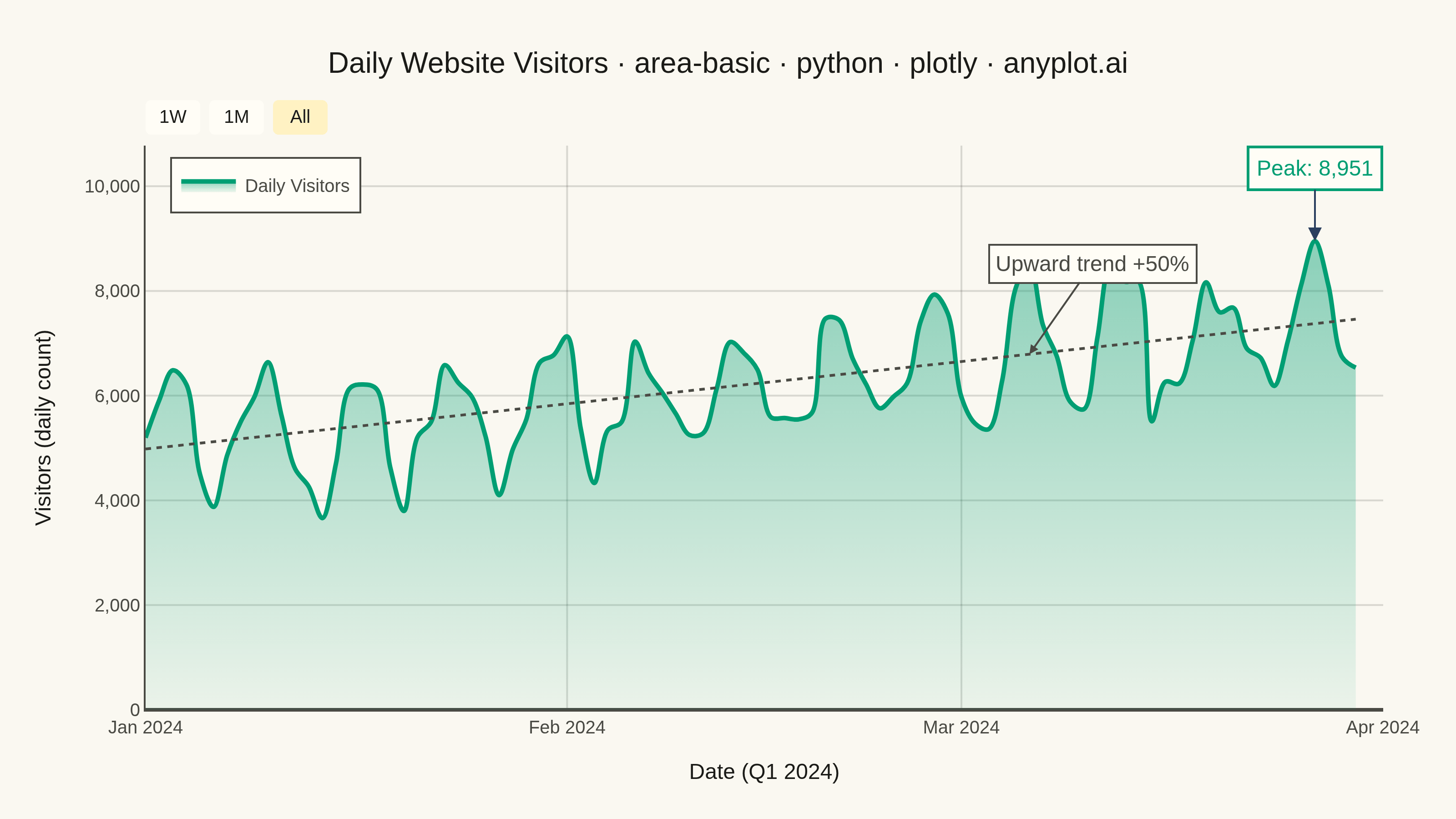
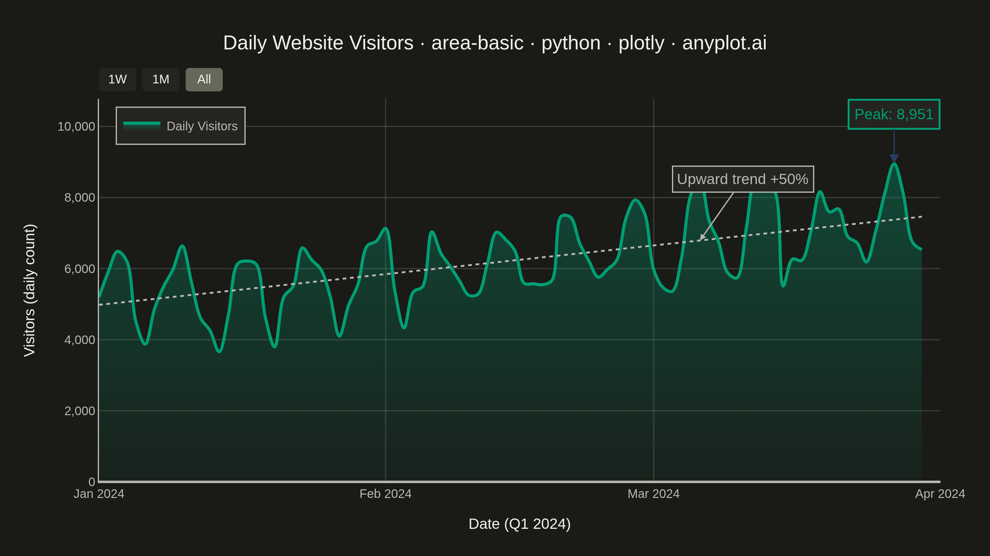
An area chart showing quantitative data over a continuous axis with the area below the line filled. It emphasizes the magnitude of values over time by filling the space between the line and axis, creating visual weight that helps readers understand volume and trends. Particularly effective for showing cumulative totals, resource consumption, or any data where the "amount" is as important as the trend.
""" anyplot.ai
area-basic: Basic Area Chart
Library: plotly 6.7.0 | Python 3.13.13
Quality: 93/100 | Updated: 2026-05-28
"""

import os

import numpy as np
import pandas as pd
import plotly.graph_objects as go


# Theme tokens
THEME = os.getenv("ANYPLOT_THEME", "light")
PAGE_BG = "#FAF8F1" if THEME == "light" else "#1A1A17"
ELEVATED_BG = "#FFFDF6" if THEME == "light" else "#242420"
INK = "#1A1A17" if THEME == "light" else "#F0EFE8"
INK_SOFT = "#4A4A44" if THEME == "light" else "#B8B7B0"
GRID = "rgba(26,26,23,0.15)" if THEME == "light" else "rgba(240,239,232,0.15)"
BRAND = "#009E73"

# Data - daily website visitors over a quarter
np.random.seed(42)
dates = pd.date_range("2024-01-01", periods=90, freq="D").strftime("%Y-%m-%d").tolist()
base = 5000
trend_offset = np.linspace(0, 2500, 90)
weekly_pattern = 1200 * np.sin(np.arange(90) * 2 * np.pi / 7)
noise = np.random.randn(90) * 400
visitors = base + trend_offset + weekly_pattern + noise
visitors = np.maximum(visitors, 1500).astype(int)

# Fit linear trend line for annotation anchor
trend_fit = np.polyfit(np.arange(90), visitors, 1)
trend_vals = np.polyval(trend_fit, np.arange(90))

# Title font size (scale to 67-char baseline)
title = "Daily Website Visitors · area-basic · python · plotly · anyplot.ai"
title_fontsize = round(16 * (67 / len(title))) if len(title) > 67 else 16

# Fill colors (stronger gradient for visible area effect)
fill_top = "rgba(0,158,115,0.45)" if THEME == "light" else "rgba(0,158,115,0.35)"
fill_bot = "rgba(0,158,115,0.06)"

# Plot
fig = go.Figure()

fig.add_trace(
    go.Scatter(
        x=dates,
        y=visitors,
        mode="lines",
        fill="tozeroy",
        fillcolor=fill_top,
        fillgradient={"type": "vertical", "colorscale": [[0.0, fill_bot], [1.0, fill_top]]},
        line={"color": BRAND, "width": 2.5, "shape": "spline"},
        name="Daily Visitors",
        hovertemplate="<b>%{x|%b %d, %Y}</b><br>Visitors: %{y:,}<extra></extra>",
    )
)

# Subtle dotted trend reference line
fig.add_trace(
    go.Scatter(
        x=dates,
        y=trend_vals,
        mode="lines",
        line={"color": INK_SOFT, "width": 1.5, "dash": "dot"},
        showlegend=False,
        hoverinfo="skip",
    )
)

# Peak annotation
peak_idx = int(np.argmax(visitors))
fig.add_annotation(
    x=dates[peak_idx],
    y=visitors[peak_idx],
    text=f"Peak: {visitors[peak_idx]:,}",
    showarrow=True,
    arrowhead=2,
    arrowsize=1.5,
    ax=0,
    ay=-40,
    font={"size": 12, "color": BRAND},
    bordercolor=BRAND,
    borderwidth=1.5,
    borderpad=4,
    bgcolor=ELEVATED_BG,
)

# Trend annotation anchored to a point on the trend line
anchor_idx = 65
fig.add_annotation(
    x=dates[anchor_idx],
    y=trend_vals[anchor_idx],
    text="Upward trend +50%",
    showarrow=True,
    arrowhead=2,
    arrowsize=1,
    ax=35,
    ay=-50,
    arrowcolor=INK_SOFT,
    font={"size": 12, "color": INK_SOFT},
    bgcolor=ELEVATED_BG,
    bordercolor=INK_SOFT,
    borderwidth=1,
    borderpad=3,
)

# Layout
fig.update_layout(
    autosize=False,
    paper_bgcolor=PAGE_BG,
    plot_bgcolor=PAGE_BG,
    font={"color": INK},
    title={"text": title, "font": {"size": title_fontsize, "color": INK}, "x": 0.5, "xanchor": "center"},
    xaxis={
        "title": {"text": "Date (Q1 2024)", "font": {"size": 12, "color": INK}},
        "tickfont": {"size": 10, "color": INK_SOFT},
        "showgrid": True,
        "gridcolor": GRID,
        "linecolor": INK_SOFT,
        "zerolinecolor": INK_SOFT,
        "dtick": "M1",
        "tickformat": "%b %Y",
        "spikemode": "across",
        "spikethickness": 1,
        "spikecolor": "rgba(0,158,115,0.4)",
        "spikedash": "dot",
        "rangeslider": {"visible": False},
        "rangeselector": {
            "buttons": [
                {"count": 7, "label": "1W", "step": "day", "stepmode": "backward"},
                {"count": 1, "label": "1M", "step": "month", "stepmode": "backward"},
                {"step": "all", "label": "All"},
            ],
            "font": {"size": 10},
            "bgcolor": ELEVATED_BG,
            "bordercolor": INK_SOFT,
        },
    },
    yaxis={
        "title": {"text": "Visitors (daily count)", "font": {"size": 12, "color": INK}},
        "tickfont": {"size": 10, "color": INK_SOFT},
        "showgrid": True,
        "gridcolor": GRID,
        "linecolor": INK_SOFT,
        "zerolinecolor": INK_SOFT,
        "tickformat": ",",
        "spikemode": "across",
        "spikethickness": 1,
        "spikecolor": "rgba(0,158,115,0.4)",
        "spikedash": "dot",
    },
    showlegend=True,
    legend={
        "x": 0.02,
        "y": 0.98,
        "font": {"size": 10, "color": INK_SOFT},
        "bgcolor": ELEVATED_BG,
        "bordercolor": INK_SOFT,
        "borderwidth": 1,
    },
    margin={"l": 80, "r": 40, "t": 80, "b": 60},
    hovermode="x unified",
)

# Save
fig.write_image(f"plot-{THEME}.png", width=800, height=450, scale=4)

fig.update_layout(xaxis_rangeslider_visible=True)
fig.write_html(f"plot-{THEME}.html", include_plotlyjs="cdn")
Runnable source as JSON, for any HTTP client: https://api.anyplot.ai/specs/area-basic/plotly/code. Any spec id and library id listed in llms-full.txt fit the same URL shape; every URL below is complete and callable.
{
  "spec_id": "area-basic",
  "language": "python",
  "library": "plotly",
  "page": "https://anyplot.ai/area-basic/python/plotly",
  "hub": "https://anyplot.ai/area-basic",
  "code_json": "https://api.anyplot.ai/specs/area-basic/plotly/code",
  "spec_json": "https://api.anyplot.ai/specs/area-basic",
  "render_light_png": "https://storage.googleapis.com/anyplot-images/plots/area-basic/python/plotly/plot-light.png",
  "render_dark_png": "https://storage.googleapis.com/anyplot-images/plots/area-basic/python/plotly/plot-dark.png",
  "interactive_light_html": "https://storage.googleapis.com/anyplot-images/plots/area-basic/python/plotly/plot-light.html",
  "interactive_dark_html": "https://storage.googleapis.com/anyplot-images/plots/area-basic/python/plotly/plot-dark.html",
  "quality_score": 93.0,
  "license": "MIT",
  "guide": "https://anyplot.ai/llms.txt"
}
Part of Basic Area Chart on anyplot.ai.